Afro Bohemian Wallpaper Must-Haves for Beginners
In 2026 the dominant interior design conversation isn’t minimalism. It’s Heritage Maximalism.
The deliberate layering of bold cultural pattern, organic natural materials, and ancestral visual references into rooms that feel as personally meaningful as they are visually rich.
Afro Bohemian wallpaper is the most accessible entry point into Heritage Maximalism for beginners — and it’s the most consequential single surface decision available in any room. One correctly chosen panel on one correctly chosen wall can shift a room’s entire aesthetic register from generic to culturally grounded without requiring furniture replacement, renovation, or significant financial commitment.
The challenge for beginners isn’t finding the wallpaper. It’s knowing which product format to buy, which zone to start in, how to handle the technical basics of pattern repeat and visual weight, and which pairing pieces make the wallpaper work as part of a layered room system rather than as an isolated surface statement.
This guide covers all of it — in the sequence that makes each decision easier rather than harder.
Quick Takeaway:
- Beginners start in low-commitment, high-impact zones — the entryway, powder room, or bedroom accent wall — before tackling larger room applications where the stakes of a wrong choice are higher.
- Matte peel-and-stick is the beginner substrate — removable adhesive backing means the wallpaper commitment is reversible while the visual impact is full-scale.
- Visual weight is the beginner’s most important technical concept — balancing the wallpaper’s busy pattern with neutral solid furniture is the single decision that most determines whether the room reads as Heritage Maximalist or overwhelming.
The Heritage Maximalism Framework: What Beginners Need to Understand First
Heritage Maximalism is the design philosophy that makes Afro Bohemian wallpaper meaningful rather than merely decorative.
It’s the deliberate use of culturally specific pattern — mud cloth geometric forms from Mali, Kente interlocking shapes from Ghana, Adire resist-dye motifs from the Yoruba people — as the room’s visual foundation rather than as surface decoration applied on top of an already-complete interior.
The difference between Heritage Maximalism and generic maximalism is cultural narrative.
Generic maximalism is bold, layered, and pattern-rich. Heritage Maximalism is all of those things — plus every pattern and motif choice carries a specific cultural origin that the room communicates to anyone who knows how to read it.
For beginners this framework resolves the most common wallpaper anxiety: the fear that a bold pattern will be too much. Heritage Maximalism isn’t about restraint. It’s about intentionality — knowing precisely which pattern you’re choosing, where it comes from, and why it belongs in the specific room position you’re placing it.
That intentionality is what makes bold pattern read as confident rather than chaotic.
Before buying any wallpaper product confirm that you can answer these three questions: What cultural tradition does this pattern reference? What palette category does the colorway sit in — Grounded earth tone, High Contrast neutral, or Lush accent? What zone in my home is this pattern scaled correctly for?
If the answer to all three is clear the purchase is correct. If any answer is uncertain the selection stage isn’t complete yet.
First Purchase: Matte Peel-and-Stick as the Beginner Substrate
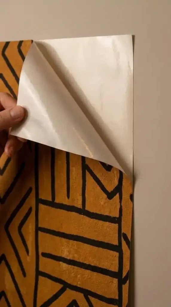
Matte peel-and-stick wallpaper is the beginner’s entry point substrate — and it’s the correct first choice for three specific reasons that have nothing to do with quality compromise.
Removable adhesive backing means the wallpaper commitment is reversible. A beginner making their first wallpaper decision in Heritage Maximalism is making a bold pattern choice in a territory they haven’t navigated before. The ability to remove and reposition without wall damage — and without professional installation or removal costs — removes the primary anxiety that prevents beginners from making confident pattern choices in the first place.
The matte finish requirement is non-negotiable even within the peel-and-stick format.
Standard peel-and-stick wallpaper has a semi-gloss or smooth vinyl surface that reads as contemporary and synthetic against the natural fiber vocabulary of rattan furniture, raw acacia wood, and woven baskets. Matte peel-and-stick — the chalky clay-like finish that reads as hand-painted and artisanal — is available from specialist suppliers and is the only peel-and-stick format that sits cohesively within the Afro Bohemian material system.
Buy one roll before buying the full room quantity.
Apply a single panel in the intended position and live with it for one week under the room’s actual 2700K warm lighting conditions before ordering the remaining panels. The pattern that looked correct on a swatch card or screen may read differently at full architectural scale under your specific light conditions — and identifying that before committing to the full order is exactly what the one-roll test prevents you from missing.
Second Purchase: The Primary Pattern Wallpaper Panel
The primary pattern wallpaper is the Heritage Maximalism foundation — the piece that establishes the room’s cultural narrative and pattern scale before any other element is introduced.
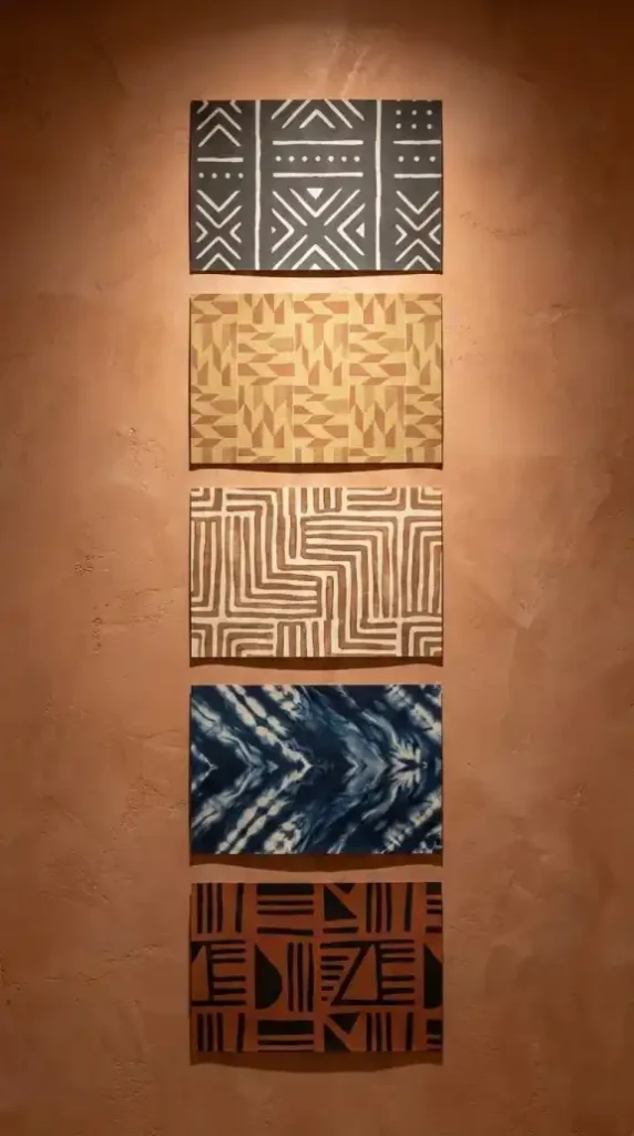
Five pattern categories cover the Afro Bohemian primary wallpaper vocabulary for beginners — and choosing the correct category depends on the room’s existing palette and the cultural narrative the room is building toward.
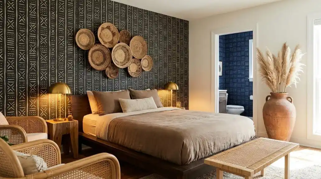
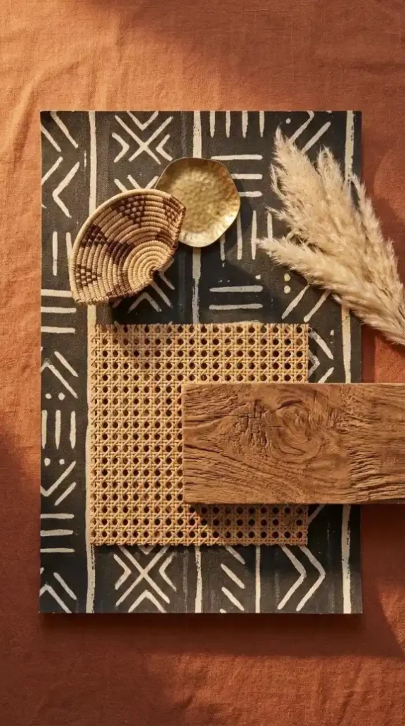
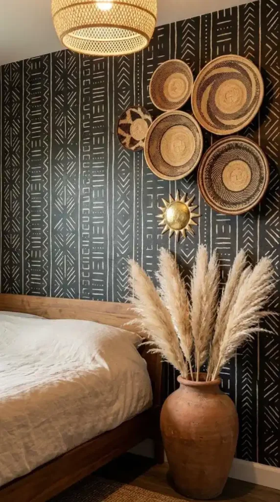
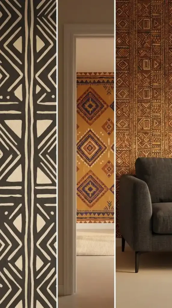
Mud cloth Bògòlanfini geometric wallpaper — bold linear geometric forms in charcoal and bone or ochre and warm black. The highest contrast pattern option. Correct for rooms running on the High Contrast palette category where the stark black and cream opposition is the room’s primary visual statement. The hand-painted aesthetic quality — slight edge variation in each geometric form — distinguishes authentic mud cloth wallpaper from a machine-printed geometric approximation.
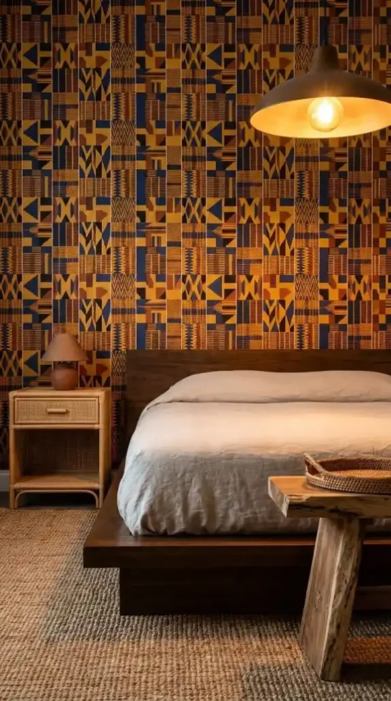
Kente-inspired interlocking geometric wallpaper — bold interlocking shapes in muted gold and terracotta that mimic the structured strip-weaving tradition of Ghana. The warmest and most vibrant primary pattern option. Correct for rooms needing the Lush Accent palette category at the wall scale — the muted gold introducing warmth and cultural vibrancy simultaneously.
Kuba cloth raffia-inspired texture wallpaper — earthy labyrinth patterns in warm brown and cream with the irregular improvisational character of the Congo’s raffia textile tradition. The most subtle primary pattern option. Correct for rooms where the textile layer is already carrying bold geometric pattern and the wall needs to contribute cultural texture rather than competing pattern intensity.
Adire indigo resist-dye wallpaper — fluid abstract forms in deep indigo and cream referencing the wax-resist batik tradition of the Yoruba people. The cooling accent option. Correct for rooms running heavily on terracotta and ochre earth tones that need the indigo Life tone at the architectural wall scale.
Tribal abstract wallpaper — modernized non-literal interpretations of ancestral art in burnt sienna, warm black, and cream. The contemporary entry point that delivers cultural narrative through abstracted motif rather than direct pattern reproduction. Correct for beginners who want Heritage Maximalism at a more contemporary register before committing to the full bold pattern vocabulary of mud cloth or Kente geometric.
Third Purchase: Grasscloth Wallpaper for the Secondary Wall
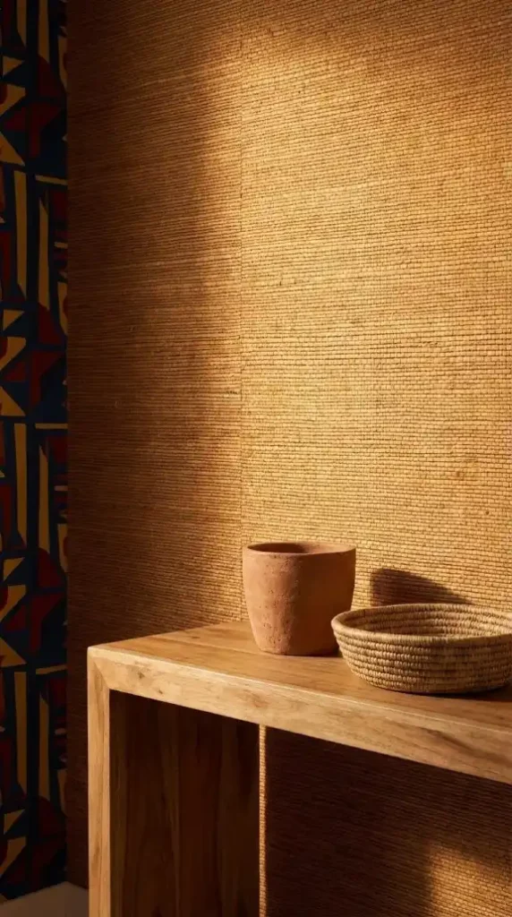
Grasscloth wallpaper on the secondary wall is the Heritage Maximalism layering technique that most elevates an Afro Bohemian wallpaper scheme beyond a single accent wall statement.
While the primary pattern wallpaper delivers the bold cultural narrative on the accent wall, grasscloth on the adjacent secondary wall wraps the room in the natural fiber vocabulary — bringing the organic material warmth of jute, sisal, and rattan to the wall surface without the pattern intensity that would compete with the primary accent.
Genuine grasscloth — actual woven grass fiber adhered to a paper backing — has dimensional surface texture that printed texture simulation can’t replicate. The individual grass fibers create slight surface relief that catches 2700K warm light exactly as the rattan pendant and the seagrass baskets do — making the secondary wall read as part of the same organic material system rather than as a different design decision on the same room’s surfaces.
The combination of bold primary pattern on one wall and grasscloth texture on the adjacent walls creates the visual hierarchy that Heritage Maximalism requires: one surface at maximum cultural pattern intensity, the surrounding surfaces at maximum organic material warmth without competing pattern.
For beginners on a tighter budget: a grasscloth-effect faux raffia peel-and-stick vinyl on the secondary walls with genuine grasscloth on the accent wall produces a similar visual outcome at lower material cost — the two-material approach reserving the premium substrate investment for the room’s highest-visibility surface.
Fourth Purchase: The Oversized Flora Botanical Panel
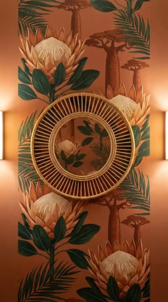
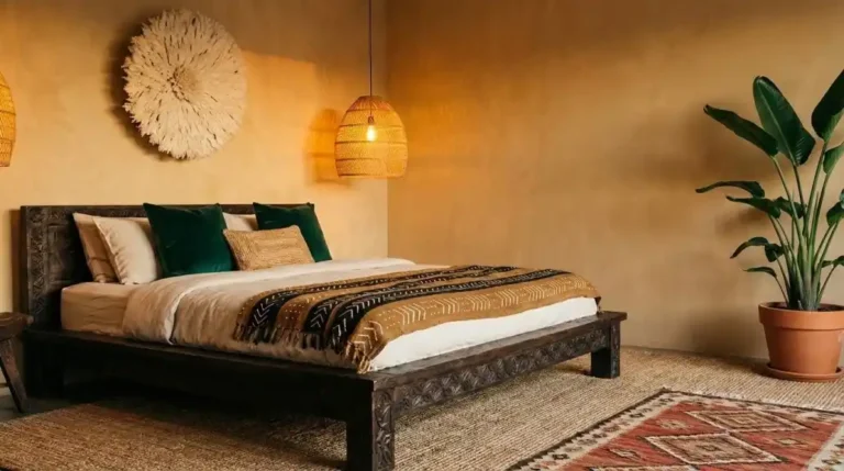
An oversized flora botanical panel — proteas, baobab silhouettes, and tropical palm fronds at mural scale — is the biophilic design element of the Afro Bohemian wallpaper system and the piece that connects the cultural pattern vocabulary to the natural world it references.
Biophilic design — the design philosophy of bringing the natural world into the built environment — is the theoretical framework the botanical wallpaper panel operates within. The oversized protea and baobab motifs aren’t decorative flora. They’re South Africa’s iconic national flower and Africa’s iconic landscape tree rendered at architectural scale — cultural narrative delivered through the natural world rather than through textile pattern tradition.
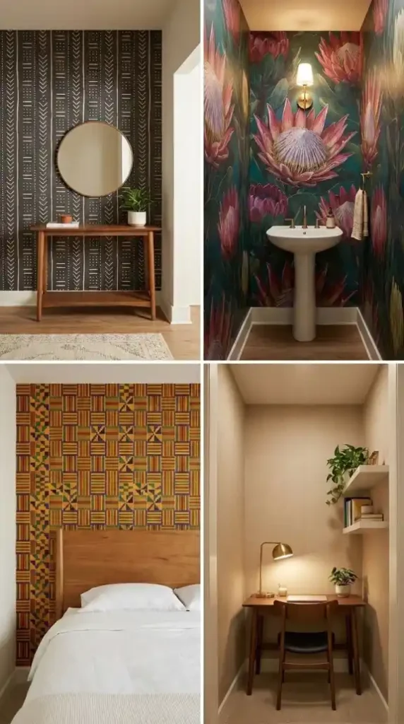
The botanical panel works most powerfully in the powder room or entryway — the beginner-friendly small zones where a single large-scale panel creates the maximum visual impact at the minimum surface area commitment.
A single oversized botanical panel applied to the powder room’s primary wall creates the Jewel Box effect — the small enclosed space allowing the grand-scale botanical motifs to be read at close range, making individual flower and leaf forms legible as detailed illustrations rather than as background pattern.
Pair a rattan-framed circular mirror mounted on the botanical panel — the circular organic frame reading as a natural compositional addition to the botanical vocabulary, and the mirror reflecting the mural pattern back into the small space to create the impression of a room larger and more lushly planted than its actual dimensions allow.
Fifth Purchase: Linen-Textured Vinyl for the Nook or Workspace
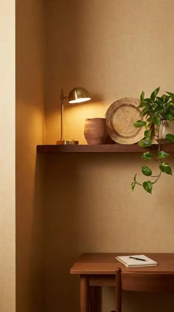
Linen-textured vinyl wallpaper — soft woven linen surface simulation in warm ochre and sand tones, durable and washable while visually maintaining the organic softness of natural linen textile — is the beginner’s zone-defining wallpaper for nooks and workspaces.
The nook or workspace wallpaper performs a specific spatial function that the accent wall and powder room panels don’t — it defines a zone within a larger room without requiring a physical partition or a full room renovation.
A linen-textured vinyl applied to the three walls of a reading nook or home office alcove creates a visually distinct environment within the larger room — the different wall treatment signaling spatially that this zone operates at a different register from the room surrounding it. The nook becomes its own micro-environment: warmer, more enclosed, more focused.
Linen-textured vinyl’s durability advantage over paper-based substrates makes it the correct choice for the workspace zone where the wall surface receives more contact and humidity exposure than bedroom or living room walls. The vinyl substrate withstands the wear that a natural grasscloth or non-woven paper substrate wouldn’t survive at the workspace wall position.
The linen texture — visual softness rather than bold pattern — keeps the nook’s visual weight at a level that supports focused cognitive work rather than the peripheral maximalist richness of the broader room. The nook wall contributes warm material texture without the pattern intensity that would make sustained work in the space cognitively taxing.
Sixth Purchase: The Pairing Furniture Pieces
Pairing furniture for Afro Bohemian wallpaper follows the visual weight principle — balancing the wallpaper’s busy pattern with furniture pieces whose material identity contributes to the room system without adding pattern competition.
Two furniture categories serve this pairing function correctly.
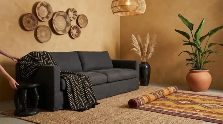
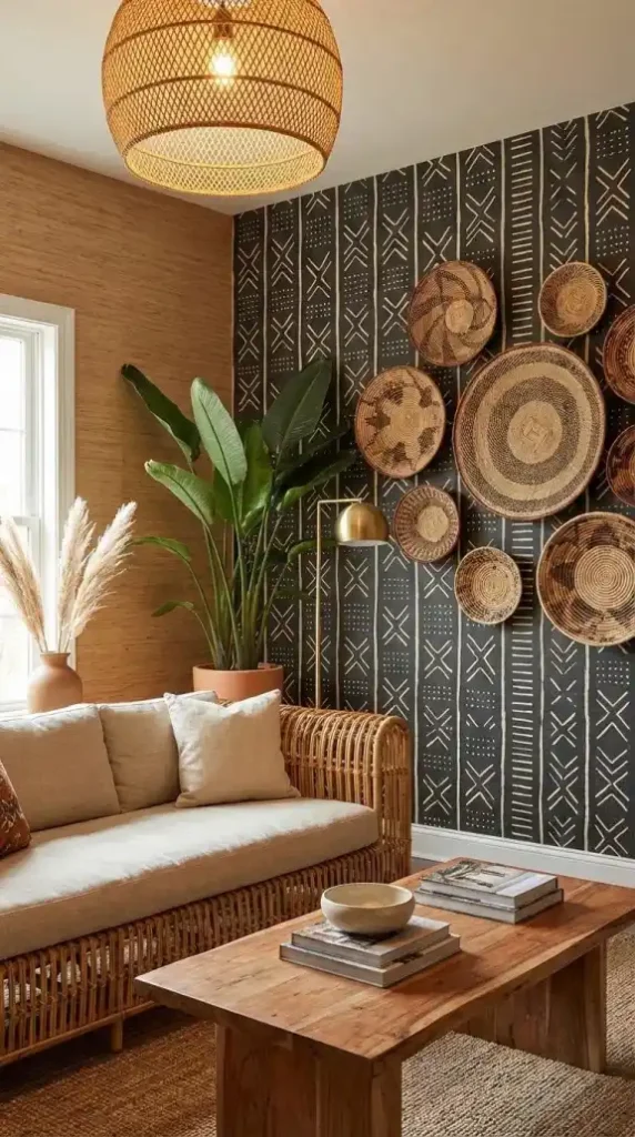
Rattan and wicker furniture — the essential bohemian companion to any Afro Bohemian wallpaper application. The open weave structure of rattan keeps the furniture layer visually light against the bold wallpaper behind it — the eye passes through the rattan weave to the wallpaper surface rather than stopping at the furniture as a competing visual element. A rattan bedside table, a wicker reading chair, a cane pendant overhead — all add the natural fiber material vocabulary without the visual weight that solid upholstered or machine-finished furniture would create in front of a maximally patterned wall.
Raw wood — acacia, teak, and dark ebony — as the grounding material counterpoint. Dark raw wood in front of a bold geometric wallpaper creates the High-Low Mix at the furniture scale: the contemporary natural material beside the ancestral cultural pattern. The deep grain of raw acacia or teak provides surface richness at the furniture level that mirrors the wallpaper’s pattern richness at the wall level — two distinct material richnesses at two distinct spatial depths.
The Rule of Three governs the pairing sequence: the wallpaper as the large pattern, the rattan or raw wood furniture as the natural material texture, the bed linen or sofa upholstery as the solid zero-pattern element. Solid bone linen, undyed cotton, or warm sand upholstery as the primary soft furnishing surface — the visual rest zone that makes the wallpaper and the furniture material texture both legible without competition.
Seventh Purchase: Dimensional Layering Pieces for Over the Wallpaper
Dimensional layering pieces mounted over the Afro Bohemian wallpaper are what transform the accent wall from a two-dimensional patterned surface into a multi-layer Heritage Maximalism composition with spatial depth.
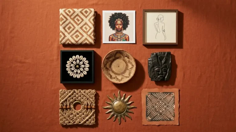
Woven Tonga and Binga wall baskets are the first dimensional purchase — five baskets in graduated sizes arranged asymmetrically over the wallpaper surface. The baskets’ tightly coiled woven surfaces project slightly from the wall plane, creating the first three-dimensional layer in front of the geometric pattern behind them. The circular basket forms break the rectangular repeat of the wallpaper’s geometric vocabulary — introducing organic circular shapes that contrast with the linear pattern behind them.
Brass accent pieces are the second dimensional purchase — a hammered brass sun wall sculpture, a small brass wall hook cluster, or a brass ring macramé piece at the wallpaper’s compositional gap positions. Brass introduces the Luxurious element of the Heritage Maximalism aesthetic at the small accent scale — the warm metallic surface catching 2700K warm light in multiple small shifting highlight points against the matte wallpaper surface behind it.
Dried pampas grass and dried florals in terracotta floor vases are the biophilic softening layer — positioned in front of the wallpapered wall rather than over it, but reading as part of the same wallpaper composition from across the room. The pale dried pampas plumes provide the most delicate organic texture in the room — their soft form reading as maximum contrast to the bold geometric wallpaper behind them and softening the overall composition at the floor level.
The Beginner Technical Guide: Pattern Repeat, Focal Point, and Visual Weight
Three technical concepts determine whether a beginner’s wallpaper application reads as intentional Heritage Maximalism or as a first attempt that needs correction.
Pattern repeat is the alignment of the pattern motif across adjacent wallpaper panels at the seams. Every Afro Bohemian wallpaper product specifies its repeat measurement — the distance between identical pattern units. Before cutting any panel measure the wall height and add the repeat measurement to the required panel length to ensure the pattern aligns correctly at every seam. Misaligned pattern repeat at a panel seam is the most immediately visible technical error in wallpaper application and the one that most undermines an otherwise correct wallpaper choice. Mud cloth geometric patterns with large bold repeat units are the most forgiving at the seam — the bold forms are less dependent on precise alignment than small-scale micro-patterns where a misalignment of even 5mm is immediately visible.
Focal point is the design principle that the wallpaper accent wall should be the first surface the eye lands on upon entering the room. Stand at the room’s entry point before the wallpaper is applied and identify which wall the eye naturally moves toward. That is the accent wall. Applying the wallpaper to any other wall — a side wall, a wall behind the entry door, a wall that isn’t in the primary sightline — produces a wallpaper that reads as a secondary design decision rather than as the room’s Heritage Maximalism foundation.
Visual weight is the balancing of the wallpaper’s bold busy pattern against the furniture and textile layer’s material neutrality. The wallpaper carries maximum visual weight. The solid furniture upholstery carries zero visual weight. The rug or curtain textile carries medium visual weight. That three-level visual weight hierarchy — heavy at the wall, medium at the floor, light at the furniture — is what prevents Heritage Maximalism from tipping into visual overload. Every patterned element added to the furniture layer beyond the rug increases the overall visual weight toward the overload threshold. The solid sofa or bed as the primary furniture surface is not a styling compromise. It’s the visual weight management decision that makes the wallpaper readable rather than oppressive.
The Four Beginner-Friendly Zones: Where to Start
Beginners should start in low-commitment high-impact zones before tackling full living room or open-plan applications where the surface area is larger and the stakes of a wrong decision are proportionally higher.
The entryway or foyer is the Statement Zone — the highest-impact beginner starting point because it has the smallest surface area of any primary room in the house while carrying the largest first-impression responsibility. A bold mud cloth geometric wallpaper in the entryway delivers the Heritage Maximalism cultural narrative to every person who enters the home from the first second of arrival. Surface area is small. Impact is maximum. And if the pattern choice turns out to be wrong the entryway is the easiest room in the house to repaper.
The powder room is the Jewel Box Zone — the enclosed small space where grand-scale botanical or geometric wallpaper reads at close viewing distance as an immersive surrounding environment rather than a distant wall pattern. The powder room’s small scale makes a single roll of premium wallpaper sufficient to cover the full space — making it the most affordable full-room application available in any home.
The bedroom accent wall is the Low-Commitment Focal Point Zone — one wall behind the headboard at full pattern commitment, three adjacent walls remaining in smooth warm plaster. The single accent wall application requires the minimum panel quantity of any primary room application and delivers the maximum focal point impact from the primary sleeping sightline.
The nook or workspace is the Zone-Definition application — linen-textured vinyl on three nook walls creating a visually distinct micro-environment within a larger room without requiring a physical partition or structural renovation. The most beginner-friendly application because the small enclosed surface area of a nook requires minimal panel quantity and the zone-defining function of the wallpaper is immediately legible regardless of the broader room’s existing decor.
What to Buy Last: The Full Room Application
The full living room or primary bedroom wallpaper application — the bold pattern on the primary accent wall with grasscloth on adjacent walls across a large room’s full surface area — is the last wallpaper purchase, not the first.
Buy it after completing at least one beginner zone application.
The entryway mud cloth panel, the powder room botanical mural, or the bedroom accent wall Kente geometric teaches the beginner the practical skills — pattern repeat alignment, panel cutting, bubble removal during application, 2700K lighting evaluation — that the larger room application requires at higher stakes.
It also teaches the design skills. Living with a bold mud cloth geometric in the entryway for three months tells you whether the High Contrast charcoal and bone colorway is the correct palette register for the primary living room application or whether the warmer ochre and terracotta Kente-inspired alternative would be more liveable at the scale of the room where the most daily time is spent.
The eclectic interiors design philosophy — the Global Eclecticism that is Heritage Maximalism’s conceptual foundation — rewards patient accumulation over rapid completion. The Afro Bohemian wallpaper system built gradually across multiple rooms over multiple months produces a home with deeper cultural narrative coherence than the same system installed simultaneously across all rooms in a single weekend.
Start small. Learn the system. Then commit to the full expression.
The Beginner Buying Sequence at a Glance
Before making any wallpaper purchase answer these questions:
- Which beginner zone is the starting point — entryway, powder room, bedroom accent wall, or nook? Identify the zone before choosing the pattern. The zone determines the correct motif scale — grand-scale for entryway and bedroom accent wall, mural scale for the powder room jewel box, linen texture for the nook.
- Is the substrate matte peel-and-stick for rental or first-time application, or non-woven paper for permanent owned-space installation? Identify the installation context before confirming the product format. Applying a permanent paste-the-wall non-woven paper in a rental space is the single most costly beginner substrate mistake.
- What is the room’s existing palette — which of the three palette categories is currently underrepresented? Grounded earth tone, High Contrast neutral, or Lush Accent? The underrepresented category is the correct wallpaper colorway choice — not the category already dominant in the room’s existing textiles and furniture.
- What is the pattern repeat measurement of the chosen wallpaper? Calculate the total panel quantity required by adding the repeat measurement to the wall height before ordering. Ordering without the pattern repeat addition consistently produces insufficient panel quantity — requiring a reorder from a potentially different dye lot that won’t match the existing panels.
- Is the primary furniture piece that will sit in front of the wallpaper a solid zero-pattern surface? If the primary sofa or bed is patterned or heavily textured the visual weight system is already broken before the wallpaper goes up — resolve the furniture surface to a solid earth tone before confirming the wallpaper purchase.
- Has the one-roll test been completed — one panel applied to the intended wall and evaluated under 2700K warm lighting for one week before the full order is confirmed? If not the full order is being confirmed without the most important data point available: how the specific pattern at the specific scale reads on the specific wall under the specific light conditions of the actual room.
Nine products. Four beginner zones. One Heritage Maximalism system.
The matte peel-and-stick substrate removes the commitment anxiety. The primary pattern panel — mud cloth, Kente, Kuba, Adire, or tribal abstract — establishes the cultural narrative. The grasscloth secondary wall wraps the room in natural fiber warmth. The oversized botanical panel delivers the biophilic design layer at the powder room or entryway scale. The linen-textured vinyl defines the nook or workspace zone. The rattan and raw wood pairing furniture balances the wallpaper’s visual weight with natural material counterpoint. The Tonga basket and brass dimensional pieces extend the wall from flat pattern into layered three-dimensional depth. The dried pampas and botanical floor elements soften the geometric boldness at the organic layer. The full room application closes the Heritage Maximalism system at its most complete expression.
Each purchase earns its place by doing something no other purchase on the list is already doing.
And the system built slowly — one beginner zone at a time, one panel tested before the full order confirmed, one layer added in response to the layer before it — produces the result that Heritage Maximalism promises at its fullest.
Not a decorated home. A culturally narrated one.
Built from the wall outward. Layered from the pattern foundation upward. And warm — genuinely, materially, unmistakably warm — in the way that only earth pigments, natural fiber, ancestral motif, and 2700K candlelight together can produce.
Take It Further:
- Afro Bohemian Wallpaper: The Complete Style Guide — Understand the full five-motif category system — from cultural geometric patterns to botanical elements and textural simulations — as the design foundation every other room element responds to.
- 11 Afro Bohemian Wallpaper Ideas for a Warm and Layered Home — Browse 11 specific wallpaper moves across every motif category and room position, each one with the pairing logic that makes it work within the broader room system.
- How to Choose and Style Afro Bohemian Wallpaper — Work through the full two-stage selection and styling process — from motif scale and substrate material to the Rule of Three and color pulling — in the sequence that makes every decision easier than the last.