How to Choose and Style Afro Bohemian Wallpaper
Most wallpaper guides tell you what to buy.
This one tells you how to decide — and in what order those decisions need to be made so that each one creates the conditions for the next rather than contradicting it.
Choosing Afro Bohemian wallpaper is a two-stage process. The selection stage resolves the product decisions: motif scale, substrate material, authentic pattern origin, and neutral base color. The styling stage resolves the room decisions: which wall, what goes over it, which textiles pair with it, and how the biophilic layer completes the composition.
Most people make styling decisions before finishing the selection stage — and end up with a wallpaper that’s correct in isolation but wrong in the room it’s applied to.
This guide covers both stages in the sequence that prevents that outcome.
Quick Takeaway:
- Motif scale is the first selection decision — grand-scale patterns for high-ceiling rooms, micro-patterns for small spaces and rooms already carrying significant textile pattern load.
- Color pulling — selecting one minor color from the wallpaper pattern and using it for the room’s upholstery or curtains — is the single technique that most reliably integrates the wallpaper into the room’s broader palette rather than letting it read as an isolated surface statement.
- The Rule of Three — one large pattern (wallpaper), one medium texture (rug), one solid (furniture) — is the structural logic that prevents the Afro Bohemian room from tipping from maximalist richness into visual chaos.
Stage One: Selection
Selection Step 1: Resolve the Motif Scale First
Motif scale is the first wallpaper decision — made before pattern category, before colorway, and before substrate material.
The wrong motif scale applied to the wrong room proportion is the most common wallpaper mistake and the hardest to diagnose after the fact — because a grand-scale pattern in a small room reads as overwhelming but the individual pattern elements are still visually correct, making the problem feel atmospheric rather than identifiable.
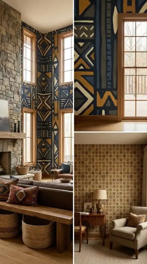
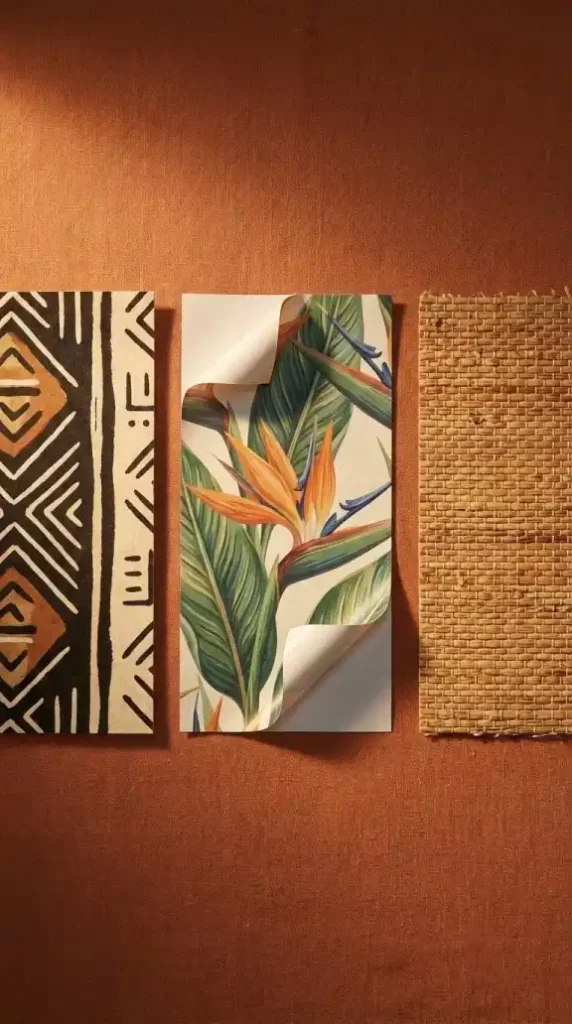
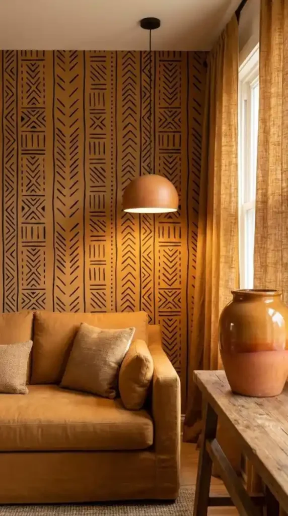
Grand-scale patterns — large bold geometric repeat units in mud cloth, Kente-inspired interlocking forms, or oversized botanical mural elements — belong in rooms with ceiling heights of 260cm or above where the pattern’s scale reads correctly against the room’s available vertical surface area. In a high-ceiling room a grand-scale mud cloth geometric wallpaper reads as architecturally bold. In a standard 240cm ceiling room the same pattern reads as crowded — the geometric units too large for the wall surface area to contain them without the room feeling enclosed.
Micro-patterns — fine Adinkra symbol grids, small Kuba cloth labyrinth repeats, grasscloth fiber texture simulations — belong in smaller rooms, rooms with standard ceiling heights, and rooms where the textile layer is already carrying significant pattern commitment and the wallpaper needs to add texture without competing at the same visual intensity.
The test: stand at the room’s entry point and estimate the distance between the entry and the accent wall. Under 3 meters — choose a micro-pattern or medium-scale repeat. Over 3 meters with ceiling height above 260cm — grand-scale pattern is appropriate.
Selection Step 2: Choose the Substrate Material
Substrate material is the second selection decision — the physical wallpaper product specification that determines application method, longevity, and environmental compatibility before the pattern choice is confirmed.
Three substrate options cover the Afro Bohemian wallpaper vocabulary at different commitment levels and application contexts.
Non-Woven Paper (Permanent) As the industry standard for owned spaces, non-woven paper is breathable, stable, and uses a “paste-the-wall” application. It is essential for the Afro Bohemian look, providing the matte, chalky, hand-painted finish that commercial prints lack. Choose this for long-term installations where authenticity is the priority.
Peel-and-Stick Vinyl (Rental-Friendly) Ideal for renters, this substrate is removable and repositionable. While convenient, standard vinyl often has a synthetic semi-gloss sheen. To maintain the Afro Bohemian aesthetic, look for specialist suppliers offering a matte or chalky finish to ensure it looks authentic rather than “plastic.”
Grasscloth — crafted from natural woven fibers, grasscloth provides genuine tactile texture rather than a printed simulation. Its dimensional surface creates a subtle relief that catches warm 2700K lighting, perfectly complementing jute and rattan elements. Highly breathable and ideal for humid environments, it is the premier choice for prioritizing the authentic material vocabulary of the Afro Bohemian aesthetic.
Selection Step 3: Verify the Authentic Print Origin
Authentic print origin verification is the selection step that separates Afro Bohemian wallpaper from generic ethnic-inspired pattern.
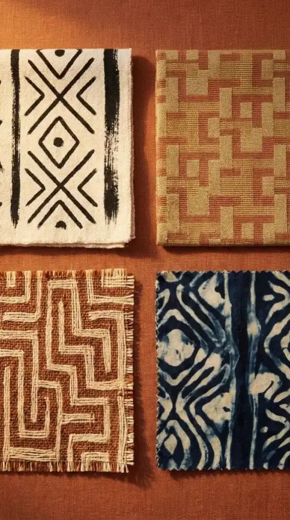
Four authentic pattern origins define the Afro Bohemian wallpaper vocabulary — and each one has specific visual characteristics that distinguish it from a surface-level appropriation of the same pattern tradition.
Mud cloth Bògòlanfini patterns carry authentic linear and geometric forms with hand-painted edge variation — the slight irregularity in each geometric unit that distinguishes hand-painted from machine-printed. Authentic mud cloth wallpaper should show slight variation in the paint density across the pattern, imperfect edges on the geometric forms, and slight color variation across the cream or ochre ground. Perfectly uniform mud cloth pattern is a machine-printed approximation — not the authentic hand-painted quality the aesthetic depends on.
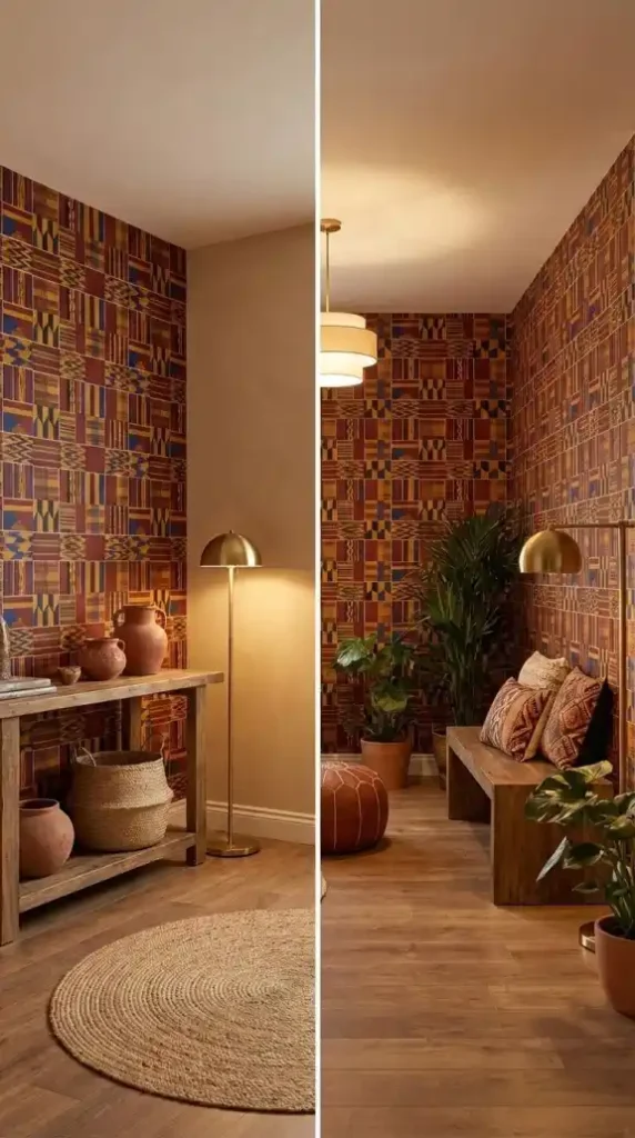
Kente-inspired interlocking geometric structures should reference the structured strip-weaving tradition of Ghana in the interlocking relationship between geometric units — the horizontal and vertical interlock that creates the characteristic visual tension of Kente composition. Generic geometric patterns that look similar but lack the specific interlocking structure of Kente weaving are pattern references rather than authentic cultural motif applications.
Kuba cloth raffia-inspired patterns should carry the irregular labyrinth quality of the Congo’s raffia textile tradition — the improvisational non-repeating geometric structure that reads as complex and organic rather than machine-regular. A Kuba cloth wallpaper with a perfectly regular repeat is by definition not authentic to the tradition — the improvisational quality is the tradition’s defining characteristic.
Adire Yoruba indigo batik patterns should show the organic resist-pattern variation of wax-resist dyeing — the slight bleed at pattern edges, the tonal depth variation across the indigo ground, the flowing abstract quality of the symbols that distinguishes hand-dyed resist patterns from machine-printed indigo geometric.
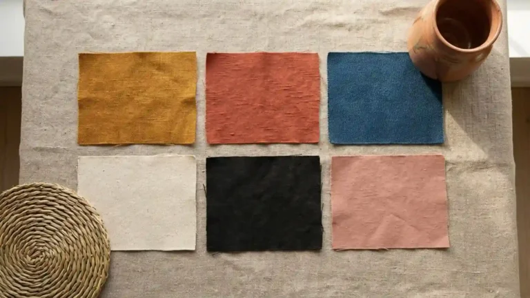
Selection Step 4: Confirm the Neutral Base Color
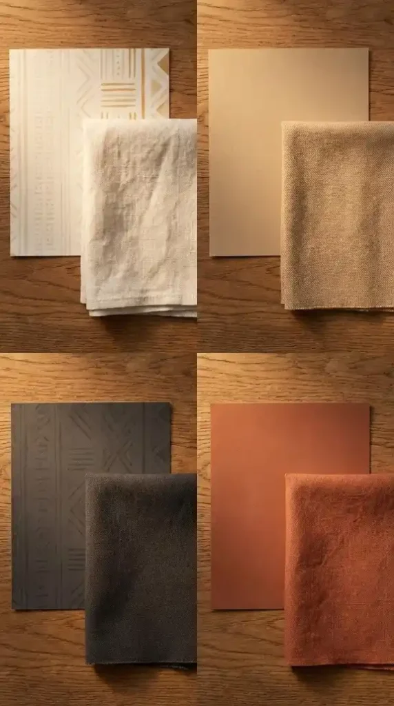
The neutral base color determines if your wallpaper integrates seamlessly or stands out as an isolated statement. Four key ground options define the Afro Bohemian palette:
Cream and Ochre (Warm & Luminous) Cream grounds provide maximum legibility for high-contrast geometric patterns, appearing sun-drenched under 2700K light. Ochre reduces contrast while injecting deeper warmth—ideal if your furniture and textiles already provide enough visual “pop” and the walls just need a cozy, golden glow.
Sand (The Versatile Mid-Neutral) Sitting between cream and terracotta, sand is the perfect base for botanical patterns. It is warm enough to feel distinctly Afro Bohemian rather than “standard boho,” yet pale enough to let organic colors remain clear and vibrant.
Charcoal (The Dark Anchor) This reverses the typical relationship, using a dark ground with cream or gold patterns. It serves as a powerful value anchor, mirroring the depth of dark wood furniture or carved objects. It’s the go-to choice for a sophisticated, moody backdrop that makes light-colored patterns appear luminous.
Clay and Terracotta (The Earth Pigment) This base directly connects your walls to fired clay vessels and terracotta pots. It is the most culturally specific and grounded option. However, it is unforgiving; ensure the room’s other earth tones match the specific temperature of the wallpaper’s red-orange undertones to avoid a color clash.
Choose your ground based on whether the room needs more warmth, more contrast, or a deeper anchor to tie the material vocabulary together.
Stage Two: Styling
Styling Step 1: Apply the Rule of Three
The Rule of Three is the structural logic that prevents the Afro Bohemian room from tipping from maximalist richness into visual chaos — and it applies specifically at the three primary surface scales of the room.
One large pattern — the wallpaper. The room’s highest pattern intensity element at its largest surface scale. This is the surface the Rule of Three is built around.
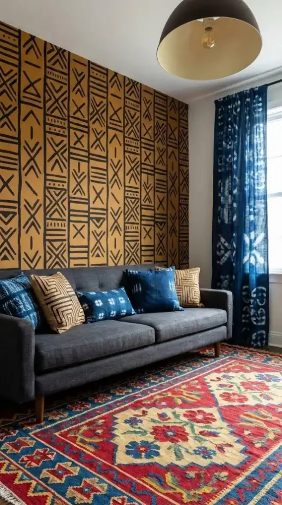
One medium texture — the rug. The room’s mid-intensity pattern element at the floor surface scale. The kilim’s geometric repeat or the Moroccan Berber’s diamond pattern operating at a distinctly different pattern scale from the wallpaper’s geometric repeat. Not a competing pattern — a responding one.
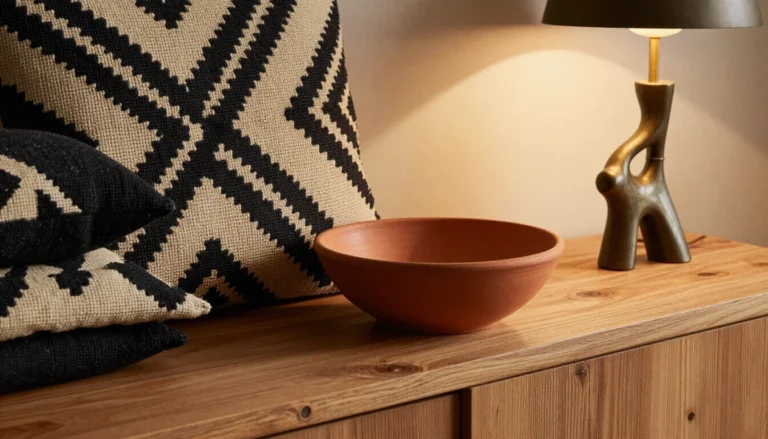
One solid — the primary furniture. The sofa, the bed, the desk — the room’s largest furniture surface in a solid earth-tone color with no pattern. The charcoal linen sofa, the bone linen bedding, the raw ochre upholstered chair. The solid furniture surface is the visual rest zone that makes the wallpaper’s pattern and the rug’s texture both readable rather than chaotic.
The Rule of Three creates a visual hierarchy across the room’s three primary surface layers — high pattern intensity at the wall, medium texture intensity at the floor, zero pattern intensity at the primary furniture. The eye reads them sequentially rather than simultaneously — which is the compositional condition that makes maximalist layering read as rich rather than busy.
Styling Step 2: Use Color Pulling to Integrate the Wallpaper

Color pulling is the single styling technique that most reliably integrates wallpaper into the room’s broader palette — and it’s the step that most beginners skip because it requires looking at the wallpaper pattern as a color source rather than as a visual statement.
Identify one minor color from the wallpaper’s pattern — not the dominant ground color and not the primary pattern color, but the secondary accent tone that appears less frequently within the pattern repeat.
In a mud cloth geometric wallpaper with an ochre ground and warm black geometric forms the minor color is the ochre — it appears as the ground but at a lower visual weight than the dominant warm black pattern.
Pull that minor color into the room’s upholstery and curtain selection.
An ochre linen sofa beside a mud cloth geometric wallpaper with an ochre ground creates the visual thread that ties the furniture to the wall surface — the ochre appearing at the wall pattern level and repeating at the furniture upholstery level, making both read as part of the same color system rather than as independently chosen elements.
Pull the same color into the curtain panels — ochre linen curtains at the window position creating a third appearance of the pulled color at the room’s third primary vertical surface. Wall, furniture, curtain — the ochre appearing at all three vertical elements creates a room where the wallpaper’s palette is woven through the space rather than confined to a single accent wall.
Styling Step 3: Apply the Accent Wall Versus Full-Room Wrap Decision

The accent wall versus full-room wrap decision determines whether the wallpaper functions as the room’s focal point or as its entire environmental envelope — and the correct choice depends on three specific room conditions.
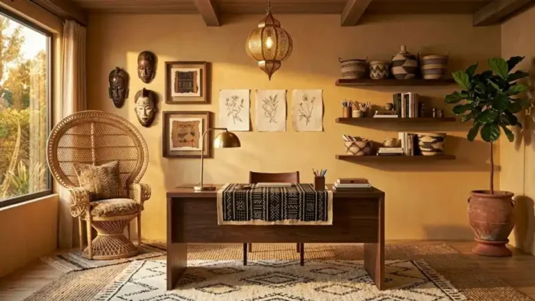
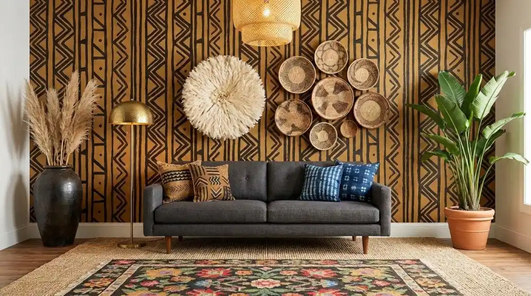
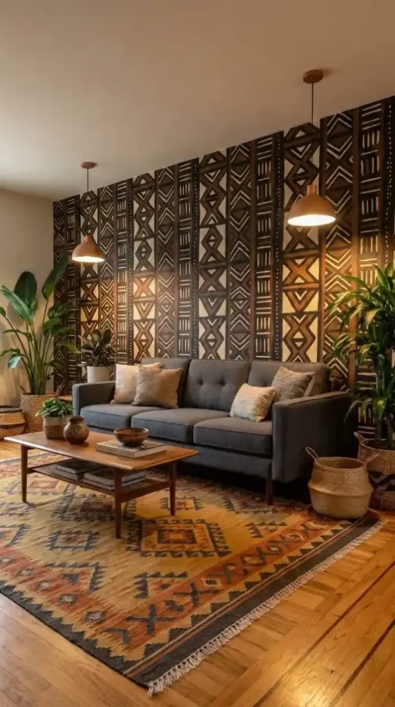
The single accent wall application is correct for most Afro Bohemian rooms. One wall at full pattern commitment. Three adjacent walls in the Grounded Neutral palette — warm sand smooth plaster, ochre limewash, or terracotta paint in a solid earth tone. The pattern concentration on one surface creates maximum visual impact while the adjacent neutral walls provide the breathing room that makes the patterned wall read as bold rather than overwhelming. The Rule of Three operates correctly at this application level — the wallpaper as the large pattern, the rug as the medium texture, the solid furniture in front of the neutral adjacent walls.
The full-room wrap is appropriate only under three specific conditions simultaneously: the pattern is a micro-scale or grasscloth texture simulation rather than a grand-scale geometric or botanical, the room has ceiling height above 270cm providing the vertical space to absorb a fully wrapped pattern environment, and the furniture layer is predominantly solid without the textile pattern layers that would create competition with a four-wall pattern application.
A grand-scale mud cloth geometric in a full-room wrap at standard ceiling height reads as enclosed and oppressive regardless of how correct the individual pattern and colorway choices are. The same micro-scale Adinkra symbol grid in a full-room wrap at high ceiling height reads as immersive and richly atmospheric.
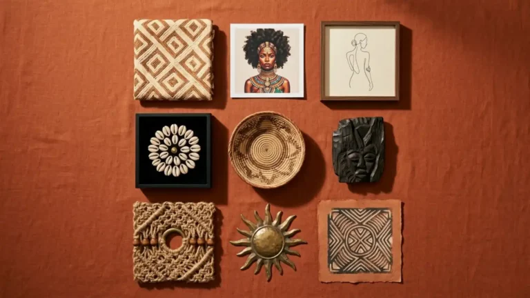
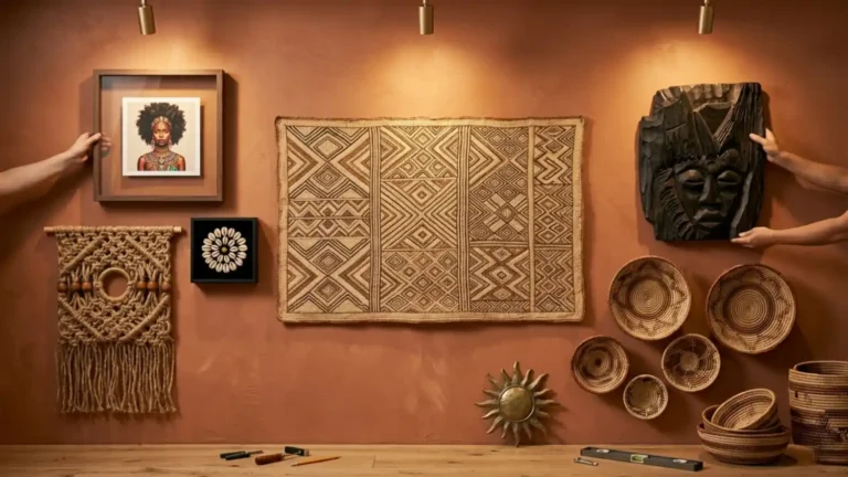
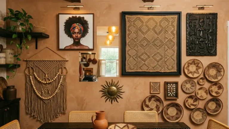
Styling Step 4: Layer Dimensional Wall Decor Over the Wallpaper
Dimensional wall decor layered over the Afro Bohemian wallpaper is the technique that transforms the accent wall from a two-dimensional patterned surface into a multi-layer wall composition with spatial depth.
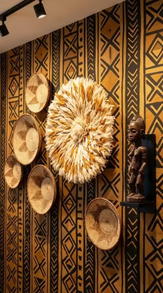
The Juju hat — the Bamiléké feathered headdress from Cameroon — is the first dimensional piece mounted over the wallpaper. Its circular feathered form creates a soft organic focal point against the geometric wallpaper behind it — the feathered texture reading as the maximum contrast to the crisp geometric pattern beneath it. Position it at the gallery wall’s center axis — the piece that the basket cluster and carved object organize around.
The Tonga basket cluster is the second dimensional layer — five to seven baskets in graduated sizes arranged asymmetrically beside the Juju hat. The baskets’ tightly coiled woven surfaces project slightly from the wall plane, creating the first true three-dimensional layer in front of the wallpaper. The circular basket forms break the rectangular geometry of the wallpaper’s geometric repeat — introducing organic circular shapes that contrast with the linear pattern vocabulary behind them.
Makonde carvings or similar dark wood carved figures — mounted on museum brackets — add the deepest three-dimensional layer. The carved figures project furthest from the wall plane, creating the strongest shadow depth against the wallpaper surface. Under warm track lighting the carved figure casts a shadow onto the wallpaper pattern behind it — the shadow itself becoming a fourth design element that exists only in the evening lighting conditions.
Styling Step 5: Mix Textiles With the Wallpaper Using Intentional Pattern Clashing
Textile mixing with Afro Bohemian wallpaper follows the intentional pattern clashing logic — pairing patterns that share palette coherence but operate at distinct pattern scales and from distinct cultural traditions.
A geometric mud cloth wallpaper paired with a floral kilim rug is the most classically Afro Bohemian textile clash — the geometric-to-floral opposition creating visual tension that reads as eclectic and globally sophisticated rather than chaotic. The key is palette coherence: the kilim’s ochre, burnt orange, and indigo should pull directly from the wallpaper’s color vocabulary through the color pulling technique established in the previous step.
A Kente-inspired geometric wallpaper paired with a shaggy Moroccan Berber rug creates a different register of intentional clash — the crisp interlocking geometry of the Kente pattern meeting the loose undulating pile of the Berber in a contrast between structure and organic softness that references the Global Eclecticism philosophy of mixing cultural design traditions intentionally.
The Rule of Three governs the textile mixing system even within the intentional clash logic. The wallpaper as the large pattern. The rug as the medium pattern. The sofa upholstery as the solid zero-pattern element. Adding a fourth patterned element at a competing scale breaks the Rule of Three — the room tips from intentional eclecticism into unresolved maximalism.
Global Eclecticism — the design philosophy centered on mixing contemporary western furniture forms with traditional African motifs — is the conceptual framework the textile mixing step operates within. A mid-century modern sofa (the contemporary western form) paired with a mud cloth geometric wallpaper (the traditional African motif), a Kuba cloth cushion (the African textile tradition), and a Moroccan kilim rug (the Global design tradition) is the full Global Eclecticism composition at its most resolved — four distinct cultural and design tradition references operating coherently within the Rule of Three structural logic.
Styling Step 6: Add the Biophilic Layer
The biophilic layer is the final styling step — adding the organic living presence that the wallpaper’s pattern vocabulary references but can’t deliver.
A botanical wallpaper featuring Bird of Paradise forms references the plant. The actual Bird of Paradise plant in a terracotta pot in the corner delivers the living version of the same reference — the two-dimensional botanical on the wallpaper and the three-dimensional living plant in the corner reading as the same botanical vocabulary at two distinct registers of material presence.
Snake Plants — Sansevieria, native to West Africa — provide the biophilic layer’s structural close-range element. Positioned on the console beside the wallpapered wall their strong upright architectural vertical lines provide structural counterpoint to both the wallpaper’s geometric pattern and the organic trailing elements of the broader plant layer.
Dried pampas grass in a heavy dark ceramic floor vase completes the biophilic layer at the dried botanical register — the pale plumes providing the most delicate organic texture in the room and connecting the biophilic layer to the room’s dried botanical element vocabulary alongside the protea and preserved palm fronds elsewhere.
The three biophilic elements — living tropical at the corner, structural Snake Plant at the close range, dried pampas at the secondary position — provide organic life at three distinct spatial depths in front of the wallpapered accent wall. The wallpaper’s pattern, the three-dimensional dimensional wall decor, and the biophilic layer together create a wall composition that reads across multiple spatial planes — flat pattern, shallow-projection baskets and Juju hat, deep-projection carved objects, close-range plant life — each layer adding what the previous ones can’t provide.
The Complete Choosing and Styling Checklist
Use this checklist to confirm every decision in the correct sequence before committing to a wallpaper purchase or installation:
Selection Stage:
- Is the motif scale correct for the room’s ceiling height and viewing distance? Grand-scale for ceiling heights above 260cm and viewing distances above 3 meters. Micro-pattern for standard ceiling heights and shorter viewing distances.
- Is the substrate material correct for the installation context? Non-woven paper for permanent owned-space installation. Peel-and-stick for rental or temporary application. Grasscloth for rooms where authentic tactile quality is the primary priority.
- Does the pattern carry authentic print origin characteristics — hand-painted edge variation for mud cloth, improvisational non-repeat for Kuba cloth, organic resist-pattern variation for Adire? If the pattern is perfectly uniform and machine-regular it’s a surface-level reference rather than an authentic cultural motif application.
- Is the neutral base color within the four correct options — cream, sand, charcoal, or clay? Reject any wallpaper with a cool-toned, grey-toned, or white-white ground regardless of how correct the pattern appears. The ground color is the wallpaper’s palette foundation.
Styling Stage:
- Is the Rule of Three operating — one large pattern wallpaper, one medium texture rug, one solid primary furniture? If the solid furniture element is patterned the Rule of Three is broken and the room will read as chaotic regardless of how correct the individual pattern choices are.
- Has the color pulling technique been applied — one minor color from the wallpaper pattern identified and used for the upholstery and curtain selection? If the room’s upholstery and curtains were chosen independently of the wallpaper colorway the palette coherence between the wall and the furniture layer is accidental rather than designed.
- Is at least one dimensional wall decor piece — Juju hat, Tonga basket cluster, or Makonde carved figure — mounted over the wallpaper? If every element in front of the wallpaper is furniture-scale the transition from the flat wall surface to the room’s three-dimensional layer is abrupt rather than graduated.
- Is the intentional pattern clash between the wallpaper and the rug operating across a geometric-to-botanical or geometric-to-organic opposition rather than a geometric-to-geometric same-scale collision? Same-scale pattern clashing creates noise. Opposing pattern vocabulary clashing creates eclectic richness.
- Are all three biophilic elements present — living tropical plant at the corner position, structural close-range plant at the console or shelf, dried botanical arrangement at the secondary position? If only one biophilic register is present the organic layer reads as decorative rather than structural.
Choosing and styling Afro Bohemian wallpaper correctly
Motif scale resolved before pattern category, substrate selected before colorway confirmed, Rule of Three established before dimensional layering begins, color pulling applied before upholstery is sourced — produces a room where the wallpaper reads as the design foundation the room was built from.
Not a surface applied after the room was already assembled. Not an accent feature added to an otherwise complete room.
The foundation — the surface that every other element responds to, pulls from, and reads against.
When that relationship is correct the room doesn’t look wallpapered.
It looks designed from the wall outward. And that inside-out design logic is exactly what makes the Afro Bohemian aesthetic perform at its most distinctive — warm, layered, culturally grounded, and impossible to replicate from a shopping list alone.
Continue the Style:
- Afro Bohemian Wallpaper: The Complete Style Guide — Understand the full five-motif category system — from cultural geometric patterns to botanical elements and textural simulations — as the design foundation every other room element responds to.
- 11 Afro Bohemian Wallpaper Ideas for a Warm and Layered Home — Browse 11 specific wallpaper moves across every motif category and room position, each one with the pairing logic that makes it work within the broader room system.
- Afro Bohemian Wallpaper Must-Haves for Beginners — Start in the right zone, choose the right substrate, and build the Heritage Maximalism system one layer at a time — from the first peel-and-stick panel to the full room application.