How to Get the Luxurious Look Without the Designer Price Tag
Greige had a good run. For nearly a decade, that warm beige-gray ruled every Pinterest board and spec house. But something shifted in 2025 — and by 2026, dark green has fully taken the throne.
Interior designers are calling it the “comfort color” of the moment. After years of pale, airy interiors, people want rooms that feel enveloping — rooms that feel, distinctly, rich. Green signals nature, calm, and stability. In living rooms especially, that grounding quality is hard to beat.
The moody green look is entirely achievable with the right paint, intentional layering, and a clear understanding of how the elements work together. Here’s exactly how.
The Exact Paint Colors to Use
The wrong green kills the whole look. Too bright and it reads like a kindergarten classroom. Too blue-toned and it feels cold instead of cozy. These are the three shades designers reach for again and again:
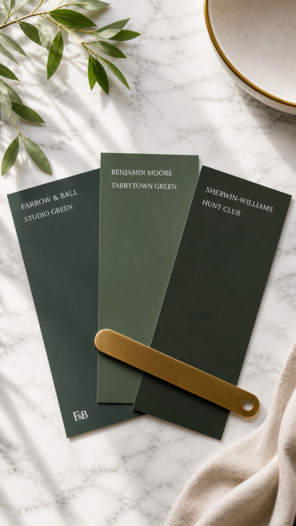
Farrow & Ball Studio Green — The gold standard. A deep, almost-black forest green with just enough warmth to avoid feeling cold. It reads completely differently in morning versus evening light, which gives the room a living quality throughout the day.
Benjamin Moore Tarrytown Green — The more accessible option. This shade leans slightly olive, which adds incredible warmth to north-facing rooms or spaces that don’t get much direct sunlight.
Sherwin-Williams Hunt Club — The deepest of the three, nearly a black-green in low light. If you want maximum drama and aren’t afraid to commit, this is your shade. It’s stunning in rooms with high ceilings or dark wood floors.
Finish and ceiling tip
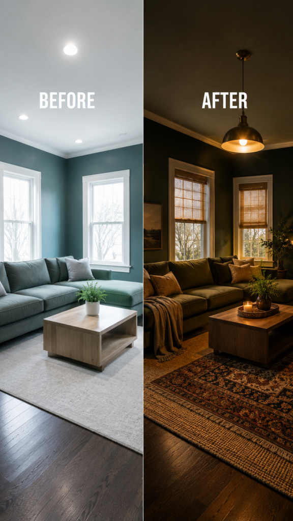
Always use eggshell or satin on walls — flat marks too easily, and semi-gloss reflects too much light and kills the mood. For the ceiling, mix your wall color 50/50 with ceiling white. This “color dip” effect makes the room feel like a jewel box and is responsible for most of those jaw-dropping dark green rooms you’ve been saving.
The Layering Formula
Painting the walls is just the beginning. The magic is in the layering, and there’s a specific sequence that works every time:
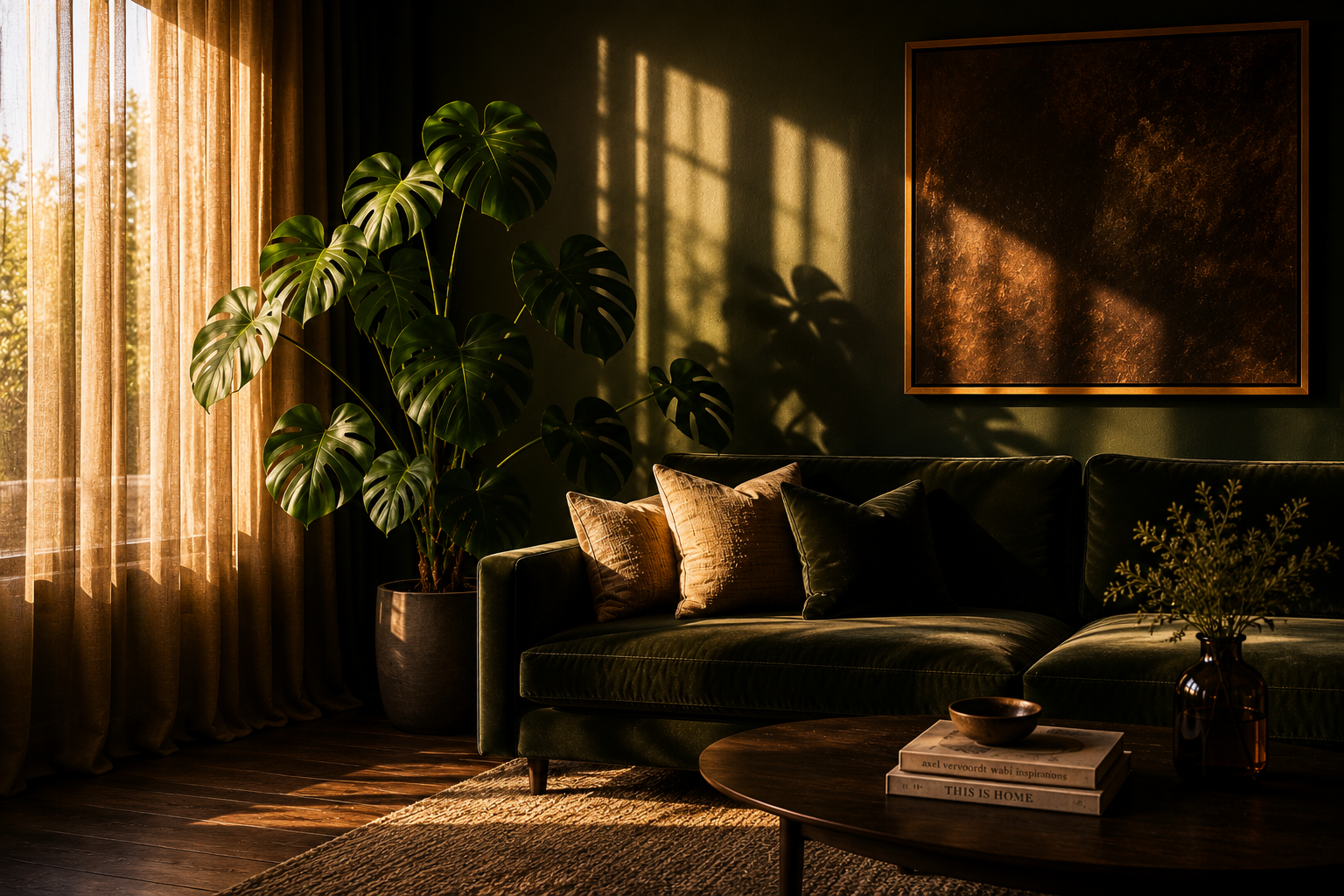
- Base — Dark green walls. Go full commitment: all four walls, ceiling, trim in the same tone. Half-measures produce half the effect.
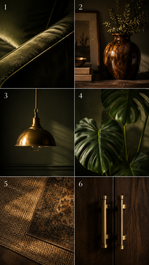
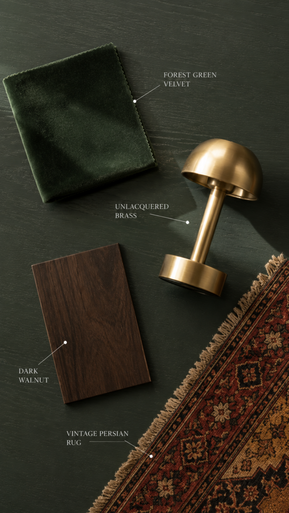
- Layer 1 — Velvet sofa in forest or hunter green. Go tone-on-tone, not contrast. A green velvet sofa against green walls creates incredible depth.
- Layer 2 — Warm amber and rust accents. Throw pillows, ceramic vases, a rust-orange linen blanket. These warm tones are the counterweight that stops the room from feeling like a cave. Aim for 20–25% of your accent color to sit in the amber/rust family.
- Layer 3 — Mixed metals: brass and bronze. Pendant lights, cabinet hardware, picture frames. Avoid chrome or nickel — they read cold and clinical. Warm metals are the jewelry of this look.
- Layer 4 — Lush house plants. Monstera, fiddle leaf fig, snake plant. One large statement plant beats five small ones. The plants should feel inevitable, not decorative.
- Layer 5 — Layered rugs and textures. A neutral jute base topped with a smaller vintage Persian, then texture everywhere: linen, boucle, raw wood, ceramic. The moody look lives and dies on tactile complexity.
The Furniture That Makes It Work
You don’t need to replace everything — a few anchor pieces carry most of the visual weight.
Velvet sofa — The most impactful piece. Hunter or forest green, tight-back, low-profile silhouette. Avoid tufted styles, which skew too formal for this aesthetic.
Brass pendant light — Warms the space from above. Unlacquered brass ages beautifully over time. Sputnik or globe silhouettes both work well against dark walls.
Dark wood coffee table — Walnut, ebonized oak, or reclaimed dark teak. Round or oval silhouettes feel more organic; sharp glass rectangles break the warmth of the look.
Persian or vintage rug — One of the most transformative elements in the room. A faded red-and-navy Persian adds a layered, collected quality that makes dark green rooms feel genuinely intentional.
Why Your Dark Green Room Looks Wrong
This is the question that comes up constantly. You painted the walls, did the velvet sofa, hung the brass lamp — and it still feels off. Here’s why:
Going too cool-toned. Mint, sage, and teal-adjacent greens photograph beautifully but create cold rooms. You want greens with a warm, earthy undertone — moss, lichen, old British library. If your green could exist in a hospital, it’s the wrong green.
Not enough warm contrast. An all-green room with white trim and grey accessories is a swamp, not a jewel box. Amber, rust, and brass tones pull the warmth out of the green. Without them, dark reads as heavy, not rich.
Over-lighting the space. Overhead recessed lighting on full blast murders the mood. Switch to layered lighting: one ambient source, one task lamp, and at least two accent sources. Dimmer switches are non-negotiable.
Missing the texture layer. Smooth walls, velvet sofa, glass table — that’s a showroom. Texture is what makes a room feel lived-in and expensive simultaneously. Every surface needs a different material.
Room Size Solutions
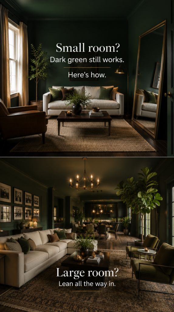
Small room (under 200 sq ft): Paint the ceiling the same color as the walls to add perceived height. Use one large mirror opposite the main light source. Choose furniture with legs to keep the floor visible. Stick to one large rug rather than layering — in small rooms, layered rugs feel busy.
Large room (over 350 sq ft): Create distinct zones with separate rug areas — a reading nook, a conversation grouping, a drinks corner. Layer multiple light sources: chandelier, floor lamps, table lamps, and candles. One large-scale plant (a six-foot fiddle leaf fig, for example) belongs here. At this scale, a second accent color — deep burgundy or cognac — works well alongside the amber tones.
The Takeaway
Dark green rooms succeed or fail based on three things: color temperature (warm-toned green, not cool), contrast (amber and brass to balance the depth), and texture (every surface a different material). Get those three right and the look comes together naturally — regardless of room size or how much you’re working with.
