11 Afro Bohemian Color Palettes That Actually Work
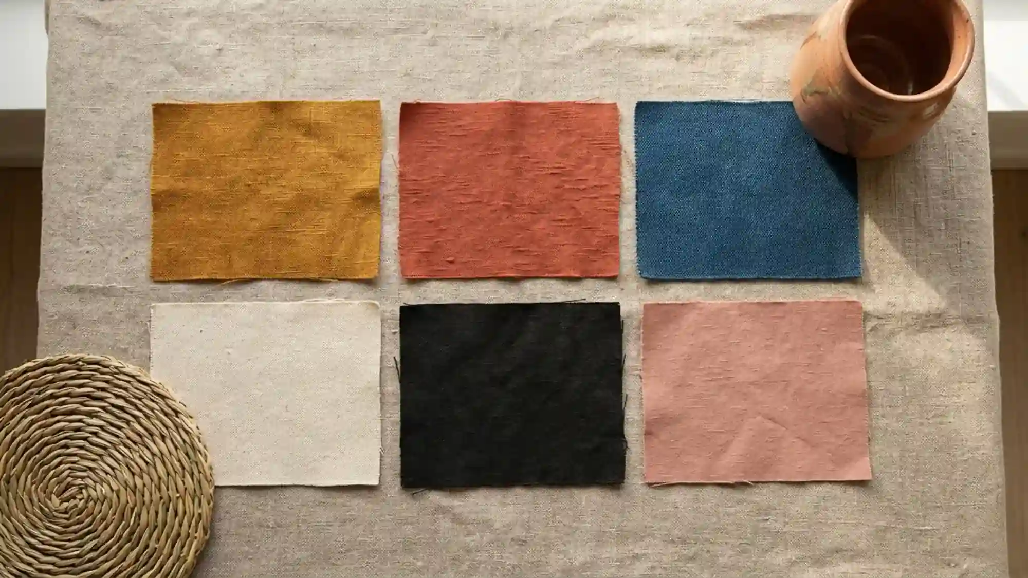
The problem with most Afro Bohemian color palette guides is that they show you swatches on a white background.
White backgrounds lie. They strip out the material context that makes earth pigments work — the way ochre shifts under 2700K light, the way terracotta deepens against raw linen, the way warm black anchors a palette that would otherwise read as muddy.
These 11 palettes are built the way rooms are actually built — from a dominant tone, a supporting tone, an accent, and a neutral. Each one references a specific material application so you can see where each color palette lands, not just what it looks like in isolation.
Afro Bohemian Quick Takeaway:
- Every Afro Bohemian Color Palettes needs a warm black or deep tone to anchor it — without it, earth tones flatten into undifferentiated warmth.
- Raw linen, not white, is the correct neutral — white pulls the palette cool and visually disconnects the earth tones from each other.
- Test your palette under 2700K warm light before committing — the same colors read differently under cool white and will mislead you at the paint store.
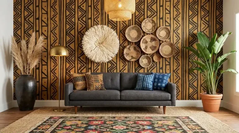
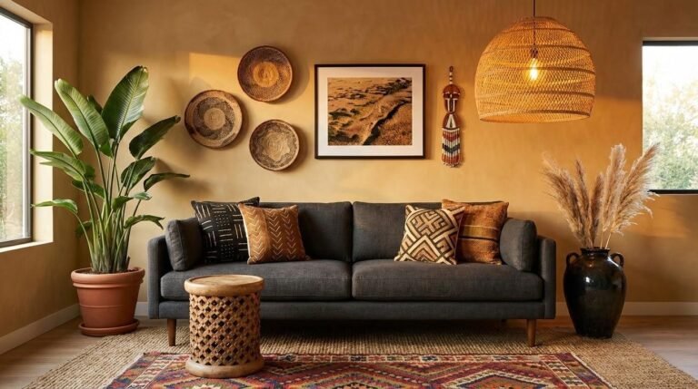
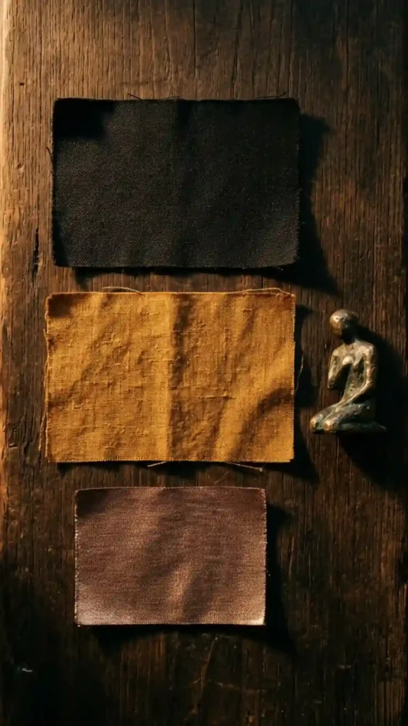
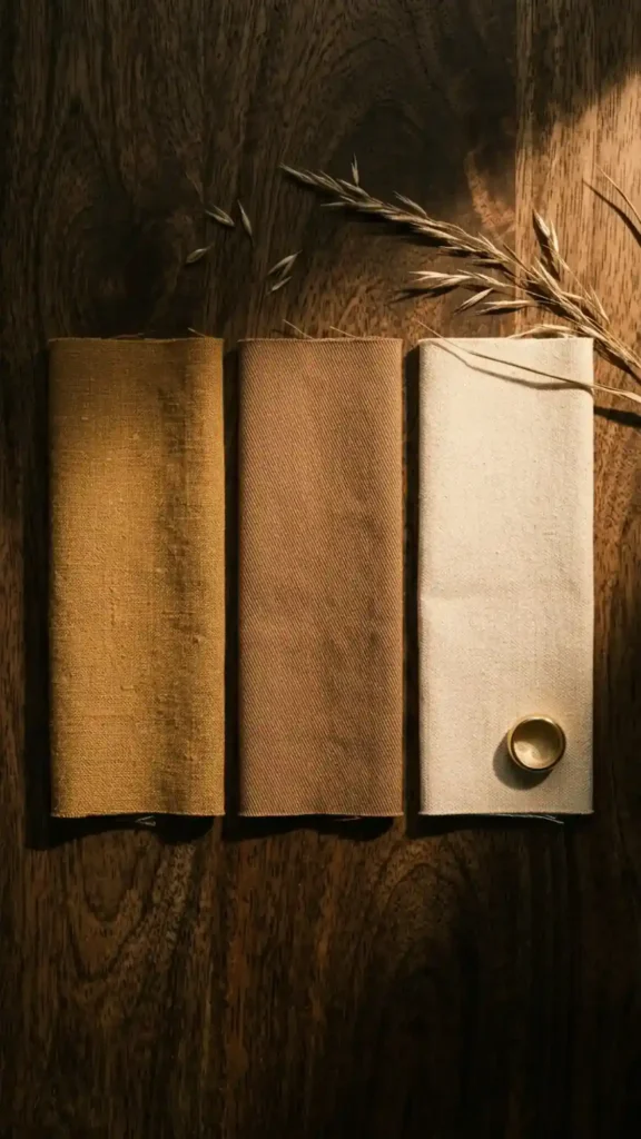
1. Afro Bohemian Palettes Classic Bogolan: Warm Black, Cream, and Ochre
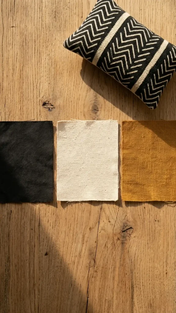
This is the palette of mud cloth itself — and it works because it’s been refined over centuries of actual use.
Warm black as the dominant, undyed cream as the ground, deep ochre as the accent that bridges the two. The contrast ratio between black and cream is high enough that the palette reads with immediate clarity, while the ochre prevents it from feeling stark or graphic-design-flat.
Apply it as: black in pattern textiles and furniture stain, cream in wall tone and linen upholstery, ochre in ceramic vessels and rug border detail. This is the palette to start with if you’re building the aesthetic from zero — it’s the most forgiving and the most culturally grounded.
2. Saharan Dust: Deep Sand, Burnt Sienna, and Warm Brown
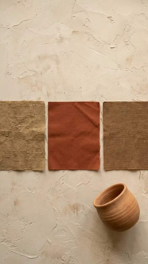
A monochromatic earth palette that operates entirely within the brown-orange-sand range.
The palette reads as warm, grounded, and almost architectural — because all three tones share the same pigment family, the room holds together without obvious contrast. The visual interest comes from material variation instead: a sand plaster wall reads differently from a sand linen cushion from a sand ceramic even when the colors are nearly identical.
This palette requires strong material contrast to avoid reading as flat. Rough plaster against smooth linen against hand-thrown clay — the textural difference carries the visual work that color contrast would do in a more varied palette. Works best in bedrooms and low-stimulation spaces.
3. Kente Flash: Ochre, Forest Green, and Warm Black
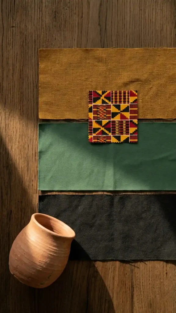
Kente weaving from Ghana uses high-contrast color combinations — and green appears alongside gold and black in traditional compositions more frequently than most Afro Bohemian references acknowledge.
Muted forest green — not emerald, not sage — sits within the earth pigment logic because it reads as a plant-dye green rather than a synthetic one. Against ochre and warm black, it creates the highest-contrast palette on this list while still reading as cohesive.
Use the green sparingly: one cushion, one plant vessel, one textile accent. It’s a high-energy tone that carries significant visual weight relative to its surface area. The ochre and black do the structural work; the green is the accent that makes the palette memorable.
4. Indigo Depth: Deep Indigo, Raw Linen, and Terracotta
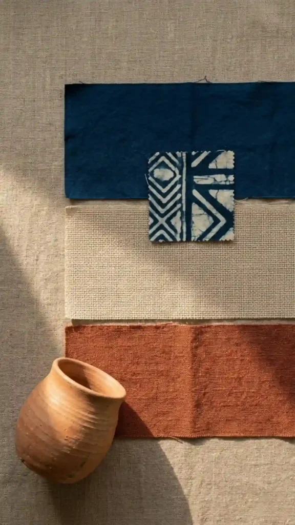
Indigo is the most architecturally powerful color in the Afro Bohemian palette — and it’s consistently underused.
Plant-dye indigo has a depth that synthetic navy can’t replicate. It absorbs light rather than reflecting it, which creates a visual recession effect: an indigo wall or large textile makes the room feel deeper. Against raw linen and terracotta, it creates a warm-cool tension that reads as sophisticated rather than conflicted — because both the linen and terracotta are warm enough to pull the indigo into the earth palette.
Apply indigo at large scale: a wall, a large woven tapestry, or heavy curtain panels. At small scale — a single cushion — it loses its architectural impact and reads as an accessory color rather than a structural one.
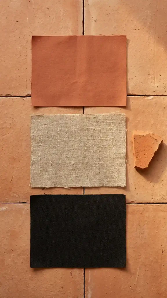
5. West African Earth: Terracotta, Ochre, and Dusty Rose
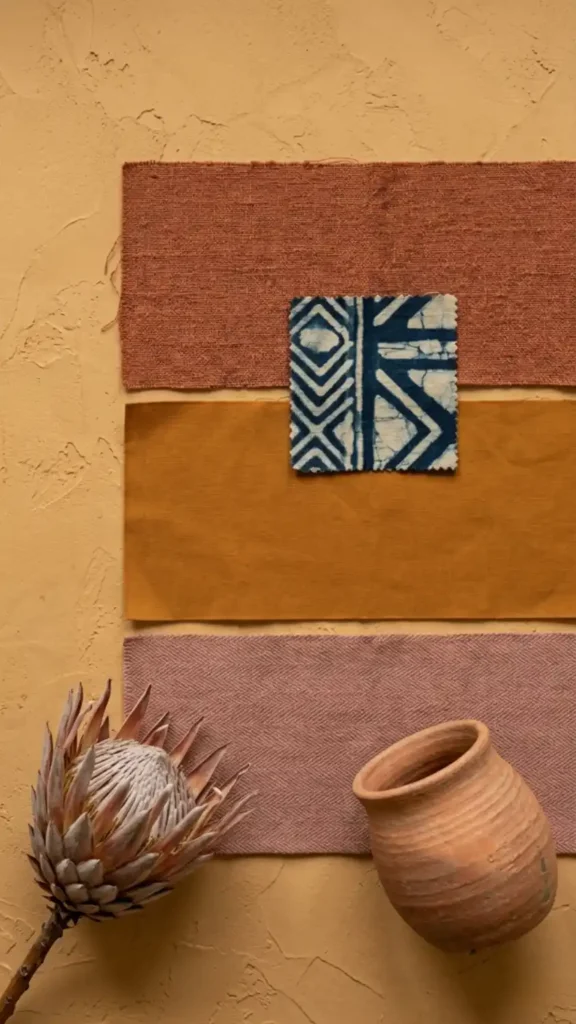
Dusty rose — specifically the muted, clay-toned version rather than the pastel pink — sits within the earth pigment range because it reads as a fired clay color rather than a fashion color.
Against terracotta and ochre, it adds a lighter value without introducing cool tones. The palette reads as warm and feminine without becoming soft or decoratively thin. It has particular strength in bedrooms where the ochre-terracotta core needs a lighter counterpoint to prevent the room from feeling heavy.
The key word is dusty. The rose has to read as if it’s been sun-faded or clay-washed. If it reads as fresh pink, it’s the wrong tone and will pull the palette away from its earth pigment grounding.
6. Midnight Savanna: Warm Black, Deep Ochre, and Bronze
The darkest palette on this list — and the one with the most dramatic spatial effect.
Warm black as the dominant wall or furniture tone, deep ochre as the mid-tone textile layer, and bronze metalwork or metallic-threaded textile as the accent. Bronze is the only metallic that works within the Afro Bohemian material vocabulary — gold reads as decorative, silver reads as cool, brass reads as transitional. Bronze has the oxidized depth that references ironwork and cast metal craft traditions.
This palette works in spaces with strong natural light during the day. In a north-facing or low-light room, the black dominant will absorb what light exists and the palette will read as oppressive rather than dramatic. Compensate with 2700K lighting at multiple heights if natural light is limited.
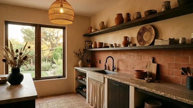
7. River Clay: Mid Terracotta, Warm Sand, and Natural Black
A three-tone palette that operates at medium contrast — warm enough to feel Afro Bohemian, balanced enough to work in open-plan spaces where the aesthetic needs to hold across multiple zones.
Mid terracotta — not the deepest burnt version, not a washed-out version — sits at a value level that bridges sand and black without forcing either to carry too much contrast weight. The palette is easier to implement than high-contrast versions because the tolerance for slight color variation is wider.
This works particularly well in kitchens and open-plan living areas where the color has to perform across different material surfaces — tile, wood, textile, plaster — without needing exact color matching. The three tones have enough individual identity that the eye accepts them as a deliberate system rather than a near-miss.
8. Harmattan Haze: Warm Grey-Brown, Ochre, and Cream
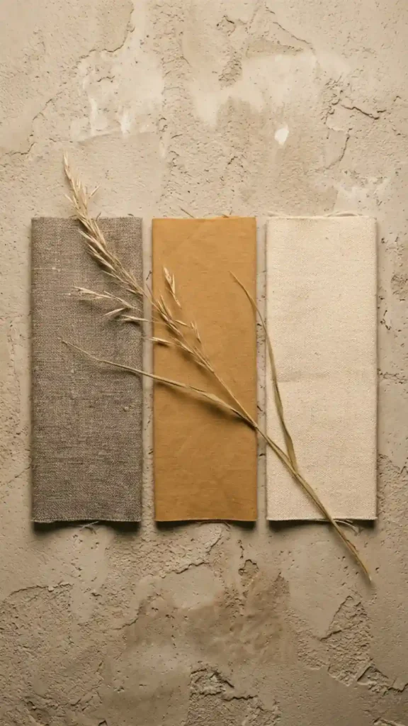
The most muted palette on this list — built for spaces where the Afro Bohemian aesthetic needs to operate quietly rather than assertively.
Warm grey-brown is the critical tone here. It has to lean brown — if it tips toward cool grey, the earth pigment logic dissolves. Think of it as brown with the saturation reduced by half rather than grey with warmth added. Against muted ochre and undyed cream, it creates a palette that reads as sophisticated restraint rather than indecision.
This palette is the correct choice for shared spaces — a home office used for client video calls, a rental property where the aesthetic needs broad appeal, or a room that transitions between multiple uses. The Afro Bohemian material vocabulary reads through furniture and textile texture even when the palette operates at low saturation.
9. Adire Blue: Pale Indigo, Raw Linen, and Warm Sand
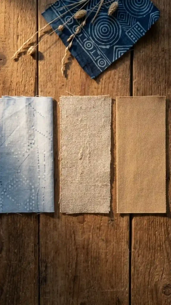
Adire — Yoruba resist-dye textile tradition from Nigeria — produces pale, washed indigo tones rather than the deep saturated indigo of West African strip weaving.
This lighter palette is the entry point for rooms where the full-depth indigo feels too strong. Pale indigo against raw linen and warm sand reads as airy and calm while still referencing the African textile tradition directly. It works in bedrooms and bathrooms where the deeper earth palettes would feel too heavy for the room’s functional purpose.
The pale indigo has to retain a warm undertone — if it reads as blue-grey or periwinkle, it’s shifted into cool territory and lost its earth pigment relationship. Look for indigo tones with a slight green or brown undertone rather than a pure blue one.
10. Fulani Gold: Deep Gold, Warm Brown, and Cream
The warmest and most luminous palette on this list — built around the deep gold tones of Fulani goldwork jewelry traditions rather than the more common ochre base.
Deep gold reads as a warmer, higher-value version of ochre — more saturated, slightly more yellow. Against warm brown and cream, it creates a palette with strong internal light that performs particularly well in rooms with limited natural light. The palette appears to generate warmth from within the room rather than relying on sunlight to activate it.
Use this palette in north-facing rooms, basement spaces, or any interior where natural light is consistently low. The high saturation of the gold compensates for what the light doesn’t provide.
11. Earth and Iron: Terracotta, Warm Black, and Rust Orange
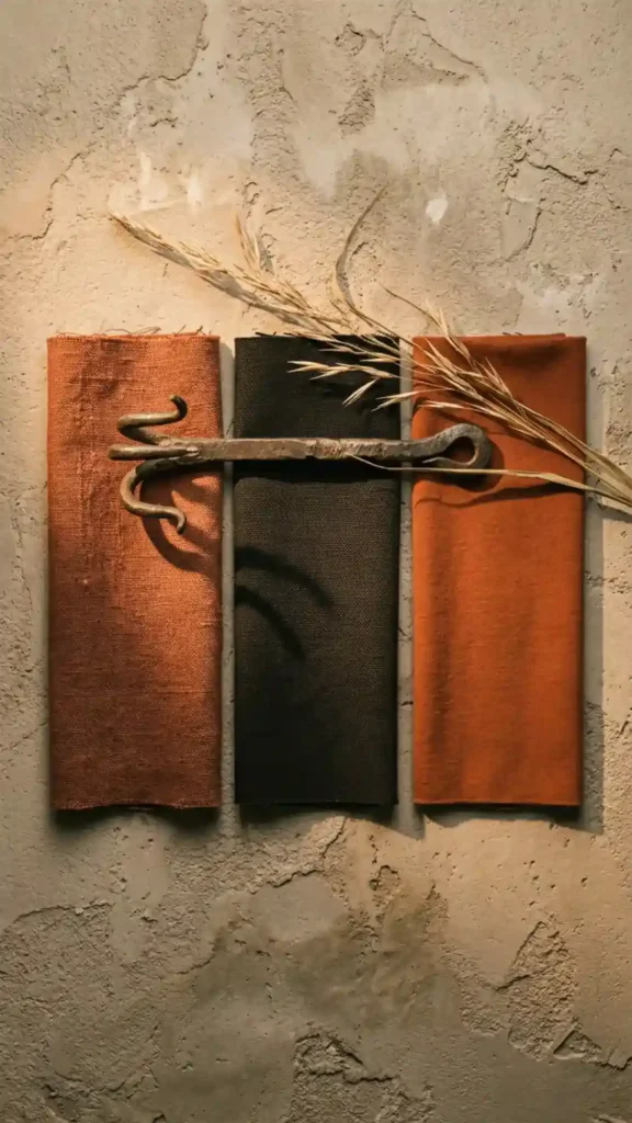
The most energetically charged palette on this list — three high-saturation earth tones in close value range with maximum warmth.
Terracotta, warm black, and rust orange all read as fired or oxidized materials — clay, iron, and pigment. The palette has a raw material logic that references traditional craft production directly. It’s the most visually assertive combination here and requires confident implementation: large pattern textiles, bold furniture forms, deliberate negative space.
This palette cannot be timid in its application. Pale versions of these tones will read as muddy rather than bold. Commit to the full depth of each color — deep terracotta, true warm black, saturated rust — and the palette holds. Pull back on any one of the three and the system loses the tension that makes it work.
Reading Your Own Afro Bohemian Color Palette Instinct Before You Paint Anything
Before committing to a palette, spend ten minutes with your saved images and answer these five questions:
- Do your saved rooms trend toward high contrast (dark and light together) or low contrast (tones close in value)? High contrast saves point toward palettes 1, 3, or 11. Low contrast saves point toward palettes 2, 8, or 9.
- Is indigo present in more than half your saved images? If yes, build from palette 4 or 9 — your instinct is already telling you the direction.
- Do your saved rooms feel warm and cave-like or warm and airy? Cave-like saves suggest palettes 6 or 11. Airy saves suggest palettes 5, 8, or 9.
- Which material appears most frequently in your saves — mud cloth, woven tapestry, or terracotta vessels? Mud cloth saves align with palettes 1 or 6. Tapestry saves align with palettes 3 or 4. Terracotta saves align with palettes 5 or 7.
- Are there any cool tones — grey, white, sage green — in your most-saved images? If yes, note which palette positions they occupy. That tells you where your instinct wants breathing room — and which warm neutral (sand or cream) to place there instead.
Your saves have already made the palette decision. These 11 options give you the framework to name and execute what your visual instinct has been collecting.
Every one of these palettes fails under the same condition: cool-white lighting. The earth pigment logic that makes them hold together is calibrated for 2700K warm light. Test any of these combinations in your actual space, under your actual bulbs, before buying paint or committing to large textile purchases. The palette that looked right in the store, under fluorescent light, is not the palette you’ll live with. The one that holds under warm lamplight at 7pm is.
Dig Deeper Into the Aesthetic:
- Afro Bohemian Interior Design: The Complete Style Guide — Before committing to any palette, understand the full material and cultural logic that determines why these earth pigments work together.
- 15 Afro Bohemian Interior Design Ideas for a Warm and Layered Home — See how these 11 palettes translate into actual room decisions — from mud cloth anchors to dark wood furniture selection.
- 9 Common Afro Bohemian Decorating Mistakes to Avoid — The most common palette mistake is testing colors under cool-white light — here’s the full list of errors that dissolve the aesthetic before the room is finished.
- How to Create an Afro Bohemian Interior Design Style at Home — Once your palette is locked, use this room-building guide to apply it correctly across furniture, textiles, and lighting.
- How to Mix Earth Tones, Texture, and Pattern in Afro Bohemian Decor — Choosing the right palette is only half the work — this guide covers how to layer it across pattern and material without the tones competing.
- How to Decorate in Afro Bohemian Style Without Making It Look Busy — High-saturation palettes like Earth and Iron or Kente Flash require deliberate negative space — here’s how to build that balance into the room.
- Afro Bohemian Decor Must-Haves for Beginners — If you’re choosing your first palette, start here to identify which anchor pieces should drive your color decision before you paint anything.