9 Common Afro Bohemian Decorating Mistakes to Avoid
Most Afro Bohemian rooms that don’t work aren’t failing because of bad taste.
They’re failing because of three or four specific, fixable decisions that undermine an otherwise correct foundation. The palette is right but the lighting is wrong. The textiles are right but the scale hierarchy is off. The furniture is right but there’s no visual rest zone anywhere in the room.
These 9 mistakes are the ones that appear most consistently — and each one has a correction that doesn’t require buying new furniture or starting from scratch.
Quick Takeaway:
- Cool-white lighting is the single fastest way to destroy an Afro Bohemian palette — it shifts ochre toward green and terracotta toward grey.
- Pattern mixing fails at the scale level, not the color level — two patterns at the same visual scale create noise regardless of how well their colors match.
- Every activated surface needs a visual rest zone somewhere in the room — without it, the layering reads as clutter rather than depth.
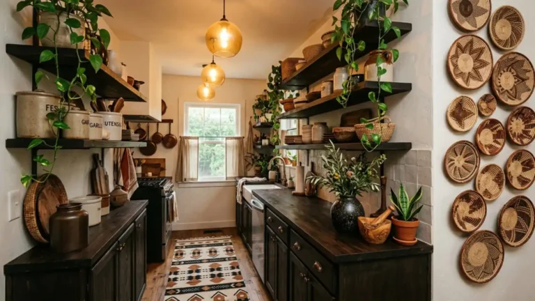
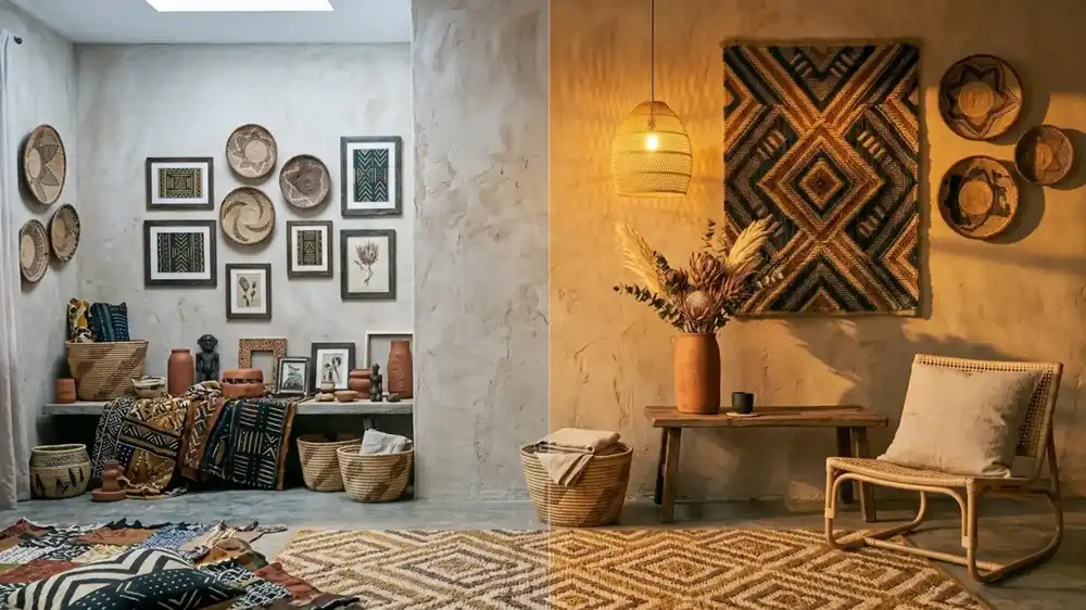
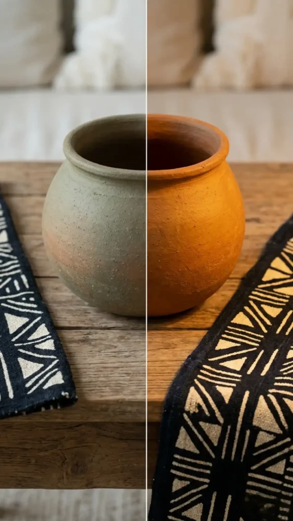
Mistake 1: Using Cool-White Lighting
This is the mistake that makes everything else irrelevant.
Cool-white lighting — 4000K and above — doesn’t just change the mood of an Afro Bohemian room. It chemically shifts the color rendering of every earth pigment in the space. Ochre reads as greenish. Terracotta greys out. Warm black loses its depth and reads as flat charcoal. Raw linen goes cold.
The palette you assembled correctly looks wrong, and there’s no styling intervention that fixes it because the problem is the light source, not the objects.
Replace every bulb in the space with 2700K warm LED or incandescent equivalent before evaluating anything else. The room you thought wasn’t working may need nothing more than this single change.
Mistake 2: Mixing Patterns at the Same Scale
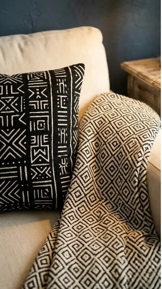
Pattern mixing in Afro Bohemian design fails at the scale level, not the color level.
Two patterns at the same visual scale placed in the same frame create competition — the eye can’t resolve which one to read first and registers both as noise. The instinct is usually to remove one of the patterns. The actual fix is to change its scale.
If your rug and your sofa throw are both mid-size geometric patterns, the problem isn’t the patterns — it’s that they’re occupying the same perceptual distance from the viewer. Replace the throw with a large-scale mud cloth or a solid linen in a palette tone. The rug’s pattern then reads clearly because it no longer has a competitor at the same scale.
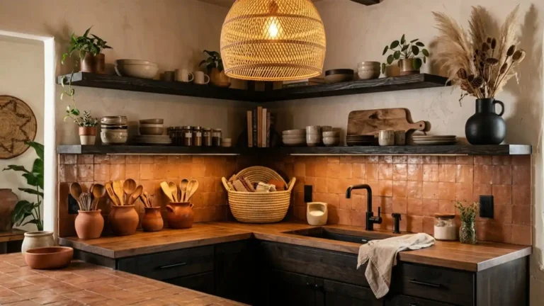
Mistake 3: Using White as the Neutral
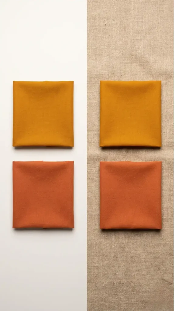
White reads as cool against earth pigments — and cool neutrals create visual disconnection between warm tones that would otherwise hold together naturally.
Raw linen, undyed canvas, warm sand, and unbleached cotton are the correct neutrals in this palette. They share the same pigment origin as the earth tones — they read as part of the same material family rather than a background imposed on top of it.
A white wall behind an ochre textile and terracotta vessel doesn’t unify them. It separates them by placing each object in front of a cool visual void. The same objects against a warm sand or raw plaster wall read as a cohesive composition because the wall participates in the palette rather than standing outside it.
Mistake 4: Activating Every Surface
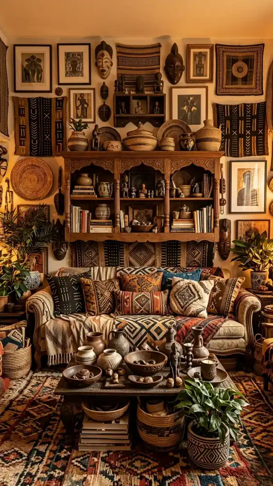
Layering is not the same as filling every available surface.
The visual richness of Afro Bohemian design comes from contrast — decorated against undecorated, textured against plain, pattern against solid. When every surface is activated simultaneously, the contrast disappears and the layering reads as clutter rather than depth.
Choose one wall per room to leave largely undecorated. Choose one surface in each vignette to leave empty. The bare plaster wall makes the woven tapestry on the adjacent wall more impactful. The empty shelf section makes the styled section more legible. Negative space isn’t absence of design — it’s the design decision that makes everything else visible.
Mistake 5: Substituting Synthetic Fabrics for Natural Fiber
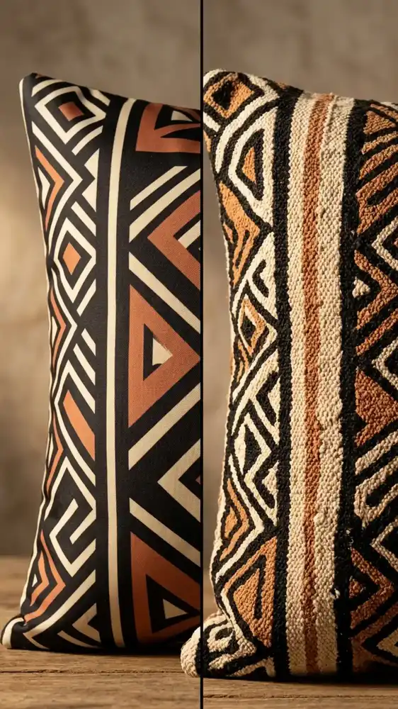
A polyester cushion printed with a geometric pattern is not a mud cloth substitute.
The pattern may look similar on a product listing. In the room, under warm light, the difference is immediate. Synthetic fabrics have a surface uniformity that flattens the texture contrast the aesthetic depends on. They also catch light differently — the slight sheen of polyester reads as incongruent against the matte, light-absorbing surface of natural cotton, linen, and wool.
Natural fiber isn’t a luxury upgrade in Afro Bohemian design — it’s a structural requirement. Cotton, linen, wool, jute, seagrass, and rattan are the material vocabulary. Where budget is a constraint, prioritize natural fiber in the most visually prominent positions and accept synthetic in items at the back of the room or under other layers.
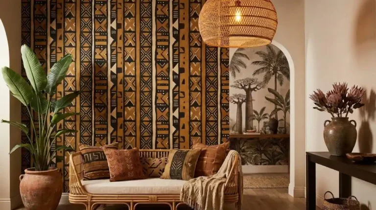
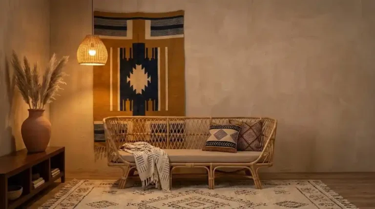
Mistake 6: Choosing Furniture That’s Too High Off the Ground
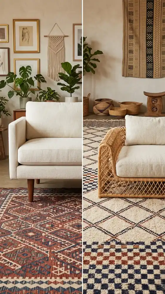
High-legged furniture lifts the visual weight of the room upward — away from the rug, the floor textiles, and the layered ground plane where the Afro Bohemian aesthetic lives.
The style is architecturally grounded. Low platform beds, squat wooden stools, low-slung rattan loungers — the silhouettes keep the room’s weight close to the floor and in conversation with the textile layers beneath them. Elevated tapered-leg furniture references mid-century modern, Scandinavian, or contemporary aesthetics that operate on a different visual logic.
If replacing existing furniture isn’t an option, compensate by building the floor layer up: a larger, thicker rug, floor cushions, stacked baskets at ground level. Pull the visual weight down toward the floor even if the furniture profile can’t be changed.
Mistake 7: Using Bright or Cool-Toned Accent Colors
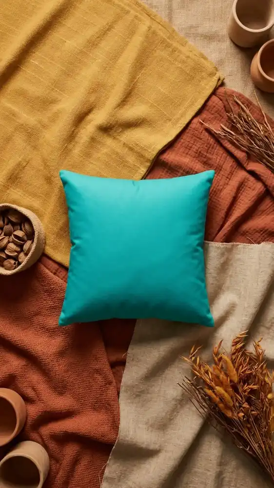
The most common single-object mistake in Afro Bohemian rooms is one cool-toned accent that was chosen for visual contrast without considering its pigment origin.
Bright teal, electric blue, lime green, hot pink — these colors reference synthetic dye traditions rather than earth pigment or plant dye traditions. Against ochre and terracotta, they don’t create interesting contrast. They create visual disconnection — a signal that something in the room belongs to a different design language.
If the room needs a cooler accent, muted forest green or deep plant-dye indigo are the two options within the palette’s material logic. Both read as plant-derived rather than synthetic. Both create contrast without breaking the pigment coherence that holds the palette together.
Mistake 8: Hanging Art Too High on the Wall
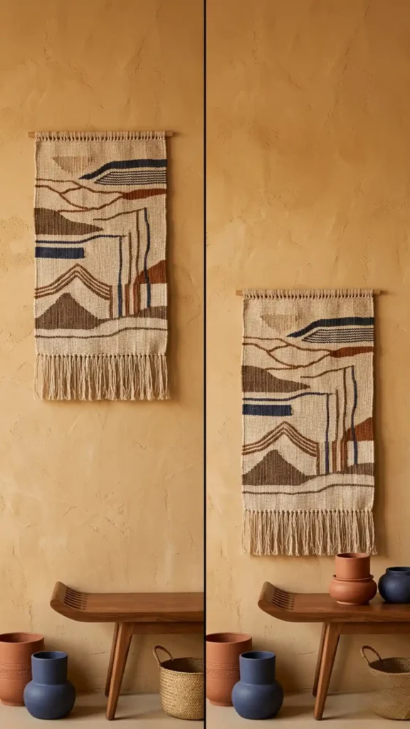
Standard picture-hanging height — eye level at standing — works for framed art in conventional interiors.
In Afro Bohemian design, where the furniture is low and the visual weight is close to the ground, hanging wall pieces at standard height creates a disconnection between the wall layer and the furniture layer. There’s a visual gap — a section of unused wall between the top of the furniture and the bottom of the art — that reads as spatial indecision.
Hang tapestries and large wall pieces lower than you think is correct. The bottom edge of a wall tapestry positioned above a low console should be close enough to the console surface that the two elements read as a unified vertical composition rather than two separate design decisions.
Mistake 9: Buying Everything at Once
Afro Bohemian rooms that read as authentic are almost always assembled over time.
The aesthetic is built on handmade objects, natural materials, and cultural artifacts — categories where the best pieces are found rather than purchased all at once from a single source. A room where every element arrived in the same delivery reads as a styled set rather than a lived space, regardless of how correct the individual choices are.
Start with the three structural decisions: anchor textile, lighting temperature, and wall tone. Live with those for a month before adding the next layer. The room will tell you what it needs as it develops — and the pieces you find gradually will have the specificity and variation that make the aesthetic feel genuinely layered rather than assembled.
The Quick Audit: Finding Which Mistake Is in Your Room Right Now
Before making any changes, walk through your space and answer these six questions:
- What color temperature are your bulbs? If you don’t know, buy a single 2700K bulb and swap it into the most-used lamp. Evaluate the room under that light before doing anything else.
- Stand at the room’s main entry point and identify the two most visually dominant patterns. Are they at the same scale? If yes, that’s your first fix.
- Is there any wall section or surface in the room that is completely undecorated? If no, identify the least important decorated surface and clear it entirely.
- Run your hand across the most prominent textile in the room. Does it have surface texture variation — raised weave, pile depth, fiber irregularity? If it feels uniformly smooth, it’s likely synthetic.
- Look at the furniture from a seated position on the floor. Does it feel low and grounded or elevated and floating above the rug layer?
- Is there any single object in the room that was chosen for color contrast alone — an accent piece in a tone that doesn’t share a pigment origin with the rest of the palette? Identify it. That’s the first thing to swap.
One honest walk-through with these six questions will surface the two or three mistakes that are doing the most damage. Fix those first — the room will often resolve itself from there without any additional purchases.
Afro Bohemian design is more forgiving than it looks when the foundational decisions are correct. Get the lighting temperature right, resolve the pattern scale hierarchy, and give the room a visual rest zone — and the remaining mistakes become cosmetic rather than structural. Most rooms don’t need to be rebuilt. They need three specific corrections and the patience to make them one at a time.
Go Deeper:
- Afro Bohemian Interior Design: The Complete Style Guide — Understand the full material and cultural system behind the aesthetic so you can identify which foundational decisions are worth protecting.
- 15 Afro Bohemian Interior Design Ideas for a Warm and Layered Home — Each idea here is the correct version of a mistake covered above — use it as the reference point for what the right execution actually looks like.
- 11 Afro Bohemian Color Palettes That Actually Work — Mistakes 3 and 7 are almost always palette problems — use these 11 combinations to replace the cool neutrals and synthetic accent colors dissolving your room.
- How to Create an Afro Bohemian Interior Design Style at Home — Once you’ve identified and corrected your mistakes, this room-building guide walks you through assembling the foundation in the right order.
- How to Mix Soulful Earth Tones in Afro Bohemian Decor — Mistakes 2 and 5 both come down to scale and material logic — this guide covers both in full detail.
- How to Decorate in Afro Bohemian Style Without Making It Look Busy — Mistake 4 is the most common reason rooms read as cluttered — this guide builds the full negative space and visual rest system around that single principle.
- Afro Bohemian Decor Must-Haves for Beginners — If you’re correcting a room that was built without a clear starting point, this beginner list gives you the anchor pieces to rebuild from.