How to Decorate in Afro Bohemian Style Without Making It Look Busy
The busiest-looking Afro Bohemian rooms almost always have the right ingredients.
Correct palette. Correct textiles. Correct objects. But every surface activated simultaneously, no visual rest zone anywhere, and the eye cycling continuously with nowhere to land.
The style isn’t the problem. The density is.
Afro Bohemian design is built on layering — but layering has a structural limit. Past that limit, the room stops reading as rich and starts reading as chaotic. The difference between the two isn’t the number of elements. It’s whether each element has enough visual breathing room to be read on its own terms.
This guide covers exactly where that limit is and how to stay on the right side of it.
Quick Takeaway:
- A room needs one undecorated surface for every two decorated ones — without that ratio, the eye has no place to rest and registers everything as noise.
- The anchor point hierarchy determines where the eye enters the room — everything else is arranged to support that entry point, not compete with it.
- Object density is resolved by editing down to odd-number groupings with deliberate negative space between elements, not by adding more to fill gaps.
Why Afro Bohemian Rooms Read as Busy
A room reads as busy when the eye can’t establish a sequence.
In a well-composed room, the eye enters at the most visually dominant element, moves to the second most dominant, then rests on a quieter zone before cycling again.
That sequence requires contrast between activated and unactivated surfaces.
When every surface is decorated at similar visual weight, the contrast disappears. The eye can’t find an entry point because everything is competing equally for attention.
The result isn’t abundance — it’s visual gridlock.
The One-in-Three Rule for Surface Activation
For every two decorated surfaces in a room, one should be left largely unactivated.
Two decorated walls, one bare wall. Two styled shelves, one empty shelf section. Two object-filled vignettes, one empty console surface.
This isn’t a conservative approach to decorating — it’s the contrast mechanism that makes the decorated surfaces more impactful.
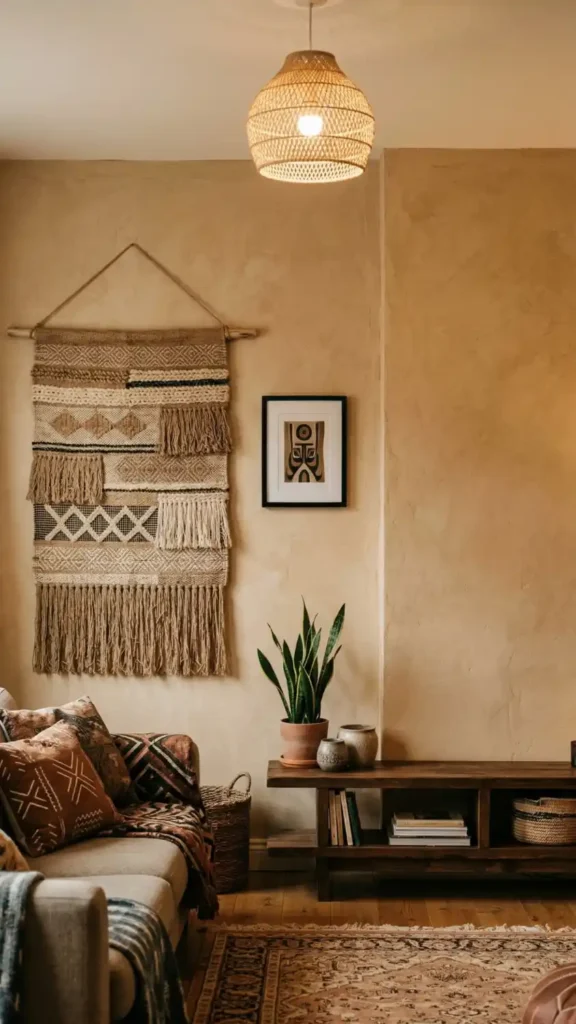
A woven tapestry on an otherwise bare wall reads more powerfully than the same tapestry surrounded by competing wall art.
The bare plaster isn’t absence of design. It’s the design decision that allows everything beside it to be fully legible.
Establishing the Anchor Point First
Before adding any element to a room, identify the anchor point — the single most visually dominant element that the eye should enter on.
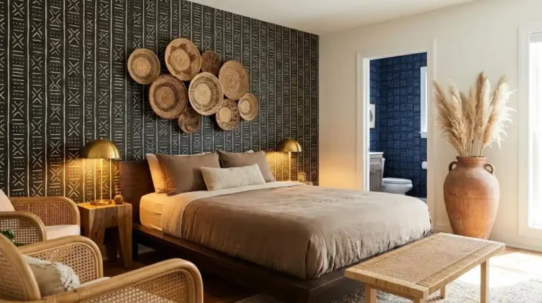
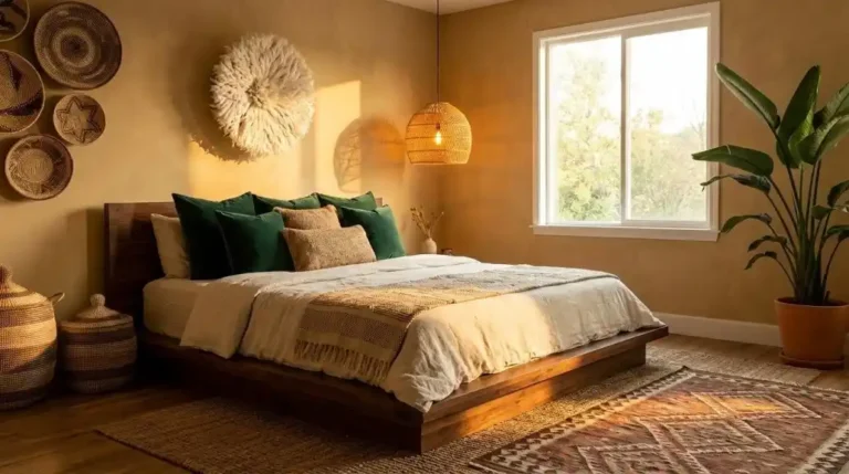
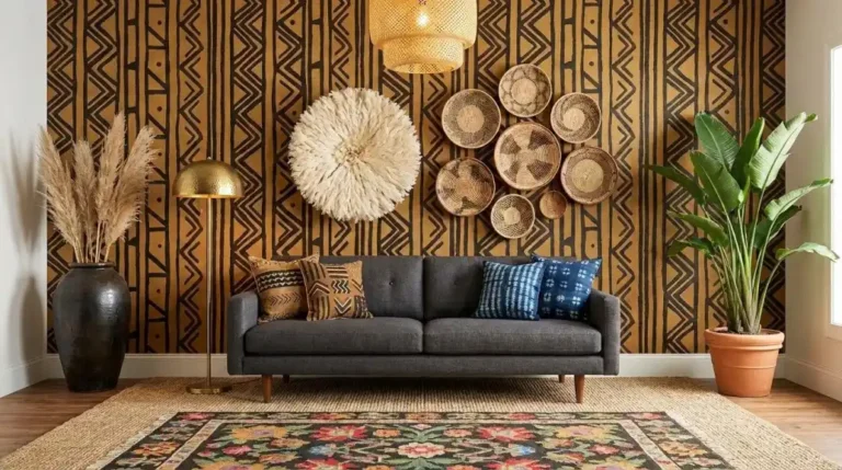
In most Afro Bohemian rooms, the anchor is either the wall tapestry or the mud cloth on the primary seating piece.
Every other element in the room should be at a lower visual weight than the anchor.
If two elements compete for anchor status — a large tapestry and an equally large gallery wall on the adjacent surface — the eye can’t resolve which one to enter on and reads both as noise.
One anchor. Everything else supports it.
How to Edit an Over-Layered Room
Editing an over-layered room is a removal process, not a rearrangement process.
Start with the surface that reads as the most visually congested. Remove everything from it entirely. Then replace only the elements that contribute something no other surface element is already providing — a specific height, a specific material type, a specific scale.
Leave the rest off the surface.
The instinct is to put things back because empty space feels unfinished. Resist it for at least three days.
Most rooms don’t read as unfinished after editing — they read as resolved. The congestion was creating the feeling of incompleteness, not the emptiness.
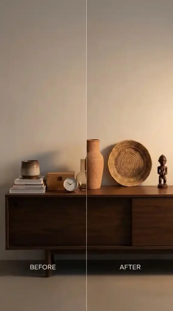
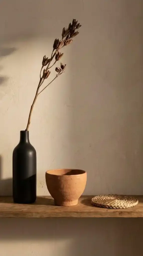
Odd Numbers and Negative Space in Object Groupings
Odd-number groupings — three objects, five objects — create visual tension that keeps the eye moving.
Even numbers resolve too quickly into symmetry. The eye reads them as a pair and moves on. Odd numbers have an unresolved quality that extends the eye’s engagement without creating confusion.
Within each grouping, vary height, material, and scale: one tall, one mid, one low. One smooth surface, one rough, one open-weave.
Then leave negative space between them — actual empty shelf or surface — both within the grouping and on either side of it.
The negative space isn’t empty. It’s the visual pause that makes each object in the group legible on its own terms.
The Textile Limit Per Surface
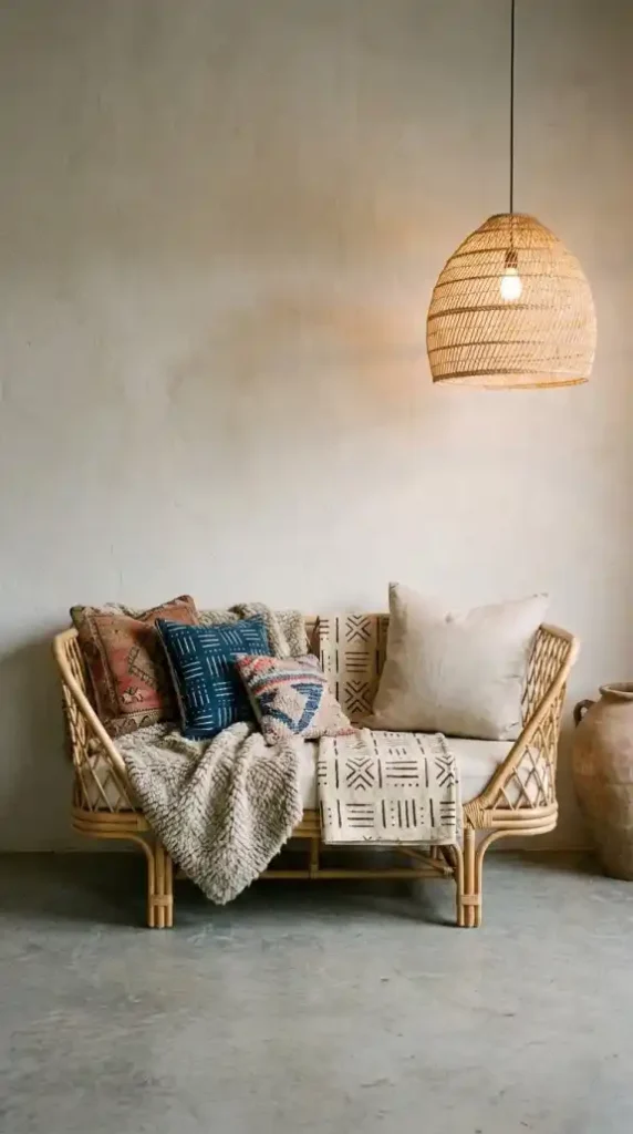
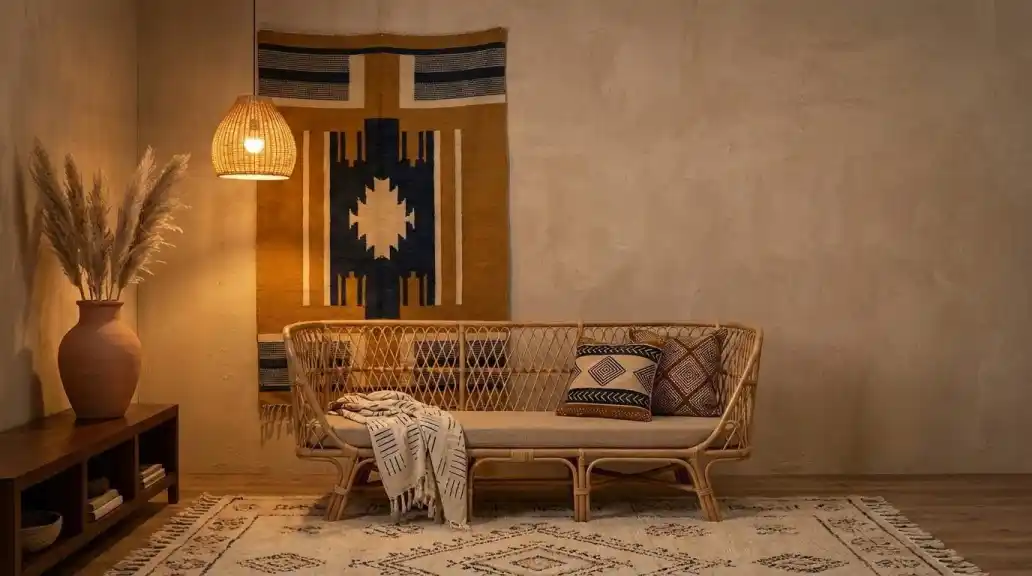
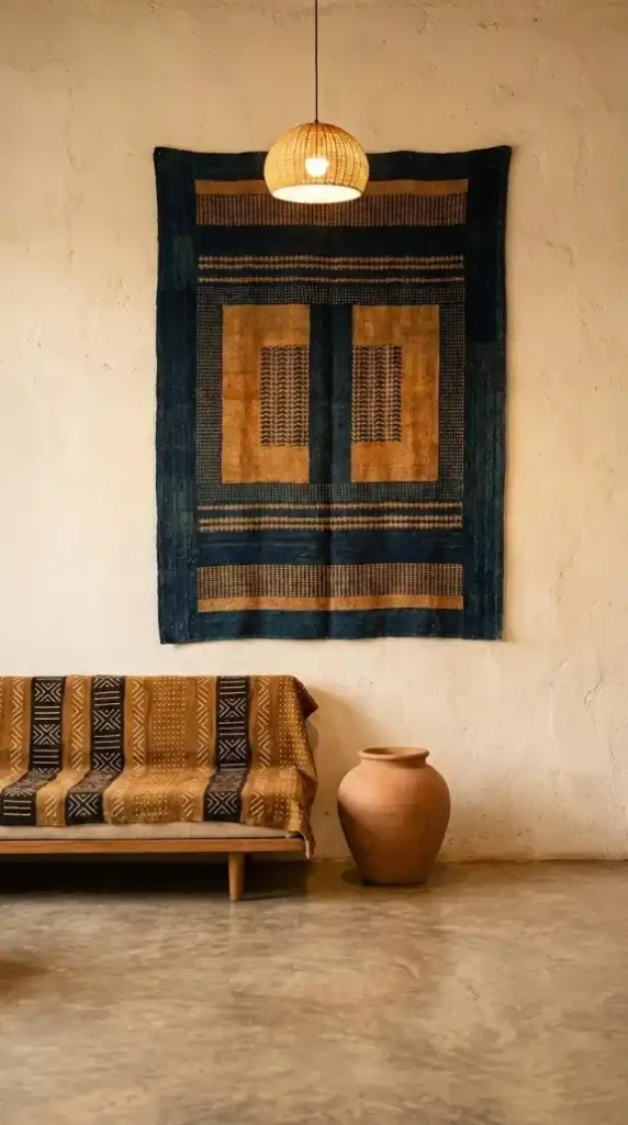
There is a textile limit per surface — and on a standard two-seat sofa, it’s two to three textile elements maximum.
One anchor throw. One or two cushions. That’s the composition.
More than three textiles on a single seating piece creates a surface that reads as unsettled rather than layered.
The depth of the aesthetic comes from the contrast between the sofa’s textile layer, the rug’s textile layer, and the wall’s textile layer — not from stacking all three layers onto the sofa simultaneously.
Let each surface own its textile contribution. The sofa owns the throw and cushions. The floor owns the rug. The wall owns the tapestry. Keep those layers distinct and the room reads as structured depth rather than accumulated softness.
Pattern Density: When to Use Solid Instead
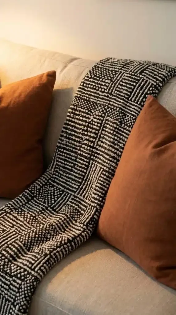
Solid-colored textiles are not a compromise in Afro Bohemian design — they are the rest zones within the pattern composition.
For every patterned textile, at least one adjacent textile should be solid in a palette tone.
A mud cloth throw reads more powerfully between two solid rust linen cushions than between two other patterned cushions.
The solids provide the visual pause that makes the pattern legible. Without them, the pattern has no contrast to read against — it just joins the visual density rather than standing out from it.
Solid ochre linen, raw undyed canvas, rust cotton — these are active design decisions, not placeholder choices while you find another pattern.
Floor Layer Discipline
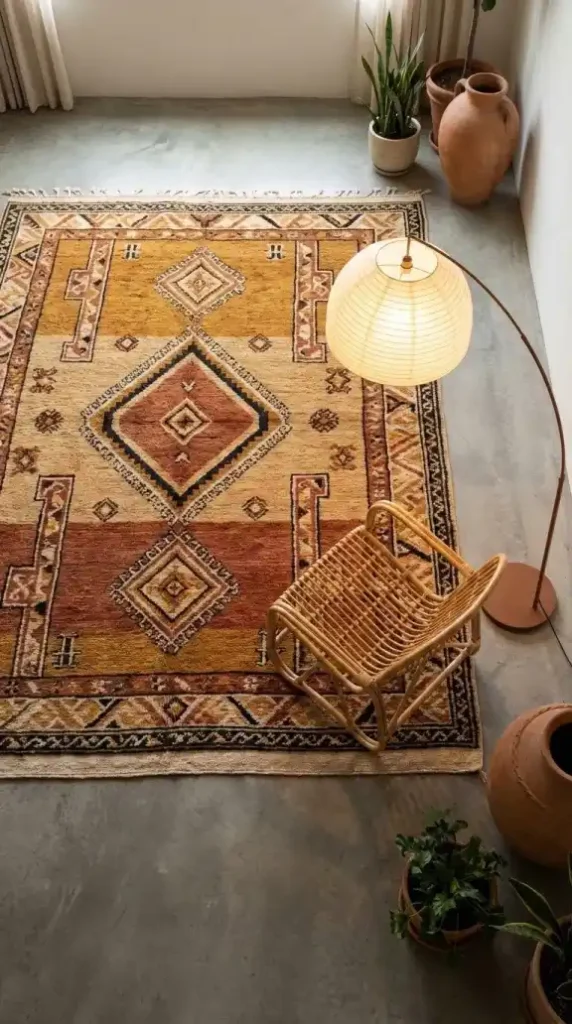
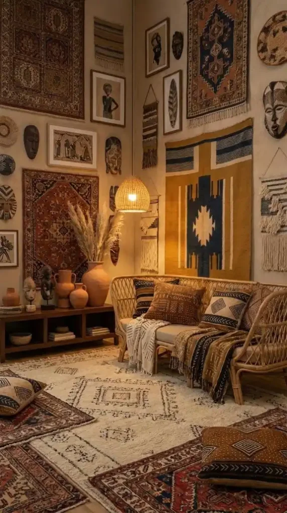
Layered rugs are a visual complexity that most Afro Bohemian rooms don’t need and few can hold without reading as busy.
One large rug — floor-filling, extending under all major furniture — is almost always more effective than two rugs layered or positioned separately.
The single large rug unifies the floor plane. Two rugs divide it.
If the floor layer feels incomplete with one rug, the solution is a larger rug — not a second one placed beside or on top of it.
Keep the floor layer simple. The complexity lives in the wall and textile layers. The floor’s job is to ground the room, not to add another layer of pattern competition.
Wall Density: The Two-Element Maximum Per Wall
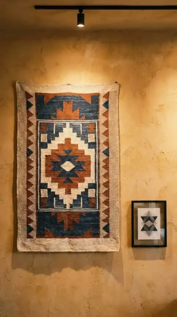
A single wall in an Afro Bohemian room should hold a maximum of two wall elements — one large anchor and one smaller supporting piece at a different scale.
More than two wall elements on a single wall creates a gallery wall effect — which references a different aesthetic tradition and introduces a density that works against the breathing room the style needs.
The large tapestry is the wall’s anchor element. A small framed print, a single woven basket, or a small shelf with one object can serve as the supporting element at smaller scale.
The rest of the wall stays bare.
That’s the full composition. Two elements, varying scale, surrounding bare wall. It holds.
Auditing Your Room for Visual Overload
Walk through your space and answer these questions before adding anything new:
- Stand at the room’s entry point. Where does your eye land first? If you can’t identify a single clear entry point, the anchor hierarchy needs to be resolved before anything else is addressed.
- Count the activated surfaces — walls with art, styled shelves, decorated consoles. Is at least one third of the total surface area left undecorated? If not, identify the least important decorated surface and clear it.
- Look at the sofa or bed. Count the textiles on it. If there are more than three, remove the least distinctive one and leave it off.
- Identify every patterned textile in the room. Is there at least one solid textile adjacent to each patterned one? If two patterned textiles are touching or in the same close frame, add a solid between them.
- Count the objects on the most decorated surface. If it’s an even number, remove one. If it’s more than five, reduce to three. Leave the negative space where the removed objects were.
- Is there any wall with more than two wall-hung elements? If yes, remove all but the largest piece and evaluate whether the second element is actually needed.
Afro Bohemian design is not a maximalist aesthetic.
It’s a layered aesthetic — and layering has internal logic. Each layer contributes something the others don’t. Each element earns its surface area.
The rooms that look effortlessly rich aren’t the ones that added the most. They’re the ones that stopped adding at exactly the right moment — when every element in the room had enough space to be seen, and the undecorated surfaces were doing as much visual work as the decorated ones.
That stopping point is the design skill. Everything before it is just shopping.
Take it Further
- Afro Bohemian Interior Design: The Complete Style Guide — Understand the full material and layering logic behind the aesthetic before applying the density controls and surface ratios covered in this guide.
- 15 Afro Bohemian Interior Design Ideas for a Warm and Layered Home — Each idea here is an example of layering done at the correct density — use it as the visual reference for what the one-in-three surface rule looks like in a finished room.
- 11 Afro Bohemian Color Palettes That Actually Work — Solid textiles used as rest zones need to land within the right palette — these 11 combinations show exactly which earth tones work as breathing space between patterns.
- 9 Common Afro Bohemian Decorating Mistakes to Avoid — Mistake 4 covers the activated-surface problem in full detail — read it alongside this guide to understand both the cause and the correction from two different angles.
- How to Create an Afro Bohemian Interior Design Style at Home — The sequential room-building process in this guide naturally prevents over-layering by resolving one surface at a time before moving to the next.
- How to Mix Soulful Earth Tones in Afro Bohemian Decor — The pattern density and textile limit principles here work directly alongside the scale hierarchy system — read both guides together before making any textile decisions.
- Afro Bohemian Decor Must-Haves for Beginners — If editing feels harder than adding, start here to identify the minimum anchor pieces the room needs — everything beyond that list is optional, not essential.