How to Mix Soulful Earth Tones in Afro Bohemian Decor
The rooms that look impossibly layered and cohesive at the same time aren’t the result of better taste.
They’re the result of three specific systems operating correctly in parallel: mix soulful earth tones chosen by pigment origin rather than visual similarity, textures selected for maximum surface contrast, and patterns arranged by scale hierarchy rather than color matching.
Most mixing attempts fail because they address color, texture, and pattern independently — as three separate problems. In Afro Bohemian design they’re one problem. Each system affects how the other two read. Get all three operating together and the room holds any amount of layering. Get one wrong and the other two can’t compensate.
Quick Takeaway:
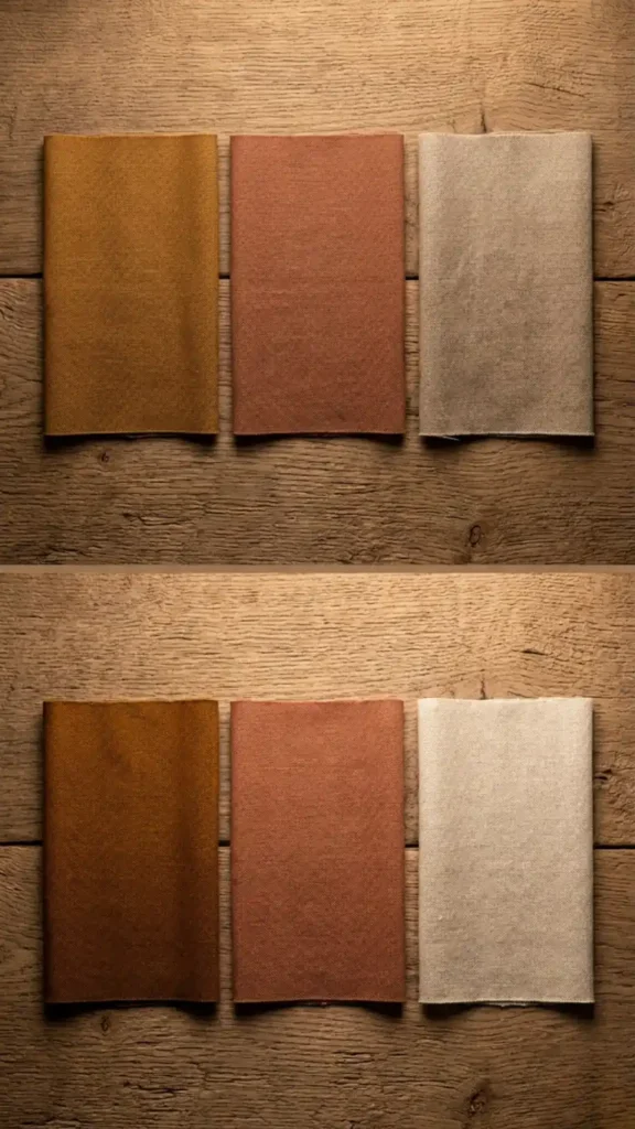
- Earth tones mix correctly when they share a pigment origin — ochre, terracotta, and raw sienna all derive from iron oxide and hold together without effort.
- Texture contrast needs at least three distinct surface types in the same frame — rough, smooth, and open-weave — or the room reads as materially flat.
- Pattern mixing is resolved at the scale level first — two patterns at the same visual scale create noise regardless of how well their colors match.
Why Mix Soulful Earth Tones Differently Than Other Colors
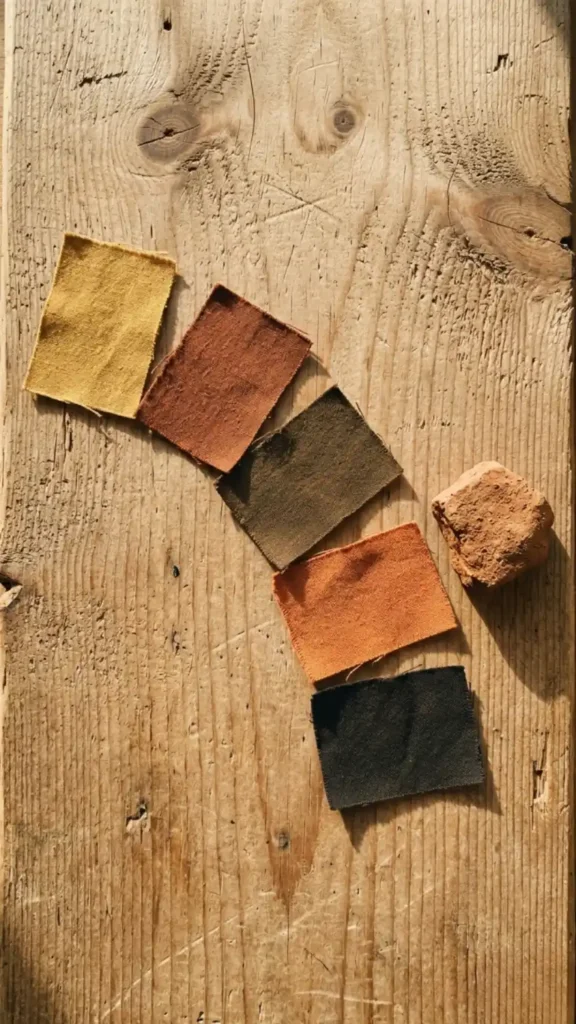
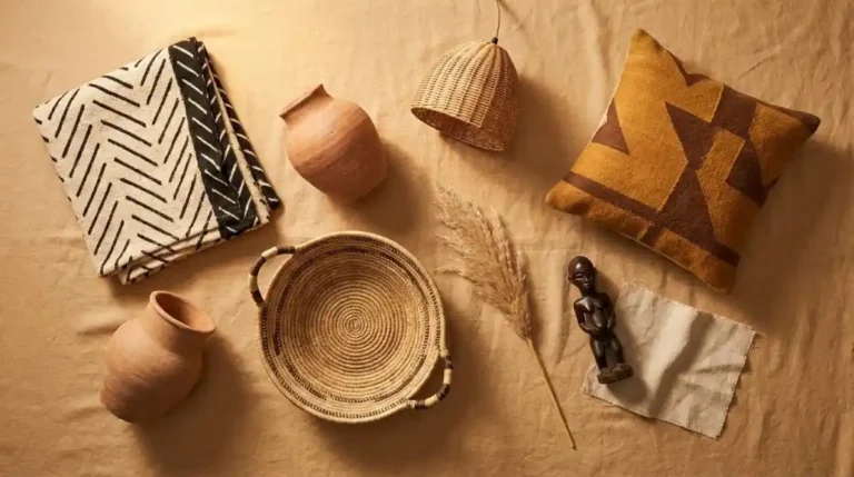
To mix soulful earth tones, it must have a natural look because they share a chemical origin — iron oxide, carbon, and clay mineral pigments that occur together in the same geological environments.
Ochre, terracotta, raw sienna, warm brown, and warm black are all derived from the same pigment family. Placed together, the eye reads them as belonging to the same material world rather than as colors that have been deliberately coordinated. This is why Afro Bohemian palettes can hold five or six earth tones simultaneously without looking busy — the colors aren’t competing, they’re confirming each other.
The mixing failure happens when a tone from outside this pigment family enters the composition. Cool grey shares no pigment origin with ochre. Bright teal shares no pigment origin with terracotta. One foreign tone doesn’t just stand out — it signals that the palette has a different logic operating inside it, and the eye registers that inconsistency as visual tension rather than contrast.
The Pigment Origin Test: How to Know If a Color Belongs
Before adding any color to an Afro Bohemian composition, run it through the pigment origin test.
Ask: does this color read as if it could have been produced from soil, clay, plant dye, or mineral oxide? Burnt orange — yes. Muted forest green — yes, it reads as plant-dye derived. Dusty rose with a clay undertone — yes. Bright coral — no. Electric blue — no.
Any color that reads as synthetic dye rather than natural pigment will create a discontinuity in the palette regardless of how visually appealing it seems in isolation.
This test is more reliable than trying to match colors by eye because it addresses the underlying logic rather than the surface appearance. Two colors can look similar on a swatch board and read as incompatible in a room if one is earth-derived and the other is synthetic-derived. The pigment origin is what the room reads — not the color card.
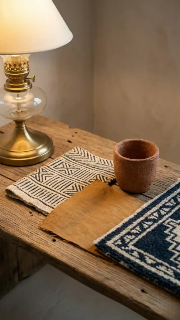
How to Build Surface Contrast With Three Material Types
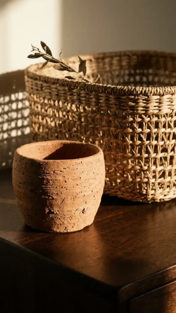
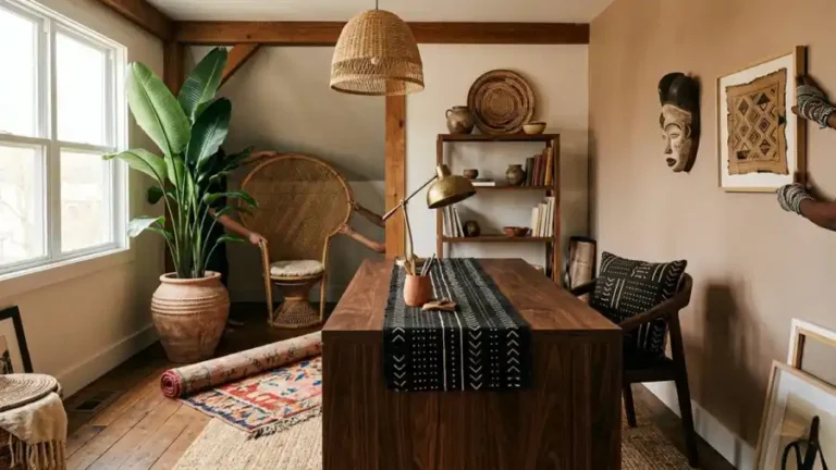
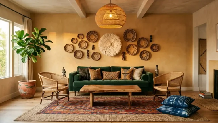
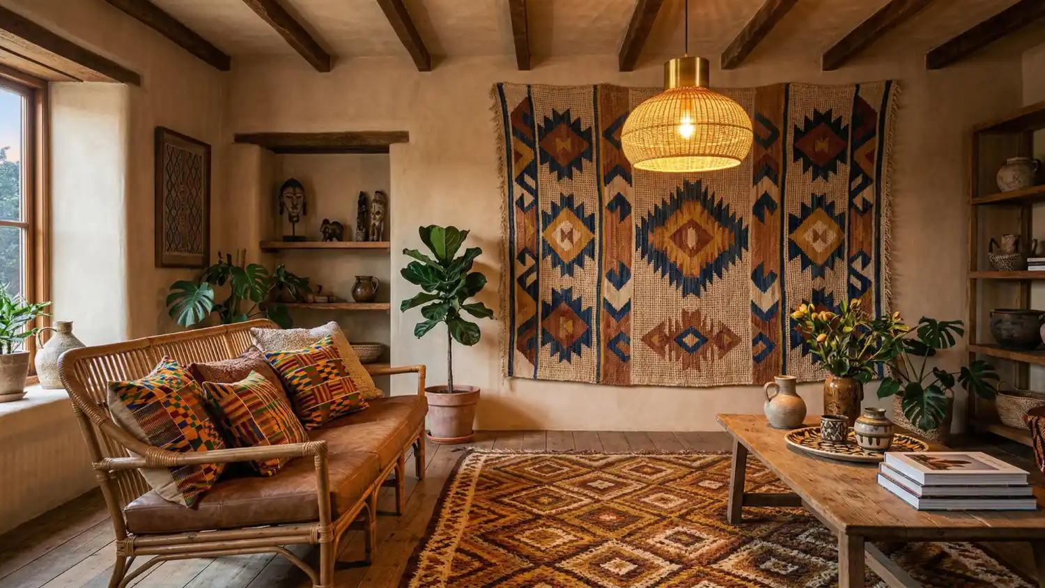
Texture contrast in Afro Bohemian design requires at least three distinct surface types in the same visual frame: one rough, one smooth, and one open or structural.
Rough surfaces — unglazed terracotta, raw plaster, hand-carved wood with visible tool marks — absorb and scatter light. They read as warm and tactile.
Smooth surfaces — dark-oiled hardwood, glazed ceramic, polished metal — reflect light directionally. They read as grounded and resolved.
Open or structural surfaces — rattan weave, natural fiber tapestry, coiled grass — cast their own shadow patterns and add a third dimension to the surface composition.
An interior composed entirely of rough surfaces feels heavy, while one that is strictly smooth comes across as cold; similarly, a space filled only with open-weaves feels unresolved.
The combination of all three gives the eye multiple types of surface behavior to move between, which is the physical mechanism behind what people describe as a room feeling “rich” or “layered.”
Value Range: The Invisible Architecture of Earth Tone Mixing
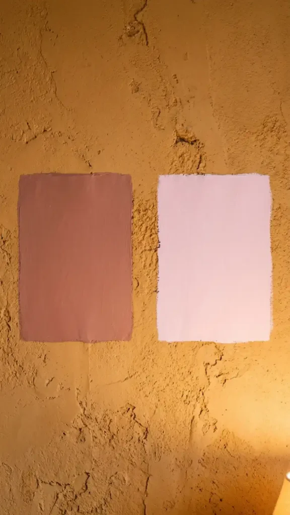
Value — the light-to-dark ratio within a palette — is what gives earth tone combinations their internal structure.
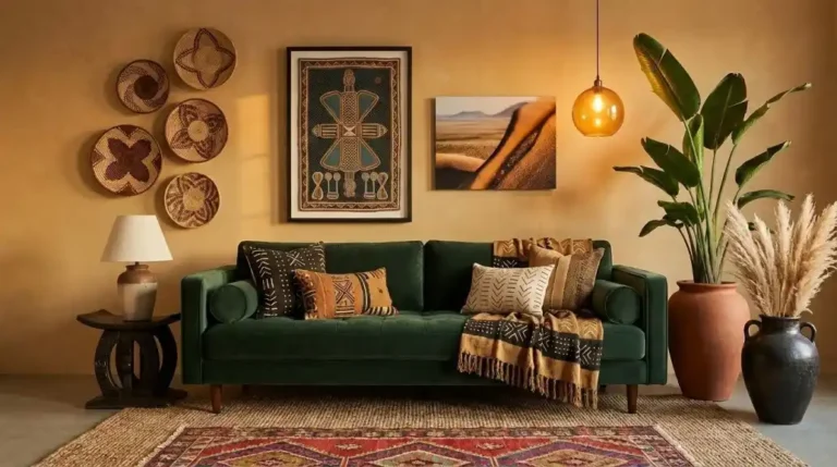
Three earth tones at the same value level will blend into each other regardless of how different their hues are. Deep ochre, mid terracotta, and rich raw sienna at the same medium value read as a single undifferentiated warmth. The same three tones redistributed across a clear value range — one light, one medium, one dark — create the internal contrast that makes each color legible on its own terms.
In practice: raw linen or warm sand carries the light value. Ochre and terracotta carry the mid value. Warm black or deep indigo carries the dark value. The palette needs all three levels present and clearly differentiated.
If the darkest tone in your room is a medium-depth terracotta, the palette is missing its anchor and will read as soft rather than structured.
How Pattern Scale Hierarchy Actually Works
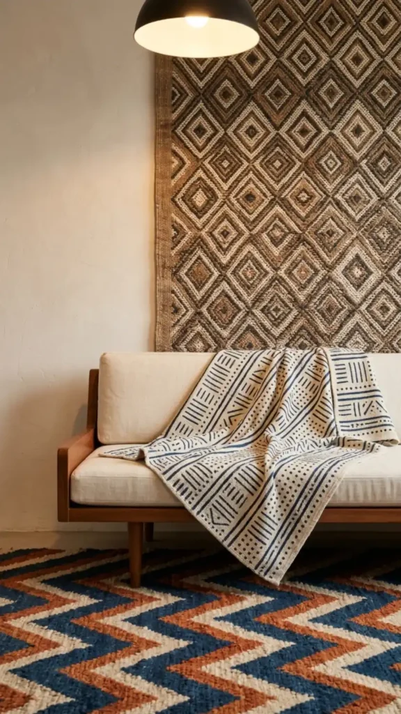
Pattern scale hierarchy means placing each pattern at a distinct perceptual distance from the viewer — so the eye reads them sequentially rather than simultaneously.
Large-scale patterns belong at the macro level: the wall tapestry, the large throw across a sofa back, the dominant rug. These are read from across the room. Mid-scale patterns belong at the mid level: a cushion cover, a rug border, a folded textile draped over a chair arm.
These are read from seated distance. Small-scale patterns belong at the detail level: a ceramic motif, a narrow textile trim, a small framed print. These are read up close.
The hierarchy works even when the patterns have no color relationship to each other — because the eye never needs to compare them directly. Each one occupies its own viewing distance. Conflict only arises when two patterns are placed at the same scale in the same frame, forcing the eye to resolve them simultaneously.
That’s the only pattern mixing rule that matters.
Mixing Geometric Motifs Without Repetition Fatigue
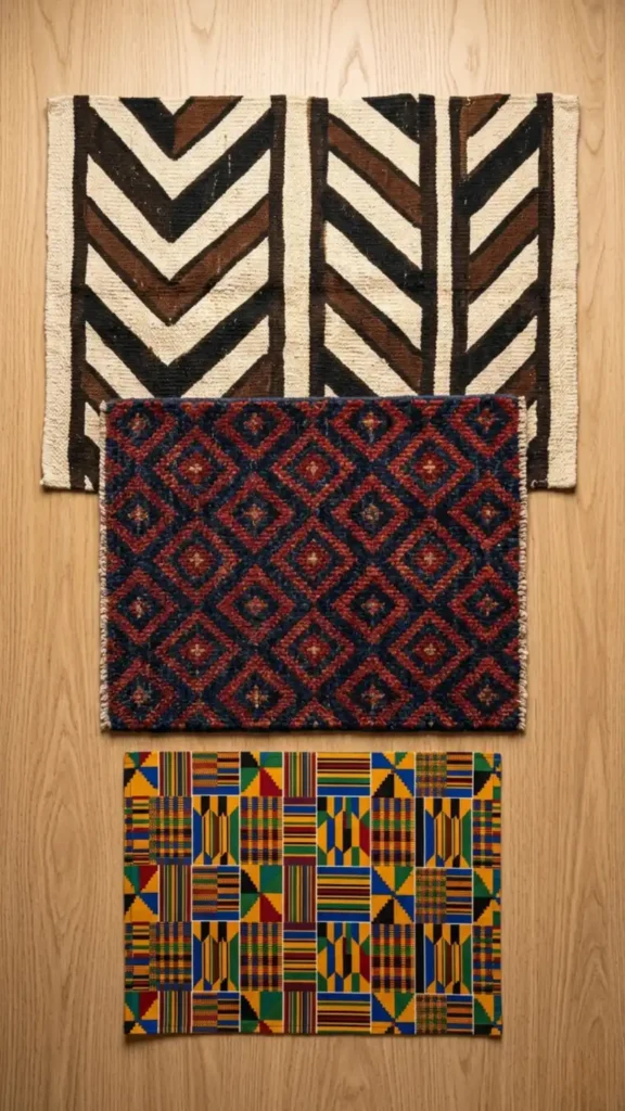
The Afro Bohemian pattern vocabulary is almost entirely geometric — but geometric doesn’t mean uniform, and repetition fatigue sets in when the same motif type appears at every scale level.
Vary the geometric family across scale levels: diamond repeat at the large scale, chevron at the mid scale, linear repeat at the small scale. All three are geometric, all three can sit within the same earth palette, but each references a different structural system — so the eye reads variety within coherence rather than repetition within a single theme.
The colorway can stay consistent across all three. Ochre and warm black in a large diamond tapestry, ochre and warm brown in a mid-scale chevron rug, cream and black in a small-scale linear cushion — three different motif families, one consistent palette.
The geometric variation provides the visual interest; the palette coherence provides the unity.
Where Texture and Pattern Overlap — and Where They Conflict
Texture and pattern reinforce each other when they operate at different scales — and conflict when they compete at the same one.
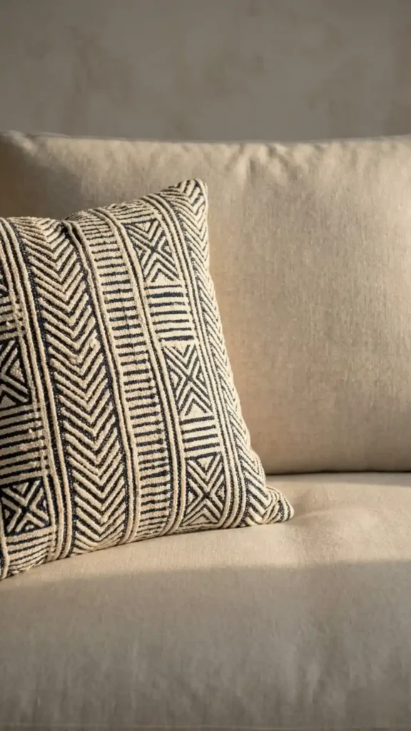
A mud cloth textile is both a texture and a pattern simultaneously: the raised weave is the texture and the geometric repeat is the pattern. At the large scale, it contributes both material depth and visual information.
A smooth surface placed beside it — a plain linen cushion, a polished wood surface, an unglazed ceramic — provides the rest that lets both the texture and the pattern of the mud cloth read at full impact.
The conflict happens when a highly textured surface and a busy pattern occupy the same viewing distance. A rough woven basket placed directly beside a small-scale printed textile creates surface competition — both are demanding attention at the same perceptual distance through different means.
Separate them by scale, by physical distance, or by placing a smooth material between them.
The Light Test: Reading Your Mix Before Committing
Before committing to any material combination, assemble the actual physical samples together under your 2700K lamp and evaluate them under raking side light.
Raking light — a lamp positioned at a low angle to the side, casting light across rather than down — reveals surface texture depth that overhead lighting hides. The mud cloth weave that looks flat under a ceiling light shows full relief under a raking lamp.
The plaster wall texture that reads as smooth in daylight shows its grain under warm side light at night.
This test also shows you the color interaction between materials in real conditions. The ochre swatch that looked cohesive with the terracotta vessel under the store’s fluorescent light may read differently under your warm lamp at home.
Run the test before hanging, purchasing, or committing — and trust the room under your actual light conditions over any combination that looked right elsewhere.
Auditing Your Mix: Five Questions Before You Add Anything New
Before introducing any new element — a textile, a vessel, a rug, a wall piece — answer these five questions about what’s already in the room:
- Can you identify three distinct surface types in the room’s most prominent vignette — one rough, one smooth, one open or structural? If you can only identify two, the next addition should address the missing surface type rather than adding another of an existing one.
- What is the lightest value tone currently in the room? The darkest? Is there a clear range between them or are most tones clustered at the same medium value?
- Name the three largest patterns in the room. Are they at three distinct scales? If two are competing at the same scale, resolve that before adding a fourth pattern.
- Does every color in the room pass the pigment origin test — does it read as earth-derived, plant-dye derived, or mineral-derived? Identify any color that reads as synthetic and note where it sits in the room.
- Where does your eye rest longest when you stand at the room’s entry point? That’s where the most successful mixing is already happening. The next addition should support that zone, not compete with it.
Earth tone mixing, texture contrast, and pattern hierarchy aren’t three separate skills. They’re three expressions of the same underlying principle: every element in the room should belong to the same material logic, occupy its own scale position, and contribute a surface behavior that no other element is already providing.
When all three conditions are met simultaneously, the room can hold more layers than most people think is possible — because each layer is doing distinct work rather than competing for the same visual territory.
More to Explore:
- Afro Bohemian Interior Design: The Complete Style Guide — Understand the full cultural and material framework that explains why earth pigment logic, texture contrast, and pattern hierarchy work as a unified system.
- 15 Afro Bohemian Interior Design Ideas for a Warm and Layered Home — See the three-scale pattern hierarchy and surface contrast principles from this guide applied across real room compositions from floor to wall.
- 11 Afro Bohemian Color Palettes That Actually Work — Once you understand the pigment origin test, use these 11 palettes to identify which earth tone combinations pass it before committing to paint or textiles.
- 9 Common Afro Bohemian Decorating Mistakes to Avoid — The most destructive mixing mistakes — same-scale pattern collision, synthetic accent colors, and cool neutrals — are covered in full detail here with specific corrections.
- How to Create an Afro Bohemian Interior Design Style at Home — Apply the mixing principles from this guide within the correct room-building sequence — textiles first, furniture second, objects last.
- How to Decorate in Afro Bohemian Style Without Making It Look Busy — When the three systems in this guide are correctly assembled, this is the next problem to solve: how much layering is too much and where the room needs to breathe.
- Afro Bohemian Decor Must-Haves for Beginners — If the pigment origin test and scale hierarchy feel abstract, start here with the physical anchor pieces that make both principles concrete and easy to apply.
Loved these styles? Find more tips on our main stage: https://colorblendinteriors.com/home