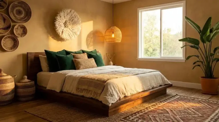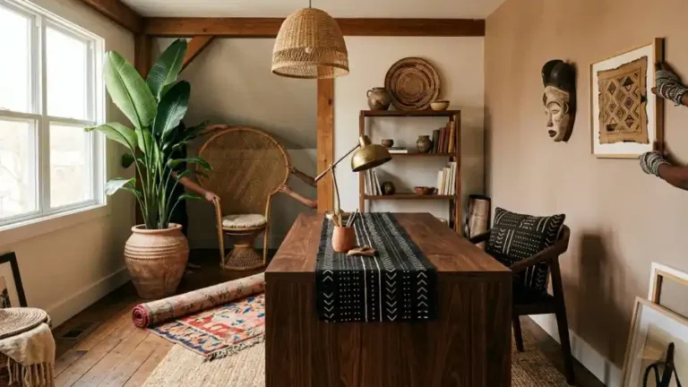
How to Style an Afro Bohemian Bathroom
The bathroom is the room where sequence matters most and forgiveness is least.
In a living room, a styling mistake can be absorbed by the room’s spatial generosity — a wrong cushion disappears into the sofa arrangement, an over-activated shelf is compensated for by a bare adjacent wall. In a bathroom, every surface is within the viewer’s field of vision simultaneously. There is nowhere for a wrong decision to hide.
This means the Afro Bohemian bathroom has to be built correctly from the first intervention — with each decision made in the sequence that sets up the next one rather than working against it.
Five positions. Ten steps. One precise application of the 60-30-10 palette logic that holds the whole room together at small scale.
Quick Takeaway:
- The 60-30-10 audit comes before any purchase or styling decision — it tells you exactly which palette category is over-represented and which is missing before you spend anything.
- Hardware replacement comes before textiles — wrong hardware finish undermines every correct textile and object placed around it.
- The vanity vignette is styled last — because it’s the room’s most intimate surface and its three objects need to respond to everything already assembled around them.
Step 1: Run the 60-30-10 Audit Before Touching Anything
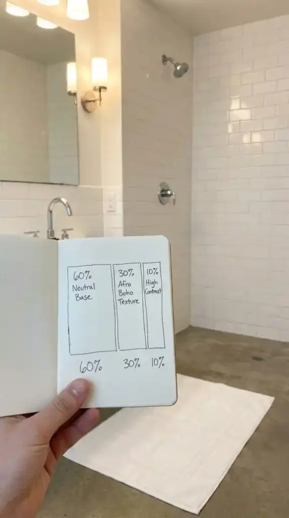
Before buying anything or moving anything, walk through the bathroom and estimate the current palette distribution across its three categories.
60% Neutral Base — creamy whites, charcoal, deep ebony in large-format tiles and smooth wall surfaces. This is the visual breathing room that makes the texture and accent layers legible rather than overwhelming.
30% Afro Bohemian Texture — reclaimed wood, seagrass baskets, mud cloth, jute, rattan, Turkish cotton. The natural material vocabulary applied at functional object positions.
10% High Contrast Accent — bold art, hammered copper hardware, matte black fixtures, vibrant plant life. The punctuation marks that signal cultural confidence.
Write down your estimates.
The category furthest below its correct allocation is where the first purchase goes. The category over-represented tells you what to stop buying.
Most existing bathrooms run at 80–90% neutral base with almost no texture or accent layer. That tells you immediately: the first five purchases should all be directed at the 30% texture category before the 10% accent is addressed.
Don’t skip this step. The audit is the styling plan — it tells you what the room needs before you’ve spent a single peso on it.
Step 2: Replace Every Bulb With 2700K Warm Light
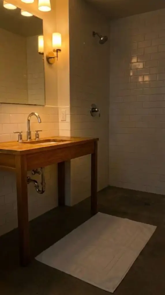
The second step is replacing every bulb in the bathroom with 2700K warm light before any styling decision is evaluated under its actual conditions.
Cool-white bathroom lighting — standard in most existing bathrooms — shifts terracotta toward grey-brown, warms ochre toward muddy green, and makes the mud cloth’s cream tones read as cold white.
The terracotta soap dispenser you’re about to buy for the vanity will look wrong under cool white light regardless of how correct its color is. The teak vanity’s warm grain will read as flat brown. The hammered copper faucet will lose the amber glow that makes it perform as a material accent.
Fix the light source before evaluating any of these.
Wall-mounted sconces on either side of the mirror position rather than a single overhead downlight provide the most flattering and materially accurate light for the bathroom surfaces.
Two sconces at face height create bilateral warm light that eliminates the harsh overhead shadow that single downlights produce — and under 2700K bilateral sconce lighting every earth-pigment surface in the bathroom reads at its most accurate and most cohesive.
Step 3: Replace the Hardware First
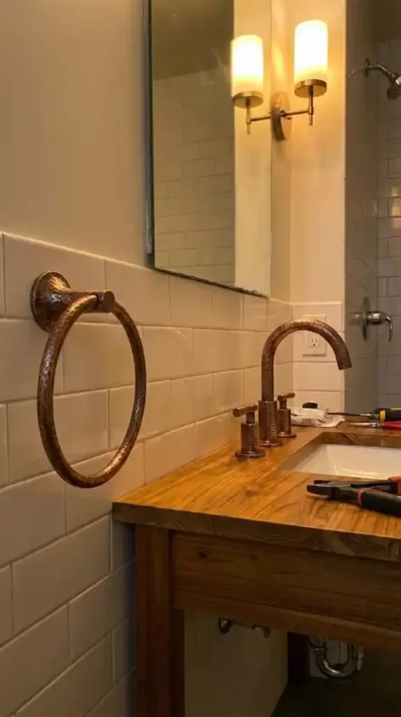
Hardware replacement comes before textiles, before objects, and before the mirror.
This is the styling sequence rule that most bathroom guides reverse — and reversing it produces a room where the hardware undermines every correct element placed around it.
Chrome and polished nickel hardware reads as clinical and cool under any light temperature. It signals a different material logic from the hammered copper and natural fiber vocabulary the aesthetic runs on. One chrome faucet visible in an otherwise correctly assembled Afro Bohemian bathroom pulls the room’s material coherence toward contemporary rather than artisanal.
Replace the faucet first — it’s the most visible hardware piece and the one that most immediately changes the room’s material reading.
Then replace in order of visual prominence: towel rings, toilet paper holder, robe hooks.
All in hammered copper or antique brass. Consistent finish across every metal position.
The “collected over time” quality the Afro Bohemian aesthetic depends on requires hardware consistency — mixing hammered copper with chrome towel rings signals a design logic still in progress rather than one that’s been resolved.
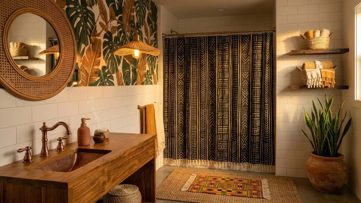
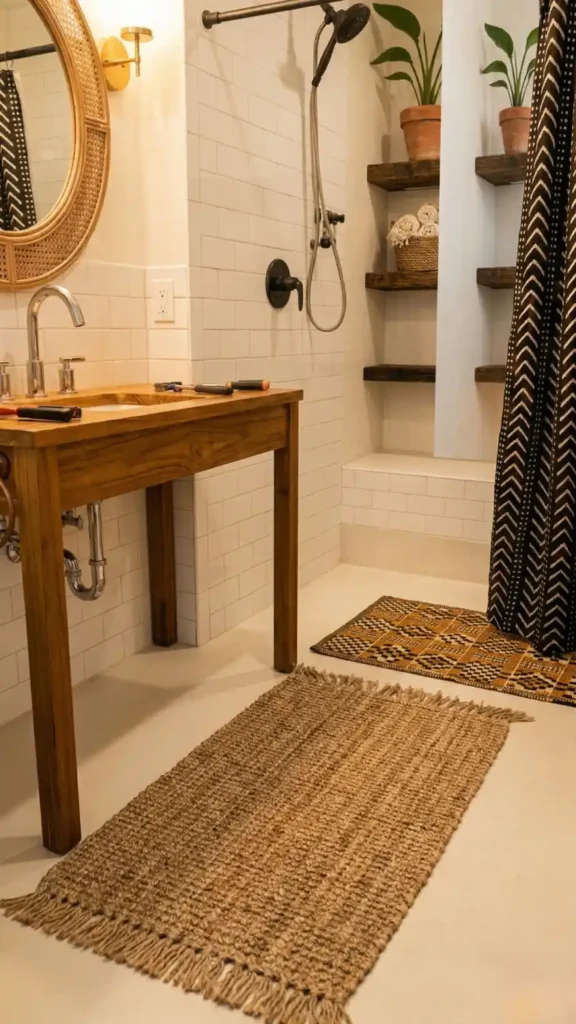
Step 4: Install the Mud Cloth Shower Curtain
The mud cloth shower curtain goes up after the hardware is confirmed as correct — because the curtain’s matte black rod needs to read as part of the same matte black hardware family rather than as a mismatched fixture.
Hang the mud cloth curtain from a matte black rod — not chrome, not polished brass, not tension-mounted white.
The matte black rod connects the curtain to the broader hardware finish logic of the room — creating a visual thread between the curtain position and the towel rings and faucet at the vanity.
Once the curtain is hung, step back and evaluate the room’s High Contrast distribution.
The mud cloth’s black and cream geometric pattern now occupies the bathroom’s largest textile surface. The 10% high-contrast accent layer is partially fulfilled at the shower position.
Everything added after this point needs to be evaluated against the mud cloth’s pattern presence — ensuring additional pattern elements are at smaller scale and lower visual weight rather than competing at the same scale and intensity.
Step 5: Mount the Circular Rattan Mirror
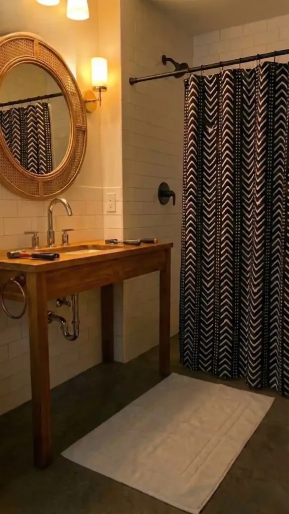
The circular rattan mirror goes up after the mud cloth curtain is in place — because the mirror’s reflective surface will pick up the curtain’s geometric pattern and project it back into the room from the vanity position.
That reflection doubles the visual presence of the mud cloth without adding another textile surface — which is exactly the mirror’s functional role in the bathroom’s small-scale composition.
Mount the mirror at a height where its center sits approximately 160cm from the floor — the standard eye-level position that ensures the reflection captures both the vanity objects below and the shower curtain across the room.
Confirm the circular rattan frame reads correctly against the cream tile wall.
The open rattan weave introduces the natural fiber vocabulary at the bathroom’s primary vertical surface — connecting the mirror to the seagrass baskets that will go on the shelf and the jute bath mat that will go on the floor. Once the mirror is mounted the room’s natural fiber thread is established. Every subsequent natural material object added to the room will read as part of the same material logic.
Step 6: Install Reclaimed Wood Shelving and Style It
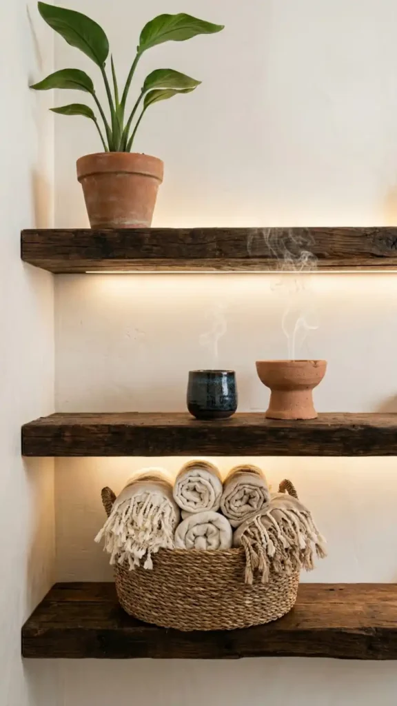
Reclaimed wood shelving is installed before the floor layer and the vanity vignette are styled — because the shelf establishes the dark wood value anchor that both the floor and vanity compositions respond to.
Install the shelf against the wall with the most neutral surface — cream tile, warm plaster — where the dark wood reads with maximum contrast against the light background.
Then style the shelf in sequence from bottom to top.
Bottom shelf: one large seagrass basket holding rolled Turkish cotton towels with fringe visible at the top. This is the storage layer — functional, materially correct, and contributing to the 30% texture allocation.
Middle shelf: a terracotta incense burner, a small dark ceramic vessel, and one dried botanical stem. Three objects in an odd-number arrangement with deliberate negative space between them.
Top shelf: a humidity-tolerant plant in a terracotta pot — Bird of Paradise if the shelf can support its weight, a trailing Pothos in a hanging planter above the shelf if not.
Style each shelf level and step back before moving to the next. The shelf as a complete vertical composition should read as progressively richer from bottom to top — not uniformly dense across all three levels.
Step 7: Lay the Floor Layer
The floor layer is laid after the shelf is styled — because the shelf’s dark wood and seagrass tones determine whether the floor mats need to add warmth or pattern as their primary contribution.
A dark-toned shelf with warm seagrass baskets already in place means the floor layer can stay neutral — the jute bath mat in front of the vanity in natural honey tone provides organic texture without adding competing color.
The kente-inspired hand-woven bath mat at the shower exit position adds the Heritage Accent pattern layer at the secondary floor position — ochre, black, and cream geometric weave at the point of first foot contact exiting the shower.
Lay the jute mat first and confirm its position in front of the vanity before placing the kente mat.
The two mats should not overlap or sit in immediate proximity. The tile floor surface between them is part of the floor composition — the neutral base visible between the two texture layers creates the visual rest that makes each mat readable on its own terms.
Step 8: Apply the Accent Wall Wallpaper
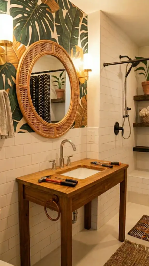
The accent wall wallpaper goes on after the mirror is mounted — because the mirror position determines which wall becomes the accent wall and the rattan frame needs to be visible against the wallpaper before the pattern choice is confirmed as correct.
One wall only.
Bold botanical tropical leaf wallpaper in deep forest green and warm ochre delivers the Life tone jungle layer at architectural scale. At bathroom proximity — closer than any other room allows — the large-scale tropical leaf pattern reads as lush and immersive rather than overwhelming.
Abstract mud cloth patterned wallpaper in black and cream delivers the High Contrast component at wall scale. If the mud cloth shower curtain is already carrying significant black and cream pattern, the botanical wallpaper on the accent wall adds the Life tone rather than repeating the High Contrast.
Evaluate the two options against the mud cloth curtain already in place.
If the curtain’s black and cream is dominant, the botanical wallpaper in forest green and ochre balances the palette. If the curtain reads as restrained in its pattern scale, the mud cloth wallpaper can reinforce the High Contrast layer at wall scale without tipping into pattern overload.
One wall. Maximum pattern commitment. Every adjacent surface remains in the 60% neutral base.
Step 9: Hang Turkish Cotton Towels on Hammered Hardware
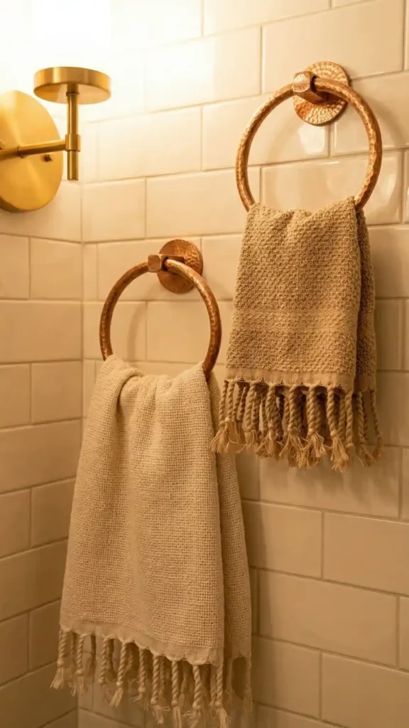
Turkish cotton towels with fringe are hung after the hardware is confirmed and the shelf seagrass basket towel storage is styled — because the displayed towels and the stored towels serve two different functions and both positions need to be resolved before the vanity vignette is assembled.
Hang one bath towel and one hand towel on the hammered copper towel rings.
Two towels maximum at the display position. More reads as a linen closet arrangement rather than a composed textile layer.
The fringe detail should hang freely — not tucked or folded in. The loose natural fiber fringe catching warm sconce light provides the boho softness at the functional textile position that connects the towels to the broader natural material vocabulary of the room.
Natural undyed cotton and warm sand tone towels sit within the Grounded Neutral palette category — the 60% base layer at the functional textile position.
Step back after hanging the towels and evaluate the bathroom’s textile composition as a whole.
The mud cloth shower curtain occupies the High Contrast position. The Turkish cotton towels occupy the Grounded Neutral position. The kente-inspired bath mat occupies the Heritage Accent position. Three distinct textile traditions at three distinct palette positions — the full bathroom textile layer resolved.
Step 10: Style the Vanity Vignette
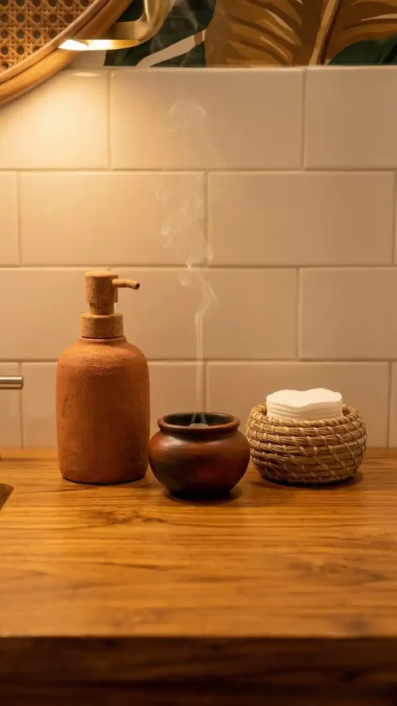
The vanity vignette is styled last — because it’s the room’s most intimate surface and its three objects need to respond to everything already assembled around them rather than being chosen in isolation.
Three objects. Odd number. Deliberate negative space on both sides.
A terracotta clay soap dispenser with a natural cork or dark wood pump at the left position — the rough unglazed clay surface reading as materially cohesive with the terracotta pots holding the bathroom plants.
A small terracotta or dark ceramic incense burner at center — sandalwood or frankincense — adding the sensory layer at the most intimate bathroom surface.
The thin smoke wisp from the incense adds movement to the static vignette. The scent activates the room at the olfactory level — making the bathroom immersive rather than merely visual. Sandalwood and frankincense reference the same warm earthy material origin as the aesthetic’s visual palette through scent association.
A small seagrass basket holding cotton rounds or daily-use objects at the right position — functional, materially correct, completing the three-object arrangement with a natural fiber element at the smallest vignette scale.
Deliberate negative space on both outer sides of the grouping.
The empty teak surface on either side of the three objects is the visual breathing room that the bathroom’s small scale requires most urgently. Place the objects. Step back. Resist the instinct to fill the remaining surface.
Final Audit: Reading the Bathroom Before Calling It Done
Walk through the fully assembled bathroom and answer these questions:
- Stand at the bathroom entry point. Where does the eye land first? It should land on the mud cloth shower curtain or the circular rattan mirror — whichever is the room’s most visually prominent surface from the entry angle. If the eye lands on a chrome fixture or a plain white bath mat first the hardware replacement or floor layer is incomplete.
- Estimate the palette distribution again now that the room is assembled. Has the 30% texture category reached its correct allocation through the teak wood, seagrass baskets, jute mat, rattan mirror, and Turkish cotton towels? Has the 10% accent category been reached without being exceeded through the hammered copper hardware, mud cloth curtain, bold wallpaper, and plant life?
- Is the vanity vignette readable as three distinct objects with deliberate negative space on both sides? Walk to the vanity and look at the surface from standing height. If the negative space has been filled in since styling remove the most recently added object and leave the surface clear.
- Are the two bath mats at two distinct floor positions with visible tile between them? If the mats are touching or overlapping they’re reading as one floor covering rather than two distinct layers. Separate them with at least 20cm of visible tile floor between positions.
- Check every plant pot. Are all terracotta or dark ceramic? Any plastic nursery container still visible in an assembled Afro Bohemian bathroom is the most common material break — and in a small space it’s immediately visible from every position in the room simultaneously.
- Light the incense on the vanity. Stand at the entry point. Does the room feel inhabited or decorated? Scent crosses the room before the eye has resolved any surface detail — if the sandalwood reaches the entry point before the eye has landed on the mud cloth curtain, the sensory layer is complete.
The Afro Bohemian bathroom is styled in ten steps — but the precision required at each step is higher than any other room in the house.
Small scale makes every decision visible. There is nowhere for a wrong hardware finish to hide. There is no adjacent bare wall to absorb an over-activated surface. Every element is in the viewer’s field of vision simultaneously from the moment they enter.
That constraint is also the opportunity.
When the mud cloth curtain, the hammered copper hardware, the circular rattan mirror, the teak vanity, the seagrass baskets, the kente mat, the botanical wallpaper, the Turkish cotton towels, the terracotta vignette, and the sandalwood incense are all operating correctly in the same small space — the room performs with an intensity that the larger rooms, with their spatial generosity, can’t replicate.
Precision in a constrained space produces the most cohesive result in the house. That’s not a limitation. That’s the design opportunity the bathroom provides.
Continue the Room:
- Afro Bohemian Bathroom: The Complete Style Guide — Understand the full material logic behind every bathroom decision — from the 60-30-10 palette distribution to the hammered copper hardware thread — as a unified system applied at small scale.
- 11 Afro Bohemian Bathroom Ideas for a Warm and Layered Space — See each of the five bathroom positions — shower, vanity, mirror, floor, and shelf — addressed as specific moves with a specific reason behind each one.
- Afro Bohemian Bathroom Decor Must-Haves for Beginners — If the palette framework and material sequencing feel abstract, start here with the ten physical anchor pieces that make both principles concrete from the first purchase.