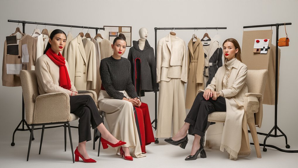
7 Designers Who Swear by the “One Red Element” Rule
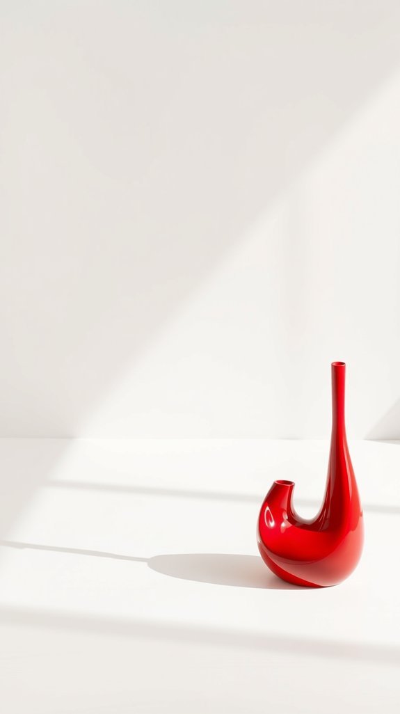
Red’s the secret weapon you’re missing 🎨 You’ve probably felt it—that “something’s off” vibe in a room that’s otherwise perfect. Seven designers, including Kelly Wearstler and Bobby Berk, cracked the code with one bold move: a single red element—perhaps a vintage Barcelona chair, a lacquered Chinese export cabinet, or even a simple glazed ceramic vase—that transforms everything. It’s not complicated. It’s not expensive. But here’s the thing—most people get it totally wrong by scattering crimson everywhere or choosing fire-engine tones that fight their palette. Want to know how they’re doing it differently, using specific undertones like rust, oxblood, or persimmon instead?
The “One Red Element” Rule: Why It Works and When to Use It

From barely-there blush to full oxblood, choosing the right red paint shade depends on your desired effect and the room’s natural light.
Kelly Wearstler’s Red Signature: Consistency Across Collections
How’s Kelly Wearstler doing it? 🤔 The Los Angeles-based interior designer and founder of Kelly Wearstler Studio is basically the red-element guru who proves consistency isn’t boring—it’s iconic!
One Red Elements Across Everything 🎨
From Kelly Wearstler furniture to her wallpaper collections and decorative objects, she drops red into every collection. Same vibe. Different pieces. That’s the magic!
Color Consistency = Your Brand ✨
You pick your red—the specific shade that becomes your signature. Stick with it across textiles, lighting, and ceramic vessels. Suddenly you’re recognizable. People know your aesthetic! When you balance red with neutrals like white and black in the right ratios, your bold accent becomes a sophisticated signature rather than visual chaos.
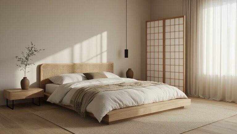
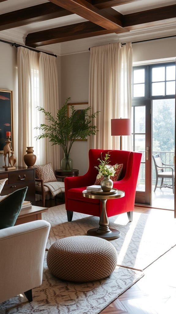
Nate Berkus Proves Red Transforms Neutral Spaces
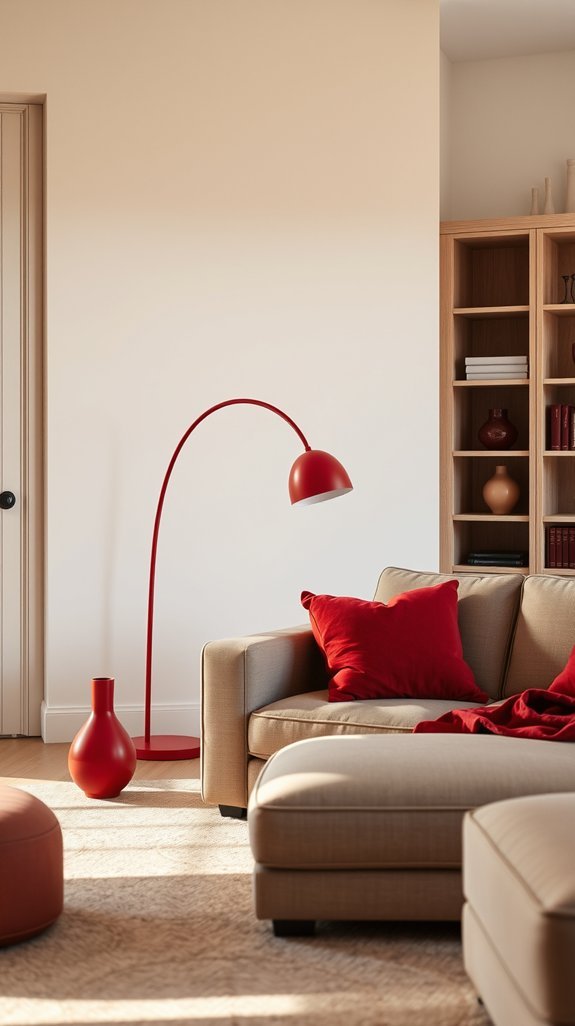
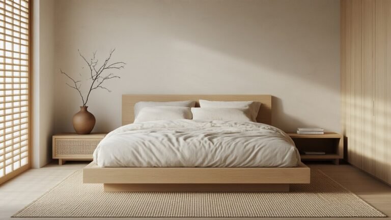
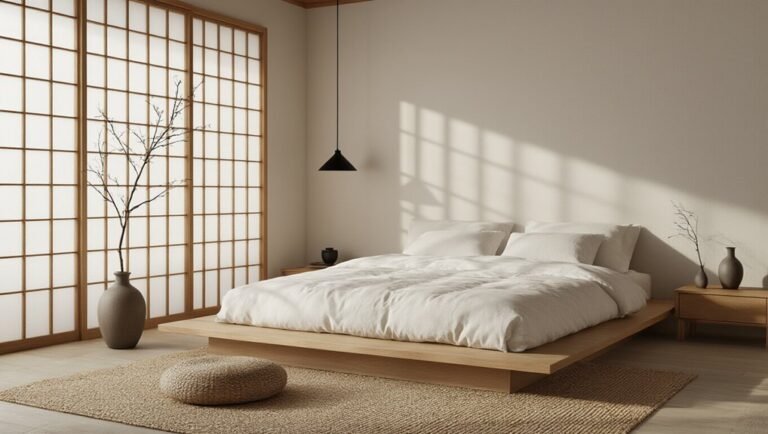
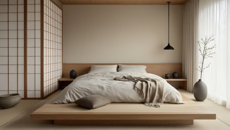
What happens when you add red to beige-on-beige-on-beige? 🔴 Nate Berkus, the design wizard behind some of the most jaw-dropping neutral spaces for stars like Oprah Winfrey, swears that one strategic red element transforms everything. You’re literally injecting life into your room’s vibe. A pillow. A vintage kilim. An accent wall. Literally anything crimson, burgundy, or scarlet works. Your neutral palette of oat, greige, and warm white suddenly feels intentional. Not boring. That’s the magic happening here. ✨ For those ready to commit bolder, matte black metal bedframes create the perfect modern anchor against red bedroom walls, sharpening the entire aesthetic with striking contrast.
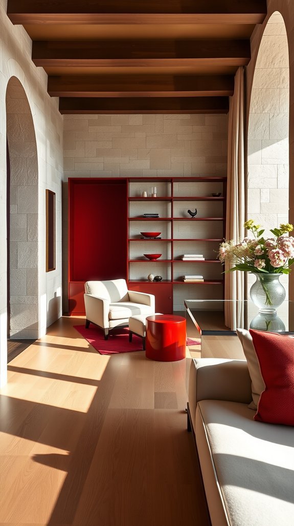
Studiomama’s Minimalist Red Philosophy
Sometimes less really is more. 🎨 The London-based design studio Studiomama takes the red element thing and strips it down to its essence. Their color theory approach? Totally chill. You pick one strategic red piece—perhaps a 1970s Ryd chair or a vintage Anglepoise lamp. Everything else stays neutral and clean, with untreated timber and soft whites. It’s the subtopic misfit move that actually works. Why overcomplicate your space? One bold accent. Done. Your minimalist vibe, championed by founder Nina Tolstrup, stays intact! 🔴
Justina Blakeney’s Bold Red in Eclectic Interiors
While Studiomama’s one-red-piece strategy keeps things zen and restrained, Los Angeles-based designer Justina Blakeney—founder of Jungalow and author of *The New Bohemians*—gonna flip that script entirely. 🌶 She’s all about layering bold red into spaces that already pop with color and pattern, picking up inspiration from her travels to Morocco, Mexico, and beyond. You’re mixing vintage rugs from her Etsy shop, botanical prints, macramé wall hangings, and that bold color together to create an eclectic vibe that feels intentional. She proves you don’t need minimalism to make red work—whether it’s a lacquered credenza, a vintage Persian rug, or a cluster of ceramic vessels in her signature style. Blakeney demonstrates that even in maximalist spaces, red as the main color can be successfully balanced with warm neutrals and crisp whites to prevent visual overwhelm. Your space can be chaotic and cohesive simultaneously. That’s the Jungalow magic!
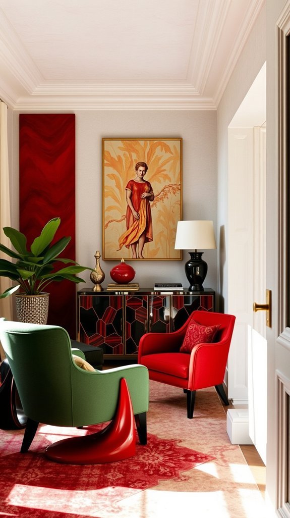
Roman and Williams Use Red to Anchor Luxury Homes
Roman and Williams totally get it. The New York-based design studio anchors luxury homes with strategic red architecture. Think bold statement walls in SoHo penthouses or premium branding through accessories like their custom leather goods. You’re not going overboard here. One perfectly placed red element—whether it’s a vintage Moroccan rug or a lacquered door—makes everything else pop. It’s that designer secret Stephen Alesch and Robin Standefer use that screams “I know what I’m doing.” Drawing from centuries of tradition, Persian rug patterns offer another sophisticated way to introduce that singular red moment while adding layers of history and visual complexity to a space.
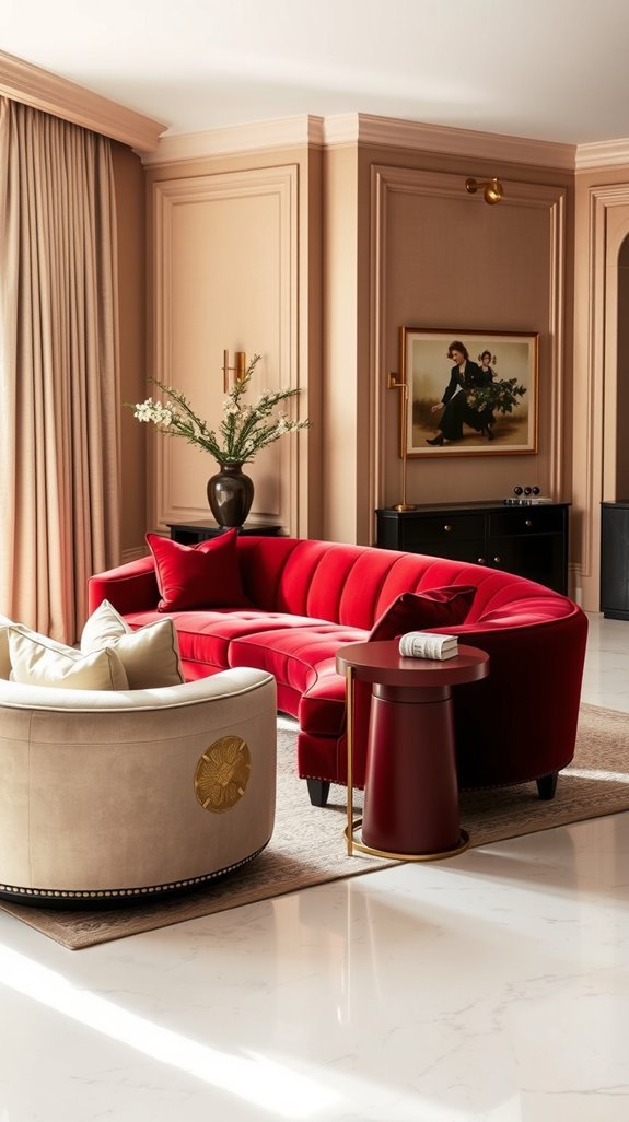
India Mahdavi’s Red Across Residential and Retail
India Mahdavi takes the one red element rule and absolutely runs with it. 🎨 She’s not just decorating homes—she’s creating whole worlds where red becomes the language itself. From her residential projects to retail spaces like her iconic Hotel Victoire or the Ladurée boutiques, India Mahdavi red across everything hits different. She layers crimson, vermillion, and burgundy strategically through curved velvet furniture, lacquered surfaces, and dramatic accent walls. Your space transforms into something bold and cohesive. That’s the residential retail magic she brings. 🔴 The angular geometric decor reinforces this bold energy without ever competing with her signature saturated color palette.