10 Burgundy Bedroom Ideas That Feel Like a Five-Star Hotel
Ever painted a room thinking you’d created something magical, only to feel like you’re living in a cave by week two? Burgundy bedrooms walk that tightrope constantly. Go too bold on every wall and you lose the cozy-luxe magic. The trick is restraint with impact.
Here’s the winning formula: treat burgundy as your statement, not your foundation. One velvet headboard wall. Brass accents that catch the light. Cream layers that keep the space breathing. Test your swatches twice—morning sun turns burgundy warm and rich, while evening lamps shift it moody and deep.
This approach saves you from expensive do-overs and gives you that five-star hotel feeling without the $400/night price tag. Actually usable. Genuinely stunning. The kind of bedroom that makes you pause in the doorway when the light hits just right.
Your wine-colored sanctuary is closer than you think. Ready to see how it’s done?
Start With Burgundy: Accent Wall or Whole Room?
You Want Bold. You’re Scared of Bold. We Get It.
Burgundy walls feel like a *commitment*. Like showing up to brunch in red lipstick and everyone’s staring. But here’s the thing—that bed wall is begging for drama. Start there. Paint just that one surface and wake up in what suddenly feels like a boutique hotel room you actually own.
Testing the vibe first isn’t playing it safe. It’s *smart* safe. You get the cozy, wrapped-in-velvet energy without the “did I just paint a cave?” panic. And if you love it? Go ahead. Do the whole room. Live your fancy life.
You get all the wrapped-in-velvet energy without the “did I just paint a cave?” panic.
- Test on your bed wall first—biggest visual impact, easiest to reverse
- Check the color morning, noon, and night—burgundy shifts with light
- Pair with warm metallics or creamy whites—instant luxe, zero stuffiness
- Love it? Commit. Full rooms feel enveloping, not overwhelming
Still debating? Your next read breaks down exactly how to build around that burgundy without buying all new furniture.
Paint Ceilings and Trim in Warm, Layered Tones
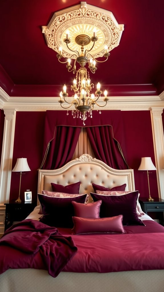
You stare at your walls and they stare back—bland, safe, forgettable. But ceilings? Trim? These forgotten surfaces are secretly your best shot at that designer look you’ve been pinning for months. Most people slap white everywhere and call it done. That’s the design equivalent of wearing socks with sandals: technically fine, but why settle?
Here’s the thing: painting your ceiling in creamy beige or soft terracotta creates instant warmth that wall color alone can’t touch. It’s like adding a filter to your real life. Your trim then becomes the quiet hero—think caramel, toasted almond, tones that whisper instead of compete. The magic happens in the layers. Burgundy furniture suddenly pops. The whole room feels expensive without the price tag.
Clear Takeaways:
- Paint ceilings in warm tones (creamy beige, soft terracotta) to add depth most rooms lack
- Choose trim colors 1-2 shades deeper than your ceiling for subtle contrast
- Mix neutrals intentionally—don’t match trim to walls or ceiling exactly
- Add one bold accent color (burgundy, navy, olive) against the warm base
- Test samples in morning and evening light before committing
Ready to look up and actually love what you see?
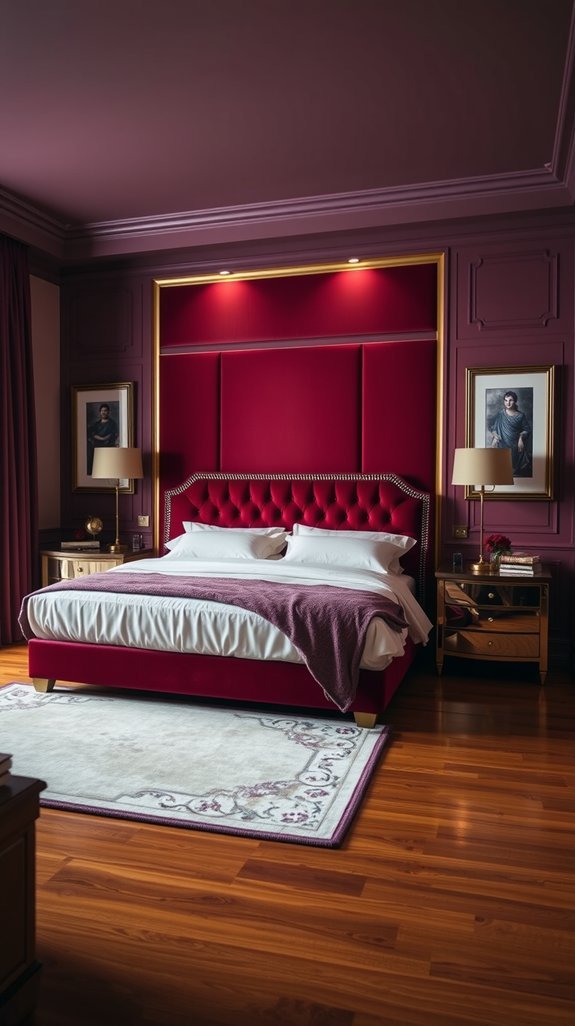
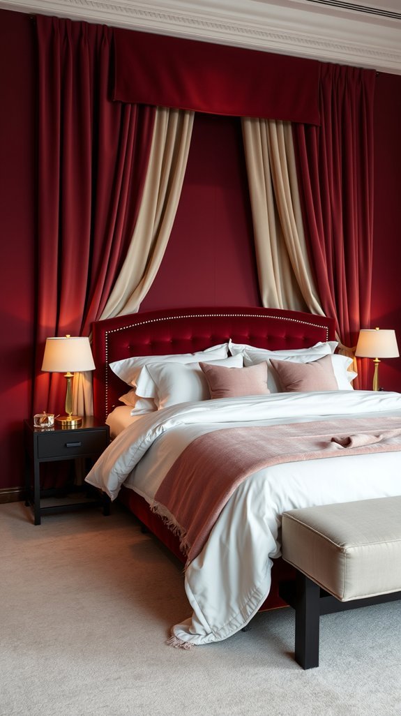
Choose a Statement Velvet Headboard in Deep Wine
You want that hotel-suite glow, but your bedroom still looks like a “before” photo. Same. We scroll past velvet headboards on Instagram for *years*, assuming they’re either too pricey or too high-maintenance for real life. Plot twist: they’re neither.
A deep wine velvet headboard hits that sweet spot—rich enough to feel indulgent, durable enough to survive morning coffee in bed. (And yes, it hides stains better than you’d hope.)
Quick Wins You Can Use Now:
- Pair wine velvet with warm neutrals—cream, camel, or soft gray keep it grounded
- Add brass or matte black accents for instant sophistication
- Fluff regularly; velvet bounces back with a quick brush
This is the upgrade that makes you smile when you walk in. Ready to see how it all comes together?
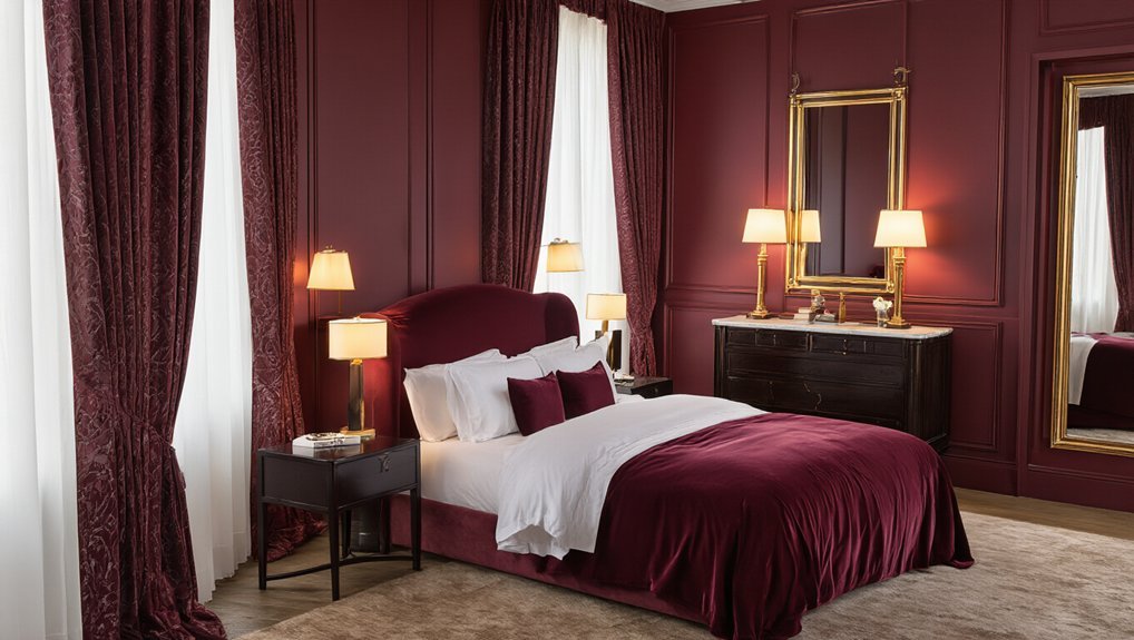
Brighten Deep Burgundy With Brass and Gold Accents
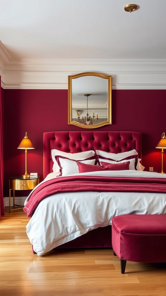
Deep burgundy walls can feel like a gorgeous mistake—dramatic, yes, but suddenly your living room’s eating all the light and moodiness is tipping into cave territory. We’ve all stood in that space wondering if we painted ourselves into a decorating problem we actually have to live with.
Here’s the fix that doesn’t involve repainting: brass and gold accents. These warm metallics catch and bounce light beautifully, turning that same moody wall into a rich, layered backdrop that feels intentional, not accidental.
The best part? This isn’t a full redesign. A few strategic swaps transform the entire room—and you’ll use these pieces forever. Ready to turn your dark drama into something that actually glows? Let’s break it down.
Clear Takeaways:
- Replace basic hardware (knobs, pulls, hooks) with brass finishes—small change, big impact
- Hang one gold-framed mirror opposite or near your window to maximize natural light
- Pair warm metallics with velvet textures in pillows or curtains for instant depth
- Keep your contrast palette simple: burgundy + brass + one neutral like cream or warm white
- Shop vintage brass for budget-friendly pieces with more character than big-box options
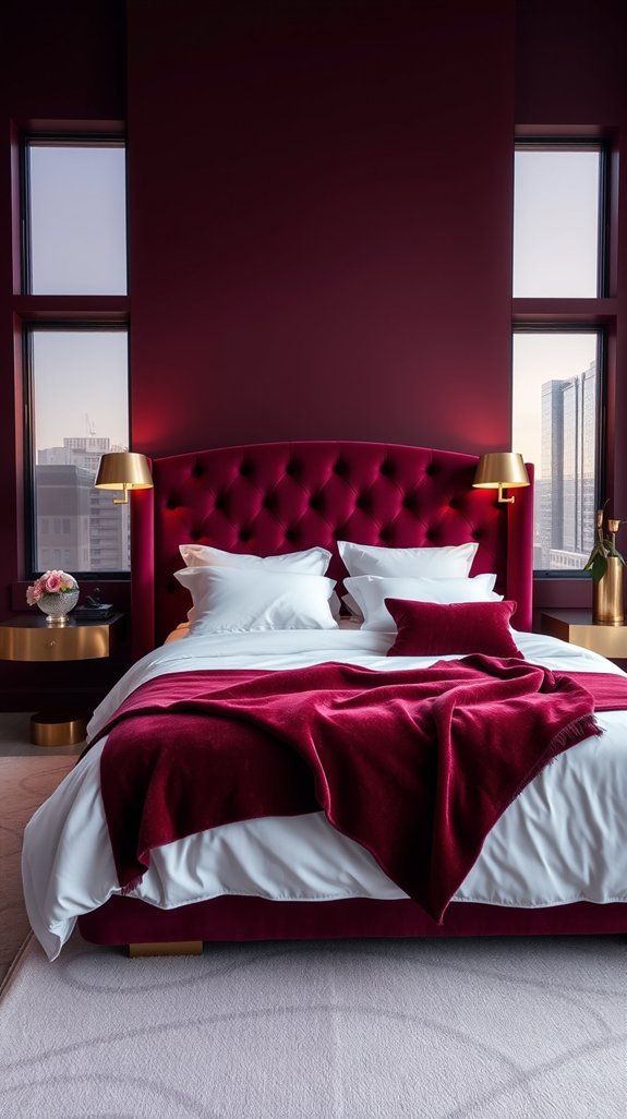
Install Dimmable Sconces for Hotel-Style Ambiance
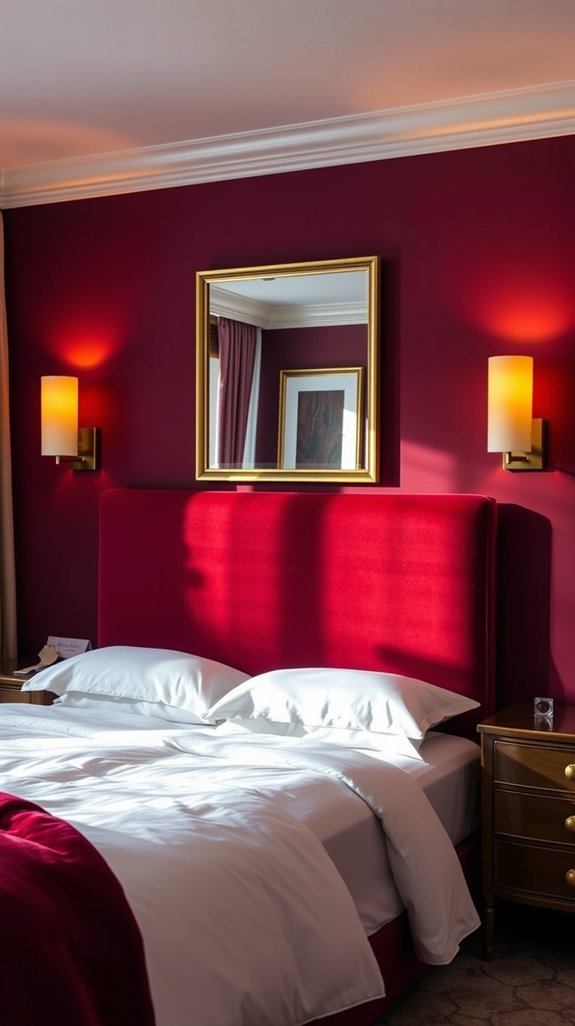
You know that moment when you walk into a hotel room and everything just feels *right*? The lights are soft. The walls look expensive. You immediately want to take a photo you’ll never delete. Then you get home, flip your bedroom switch, and—harsh overhead lighting. Mood: instantly killed.
The secret isn’t a bigger budget. It’s smarter lighting. Dimensional wall sconces with dimmers give you that same polished, layered glow without rewiring your entire life. They’re the design hack that looks fancy but actually solves real problems—like reading without blinding your partner or making your paint color finally look the way it did on the swatch.
Best part? You control the vibe. Movie night, morning coffee, midnight scrolling—one fixture handles it all.
What to do today:
- Measure 48–60 inches from the floor for sconce height (about shoulder level when you’re in bed)
- Pick dimmable LED bulbs in warm white (2700K) for that golden-hour glow
- Install on both sides of the bed for balanced, shadow-free light
- Choose swing-arm styles if you actually read in bed
- Test your wall paint at 20% brightness—colors transform completely
Ready to trick your brain into thinking you upgraded everything?
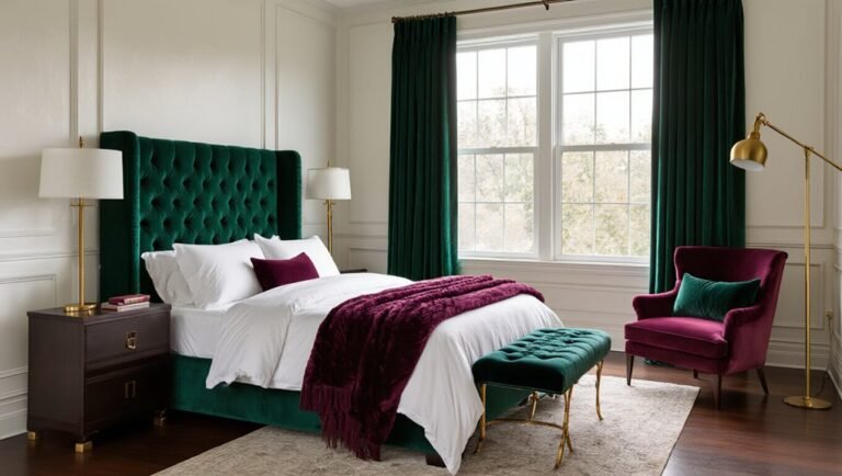
Anchor Bold Color With Dark Wood Furniture
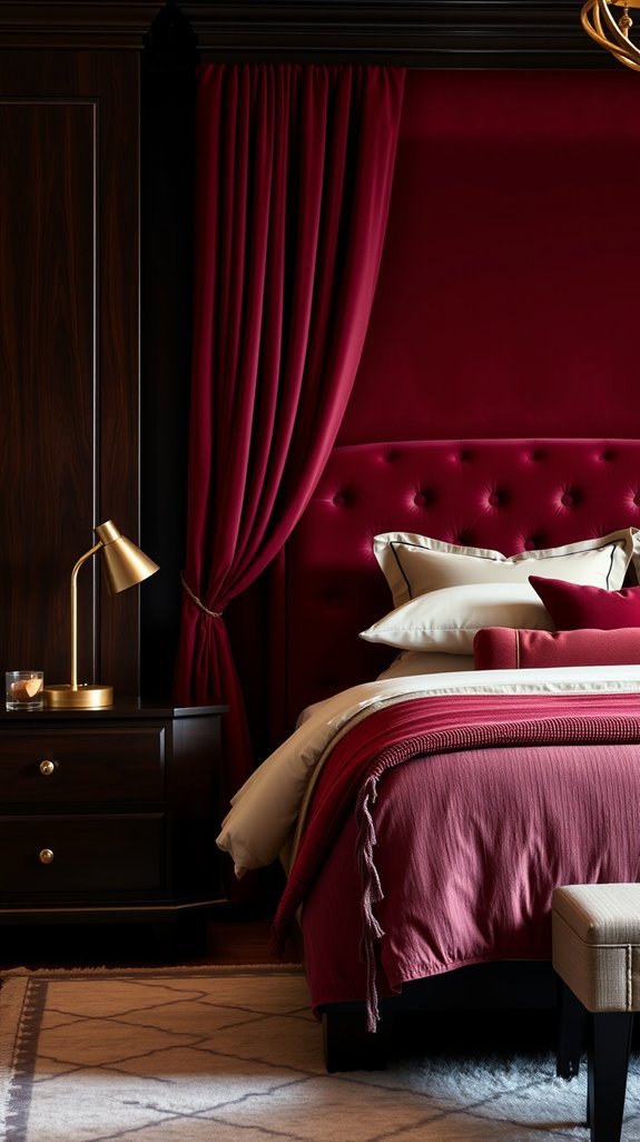
You picked the perfect paint. That rich, moody color looks *chef’s kiss* in the can. Then you roll it onto your walls and… something feels off. The color’s floating. Disjointed. Like it’s dressed up for a party but the furniture showed up in gym shorts.
The problem isn’t your taste—it’s your anchors. Bold color needs something heavy to grab onto, or your room feels like it’s spinning. Enter dark wood furniture: the design equivalent of a firm handshake. Walnut. Espresso. Deep mahogany. These pieces don’t just hold your lamps—they hold the whole room together.
Bold color needs something heavy to grab onto, or your room feels like it’s spinning.
Here’s what actually works:
- Choose furniture 2–3 shades darker than your floor for clear contrast without clash
- Let the grain show—skip painted finishes that compete with your wall color
- Prioritize pieces with visual weight: thick legs, solid bases, substantial hardware
- Match wood tones across at least 3 pieces (bed frame + nightstands + dresser) for intentional flow
- Test in your actual light—bring swatches home; that “espresso” can read orange or purple
The payoff? Your bold color finally makes sense. The room feels settled, expensive, and completely intentional. No more design whiplash when you walk through the door.
Ready to see which wood tones love your walls back?
Mix Silk, Linen, and Wool for Tactile Depth
Ever feel like your outfit or space looks “fine” but still falls flat? That flatness usually comes from one missing ingredient: texture. Smooth-on-smooth might photograph well, but it lacks the soulful depth your hands and eyes actually crave.
Here’s the fix you can use today—mix silk, linen, and wool** in one look or room. Start with your base (that burgundy piece you’ve been eyeing works perfectly). Layer silk** against your skin or shoulders for that luxe, liquid feel. Add linen where you want relaxed, lived-in structure—those natural crinkles hide wrinkles and add instant character. Top it with wool for coziness and visual weight.
- Silk first for comfort and subtle shine
- Linen second for breathability and casual structure
- Wool last for warmth and rich contrast
Mixing textures means you’re never boring, never overdone. Each material does its job while playing nicely together. Plus, this trio works across seasons—swap the wool weight, keep the formula.
Ready to turn heads and actually enjoy how things *feel*? Your next layer is waiting.
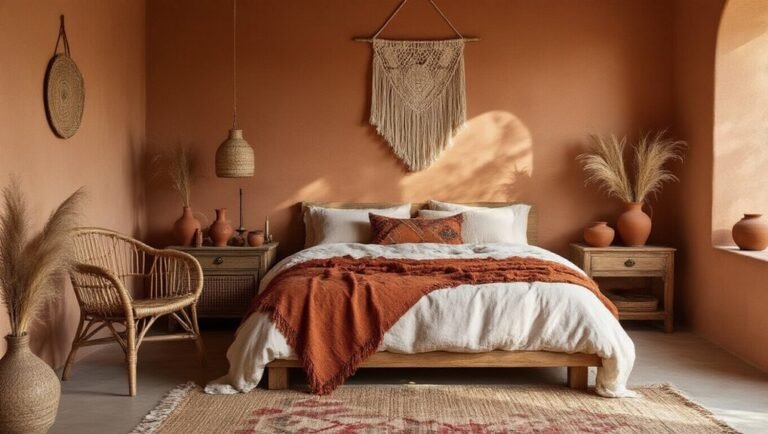
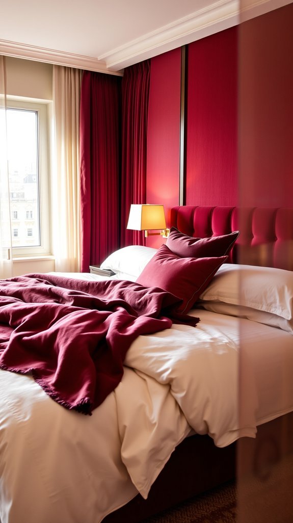
Soften Burgundy Walls With Cream and Blush Textiles
Burgundy walls felt like such a bold choice—until you realized your bedroom now resembles a medieval tavern at 2 p.m. That dramatic color you loved in the store? It’s swallowing your space whole, and suddenly you’re wondering if repainting counts as cardio.
Deep breath. You don’t need a paintbrush. You need pillows.
Cream and blush textiles are the secret to taming those wine-colored walls without losing their soul. Think of them as the diplomatic translators between “look at me” walls and “actually livable” comfort. The result feels expensive, curated, and weirdly like your favorite boutique hotel—minus the $18 minibar nuts you’ll never eat.
This isn’t about covering up your bold choice. It’s about letting it shine without letting it overwhelm. And the best part? These layers work in every season, through every trend cycle.
Ready to turn that dramatic gamble into your favorite room? Here’s exactly how to soften those walls without softening their impact:
- Drape a chunky cream knit throw across your bed or sofa—that texture absorbs visual weight instantly
- Add blush velvet or linen pillows in varying sizes; aim for 2-3 per seating area
- Choose curtains 1-2 shades lighter than your walls with subtle texture (linen, not flat cotton)
- Layer a natural fiber rug (jute or wool in cream) to ground the space
- Incorporate one metallic accent—brass or champagne—to bridge warm and cool tones
Start with the throw. Everything else builds from there. ✨
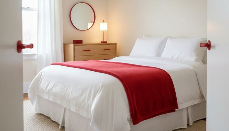
Dress the Bed in Luxury Hotel-Grade Linens
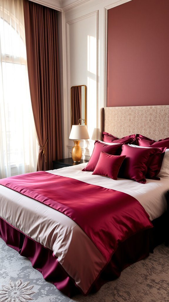
We’ve all woken up tangled in cheap sheets, wondering why hotel beds feel like clouds and ours feel like a laundromat afterthought. The secret isn’t magic—it’s intentional layering and quality basics that work harder while you sleep.
Quick Wins for Your Dream Bed:
- Swap in percale for crisp, cool comfort or sateen for silky warmth—choose your adventure
- Treat your duvet like a design moment: fold it back, fluff it up, make it picture-worthy
- Use creamy neutrals against bold walls (hello, burgundy) for instant sophistication
- Invest once, sleep better for years—good linens actually get softer with washing
Your bedroom should feel like a retreat, not an afterthought. Ready to build a bed you’ll actually want to crawl into?
Anchor the Space With a Plush, Room-Sized Area Rug
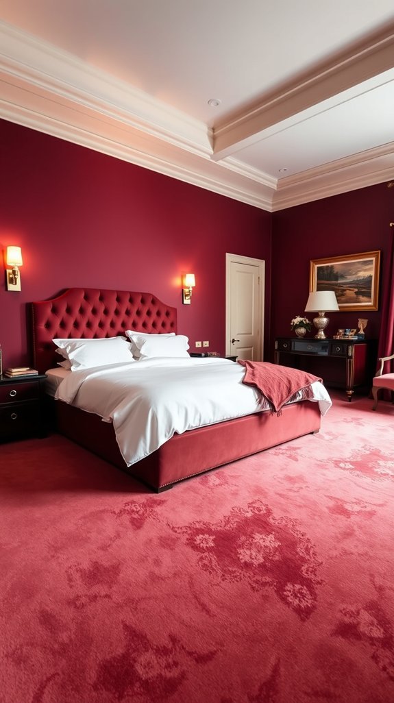
Your bedroom floor feels cold and uninspired, doesn’t it? You’ve got the cozy bedding, the dim lighting, but something still feels… off. That sad little throw rug by the door isn’t doing you any favors.
Here’s the fix: one plush, room-sized area rug that changes everything.
What to look for:
- Go big or go home. Skip the dinky mats. A true room-sized rug anchors your space and feels instantly grown-up.
- Pile on the plush. Thick, sink-your-toes-in texture at 2 AM? Non-negotiable.
- Embrace deep tones. Burgundy and wine shades ground the room and flip your “chill apartment” into “suite life” energy.
- Layer it right. Let your bed legs rest on top—you’re literally walking on clouds now.
- Think hotel, but yours. That elevated, pulled-together look you crave starts from the floor up.
Ready to find the rug that pulls it all together? Your feet (and your midnight bathroom trips) will thank you.
Conclusion
You want a bedroom that feels expensive. But your budget says “discount sheets and hope for the best.”
Here’s the truth: luxury isn’t about spending big. It’s about spending *smart*.
Burgundy done right transforms any room from “where did I sleep last night” to “yes, this is my five-star suite.” This rich, moody color hides clutter, photographs beautifully, and somehow makes IKEA furniture look intentional.
Best part? You don’t need a full renovation to get there. A single burgundy wall works magic. Add some brass accents and linen that doesn’t feel like sandpaper, and suddenly you’re the person who has their life together.
Small changes. Big payoff. Your bedroom becomes the escape you actually want to come home to.
Ready to steal some hotel secrets? These 10 ideas prove you don’t need a concierge to live like you have one.
—
Quick wins you can try today:
- Test burgundy with one accent wall first—light changes everything
- Mix velvet, linen, and brass for instant depth
- Upgrade your sheets (your skin will thank you)
- Keep it personal, not perfect—this is your space, not a showroom