How to Style a Monochromatic Room Using Only Shades of Blue
You fell in love with every shade of blue at the paint store, but now your living room feels more “sad ocean” than “serene retreat.” That cornflower sofa clashes with your navy walls, and somehow everything looks muddy instead of magical. Here’s the thing: monochromatic rooms fail when color is the only tool you’re using.
The secret isn’t buying more pillows—it’s learning how light hits texture, why proportion matters more than palette, and where to place that single shock of contrast. Once you crack this code, you’ll never fear bold color again. Your space becomes easier to decorate, easier to live in, and honestly? More impressive than rooms stuffed with competing trends.
Ready to turn your blue period into a masterpiece?
Key Takeaways
You’ve stared at a thousand Pinterest boards, collected blue paint chips until your wallet bulged, and still your living room feels more “sad aquarium” than “serene sanctuary.” Choosing one color shouldn’t feel this hard, right?
Here’s the secret: monochromatic blue rooms aren’t about collecting every shade from navy to robin’s egg and hoping they get along. They’re about committing to one anchor blue and letting everything else whisper or shout in response.
Think of it like building a wardrobe around your favorite jeans—familiar, flexible, and impossible to mess up. When done right, a single-color scheme actually simplifies decisions and creates a space that ages gracefully without constant redecorating.
Ready to turn your blue period into your best work? These five designer-tested strategies make one-color living feel anything but one-note.
Pick Your Monochromatic Blue Base
You’ve stared at paint chips until your eyes crossed. Is it coastal blue? Navy? Something with a hint of gray? Suddenly every shade looks identical, and your dream room feels impossible.
Here’s the secret: start with just *one* perfect blue, then build everything around it.
I learned this after repainting my bedroom twice—turns out “soft blue” can look like a hospital hallway under the wrong light. The fix is embarrassingly simple. Grab actual fabric swatches, not memories of them, and test them together in morning sunlight. Your eye knows when it clicks; you just have to give it time to speak up.
The payoff? A space that feels intentional, never boring, and weirdly calming after stressful days. No more second-guessing every decor decision. One solid anchor color does the heavy lifting for years.
Ready to find the blue that actually works? These ideas will get you started.
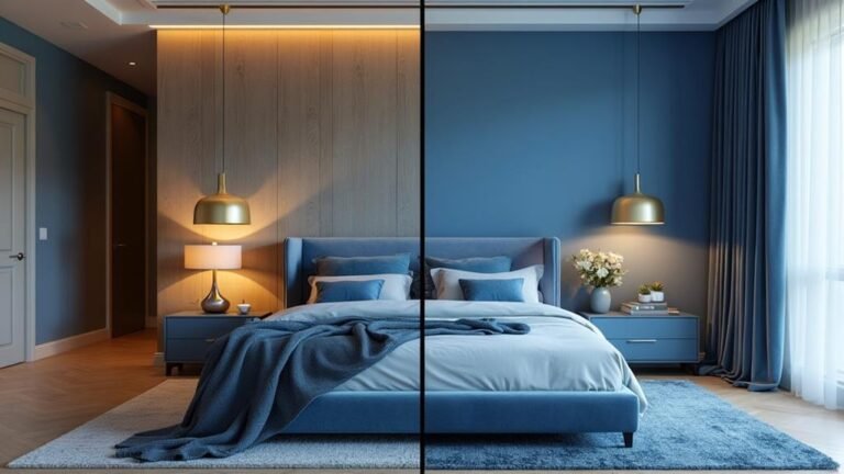
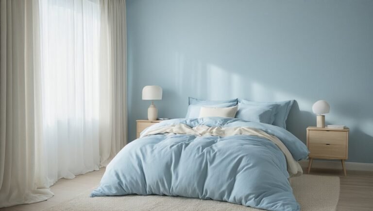
Match Your Blues to Room Light Exposure
You fell in love with that perfect navy blue paint swatch—until you brushed it on your bedroom wall and suddenly felt like you were living in a cave. We’ve all been there. Choosing blue for your space isn’t just about picking a pretty color; it’s about understanding your room’s relationship with light.
The fix is simpler than you think. North-facing room? Reach for airy sky blues and soft ices that grab every stray ray and reflect it around the room. South-facing sun magnet? That’s your permission slip to go bold with saturated teals and deep navies that would overwhelm anywhere else.
Here’s the thing paint chips won’t tell you: the same blue can feel magical at 9 a.m. and moody by 5 p.m. Getting this right means no repainting regrets and a space that actually feels like *you* intended every hour of the day.
Ready to find your perfect blue match? We’ve got the shades that work for whatever light you’re working with.
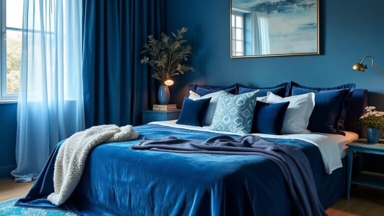
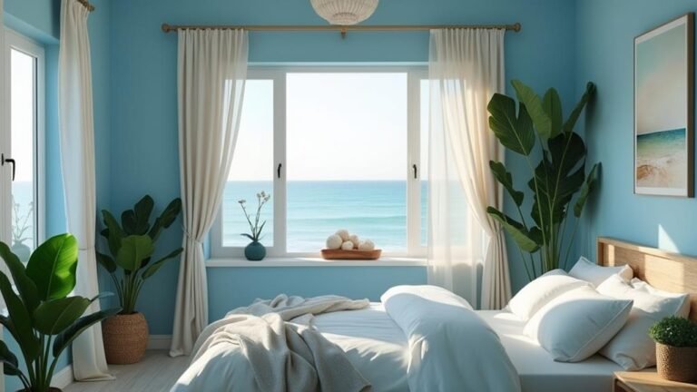
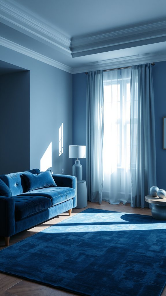
Build Gradients From Light to Dark
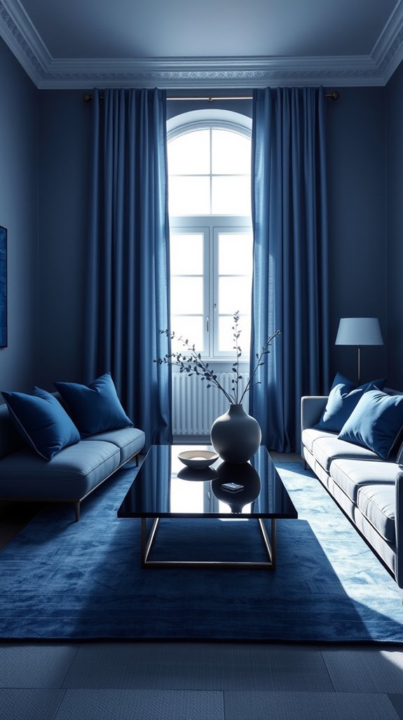
Ever feel like your room falls flat no matter how much blue you throw at it? You’re not alone. A single shade of paint can feel safe, sure—but it often ends up looking more “rental beige” than “designed sanctuary.”
Here’s the fix nobody tells you: stop choosing *one* color and start building a journey instead. Think pale morning sky by your windows, rich navy tucked into corners, and midnight accents that ground the whole space. It’s like giving your walls dimension without abandoning your color commitment entirely.
The secret weapon? A fabric swatch and a decent light bulb. Test everything before you commit, and let shadows do the heavy lifting. No fancy architecture required—just smart, layered color that works harder so you don’t have to. Ready to see how this actually comes together?
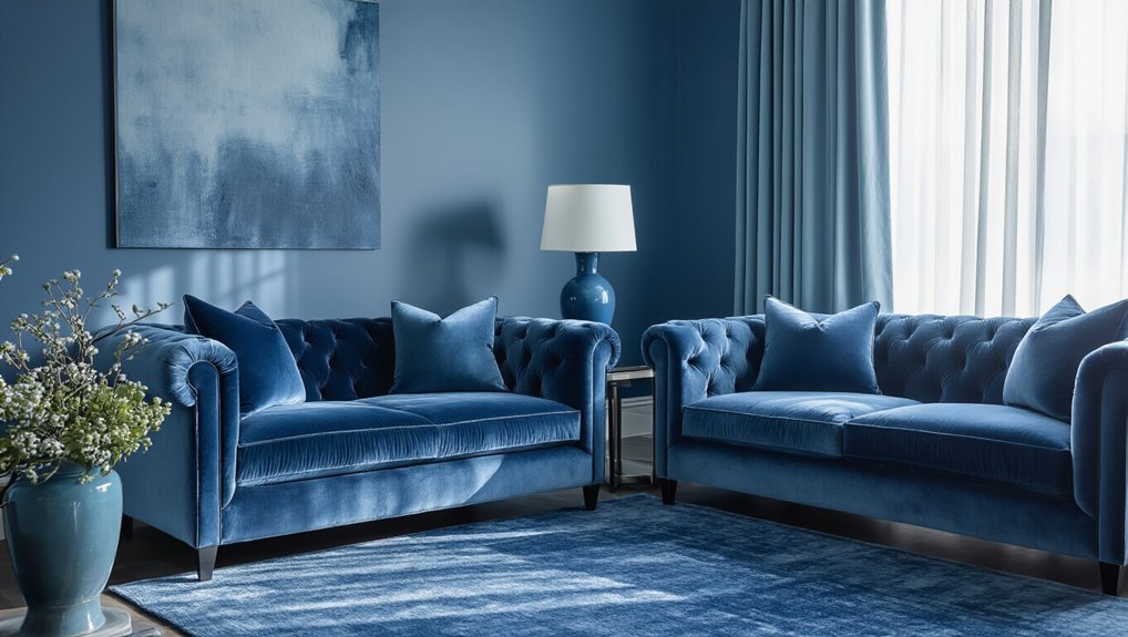
Mix Matte, Gloss, and Texture Finishes
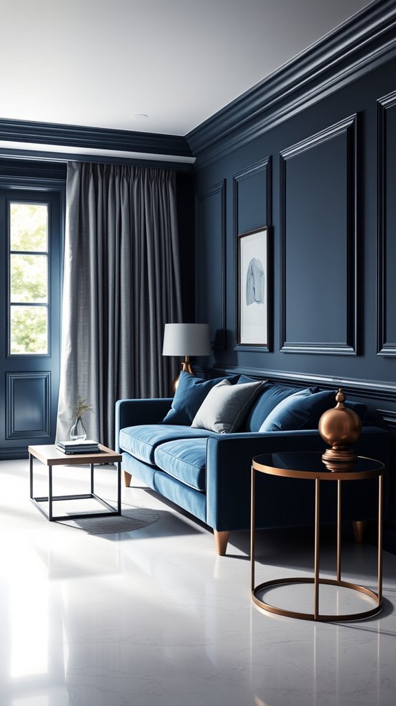
You picked the perfect blue. But now your room feels a little… flat? Like it’s missing that spark that makes you want to reach out and touch something?
Here’s the secret nobody tells you: it’s not about finding *more* blues. It’s about how you make them *feel*.
Think of it like getting dressed. You wouldn’t wear head-to-toe silk—or head-to-toe denim. Same rule applies to your walls. Pair soft, matte finishes on upholstery and paint with glossy ceramics or lacquered furniture that catches the light just so. Suddenly your space has depth, dimension, and that expensive-looking layered quality.
The best part? This trick ages beautifully. No trendy colors to tire of, no redecorating every few years. Just timeless texture that keeps your blue feeling fresh and intentional.
Ready to see how three simple finishes can transform your whole room?
Layer in Tone-on-Tone Patterns and Weaves
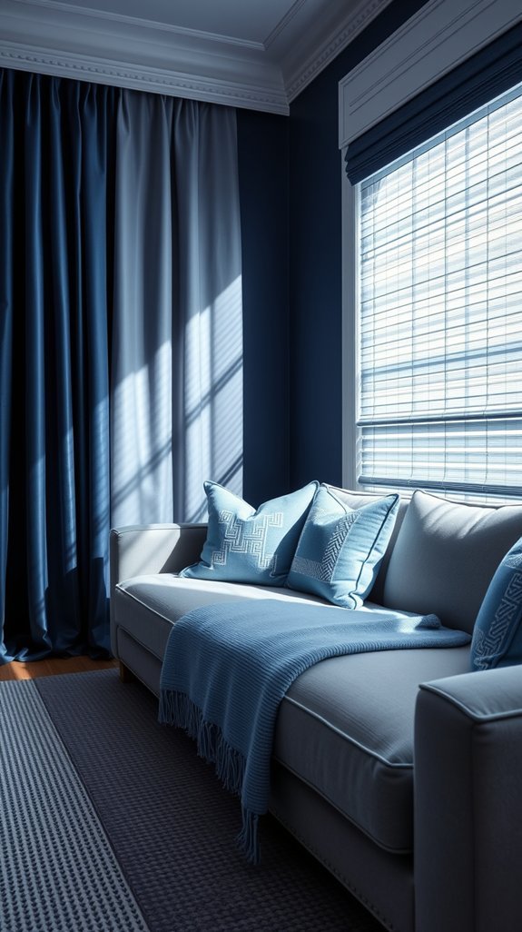
Have you ever stood in a perfectly painted blue room and felt like something was missing? That flat, one-note feeling—like walking into a paint swatch instead of a lived-in space—is the downside of playing it too safe with color.
The secret isn’t adding more colors. It’s adding more *story*.
Layering patterns and weaves in the same blue family transforms your space from “nice enough” to quietly captivating. Think navy herringbone throws tossed across sky-blue cushions, or a nubby denim ottoman catching the light beside velvet drapes. Same color, completely different personalities.
The beauty? This approach never goes stale. Trends come and go, but tonal depth—built through texture—keeps rooms feeling fresh and intentional year after year. Plus, everything still matches when you’re ready to swap in that vintage find from the flea market.
Ready to make your blue room finally feel like *you*?
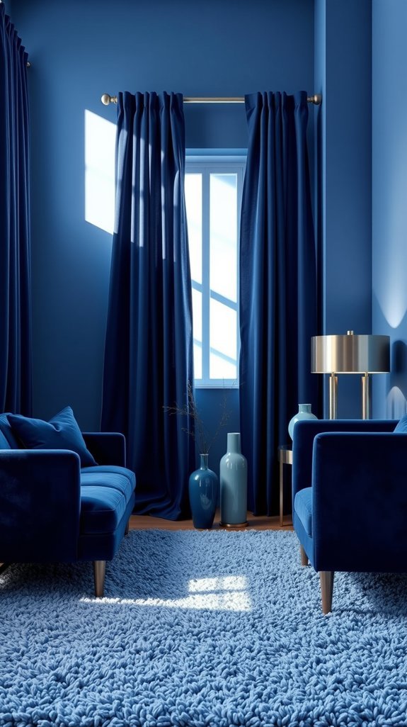
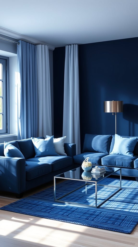
Apply the 60-30-10 Rule for Balance
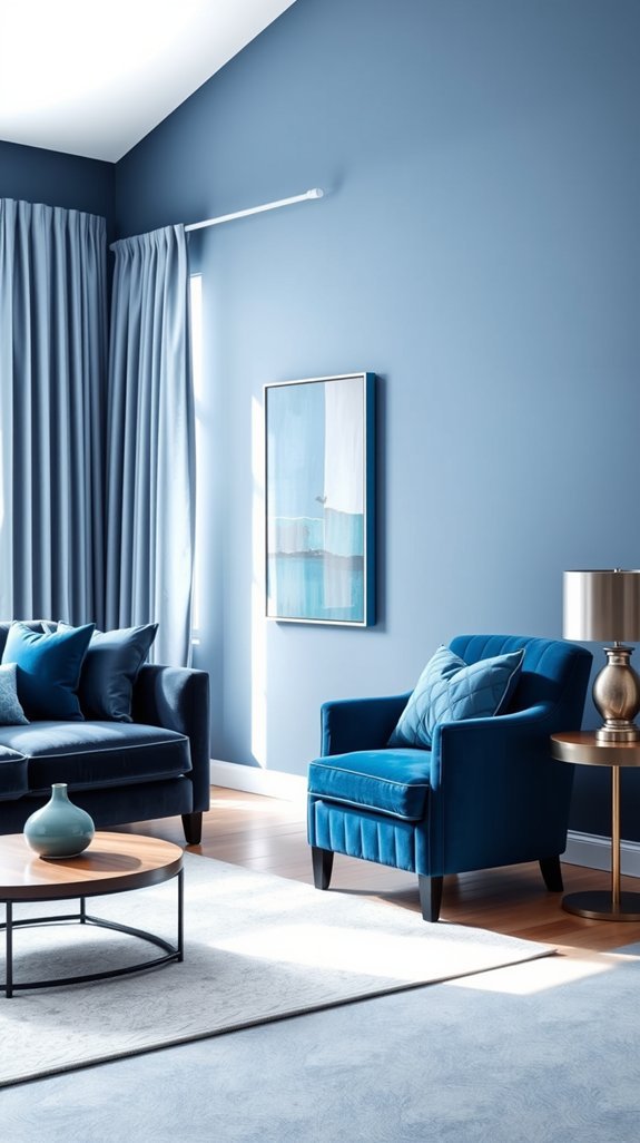
You walk into a furniture store and suddenly every sofa is navy, every rug is teal, and somehow you’ve fallen down a blue rabbit hole you can’t escape. Sound familiar? Working with one color can feel like trying to whisper and shout at the same time—how do you keep it interesting without turning your living room into a swimming pool?
Here’s the secret weapon designers actually use: the 60-30-10 rule. Think of it as a recipe where sixty percent anchors your space in a deep, grounding blue, thirty percent adds that lived-in denim energy, and ten percent delivers the surprise pop that makes people ask where you got that throw pillow. No more guesswork, no more “does this match?” spirals.
Best part? Once you nail these proportions, your space basically styles itself. Ready to see how this actually plays out in real rooms?
Fix Flat or Boring Monochrome Effects
You nailed the layout. The furniture’s perfect. But something still feels… flat, like a hotel lobby that never quite gets comfortable. Sound familiar?
Here’s the thing: color isn’t just about what you pick—it’s about how you layer it. Sticking to one tone in one finish kills the vibe faster than bad lighting. The fix? Texture. Think velvet catching morning light, rough linen beside smooth ceramic, a hit of brass or raw wood against matte walls. Same palette, totally different energy.
Best part? This isn’t a costly overhaul. You’re working with what you’ve already got, just smarter. No repainting, no regret. Just rooms that finally breathe and feel lived-in, not looked-at.
Ready to make your monochrome actually *work*? These ideas will get you there.
Conclusion
You walk into your living room and feel… nothing. Same beige walls, same tired decor, same nagging sense that your space looks like everyone else’s rental. We’ve all been there—wanting a stunning room but terrified of picking the “wrong” color or creating a chaotic mess.
Here’s the secret nobody tells you: one color, done right, beats a rainbow of mistakes every time. A blue monochromatic room sounds bold, but it’s actually one of the safest ways to look like you hired a designer (without the designer price tag). The magic happens in the layering—deep navy anchoring your sofa, soft sky blue on the walls, dusty textures catching afternoon light. It’s cohesive without being boring, calm without being cold. Plus, blue plays well with every season and never fights your furniture. Ready to find your perfect shade? Your walls are waiting.