How to Design a Moody Peacock Blue Bathroom With Jewel Tones
Ever stood in front of a paint swatch, paralyzed by the jump from “safe beige” to “what was I thinking”? Going bold with peacock blue in your bathroom can feel like that — exciting one minute, terrifying the next.
Here’s the thing: jewel tones don’t have to overwhelm. Peacock blue actually plays beautifully with light when you give it room to breathe. Think luxury hotel spa meets your favorite moody novel — dramatic yet somehow calming.
The secret isn’t buying every matching accessory. It’s restraint. One knockout wall. A vintage brass mirror that catches the light. A few carefully chosen moments of emerald or amethyst that make the blue sing without screaming.
Get it right, and your bathroom becomes the place where you actually want to linger — morning coffee, evening wind-down, or that five-minute sanctuary from household chaos.
Ready to turn your bathroom into something unforgettable?
Key Takeaways
We’ve all stared at a bathroom that feels more blah than spa—wondering why something so essential for daily routines feels so forgettable. A total overhaul sounds exhausting (and expensive), but here’s the secret: you don’t need demo day to create drama.
Enter peacock blue, that gloriously moody shade that turns an ordinary bathroom into a jewel-box retreat. It’s bold without being bossy, sophisticated without feeling stuffy. The best part? It actually hides water spots better than white ever did, and it ages beautifully as trends come and go.
Jewel tones paired with smart lighting and textured finishes give you a space that shifts from morning energizer to evening escape. Ready to see how a little color courage transforms your most-used room?
Pick Your Surfaces: Walls, Tile, Vanity, or Just Accents
Staring at a blank bathroom or kitchen, wondering how to make it feel like *you* without going overboard? We’ve all been there—paralyzed by paint swatches, second-guessing every bold choice before it even hits the wall.
Here’s the thing about peacock blue: you don’t have to dive in headfirst. This rich, jewel-toned shade meets you exactly where your comfort level is. Commit fully with saturated walls that feel like a hug every morning. Prefer to test the waters? A glossy subway tile backsplash catches light beautifully without overwhelming the room. Even a painted vanity or a few carefully chosen towels can shift the entire mood.
The best part? Peacock blue ages gracefully. Unlike trendier shades that feel dated by next season, this color has staying power that actually saves you money down the road.
Ready to find your perfect entry point? Let’s explore where this stunning shade belongs in your home.
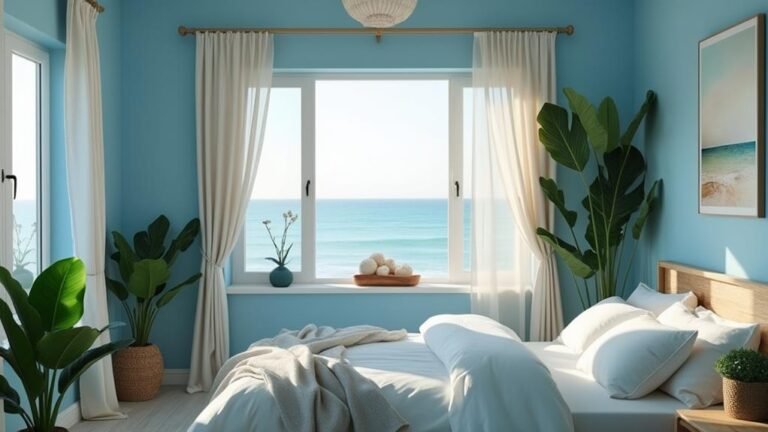
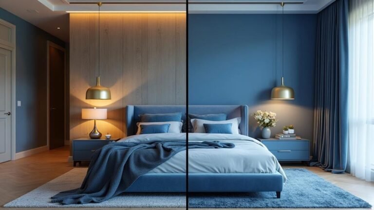
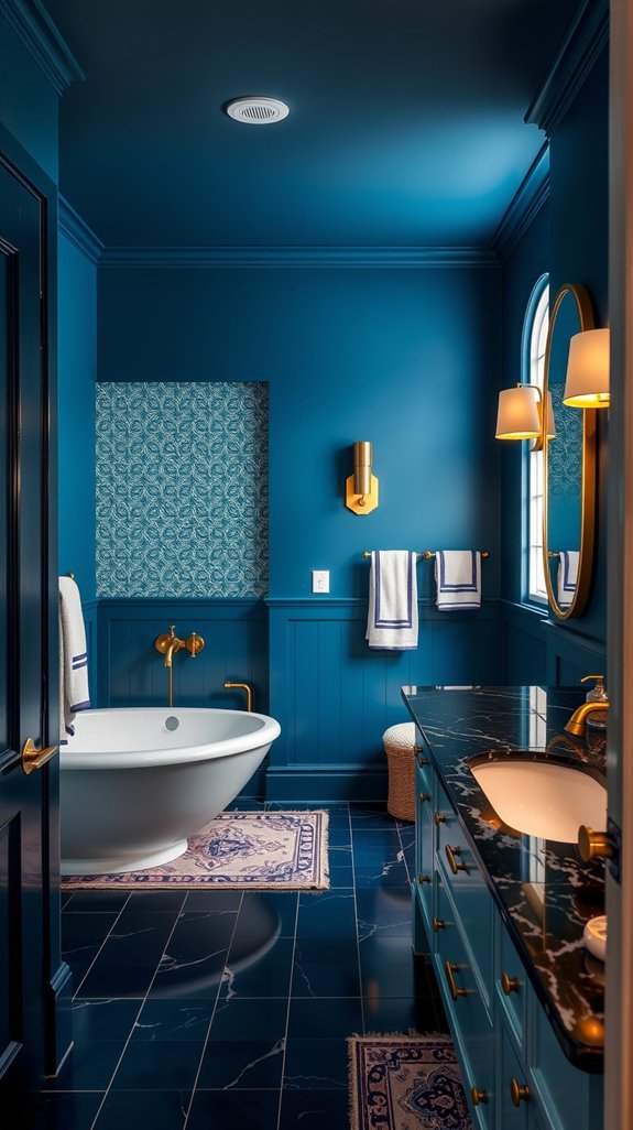
Choose the Right Peacock Blue for Your Lighting Conditions
You finally picked the perfect peacock blue for your bathroom after twenty-seven paint swatches and one minor meltdown.
Then 6 PM hit, and your “stunning jewel tone” turned institutional gray.
Your perfect peacock blue surrendered to 6 PM’s institutional gray.
Sound familiar?
The secret isn’t finding a magical color that never changes—it’s designing around how light actually behaves in your space.
Peacock blue happens to be one of the most dramatic shifters in the paint world, moving from energizing teal in morning sun to moody, mysterious depths by candlelight.
With a little intention (and the right bulbs), you can actually choreograph this daily color show instead of fighting it.
Think of your light switches as dimmers for your personal spa experience—cozy amber for soaking, crisp daylight for makeup.
Ready to make your walls work as hard as you do?
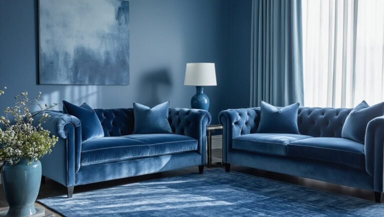
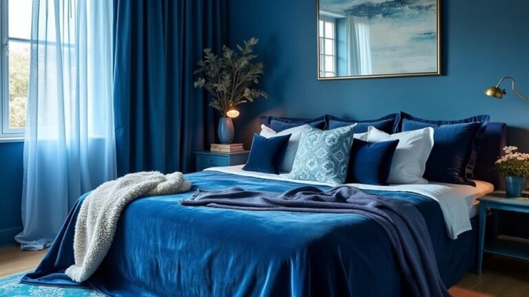
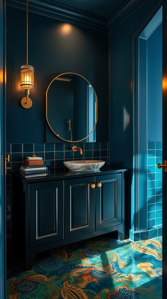
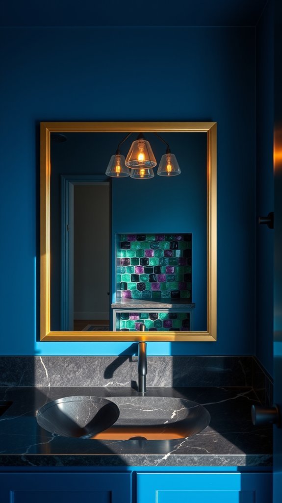
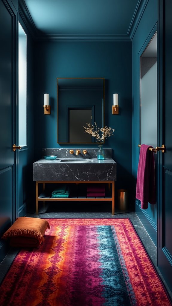
Pair Peacock Blue With Emerald, Amethyst, or Sapphire
You stare at your bathroom and feel… nothing. Another sea of beige tiles, another “safe” choice you regretted by week two. We’ve all been there—playing it so careful that our space ends up looking like a hotel we can’t wait to check out of.
Here’s the fix: stop picking one color and start building a jewel-tone story. Peacock blue pairs beautifully with emerald, amethyst, or sapphire—think tiles, plush towels, little ceramic moments on your shelf. The magic happens in the layering. Each hue keeps the others from feeling too heavy, too flat, too boring.
Best part? Jewel tones age like actually good wine. Trends come and go, but these rich, moody palettes feel collected, intentional, expensive without trying too hard.
Ready to see how three bold colors can live together without fighting? Let’s dive in.
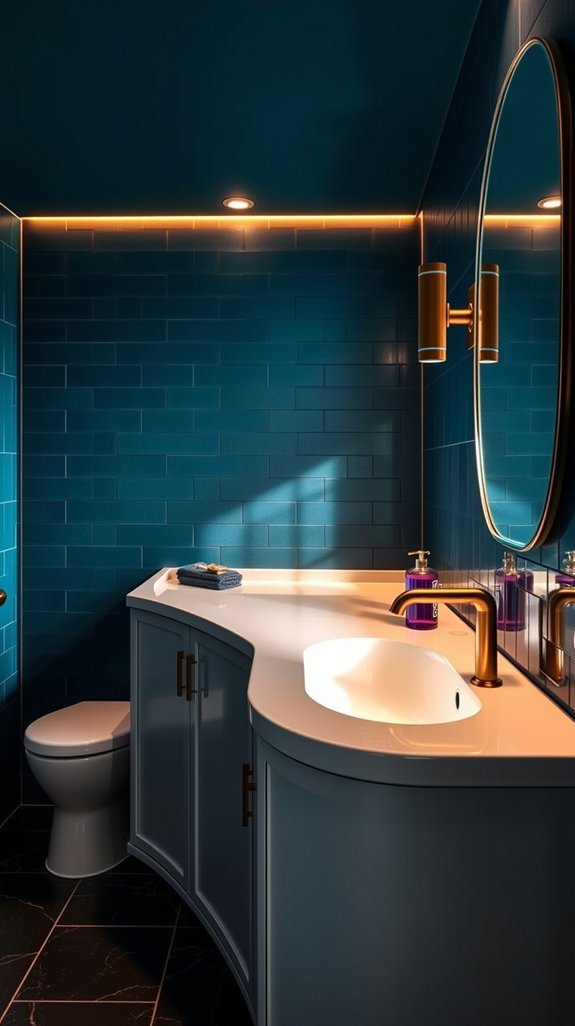
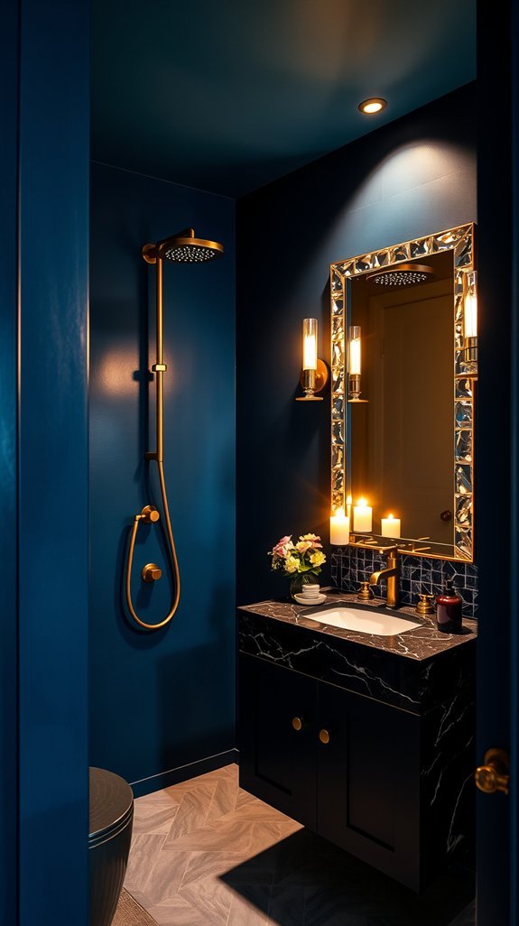
Select Metallics That Amplify Instead of Compete
Your peacock blue cabinets finally went in, and they look *almost* perfect. But something’s off—flat, even. After all that effort choosing the right jewel tone, the hardware you grabbed on autopilot is sucking the life right out of them. We’ve all been there: so focused on the big color choice that metallics become an afterthought.
Here’s the fix: treat your metals as light sources, not accessories. Brushed, hammered, or polished surfaces bounce light differently across rich blues, completely changing how your kitchen feels from morning coffee to evening dinner. Antique brass and soft bronze warm things up without starting a shouting match with your cool undertones. The beauty? Test a few finishes in *your* actual light, live with them for a day, and you’ll know. Get this pairing right once, and you won’t be tempted to swap hardware in two years.
Ready to see which metal speaks your blue’s language?
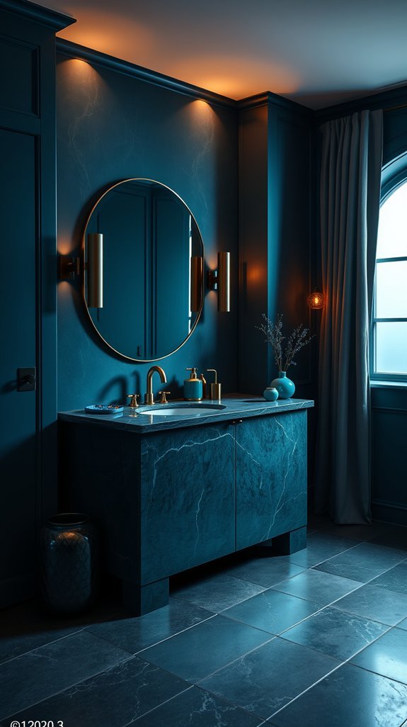
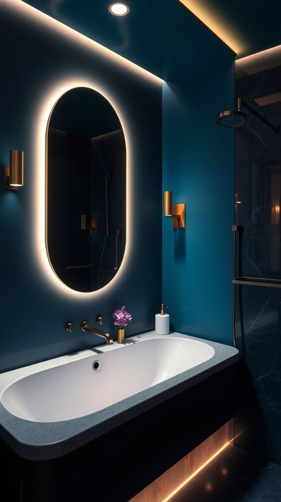
Layer Lighting to Capture Peacock Blue’s Iridescent Depth
You fell in love with that peacock blue tile for its shimmer—the way it shifts from teal to sapphire as you walk past.
Then evening comes, and suddenly your stunning backsplash turns into a dull slab of gray. Sound familiar?
The fix isn’t buying brighter bulbs or hoping for the best. It’s learning to paint with light itself.
By dimming those warm overhead fixtures after sunset while keeping cooler accent lights in play, you give that iridescent glaze the stage it deserves.
Dim your warmth, keep the cool—let that shimmer steal the show.
Wall sconces at eye level create gentle shadows that make the surface come alive. Layer in pendants, recessed spots, and subtle backlighting, and you control the mood—from vibrant coastal vibe to deep, moody sophistication.
The best part? This setup works hard every night without extra effort from you.
Ready to see your tile transform after dark?
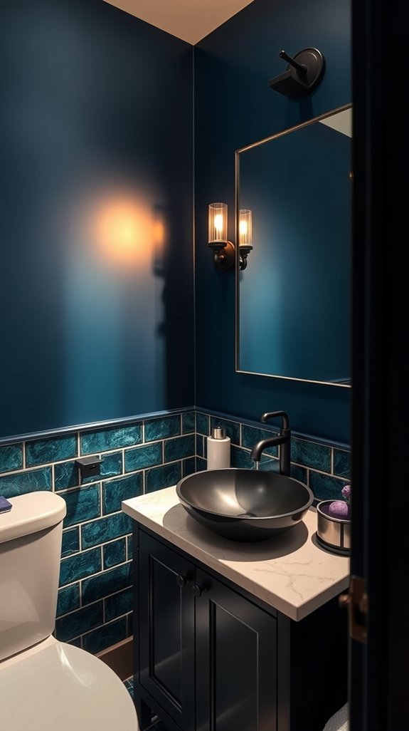
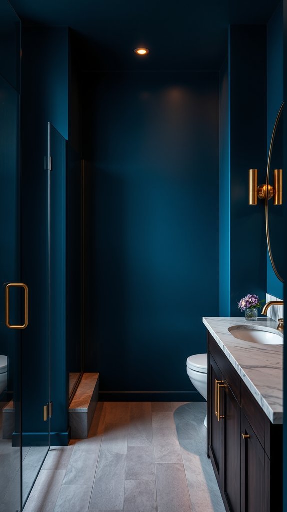
Balance Dark Color in Small Bathrooms
You finally found that perfect moody paint color for your tiny bathroom—deep, dramatic, and totally you. Then you slap it on the walls and suddenly feel like you’re brushing your teeth inside a cave. What happened to that cozy, boutique-hotel vibe you were chasing?
Here’s the secret nobody tells you: dark colors don’t shrink small spaces. Bad lighting does. The trick isn’t choosing a safer beige—it’s learning how to make that bold shade work *with* your square footage, not against it.
Think glossy tiles that catch every glimmer of light, mirrors placed exactly where you need them, and fixtures that float off the floor like magic. Suddenly your cramped powder room feels like a jewel box instead of a shoebox. Best part? This isn’t a weekend experiment you’ll regret. It’s a design move that actually makes your morning routine feel a little more luxurious, every single day.
Ready to see how the pros pull it off?
Add Textiles That Bridge Warm and Cool Jewel Tones
Cool sapphire walls can feel stunning at first—and then a little cold. Like you walked into a color, not a home. The fix? Textiles that know how to party with both sides of the color wheel.
Enter the humble throw blanket and your new best friend: burnt orange velvet. Drape it over your linen ottoman and suddenly that peacock blue bathroom has a pulse. Add copper-threaded towels for warmth that actually plays nice with cool tones. Unlike a full renovation, textiles let you test-drive color relationships without commitment.
The real magic happens in the mix—wool nubby against silk smooth, emerald and ruby finding common ground in texture. These layers work harder than paint ever could, bouncing light differently by season and mood. And when you tire of amber? Swap it for coral. Your walls stay put; your story evolves. Ready to make your jewel tones shake hands?
Mix Patterns Without Overwhelming the Space
Pattern mixing feels like that one design skill everyone else mastered while you were still figuring out throw pillows. You scroll through gorgeous bathrooms online, spot five different prints working together like old friends, and quietly close your laptop. Same.
Here’s the secret nobody shares: you don’t need to be fearless. You just need one anchor—think big, bold, and beautiful, like a dramatic floral on your peacock blue walls. From there, smaller patterns on towels or a shower curtain do the heavy lifting without competing for attention. The contrast keeps your eyes moving; the scale keeps your sanity intact.
Best part? This approach grows with you. Swap out accessories seasonally, keep your anchor timeless, and your bathroom never feels stale. No chaos, no regret, no design degree required.
Ready to turn that jewel-tone sanctuary into something that actually feels finished?
Find High-Impact Jewel-Tone Swaps on Any Budget
You want that rich, saturated bathroom—sapphire tiles, amethyst accents, a splash of garnet somewhere unexpected—but your wallet is begging for mercy. We’ve all stood in the paint aisle, coveting colors that seem to belong in mansions, not our modest starter homes.
Here’s the secret nobody tells you: jewel tones love a clever shortcut. Some of my favorite bathrooms started with a $6 vintage ashtray and a can of spray paint. That deep teal you’re eyeing? It hits different on a salvaged cabinet than on custom millwork—and nobody can tell the difference at 7 AM with coffee in hand.
The best part? These swaps actually outsmart pure luxury. Quartz remnants won’t stain. Painted hardware updates in an afternoon. Your future self thanks you for beauty that doesn’t require a second mortgage.
Ready to make your bathroom feel like a treasure chest? Let’s dig in.
Avoid the Mistakes That Dull Peacock Blue’s Luxury
You fell in love with peacock blue from a magazine spread—that moody, jewel-toned wall that seemed to glow from within. Then you painted your own bedroom and… nothing. Flat. Sad. Like a tropical lagoon somebody drained overnight.
The color isn’t the problem. It’s how we use it. Peacock blue needs friends that understand its drama: nubby fabrics, handmade tiles with wobbly edges, brass that catches lamplight at 8 p.m. Skip the glossy, factory-perfect finishes that suck the life right out of it.
Here’s the good news—this isn’t about money. A velvet pillow in that saturated blue costs less than dinner out. Vintage brass pulls from the hardware store upgrade a basic dresser instantly. These touches don’t just look expensive; they age beautifully, getting richer as years pass.
Ready to make peacock blue sing in your space? These nine mistakes are where people go wrong—and exactly how to fix them.
Conclusion
Tired of bathrooms that feel cold, boring, or straight out of a department store catalog? You’re not alone. Most of us dream of a space that feels special—a little escape we actually want to spend time in.
Enter peacock blue. This deep, dramatic shade transforms ordinary bathrooms into jewel-toned retreats that feel collected and intentional, not cookie-cutter. The trick? Layer it with emerald, amethyst, or even a touch of gold for that hidden-treasure vibe. Yes, it sounds moody. Yes, it works beautifully with real life—fingerprints and humidity included.
Here’s the best part: done right, this look ages like wine, not trendy wallpaper. No more regretting safe beige in three years. Whether you’re ready to commit or just dipping a toe in, we’ll show you how to build a bathroom that feels rich, personal, and quietly unforgettable. Let’s dive into the details.