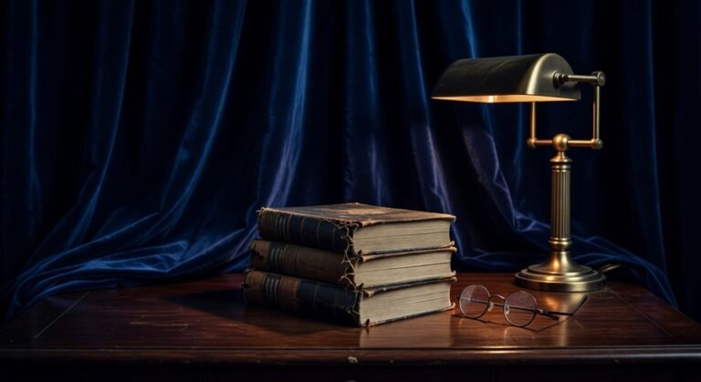
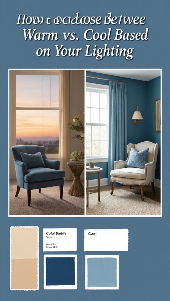
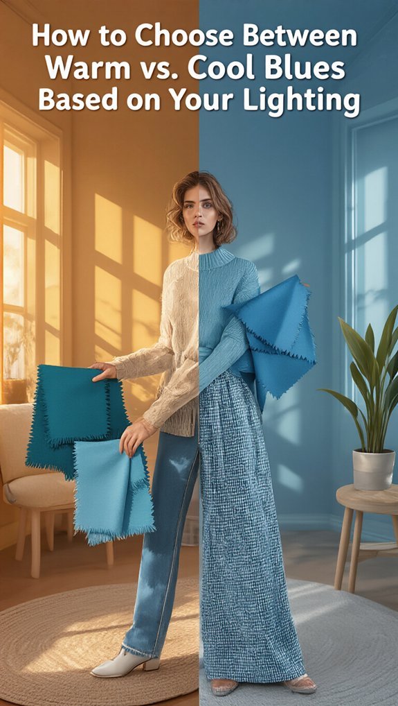
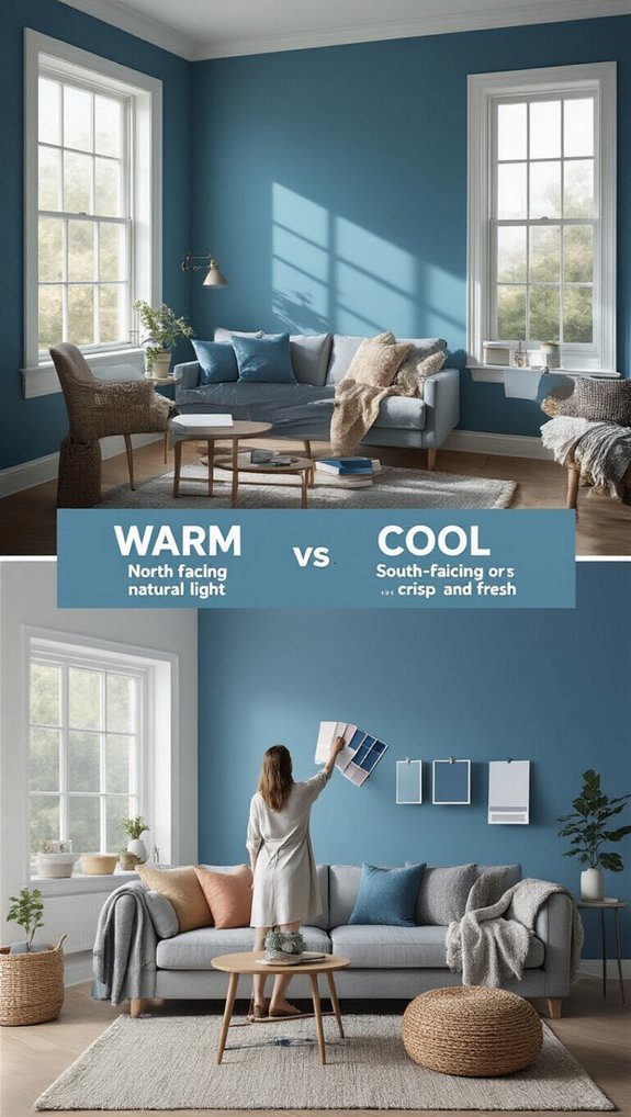
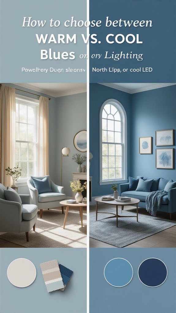
How to Choose Between Warm vs. Cool Blues Based on Your Lighting
You finally found the perfect blue paint sample, carried it home full of hope, and watched it completely betray you under your actual lighting. That stunning dusty blue turned swampy green the second you slapped it on the wall—I’ve been there more times than I’ll admit.
The fix is simpler than you’d think: match your blue’s undertone to your bulb’s temperature. Warm light (those golden Edison bulbs we all love) pulls green out of blues, which can look rich and moody or straight-up murky depending on your shade. Cool light cranks up a blue’s clarity, giving you that crisp, alert feeling that actually works for offices but can feel sterile everywhere else.
I love how this one decision protects you from the classic paint regret cycle—the sample looked perfect, the room looks wrong, now you’re repainting in six months. Get it right upfront and your walls stay gorgeous through morning coffee, afternoon Zoom calls, and that 8pm wind-down when you actually want dim lighting to cooperate with your color choice instead of fighting it.
Why Your Blue Looks Different at Night Than It Did in the Store
When you eventually get that perfect navy couch home, it suddenly looks like it belongs in a Smurf’s living room—and you’re not losing your mind, I swear! 😅 It’s all about lighting, friend, and it’s the sneakiest trick in the design world.
That store versus home disappointment hits hard, right? You’re seeing a classic blue undertone swing happening.
Fluorescent bulbs lie, natural light doesn’t! This lighting temperature mismatch messes with your night shift perception something fierce.
Same swatch, totally different vibe after sunset. Test your blues where they’ll live, not where you found them!
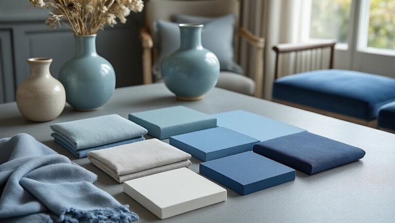
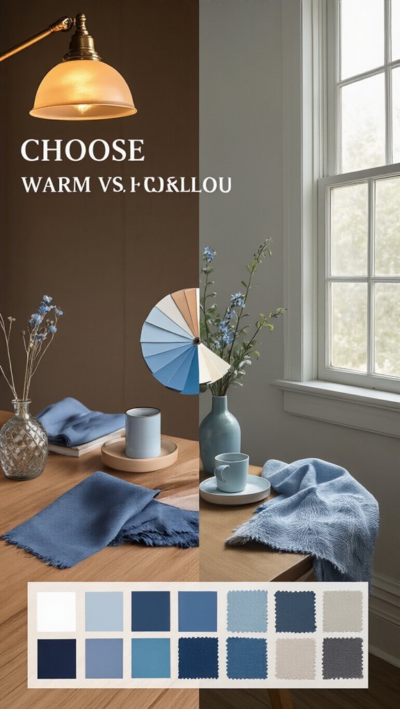
How to Read Undertones in Blue Paint Before You Buy
You’re standing in the paint aisle, squinting at swatches like they’re a secret code—don’t panic, we’ve all been there! 😅
Second, flip that card over and check the undertone (is it sneaking toward purple, green, or gray?), then slap some samples on your wall and watch them like reality TV across daylight hours—morning sun hits different than 3pm gloom, trust me.
Ultimately, grab your phone flashlight or that weird lamp from your bedroom and test it after dark, because nothing’s worse than a blue that turns “hospital corridor” at 8pm—yikes! 💡✨
Check the Undertone
Because paint chips love to play tricks on you, checking undertones before you buy isn’t just smart—it’s survival. 😅
That pretty blue you loved in the store? It might read purple at home, yikes!
Check nearby white on the strip—see those tiny hints?
Match trim undertones too, or you’ll clash hard.
Trust your gut, not the fluorescent lights! 🎨
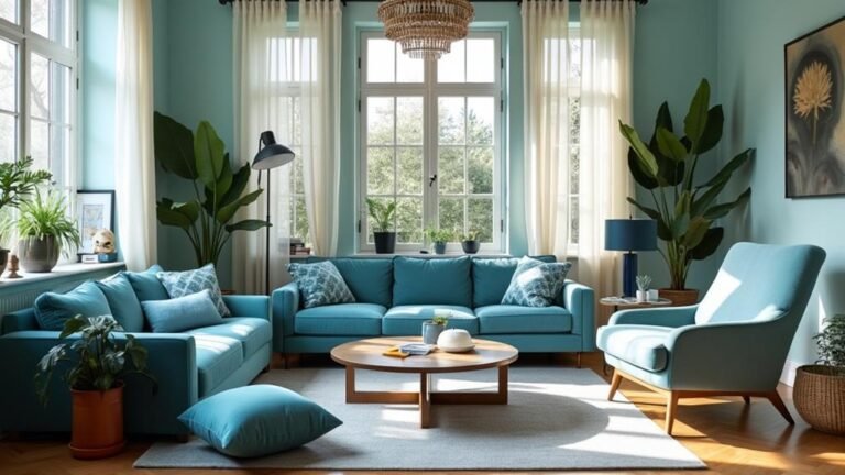
Compare Daylight Samples
Before you grab that roller, slap some samples on the wall and (this is the big one) check ’em in actual daylight—not that sad kitchen bulb from 2007.
You’ll spot natural daylight consistency issues fast.
Notice how your sky tint comparison changes?
That teal turns muddy, that navy pops gorgeous—trust the window light, it’s your truth-teller here! 🌤
Test Artificial Lighting
Why stop at daylight when your living room’s basically a nightclub after 6 PM? Pull those bulbs and measure bulb CRI first—anything under 90’s gonna lie to you (rude!).
Compare color temperature side-by-side, test on matte swatches (gloss is a cheater), and check ambient reflections off your furniture.
That “perfect” navy might go full Smurf at night! 😱
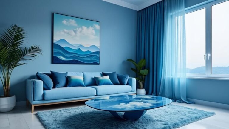
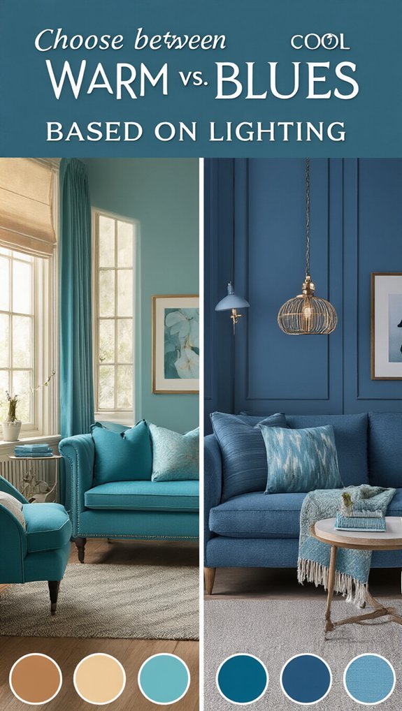
Match Your Blue to Your Bulb: Warm Light vs. Cool Light
So many blues look gorgeous in the store, then you get home and—yikes—your lighting betrays you. 😅 It’s not your fault, promise!
Compare bulb temperature before you commit, okay?
Warm bulbs (2700K) love those cozy, slightly greenish blues, while cool bulbs (5000K) make crisp, clean blues sing.
Use room samples at different times—no guesswork, no regrets! 💡
Test Your Blues the Right Way (Skip the Paint Chip Mistake)
Three paint chips walk into your car, and only one’s gonna make it out alive—sound familiar?
Don’t trust those tiny squares!
Grab sample pots, paint ’em on poster boards, and move ’em around your space.
Check your light temperature at different times—morning sun hits different than that sad overhead bulb.
Do reflection checks by holding ’em near windows and corners.
Your walls deserve the real deal, not a gas station guessing game! 🎨✨
Fix a Blue That’s Fighting Your Lighting Without Repainting
Stare at that wall that’s reading purple at 2pm like it’s personally betraying you—we’ve all been there, friend 😤! Use tint testing with peel-and-stick samples before you panic.
Fix undertone drift by swapping your bulbs (2700K = instant glow-up ✨).
Balance interior glare with sheer curtains, and match trim temperature—cool walls need cool white trim, duh!
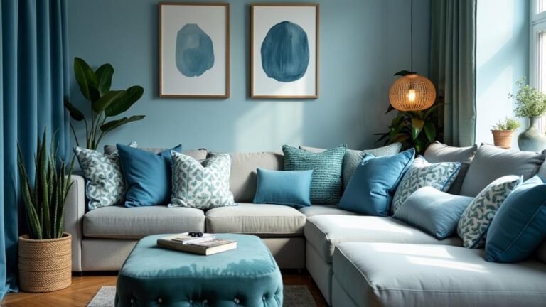
Room-by-Room: Where Warm Blues Win and Cool Blues Work
Whether you’re drowning in paint swatches or just praying you don’t end up with a “Smurf’s bathroom” situation (we’ve seen the nightmares on TikTok 😱), choosing the right blue temperature can make or break your space.
For Cozy Bedroom Selection, grab warm blues—they hug you like your favorite blanket!
But Kitchen Lighting Fit demands cool blues, keeping you alert while you chop onions (no tears needed, well… fewer tears 😅).
Match the mood, win the room!
Conclusion
You’ve got this! Trust your eyes, not the paint chip, and let your bulbs do the heavy lifting. Warm blues love cozy glow, cool blues crave that crisp daylight vibe—match ’em up, test on your actual walls (yes, really!), and you’ll nail it. No more “why does my bedroom look like a sad aquarium?” moments. Go grab those samples, channel your inner HGTV star, and paint with confidence! 🎨💡✨