7 Blue Shades Explained: How to Choose the Right One for Every Room
You stand in front of the paint swatches, arms aching from holding up fifty shades of blue that all look identical under fluorescent lights. Six months later, your bedroom feels like a waiting room and your home office might as well be underwater. I’ve been there—twice.
The trick? Blues aren’t just colors. They’re tools. A dusty navy coaxes sleep at night. A misty aqua tricks small bathrooms into feeling airy. Each shade does actual work, silently shaping how you feel in a space long after the brushes are cleaned.
Seven of them, really. Each with a specific job, a perfect room, and a way of solving problems you didn’t know paint could touch. Ready to stop guessing and start pairing?
Key Takeaways
You’ve stared at that same beige wall for three years now, haven’t you? Swatches piled on your counter, paralyzed by the fear of picking “the wrong blue”—too cold, too dark, too much like a dentist’s office. Here’s the thing no one tells you: blue isn’t just one color, it’s a whole mood board waiting to happen.
The right shade can fix problems you didn’t even know you had—sleepless nights, rooms that feel cavernous or cramped, that home office where focus goes to die. And unlike trendy accent walls you’ll tire of by spring, blue ages gracefully. It grows with your life, from chaotic toddler years to quiet empty-nest Sundays.
Ready to stop second-guessing and start painting? These seven blues each do something magical—let’s find your perfect match.
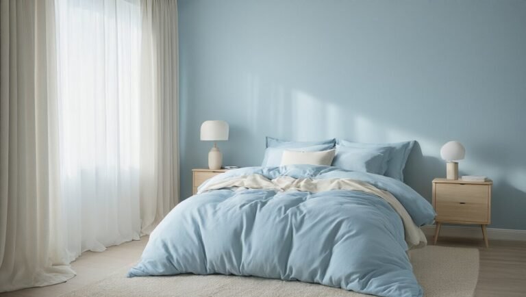
Sky: The Bedroom’s Natural Sleep Aid
You know that feeling when you’re staring at your ceiling at 2 AM, willing your brain to shut off? We’ve all been there. Your bedroom looks fine—maybe even beautiful—but something just isn’t clicking. Here’s the secret: your body is begging for the sky.
Turns out, we humans are basically solar-powered creatures with WiFi issues. Gaze up at a clear afternoon sky and your shoulders drop automatically. That soft, endless blue tells your nervous system the world is safe. Now imagine capturing that same calm and bringing it indoors.
We’re basically solar-powered creatures with WiFi issues, and our nervous systems know exactly what to do with sky blue.
Painting your bedroom ceiling or walls in pale sky blue isn’t just pretty—it’s practical neuroscience in a paint can. You’ll fall asleep faster without trying so hard. You’ll wake up actually rested. And unlike that expensive sound machine, this fix works every single night without batteries.
Ready to look up and finally let go?
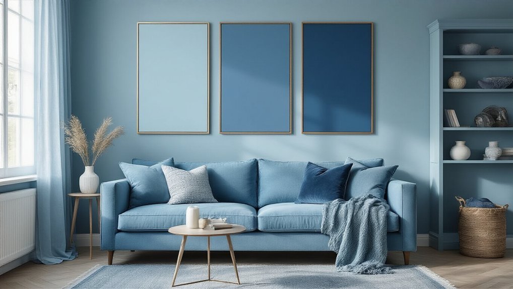
Steel: Your Neutral Alternative for Busy Rooms
Your living room works hard—morning coffee, afternoon homework piles, evening Netflix marathons. Somewhere between “cozy retreat” and “functional chaos,” it needs a color that keeps up without making things feel heavy. Navy drags you down. Sky blue puts you straight to sleep. Enter steel: the quiet hero you didn’t know you needed.
Steel sits right in that sweet spot—cool enough to feel fresh, warm enough to feel like home. It doesn’t demand attention; it simply creates space for your eye (and your sanity) to breathe. The best part? It forgives. Spills, scuffs, and that random basket of remotes practically disappear against its steady calm.
This is the color that grows with you—through design phases, life changes, and whatever your kids throw at it. Literally.
Ready to see how steel transforms the busiest room in your house?
Slate: The Focus Color for Home Offices
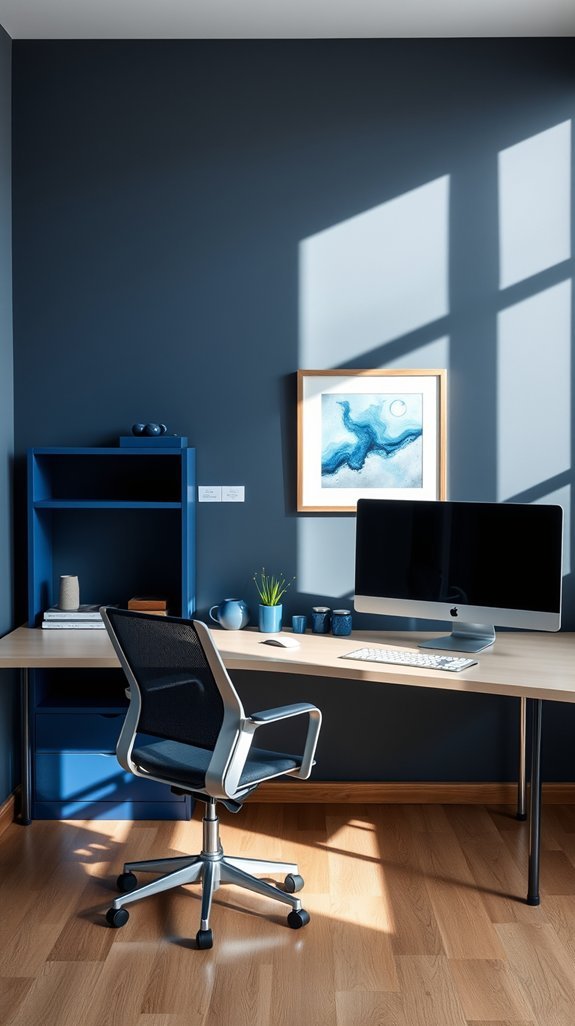
Sitting down to work at your kitchen table for the third day this week? Your laptop balanced between yesterday’s mail and a half-empty coffee mug? We’ve all been there—trying to think big thoughts in a space that screams “leftovers” instead of “let’s do this.”
Here’s the thing: you don’t need a custom build-out to claim your focus. You need one smart color choice. Slate brings that quiet authority your makeshift office has been missing. It’s the shade that says *I mean business* without making you feel like you’re trapped in a corporate cube.
The beauty? It grows with you. Messy project days, video calls, late-night deadline sprints—slate stays composed through it all. And somehow, it makes even that thrifted desk look intentional.
Ready to turn your work corner into somewhere you actually want to be? Let’s talk slate.
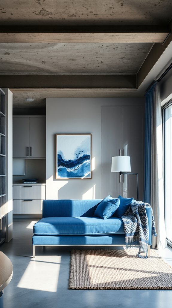
Dusty Blue: Making Open Spaces Feel Intimate (Not Icy)
Walking into a cavernous open-plan living room can feel like shouting into a void—beautiful, sure, but about as cozy as a museum lobby after hours.
Enter dusty blue, the interior design equivalent of a warm hug in cashmere. This isn’t the cold baby blue of hospital walls; it’s deeper, moodier, threaded with gray like a well-loved pair of jeans. Layer it across an accent wall, your sofa, even the curtains, and watch that same cavernous space fold itself around you like a favorite nook.
The magic? You keep all that glorious natural light and breathing room without the echo-chamber effect.
Best of all, dusty blue ages gracefully—no regrettable trendy moments here. Ready to see how this chameleon shade transforms lofts, kitchens, and everything in between?
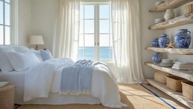
Teal: Beachy Personality Without the Cliché
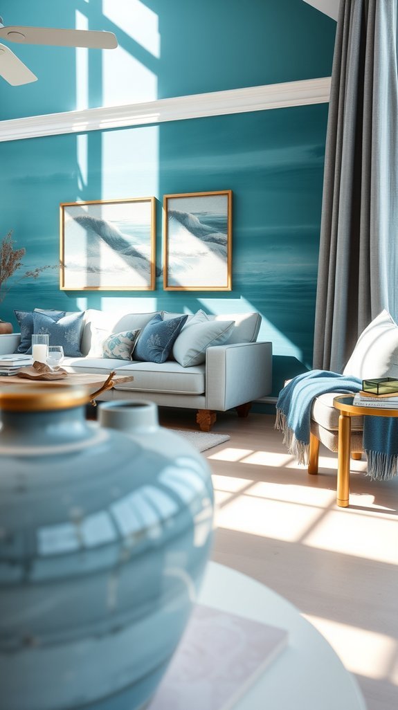
We’ve all been there—standing in a room that screams “I bought everything at a seaside souvenir stand.” The shell-shaped soap dish. The rope-wrapped lamp. That “Life’s a Beach” sign you definitely regret. You wanted coastal calm, not coastal chaos.
Enter teal. This rich blue-green gives you all the ocean vibes without the tourist-trap trappings. It feels like a breath of fresh salt air, but grown-up—sophisticated enough for dinner parties, relaxed enough for Sunday afternoon naps.
The real magic? Teal only gets better with time. Unlike trendy nautical themes that feel dated by next summer, this color ages gracefully, especially alongside natural textures like rattan, linen, or weathered driftwood. It works with what you already own and adapts as your style evolves.
Ready to see how a single color can transform your space from cliché to coastal cool?
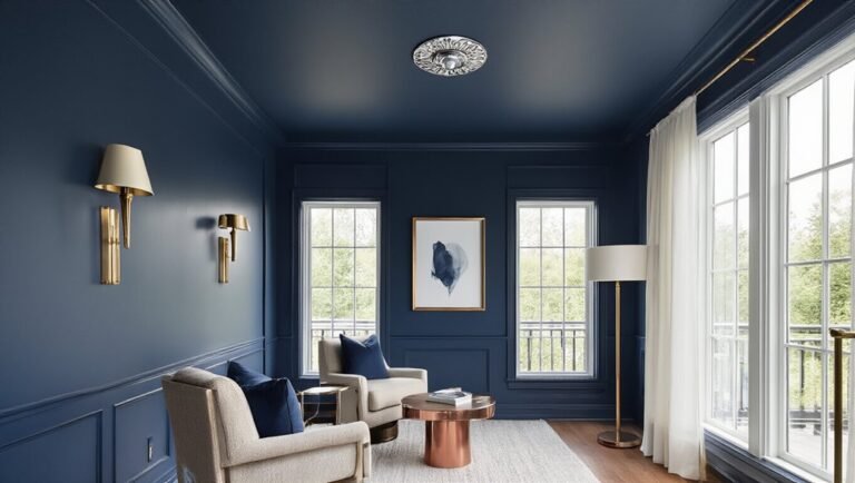
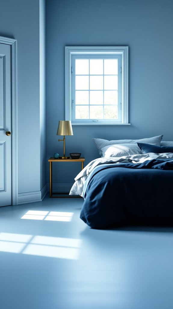
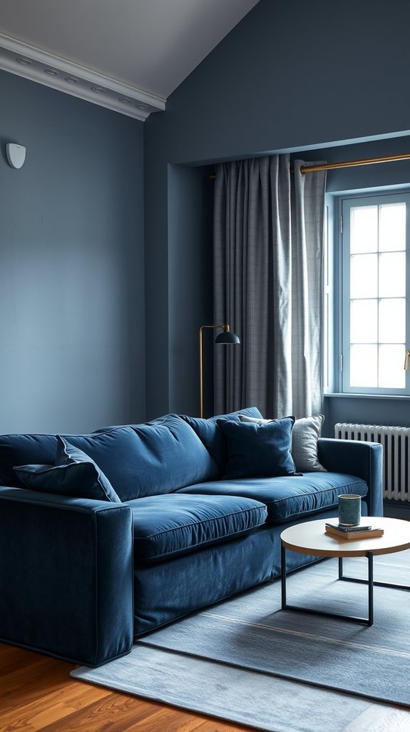
Navy: Depth That Opens Up, Not Closes In
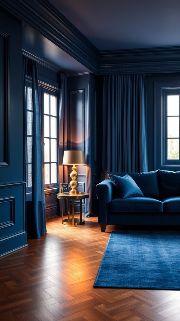
We’ve all stood in the paint aisle, staring at that swatch of navy, then quietly sliding it back on the shelf. “Too dark,” we tell ourselves. “Too risky.” But here’s the secret nobody shares at the hardware store: navy isn’t about closing in—it’s about opening up.
When you finally take the plunge, something unexpected happens. Your ceiling drifts higher. Your corners soften and disappear. That tiny bedroom? It suddenly has room to breathe. The depth creates a backdrop so rich that your cream sofa practically glows against it, and even your hand-me-down lamp looks like it belongs in a magazine spread.
Best of all, navy forgives everything—scuffs, dust, the occasional coffee splash during morning chaos. It works as hard as you do, season after season, without demanding a refresh.
Ready to see which rooms in your home are secretly begging for this transformation?
Midnight: Deep Walls That Expand-Not Shrink-Small Rooms
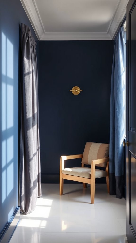
Tired of staring at your tiny living room and wishing the walls would just back up already? We’ve all been there—measuring furniture twice, cursing that awkward alcove, dreaming of square footage we don’t have. But here’s the thing: you don’t need to knock anything down to make a room feel bigger. You just need to go darker.
Midnight blue walls sound counterintuitive, sure. Most people reach for white and hope for the best. But this deep, velvety shade doesn’t box you in—it opens things up. The color drinks in the light and blurs where walls begin and end, especially against bright white trim. Suddenly your room has depth, drama, and yes, real breathing room. No renovation required, just a roller and a little guts. Ready to see how far the rabbit hole goes?
Conclusion
You stand in the paint aisle, overwhelmed by a hundred blues that all look the same on the chip—until they’re not. Suddenly your living room feels like a cold cave or your bedroom reads as a dentist’s office. Picking the wrong shade isn’t just a color mistake; it’s months of living with walls that fight your furniture and your mood. The fix? Understanding that blue isn’t just blue. There are dusty navies that hug you at night, bright teals that spark morning energy, and soft powders that somehow make small rooms breathe bigger. It’s about choosing a shade that works harder than pretty—one you’ll still love when trends fade and your life changes. Ready to find the blue that actually belongs in your home?