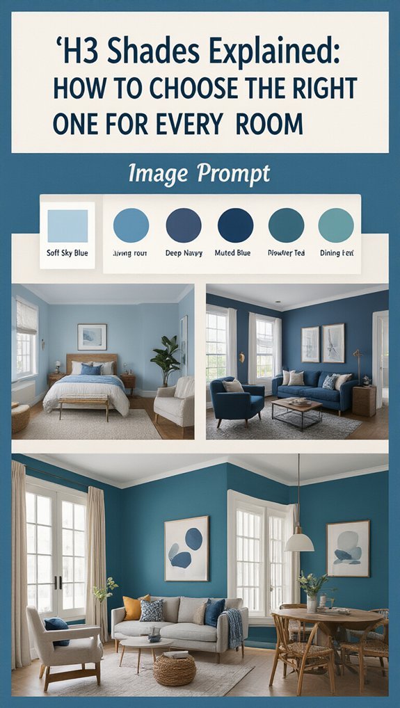
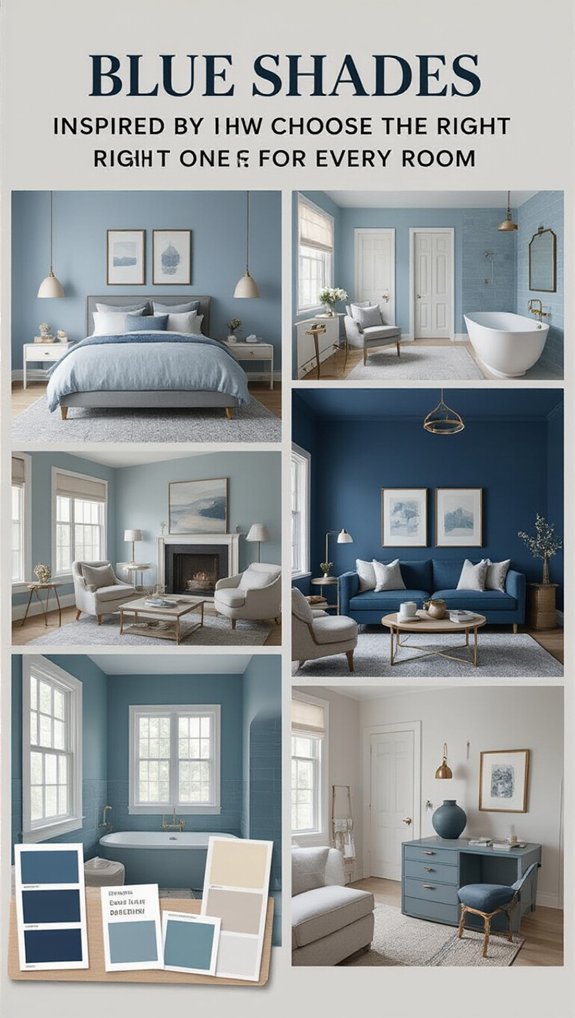
7 Blue Shades Explained: How to Choose the Right One for Every Room
You walk into the paint store determined to pick the perfect blue, then freeze solid in front of 200 nearly identical swatches—navy, cobalt, something called “hazy afternoon,” whatever that means. Choosing wrong means months of wincing every time you flip on the lights, or discovering your calming bedroom actually feels like a frozen clinic hallway. The fix? Stop treating blue like one generic color and start matching specific shades to how each room actually functions in your life. I love how powder blue softens a harsh north-facing kitchen in a way bolder shades just can’t manage, while deep teal turns a boring spare room into somewhere you’d actually want to hunker down and work. Get this right and you’re not just painting walls—you’re creating rooms that quietly support your routine, hold up through trend cycles, and sell better when you’re ready to move on. Let’s figure out which blue earns its spot in each space.
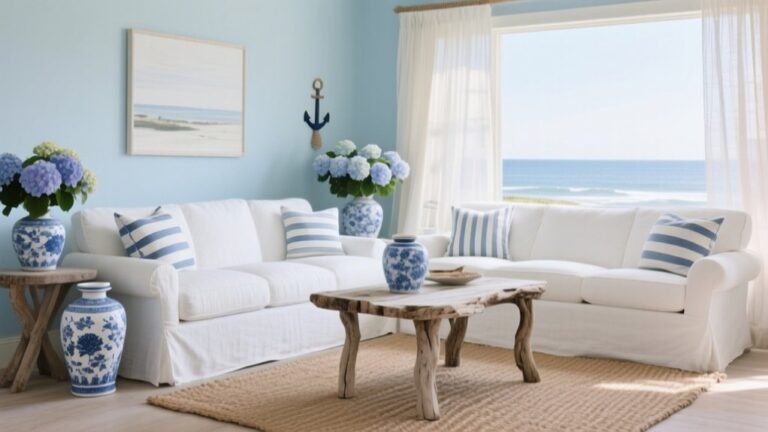
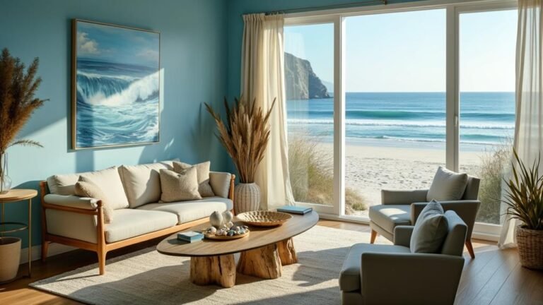
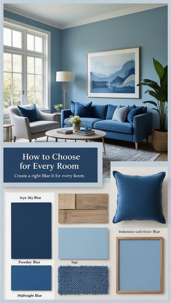
Powder Blue: The Sleep-Enhancing Shade for Bedrooms and Nurseries
Because you’ve been staring at your walls at 2 AM wondering why sleep feels impossible, let’s talk about the color that’s basically a lullaby in paint form.
Powder blue (soft, dreamy, totally not boring!) lowers your heart rate faster than ASMR videos.
You’ll actually want bedtime rituals now.
Paint this light blue on your ceiling—instant cloud vibes.
Sleep tight! 😴
Sky Blue: Why It Works in Kitchens and Breakfast Nooks (And Where It Fails)
Morning, friend! Sky blue’s your kitchen MVP—it’s like caffeine for your walls, seriously! You’ll nail color temperature harmony by pairing it with warm wood tones (trust me, no sad icebox vibes).
For cabinetry coordination tips, try cream or sage green—chef’s kiss!
But skip it in dim basements; it goes full “abandoned hospital” real fast. Stick to sunny spots! ☀
Turquoise: Balancing Energy and Calm in Home Offices and Creative Spaces
Quick wins? Paint one accent wall with turquoise and watch your home office transform. You’re tapping into serious inspiration here—this color temperature hits that sweet spot between “let’s grind” and “chill out.”
Use creative zoning (desk area = bolder, reading nook = softer) for instant stress reduction. It’s like having a productivity coach who also does yoga! 🧘♀
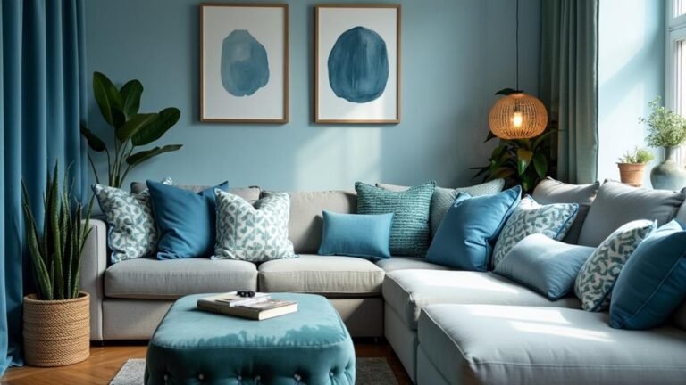
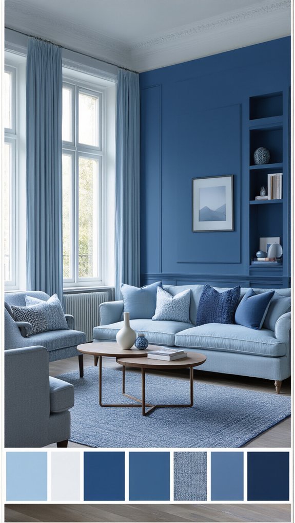
Slate Blue: The Neutral-Adjacent Choice for Open-Concept Living Areas
Balancing undertones keeps things from reading “blergh gray” or “surprise purple”—test samples!
Lighting considerations matter huge here; north-facing rooms need warmer slate, south-facing can handle cooler vibes. You’ve got this! 💪
Royal Blue: Making a Statement Without Overwhelming Dining Rooms
You’re staring at that swatch like it’s the final boss of decorating, aren’t you? 😅 Don’t panic—royal blue won’t eat your dining room alive if you play it smart, one accent wall at a time.
Balance that boldness with cream trim (or hey, even a gallery wall) and you’ll look like you planned this all along! 🎨✨
Balancing Bold Hues
When you walk into a dining room dripping in royal blue, it hits differently—like the main character just entered the scene. 😎 But here’s the thing: too much of this saturated showstopper, and your dinner guests might feel like they’re eating inside a velvet jewelry box (cozy? yes. Overwhelming? also yes).
You need color temperature effects working in your favor—cool northern light amps up royal blue’s drama, so you’re balancing with warm bulbs, stat.
Lighting based balancing saves you from midnight-masquerade vibes at brunch.
Furniture tone matching keeps you sane: pair this bold hue with natural wood (think oak, not cherry) or crisp white for breathing room.
You’re managing visual weight control by letting royal blue anchor one plane—walls OR ceiling, never both, friend.
Trust your gut, snap a pic, adjust. You’ve got this! 💪
Accent Wall Strategies
Royal blue wants the spotlight, but you’re the director here. 🎬 An accent wall lets this diva color shine without stealing the whole show—think of it as giving Beyoncé one killer solo instead of the entire album.
Pick your wall placement wisely (the one facing windows, obvs), and watch that lighting impact transform your dinner parties from meh to *chef’s kiss*! 💙
Navy Blue: Adding Depth to Small Spaces Without the Cave Effect
Though you’re scared navy will swallow your tiny bathroom whole (I get it, we’ve all watched enough HGTV disasters), this deep shade actually tricks the eye into seeing more space than you’ve got.
Use lighting tricks and reflective surfaces—mirrors, glossy tiles—to bounce light around.
Pair it with warm neutrals, and boom, no cave vibes!
Mind your furniture pairing though; keep pieces light and leggy. ✨
Midnight Blue: Creating Intimacy in Media Rooms and Powder Baths
This shade doesn’t just darken a room, it hugs it.
You’ll love how midnight blue transforms your media room into a cozy escape—think VIP theater vibes without the sticky floors!
Pair it with smart soundproofing choices (finally, no more hearing the neighbor’s lawn mower) and dimmer friendly lighting for that perfect movie-night glow.
Powder baths? Total drama, zero gloom! 🌙✨
Conclusion
You’ve got this! Grab those paint swatches, trust your gut (and your lighting), and begin in—worst case, it’s just paint, not a tattoo! 🎨 Whether you’re team powder blue for dreamy vibes or going bold with royal, your perfect shade is out there. Don’t overthink it, sample like crazy, and remember: even a “mistake” just adds character. Now go make those walls happy! 💙✨