How to Choose the Right Red Accent When Your Room Is All Neutral
You walked into your dream living room on Pinterest—cream sofa, soft gray walls, natural wood floors—and then you saw it. That perfect bolt of red. A throw pillow, maybe, or a painted door frame that made the whole space come alive. Suddenly your own beige-on-beige sanctuary feels a little… sleepy.
But here’s the honest truth: slapping any red into a neutral room is like adding hot sauce to every meal. Sometimes it works. Sometimes you ruin dinner.
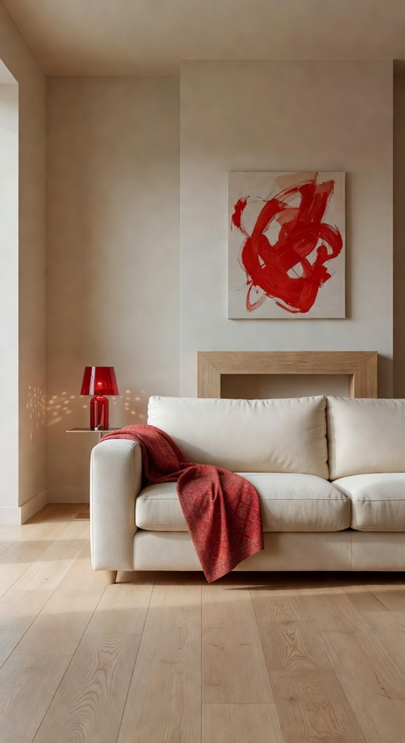
The secret isn’t finding “the best” red. It’s finding *your* red. Warm terracotta plays beautifully with cream and camel. A cool cherry red? That’s your companion for slate grays and crisp whites. Get it wrong and your cozy retreat feels off-balance for years. Get it right, and you’ve got a timeless focal point that grows with you.
Ready to find the red that actually loves your neutrals back?
Quick Wins to Try Today
- Hold up fabric swatches or a red object you already own next to your largest furniture piece in natural daylight
- Cool-toned neutrals (gray, blue-white) need reds with blue or purple undertones; warm neutrals (beige, cream) love orange-based reds
- Start with one small red accent—lampshade, vase, or artwork—before committing to bigger changes
- Live with your test piece for three days; red shifts dramatically from morning sun to evening lamplight
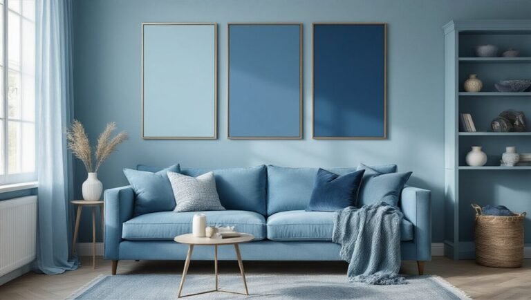
Which Red Undertone Matches Your Grays?
You finally picked that perfect crimson throw pillow. You get home, toss it on the sofa, and… something feels off. The color fights with your gray walls instead of popping. Frustrating, right?
Here’s the fix nobody told you about: undertones. Cool grays with blue or green bases need red accents that lean cherry or burgundy. Warm grays with beige or taupe underneath? They love brick red or rust. Match your undertones, and suddenly your room clicks into place.
Match your gray’s undertone to your red accent—cool grays need cherry or burgundy, warm grays pair with brick red or rust.
This isn’t just designer fussiness—it’s psychology. Harmonious colors feel calming and intentional. Clashing ones quietly stress your brain.
The best part? Once you nail this, everything gets easier. Shopping becomes faster. Your space feels pulled-together without trying too hard.
If you’re drawn to warm neutrals, pairing rust and clay tones with terracotta bedroom accents is a budget-friendly way to build on this same undertone principle throughout a whole room.
Ready to stop guessing and start matching? Let’s find your gray’s perfect red partner.
See How Light Changes Your Red’s Appearance
Beyond color consistency, this approach saves you from expensive do-overs and keeps your space feeling intentional from sunrise to sunset. Small shifts, big payoff.
Ready to make your red behave beautifully? Let’s break down what really changes the game.
—
What You’ll Learn:
- How natural and artificial light transform the same red
- Why fabric samples need an all-day test run
- The secret weapon of matte vs. glossy finishes
- Simple ways to predict your final look before committing
—
Light Play Changes Everything ✨
Your red’s vibe totally shifts with natural versus artificial light. Morning sun hits different than evening lamps. Test your fabric samples throughout the day!
Material Sheen Matters Too 🛋
Matte finishes chill out your red’s intensity. Glossy surfaces make it pop harder. Which vibe matches your space? Choosing warm-toned bulbs and fixtures can prevent harsh shadows and color distortion that would otherwise make your red walls look completely different than intended.
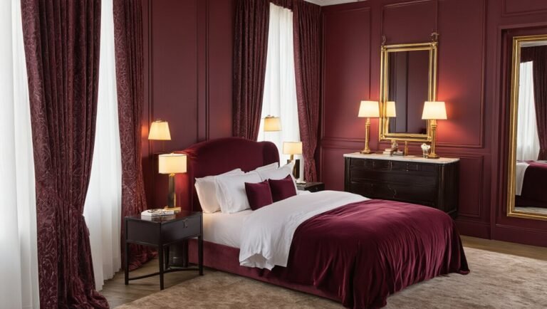
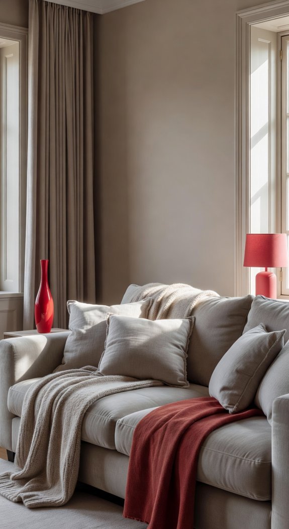
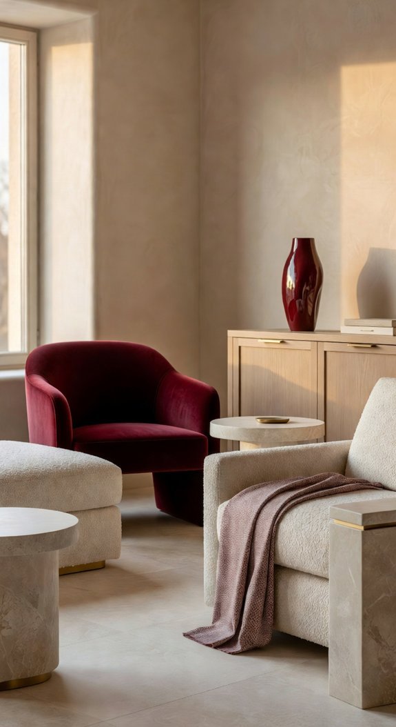
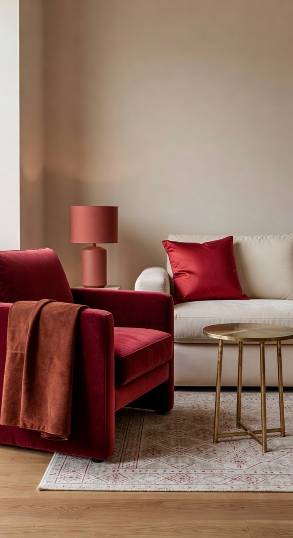
Burgundy: The Sophisticated Red Accent
You want that pulled-together look, but everything feels too bold or too boring. Bright red screams for attention. Neutrals feel safe, but safe gets old fast.
Enter burgundy. It’s red’s cooler older sister—the one who hosts dinner parties without breaking a sweat. This wine-inspired shade brings instant depth to any room without overwhelming your space. Think leather accent chairs, velvet throw pillows, or a single statement wall that makes your cream sofa look expensive.
The best part? Burgundy ages beautifully. Unlike trendy colors you’ll tire of by next season, this one actually gets better with time. It plays nice with warm woods, brass hardware, and natural textures you’ll already find around your home. When using a rich tone like this, balancing with warm neutrals on both walls and furnishings keeps the look intentional rather than overpowering.
Ready to see how this moody red can transform your space? These ideas might surprise you.
—
Quick Wins for Today:
- Swap one neutral throw for burgundy velvet on your sofa
- Paint a small powder room or inside a bookshelf for low-commitment impact
- Pair with brass lamps or picture frames for instant warmth
- Layer with cream, taupe, or charcoal to keep things grounded
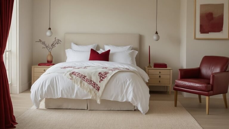
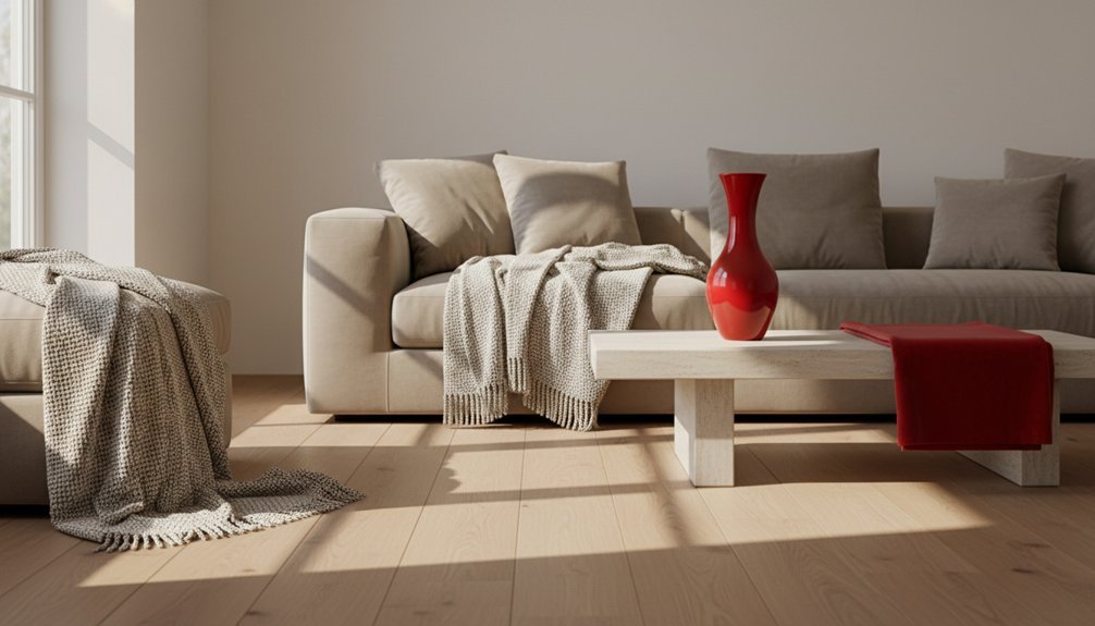
Coral and Tomato Red: Warm Without Overwhelming
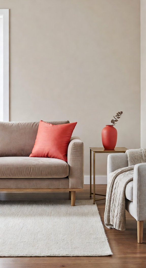
Here’s the fix: swap to coral and tomato red. These shades keep the warmth you crave without the heaviness. Coral leans peachy and soft, like sunset on a good vacation. Tomato red is that just-picked freshness your kitchen’s been begging for. Both play beautifully with warm neutrals—think oatmeal sofas, honeyed wood floors, creamy rugs.
These aren’t “look at me!” reds. They’re the friend who shows up with snacks and actually helps you move. Energizing, yes. Exhausting, never.
If you’ve been working with burgundy, pairing it with varied wall textures can actually soften that cave-like heaviness before you commit to a full color swap.
Takeaways to try today:
- Test coral on a small accent wall before committing
- Pair tomato red with natural textures (linen, rattan, raw wood)
- Use both colors in low-commitment spots first—throw pillows, ceramic vases, a single bold artwork
- Keep walls neutral and let your reds pop through accessories you can swap seasonally
Small shifts, big difference. Your sunnier, more welcoming space is closer than you think.
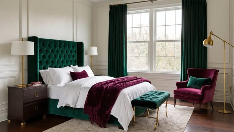
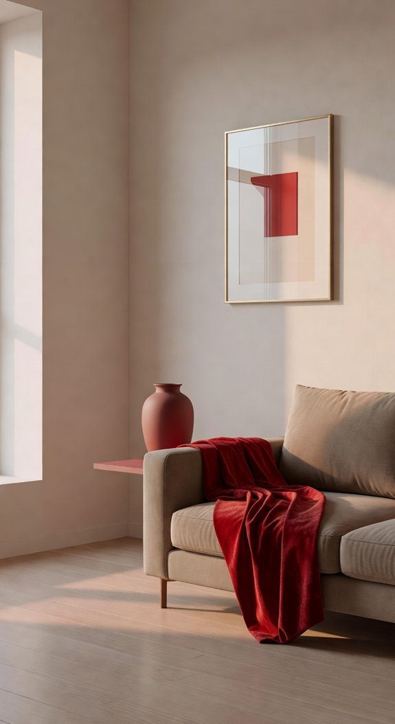
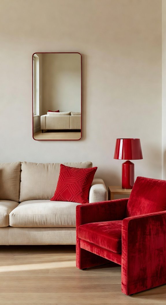
Scarlet and Crimson: Making a Bold Statement
Let’s be honest—beige has had its moment. If your living room feels more “rental waiting room” than “wow, this is *me*,” you’re not alone. Neutrals are safe, but safe rarely sparks joy when you walk through the door.
Enter scarlet and crimson. These reds don’t whisper. They announce. And surprisingly, they’re the friend your tired space didn’t know it needed.
What you need to know:
- Scarlet = instant confidence. It radiates energy without trying too hard.
- Crushed velvet or matte cotton? Both work. Texture changes everything.
- Crimson loves company. Pair it with emerald, sapphire, or clean whites for balance.
- Start small. A single accent wall or jewel-toned throw pillow tests the waters.
- Your future self thanks you. Bold choices age better than trend-chasing.
Best part? Red ages beautifully. While greige cycles in and out, a crimson chair becomes *the chair*—the one guests remember, the one that gets inherited.
Before you commit to a shade, always sample your red paint swatches and evaluate them under different lighting conditions, since artificial and natural light can shift the way scarlet and crimson read on your walls.
Ready to declare war on boring? Your color story starts here.
Start Small: Test Before You Commit
Keep things chill. You’re literally just testing! No commitment required yet. This low-stakes approach rocks honestly, because it saves you from expensive mistakes and builds confidence. Plus, those “temporary” pieces often become favorites you never planned to keep. If you’re drawn to warmer tones, pairing crimson textiles with brass fixtures can create a traditional look that feels both refined and enduring.
Ready to play around? Your perfect room is hiding in plain sight.
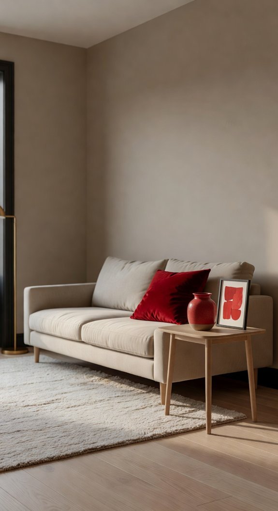
Getting the Scale Right: Wall, Furniture, or Décor
The smartest designers know scale is everything. A red accent wall demands serious lighting planning and a long-term commitment to drama. Red furniture? Flexible, forgiving, and easy to shift when you need a change. But here’s my favorite trick: start small with décor. A few crimson throw pillows, a piece of abstract art, or even a ceramic vase lets you test the waters without drowning in saturation. If you eventually want to go further, red-dominant color-blocking uses red as the primary hue to create graphic, visually confident spaces that feel intentional rather than accidental.
Your Quick-Start Guide:
- Test with textiles first — pillows, rugs, or curtains in your chosen red shade
- Check your light — north-facing rooms need warmer reds; sunny spaces can handle cooler, deeper tones
- Map your focal point — one red statement per room keeps things intentional, not chaotic
- Build around neutrals — cream, gray, and natural wood let red sing without screaming
Red doesn’t have to be scary. It just needs the right stage. Ready to find yours?
Layer Multiple Reds: Combining Shades and Textures
Ever walked into a room and felt like something was *missing*? You’ve got the red sofa. You’ve got the red rug. But somehow it all falls flat—like a beautiful song sung in one note. That’s the texture trap, and even seasoned home decorators fall into it.
Ever felt like something was missing? You’ve got the red pieces, but it all falls flat—like a beautiful song sung in one note. That’s the texture trap.
The fix is simpler than you think. Pairing matte and glossy finishes in the same color family creates instant depth without overwhelming your space. Picture velvet pillows sinking into a structured leather ottoman—same passionate red, completely different personalities. Your eye keeps moving. The room feels alive.
This isn’t just pretty. It’s practical too. Different surfaces wear differently, hide different sins, and catch morning light versus evening lamplight in ways that keep your space feeling fresh for years. In boho-inspired rooms, warm reds work especially well when layered alongside clay and sand tones across walls, textiles, and decor to create a unified, grounded palette.
Ready to stop playing it safe with flat color? Let’s build something textured.
—
What You Can Do Today
- Mix one matte fabric (velvet, linen, or wool) with one glossy surface (leather, lacquer, or glazed ceramic) in the same red family
- Test the combo in natural and artificial light before committing—watch how shadows shift
- Start small: swap one pillow or add a single leather tray to your existing setup
- Vary your sheen levels, not just your shades—the secret is contrast within harmony