7 Best Scandinavian Wall Art Pieces for a Nordic-Inspired Home
Wall art in a Scandinavian room is a test of restraint. The instinct — especially coming from other design styles — is to fill the wall. A gallery arrangement, a large canvas, a collection of frames. Scandinavian design pushes against all of that. One piece. Enough space around it to breathe. The white wall isn’t something to solve; it’s part of the composition.
I got this wrong twice before I understood it. My Austin house walls spent a year with too much on them before I pulled everything down and started with a single botanical print in a simple oak frame. The wall immediately looked more considered than it had with six things on it. That’s the Scandinavian paradox — the less you put up, the more intentional it reads.
These are the 7 wall art pieces worth putting up — and the ones worth leaving room around.
What to look for before you buy
- Subject matter follows a consistent Scandinavian vocabulary: botanical illustration, abstract line art, minimalist landscape, typography in clean sans-serif fonts, animal silhouettes. Avoid overly decorative or heavily colored prints.
- Frame material as part of the palette. Natural oak or light ash frames add warmth and sit naturally in a Scandinavian room. Black frames are a classic Scandi choice that creates strong contrast. White frames blend into the wall — effective but less interesting.
- Print scale relative to wall. The Scandinavian tendency is one large piece rather than many small ones. A 24×30 print on a large wall reads as deliberate. Six 8×10 prints on the same wall reads as indecisive.
- Paper quality for prints — matte fine art paper reads more premium than glossy photo paper. The texture of quality paper adds subtle warmth to the print in ways that glossy doesn’t.
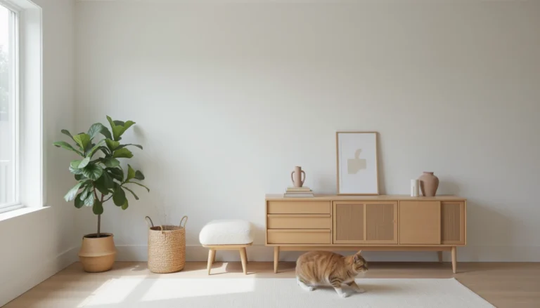
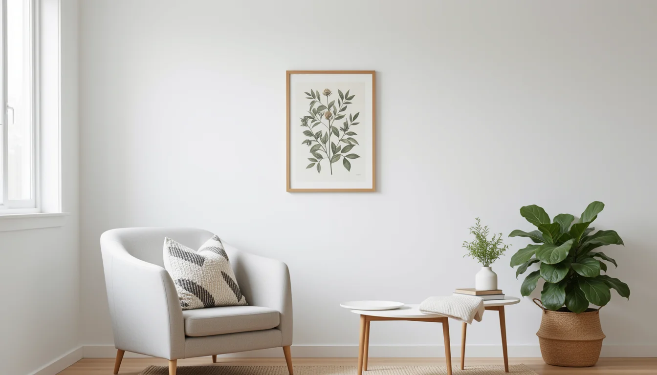
1. Botanical Line Art Print — Minimalist Illustration
Best overall
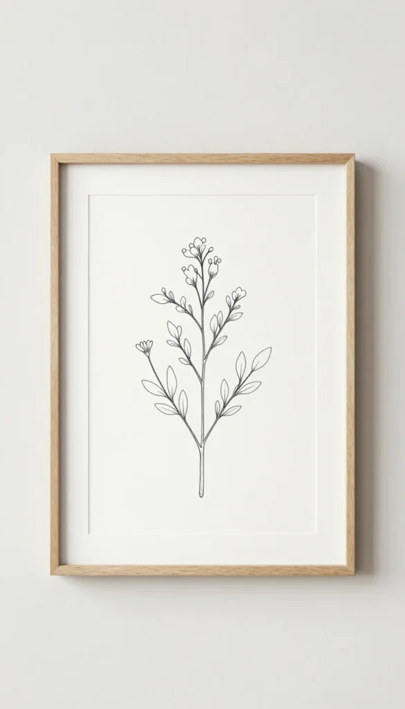
A single delicate botanical line drawing on warm white matte paper is the Scandinavian wall art archetype — and the reason it has become a cliché is that it genuinely works. The fine lines read well at distance, the subject matter brings a living quality to a minimal palette, and the scale and frame choice are the only real decisions you need to make.
Color note: Botanical line art in warm black ink on cream paper extends the room’s warm neutral palette vertically — the ink’s warmth prevents the print from reading as stark, which is the difference between Scandinavian minimalism that feels cold and minimalism that feels considered.
2. Abstract Nordic Landscape Print — Muted Tones
Best for color introduction
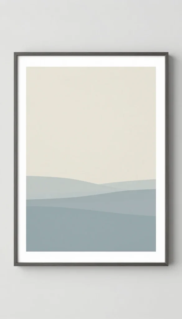
A minimal landscape — horizon line, pale sky, a suggestion of land or water — in muted sage, pale blue, and warm cream is one of the most effective ways to introduce a secondary color into a Scandinavian palette without disrupting its restraint. The key is muted rather than saturated — the colors should look like they’ve been softened by Nordic fog.
Color note: Muted sage and pale blue in a landscape print work as cool accents in a warm neutral room — they shift the palette toward the blue-grey of actual Nordic light without dominating it, which is the color move that makes a Scandinavian room feel authentic rather than just white.
3. Typography Print — Danish or Swedish Phrase
Best for personal connection
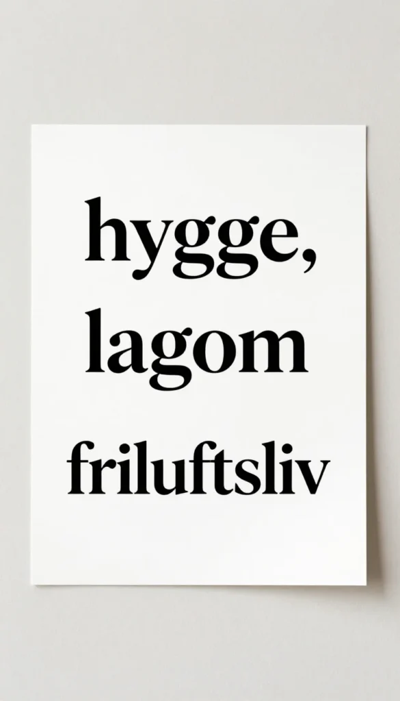
A single word or short phrase in a clean sans-serif typeface on warm white paper — “hygge,” “lagom,” “friluftsliv” — does something a purely visual print can’t: it gives the room a philosophy. The key is typeface. Clean geometric sans-serif (not script, not serif) in warm black. Centered on the print with generous margin.
Color note: Black typography on warm white paper creates the highest-contrast element in a low-contrast palette — it functions as a visual anchor that gives the eye a place to land in a room that deliberately avoids competing focal points.
4. Lino Print — Geometric Animal Silhouette
Best texture in a print
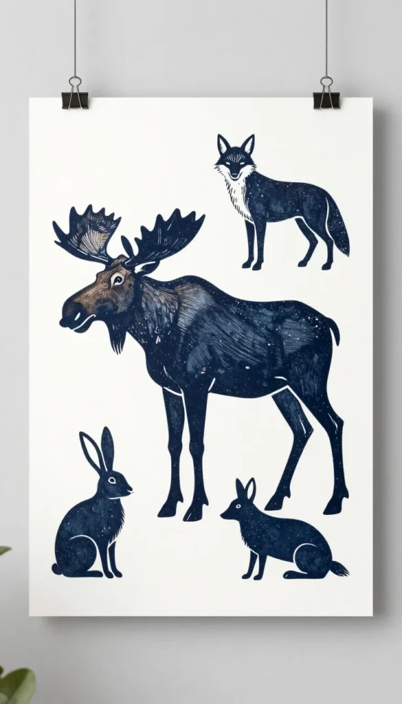
A linocut print — printed from a hand-carved block — has a texture and imperfection that digital prints don’t. The slightly irregular ink coverage and the tactile quality of the pressed paper add warmth to an otherwise cool-palette room in a way that’s difficult to explain but easy to feel. Moose, fox, or hare silhouettes are the most Scandinavian subjects.
Color note: The ink irregularity in a genuine lino print creates subtle warm-cool variation within what reads as a single black area — it’s a small color complexity that prevents the print from feeling flat and makes the room’s palette feel more layered.
5. Large Format Abstract Line Art — Single Frame
Best for large walls
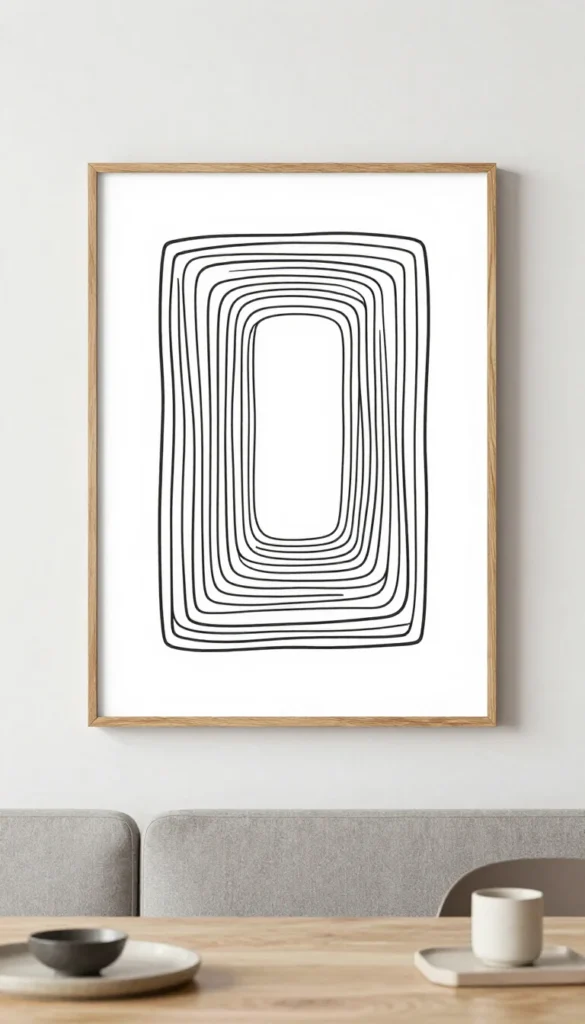
For a wall that genuinely needs to be anchored — behind a sofa, above a dining table — a large format abstract line drawing in a simple oak frame is the Scandinavian answer to the gallery wall. One large piece reads as more considered and confident than a collection of smaller ones. The larger the print, the more important the negative space within the image itself.
Color note: A large warm-white print on a warm-white wall creates a monochromatic moment where the frame and the shadow it casts are doing the color work — it’s one of the most sophisticated palette decisions in Scandinavian design and one of the easiest to execute.
6. Pressed Botanical — Framed Real Plant
Best under $35
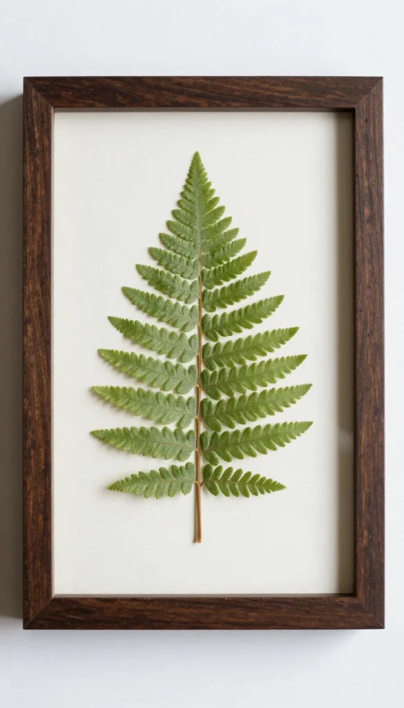
A real pressed botanical — a fern, a leaf, a wildflower — in a simple frame is more interesting than a botanical illustration because the organic material carries actual color variation that a printed reproduction can’t replicate. The slight browning and texture of a real pressed plant adds a warmth and authenticity that makes it worth the small extra effort of sourcing one.
Color note: Real pressed botanicals carry the warm green-to-amber color transition that happens when organic matter dries — it’s a color complexity that introduces both warm and cool natural tones simultaneously and bridges the plant kingdom to the Scandinavian palette’s wood and linen tones.
7. Woven Textile Wall Panel — Natural Linen
Best texture on a wall
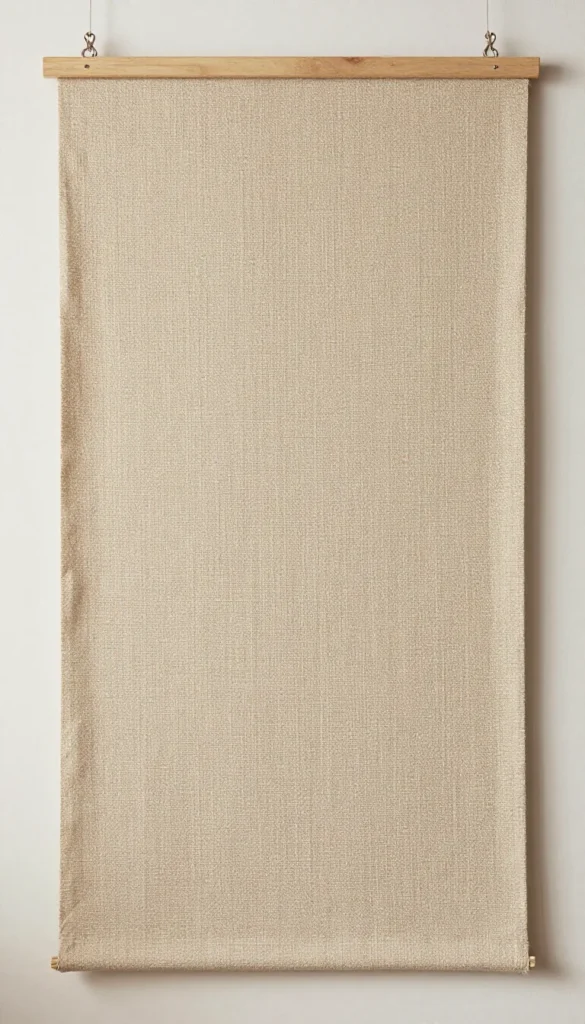
Not all Scandinavian wall art needs to be a print. A simple woven linen panel — no pattern, just the natural texture of the weave — adds warmth and dimension to a wall in a way that a framed print doesn’t. The material reference connects to the room’s other natural fiber elements and makes the wall feel part of the room rather than a separate surface.
Color note: Natural linen on a white wall creates a warm-neutral-on-neutral composition where the texture does all the work — the linen’s warm straw tone lifts the wall’s temperature without introducing a color that needs to be coordinated with anything else.
My pick for most rooms
The botanical line art print in a natural oak frame for a standard wall — it’s the single most versatile Scandinavian wall art choice because it works at any scale, in any room, against any pale palette. Pair it with genuine negative space on either side. The empty wall isn’t something you failed to fill. It’s part of the design. Total under $60 for print and frame combined.