5 Color Combinations That Go Perfectly With Blue Interiors
You’ve finally settled on blue for your interior—great choice!—but now you’re standing in the paint aisle, suddenly second-guessing everything. What furniture works? What about trim? The color you loved on the swatch now feels like a puzzle you didn’t know you were signing up for.
Here’s the thing: blue isn’t the problem. It’s actually one of the most flexible colors you can choose. The real magic happens when you pair it with unexpected companions that elevate the whole room. Think warm terracotta that makes a navy kitchen feel like a Tuscan evening, or soft blush that turns a powder blue bedroom into something straight out of a design magazine.
These combinations don’t just look good on day one—they grow with your style, hide everyday wear, and keep your space feeling fresh for years. Ready to see which pairings actually work in real homes?
Key Takeaways
Finding the right accent colors for blue interiors can feel overwhelming fast. You pick a shade, then second-guess every decision. Will it look too cold? Too dated? Suddenly your relaxing project feels like a stressful exam.
The trick is choosing pairings that do the heavy lifting for you. Blue works harder when it shares the room with colors that balance its edges and amplify its mood. Think warm metallics that catch candlelight, earthy textures that soften bold walls, or unexpected contrasts that make compact spaces feel intentional, not cramped.
These aren’t fussy, of-the-moment combinations you’ll tire of by next spring. They’re built to evolve with you—scuffs, patina, and all. Each pairing below solves a real design dilemma while keeping things livable. Ready to find your blue’s perfect match?
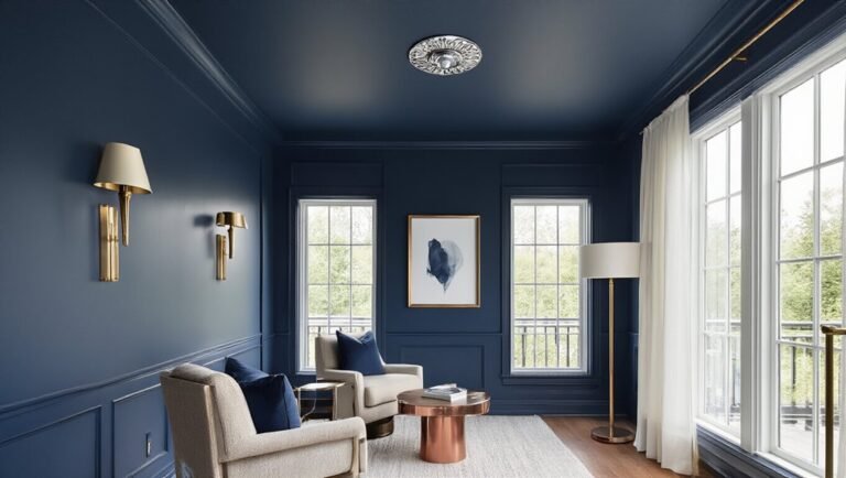
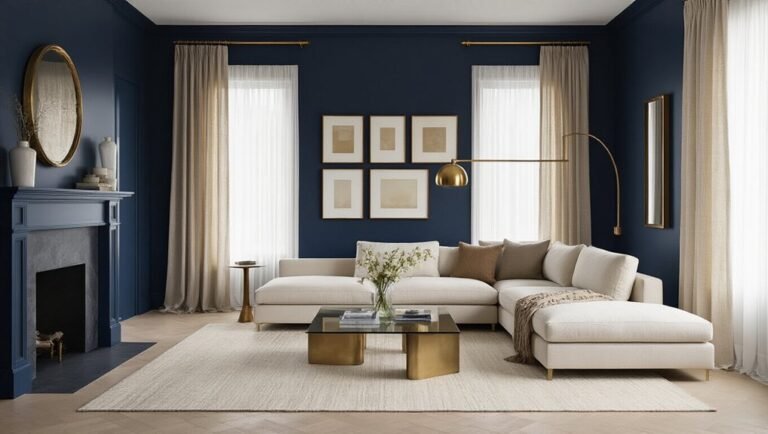
Midnight Blue and Antique Brass: Start Formal Without Looking Staged
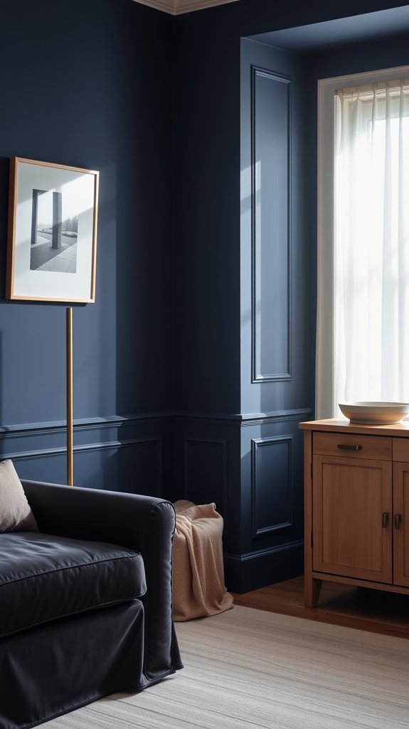
You want your home to feel polished, but every “fancy” design you see looks like it’s trying too hard. The stiff rooms. The “don’t touch anything” vibe. It’s exhausting.
Here’s the fix: midnight blue walls with antique brass accents. The deep blue grounds your space without feeling cold, while vintage-style brass catches light and actually makes rooms feel warmer. Swap in dimmer switches, and suddenly dinner parties feel intimate instead of performative.
The best part? This combo ages beautifully. Brass develops character over time, and that rich blue never screams “trend.” You’re investing in a look that stays relevant without constant updates.
Ready to see how this pairing transforms every room in your house?
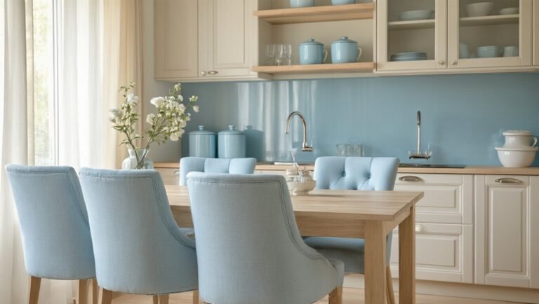
Pale Blue and Warm Sand: Coastal Character, Zero Clichés
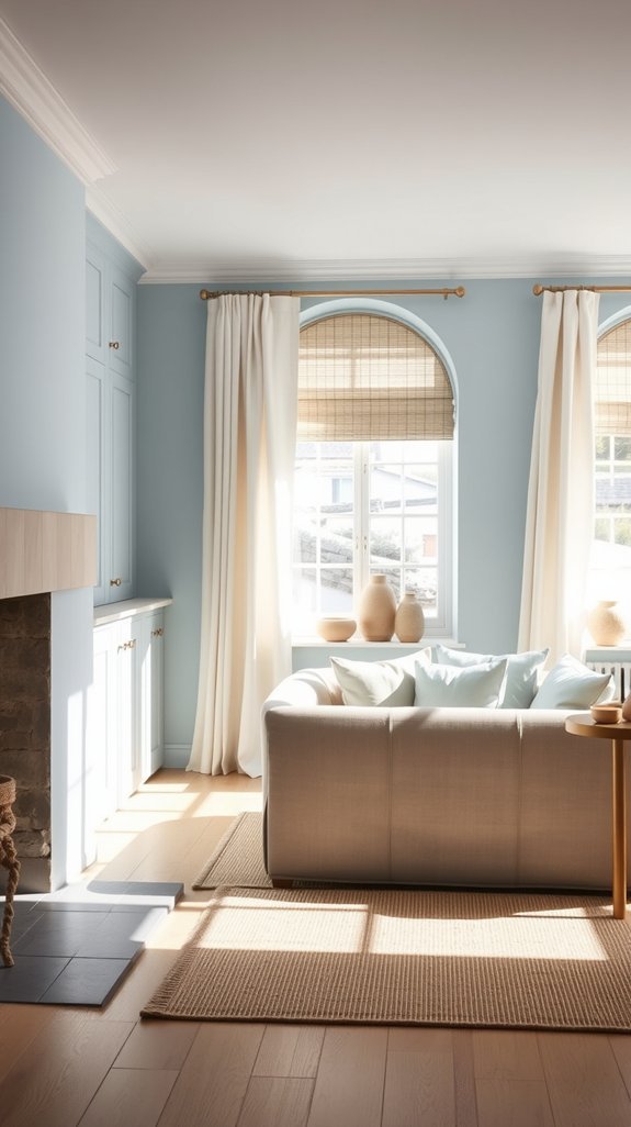
Let’s be honest—coastal décor has a bad rap. One minute you’re dreaming of breezy Hamptons vibes, the next you’re drowning in seashell-shaped soap dishes and “Live, Laugh, Love” signs staring back from your walls. We’ve all seen that beach house. Maybe we’ve even lived in it.
Coastal décor crashes fast—one minute it’s breezy Hamptons dreams, the next it’s seashell soap dishes and motivational wall signs screaming at you.
Here’s the fix: coastal done *quietly*. Think pale blue walls that feel like morning sky, paired with textiles in warm sand tones that actually make you want to kick off your shoes and stay awhile. Add raw wood and a beat-up leather chair against crisp linen, and suddenly you’ve got something better than themed—you’ve got timeless.
The beauty? This look grows with you. No annual purges of trendy anchor motifs. Just calm, collected spaces that still feel like vacation 365 days a year.
Ready to ditch the seashells and still catch the breeze? Let’s dive in.
Cobalt and Charcoal: Add Energy to Compact Modern Rooms
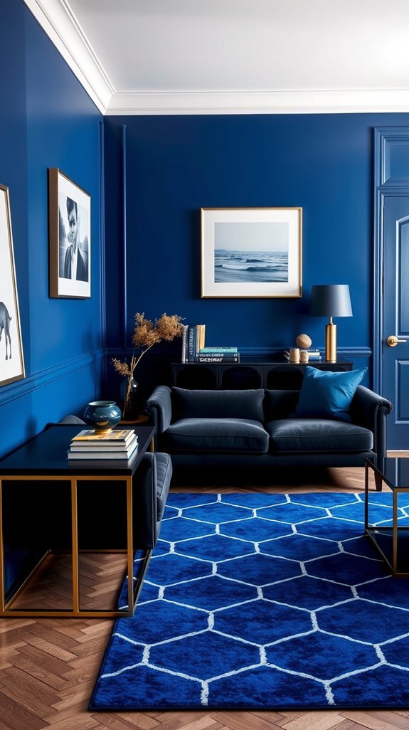
Small spaces can feel like a puzzle you never quite solve—every piece of furniture fights for attention, and “cozy” quickly turns into “cluttered.” But what if your compact room could feel bigger and bolder at the same time?
Enter cobalt and charcoal: the power couple your tiny living room didn’t know it needed. Deep, electric blue punches against moody gray accents to create depth that actually stretches your walls visually. No magic tricks—just smart color play that feels sharp, confident, and refreshingly modern.
The best part? This combo works hard so you don’t have to. It hides scuffs, forgives dust, and stays stylish for years. Suddenly your snug studio doesn’t feel like a compromise—it feels like a choice.
Ready to see how bold hues can open up your space? Let’s dive into the details.
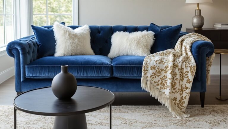
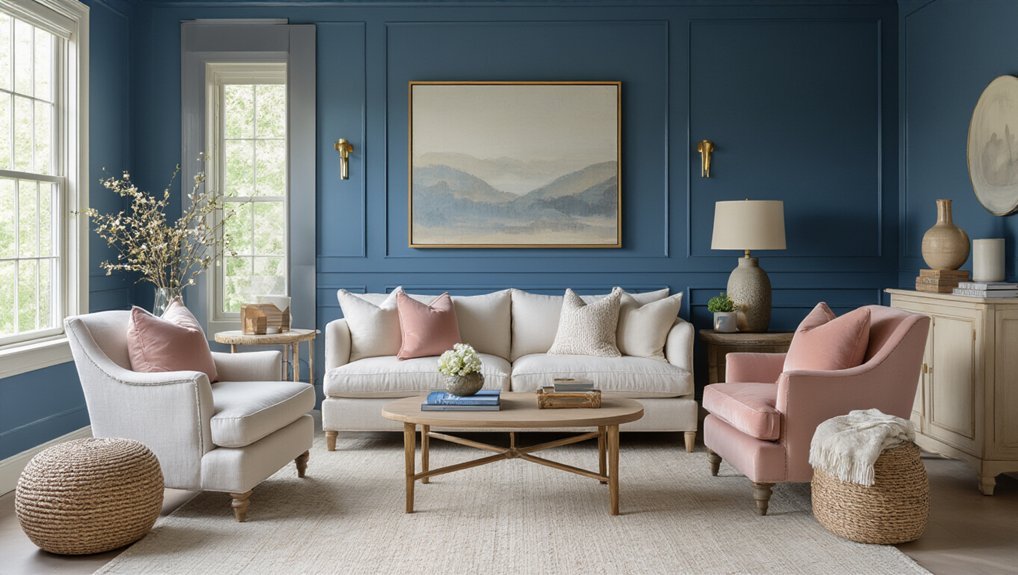
Dusty Blue and Blush: Soften Bedrooms Without Sacrificing Edge
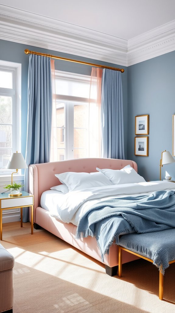
You’re tired of bedrooms that feel either too cold and bare or so soft they look like they gave up. Dusty blue and blush solve this beautifully. These two colors talk to each other instead of competing—cool restraint meets gentle warmth, and somehow your room ends up feeling both grown-up and inviting.
Here’s the magic: dusty blue does the heavy lifting of structure and calm, while blush adds just enough life to keep things from feeling stiff. Paint your walls that muted blue, pile on some blush bedding or curtains, and suddenly your space has personality without screaming for attention.
The best part? This combination ages gracefully. No trendy regrets in two years, no wondering what you were thinking. Just a bedroom that feels intentional every single morning. Ready to see how this pairing actually works in real rooms?
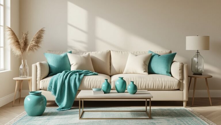
Teal and Terracotta: Create Depth When Pure Blue Falls Flat
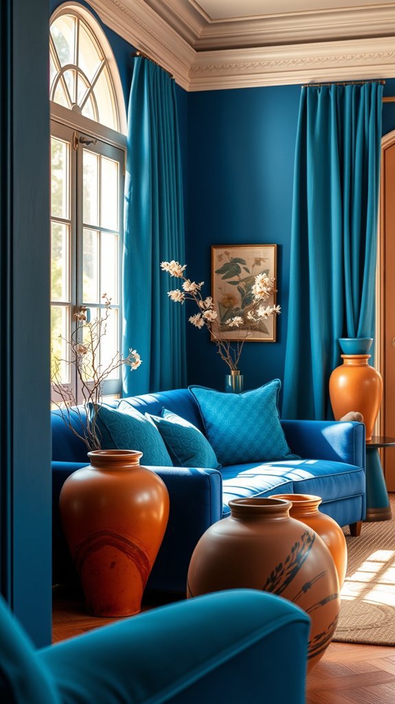
We’ve all stood in a room that somehow felt like a museum exhibit—beautiful blue walls, zero soul. Everything perfectly painted, yet somehow flat as a screensaver. That’s the pure blue trap: cool and clean, but craving the warmth that makes guests want to kick off their shoes and stay awhile.
Enter teal and terracotta, the unexpected duo that saves spaces from themselves. Think of teal as blue’s more interesting cousin—still calming, but with depth and personality. Pair it with terracotta’s sunbaked warmth, and suddenly your room breathes. Rough clay pots against plush velvet pillows. Weathered pottery beside saturated jewel tones. No design degree required—just instinct and a little courage.
The magic? This combination works as hard as you do. Trend-proof, mood-lifting, and forgiving of real life. Ready to trade flat for fascinating?
Conclusion
Blue walls felt like such a good idea—until you stood there wondering why everything looked a little cold and unfinished. We’ve all been there, staring at that perfect shade of blue and realizing it needs *something* to make it feel like home.
The secret? It’s not about buying more blue. It’s about finding colors that talk to each other. The right pairing transforms a flat, one-note room into a space with depth, warmth, and personality that actually makes sense for how you live.
Think of it like cooking: blue is your main ingredient, but the supporting flavors are what make people ask for seconds. And here’s the best part—get this right once, and you’ve got a formula that works across every room, season, and trend cycle.
Ready to meet the five color duos that actually pull it off?