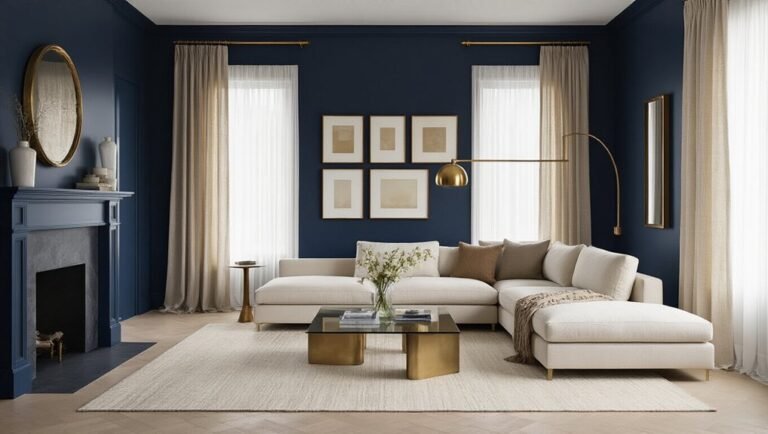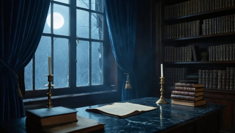
5 Reasons Midnight Blue Is the Ultimate Productivity Color for a Sophisticated Study
Tired of boring beige? You’re not alone.
Midnight blue hits different. It’s chill without knocking you out 😌
It hides your mess. Commands attention. Glows at sunset.
Your friends will notice. Trust.
Ready to see why this shade upgrades everything?
Let’s go 🚀
It Calms Your Brain Without Putting It to Sleep
You’ve been there. 3 PM hits and your focus nosedives into existential dread territory. Your brain’s screaming for coffee but your soul wants a nap. Enter midnight blue.
It’s science, not magic 🧠
How color affects focus is wild. Your brain literally chills out around blue. Cognitive benefits of blue hues include lowered heart rate and reduced anxiety. You’re calm but awake. Alert but not wired.
The sleep trap is real 😴
Pastel blue? Knocks you out. Bright blue? Stresses you out. Midnight blue hits different. It’s deep enough to feel grounded. Rich enough to feel fancy.
Your vibe matters ✨
Paint that accent wall. Grab that desk lamp. Your brain deserves this. No more 3 PM doom spirals. Just you, crushing tasks, feeling like a CEO in a moody library.
Dragon energy without the chaos!
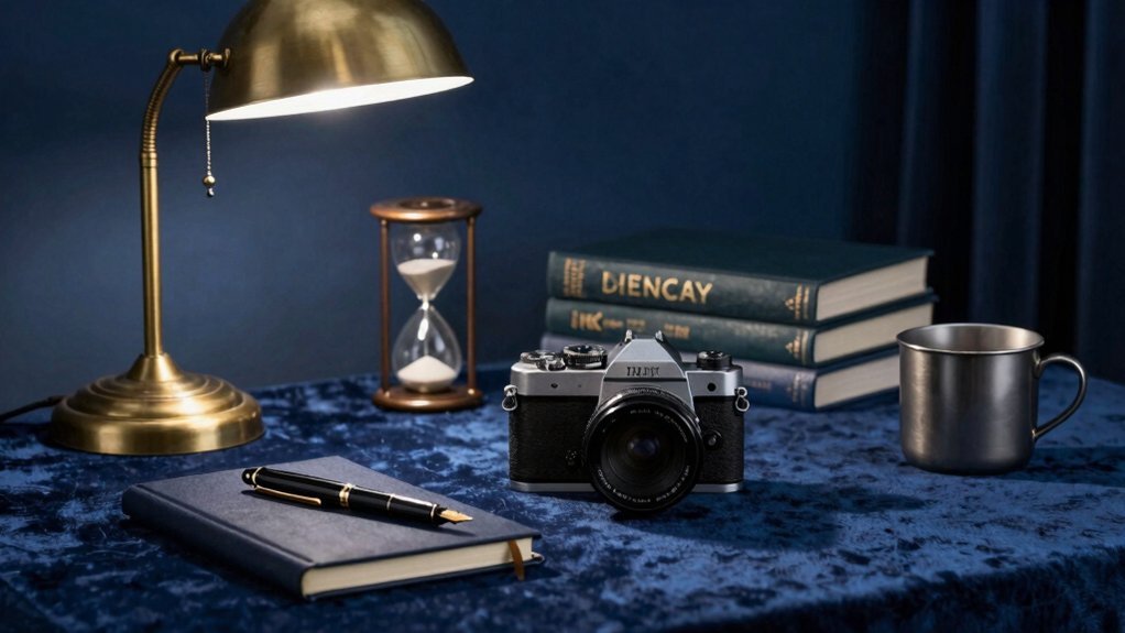
It Hides Visual Clutter So You Can Actually Focus
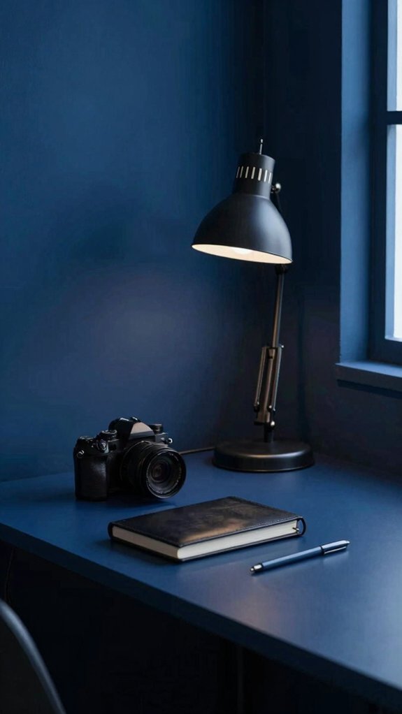
Why does your desk look like a crime scene? 😅 We’ve all been there. Cables everywhere. Coffee cups breeding.
It hides clutter like a boss.
Midnight blue swallows the mess. Your brain doesn’t register chaos. You just vibe with the calm.
Boosts focus instantly.
Dark walls create a chill zone. Your eyes relax. Your mind follows.
Calming ambiance = game changer.
No harsh white bouncing everywhere. No beige boring you to tears. Just pure productive zen ✨
Reduces distractions hard.
That random stapler? Gone. The pile of papers? Vanished into the depth.
Subtle contrast, enhanced legibility
Your screen pops. Your notes stand out. Reading feels effortless now.
You’re not decorating. You’re hacking your brain! 🧠
Dark blue = clean slate energy without the actual cleaning.
It Commands Attention Better Than Safe Neutrals
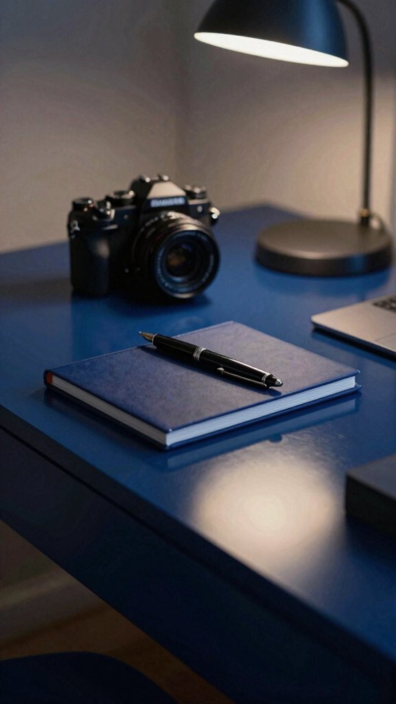
Midnight blue grabs you. It owns the room.
Safe neutrals whisper. This shade shouts “pay attention.”
You’re not drowning in distraction. You’re locking in. That deep tone creates visual clarity instantly. Your brain goes “oh, we’re doing this.” ✨
Calm focus hits different here.
Neutrals fade into background noise. Midnight blue stays present without screaming. It’s the chill authority you need.
Your desk pops against it. Your thoughts organize faster. Weird but true!
No more boring study caves.
You want a vibe that works *with* your brain, not against it. This color delivers that executive energy without the corporate soul-crush.
Pick bold. Your productivity thanks you. 🎯
It Shifts From Daylight Bright to Lamplight Warm
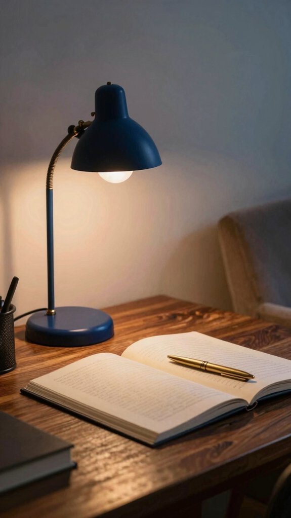
You’ve got productivity locked in from sunrise to late night cramming. No harsh surprises when the sun dips.
Daylight hits different here.
Morning sun bounces off midnight blue walls and enhances contrast without frying your retinas. You stay alert. You stay focused.
Then evening arrives.
Your desk lamp warms everything up. The color shifts color balance from crisp to cozy. You’re not fighting your space anymore.
The magic stuff:
- reduces glare on screens (your eyes thank you!)
- soft shadows hide clutter you haven’t organized yet lol
- vibe stays productive but chill
You don’t need multiple rooms. You’ve got one that adapts! It’s basically the study equivalent of that friend who fits every group.
It Tells Visitors You Didn’t Decorate on Autopilot
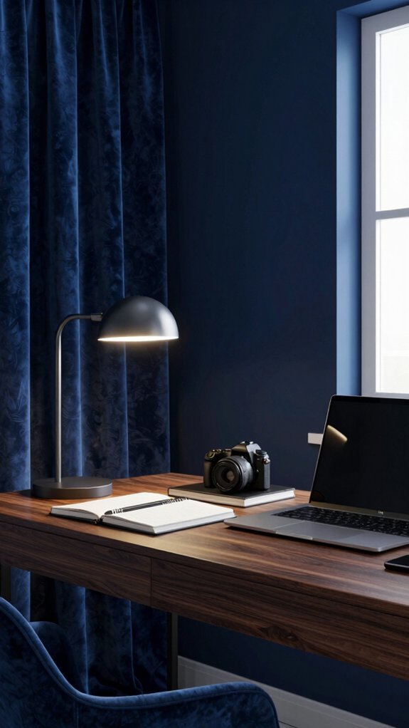
With midnight blue walls, they pause. Visitors notice. You didn’t default to beige. You chose bold. That’s intentional aesthetics at work!
Mindful curation wins. 🎯
You’ve built a vibe. Not a showroom. Not a Pinterest clone. Your study screams *you* actually thought about this. Midnight blue takes guts. It takes planning. It takes knowing yourself.
Autopilot is beige. 😴
Your friends walk in and feel the difference. They see someone who curates with purpose. Someone who rejects boring. That’s power!
The chill flex. ✨
You didn’t follow trends. You set them. Your space feels collected not bought. Lived-in not staged. That’s the ultimate sophistication.
Own it! 🙌
Your study tells stories. Your choices matter. Visitors know immediately: you’re intentional about everything. Even walls.
Conclusion
Your brain deserves better than beige.
Go bold or go home, right?
Midnight blue hits different. Your focus will thank you. Your zoom background too. 😎
Level up that study. Like yesterday.
Stop doomscrolling paint swatches. Just commit. 💪
Your sophisticated era starts now.