How to Use Scandinavian Colors Without Making Your Space Look Washed Out
Why Layering Matters: Avoiding the Flat Trap
How does one maintain visual interest when working with a restricted palette of whites, grays, and soft neutrals?
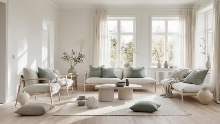
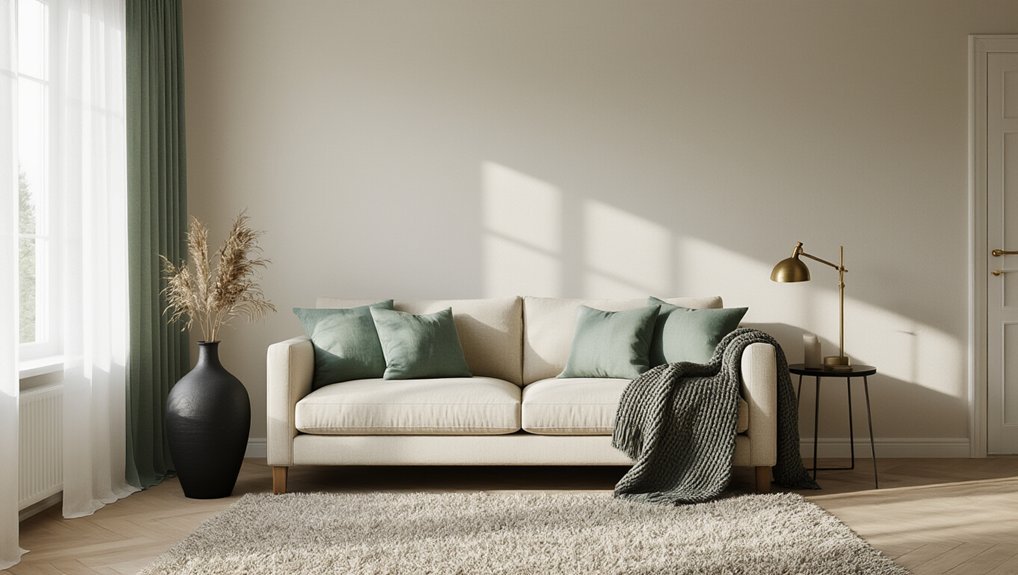
Layering proves essential. By combining textures—linen, wool, leather, and natural wood—designers create depth without relying on bold colors. This approach defines warm minimalism, where restraint meets tactile richness. Varying material finishes, from matte to glossy surfaces, adds visual complexity. Strategic placement of lighter and darker neutrals establishes subtle contrast. Incorporating natural light and shadow further emphasizes dimensionality. The key lies in understanding that Scandinavian design’s sophistication emerges not from color saturation but from thoughtful textural composition and material interplay.
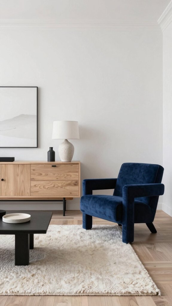
Create Depth With Monochromatic Contrast
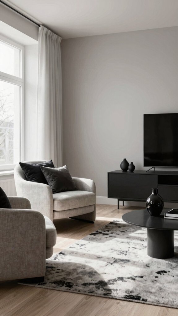
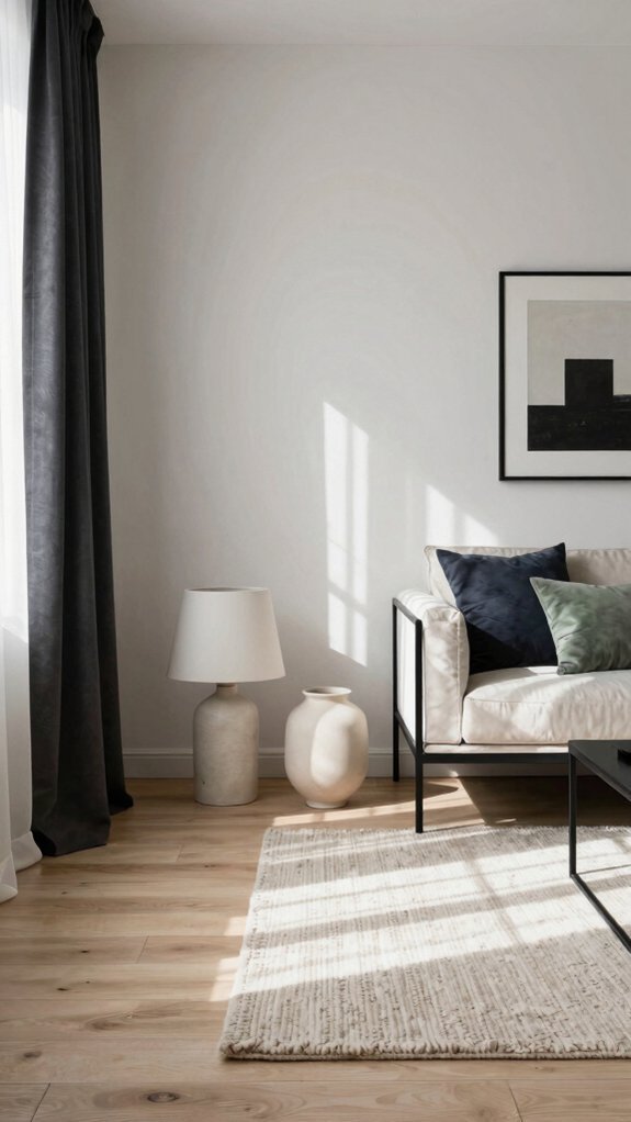
While layering textures creates the foundational richness of Scandinavian interiors, the strategic use of monochromatic contrast elevates that foundation into genuine visual drama. Designers achieve this by pairing light neutrals with deeper tones, such as charcoal accents on walls or furnishings. This approach maintains the aesthetic’s minimalist essence while introducing necessary shadow and dimension. A charcoal accent wall behind white furniture, or dark throw pillows against cream upholstery, creates focal points without overwhelming the space. The key lies in proportion: keep lighter tones dominant while allowing darker elements to punctuate and define areas, preventing the flat, washed-out appearance that undermines Scandinavian design’s intended sophistication.
Pick Warm or Cool Neutrals First (It Sets Everything)
Before layering any accent colors or textures, designers must establish whether their neutral palette leans warm or cool—a foundational decision that determines the entire room’s atmosphere and color harmony.
Establish whether your neutral palette leans warm or cool—a foundational decision that determines your room’s entire atmosphere and color harmony.
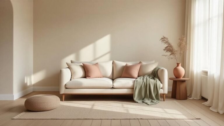
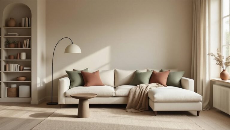
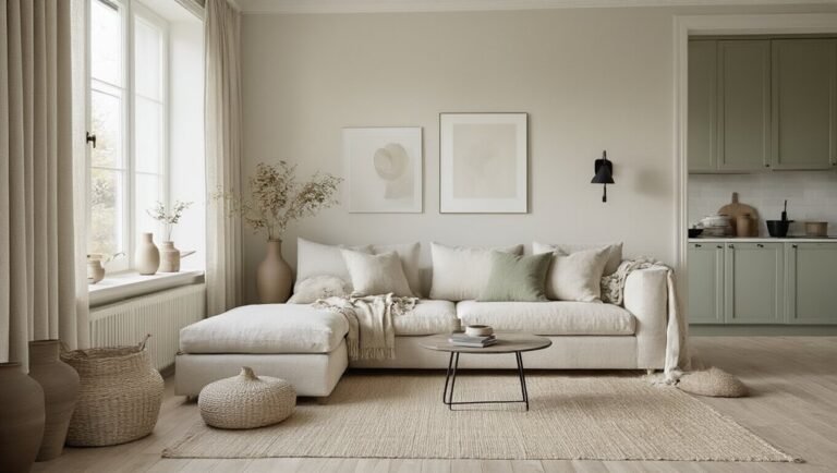
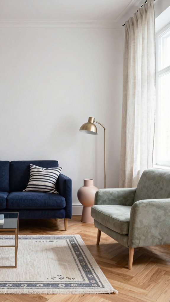
Warm neutrals like smoked oak, beige, and cream create inviting, grounded spaces that feel intimate.
Cool neutrals—whites, soft grays, and pale blues—evoke calm clarity.
This choice influences which accent colors will work best.
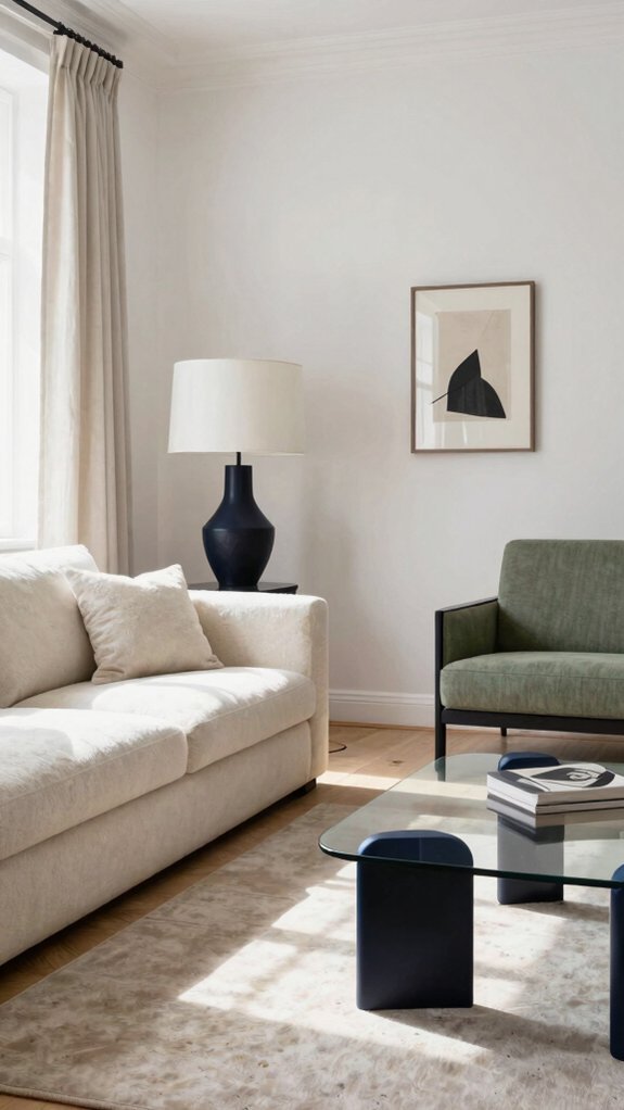
Warm-based rooms pair beautifully with terracotta or mustard, while cool-based spaces harmonize with navy or sage.
Committing to this direction prevents color clashing and ensures cohesive Scandinavian design that feels intentional rather than accidental.
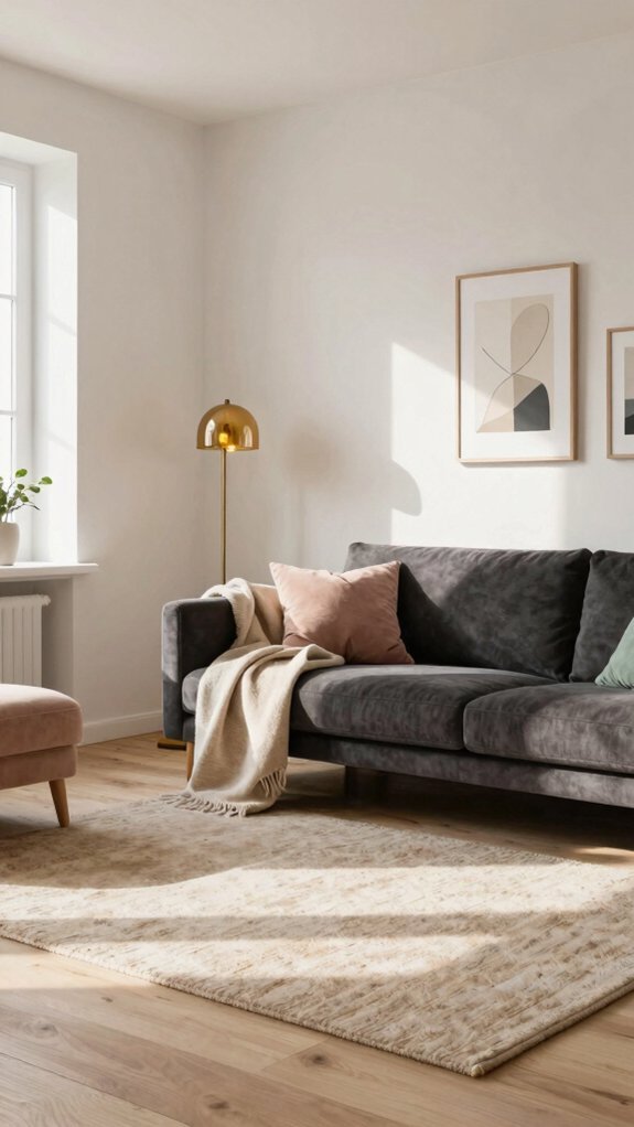
Strategic Color Pops That Reinforce Minimalism

Once the neutral foundation is established, designers can deploy color strategically to enhance rather than overwhelm the minimalist aesthetic. Accent colors function as visual punctuation marks, drawing focus to specific areas without disrupting spatial harmony. A single plum noir accent wall or carefully placed furnishings creates sophisticated depth while maintaining restraint. Deep jewel tones, muted greens, and charcoal accents work exceptionally well against light backdrops.
The key lies in limiting color application to one or two statement pieces per room. This approach preserves the clean, uncluttered feeling characteristic of Scandinavian design while introducing personality and visual interest that prevents spaces from appearing bland or sterile.
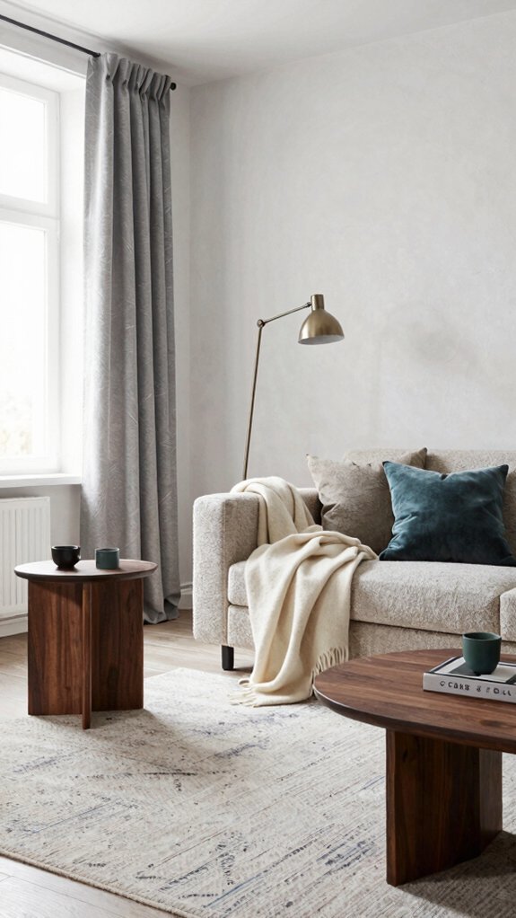
Texture: Your Secret Weapon for Visual Interest
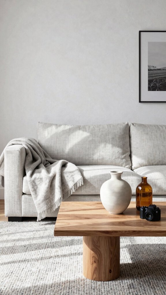
Strategic color placement establishes visual hierarchy, but texture adds the dimensional quality that prevents minimalist interiors from feeling flat or austere. Raw wood surfaces, woven textiles, and concrete elements create tactile contrast against neutral palettes. Microcement finishes on walls or floors introduce sophisticated depth while maintaining Scandinavian simplicity. Layering materials—linen, wool, stone, and metal—encourages the eye to explore surfaces rather than fixate on color limitations. These textural choices ground pale schemes in substance and authenticity. Natural variations in materials provide subtle visual interest without introducing jarring hues, allowing the space to feel sophisticated and intentional rather than incomplete.
Light Your Space to Reveal Hidden Dimension
How does lighting transform a pale Scandinavian palette from seemingly monotonous to richly dimensional? Strategic illumination reveals subtle variations within neutral tones, creating depth and visual richness. Natural light accentuates texture, while layered artificial lighting—combining ambient, task, and accent sources—highlights architectural details and surface qualities. A lime-wash finish, for instance, gains considerable dimensionality under directional light, its inherent variations becoming apparent. Warm-toned bulbs enhance cream and ivory walls, preventing sterility. Positioning light sources to cast gentle shadows across surfaces amplifies textural interest established through furnishings and finishes. This interplay between light and shadow transforms Scandinavian minimalism into sophisticated, multidimensional environments.
Add Richness Through Natural Materials
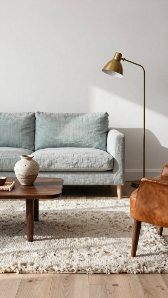
Natural materials serve as the antidote to sterile minimalism, infusing Scandinavian spaces with warmth and tactile richness. Wood flooring, exposed beams, and furniture crafted from solid timber ground neutral palettes with organic texture. Stone accents, wool rugs, and linen upholstery add layered depth that prevents rooms from appearing flat or washed out.
Incorporating elements like terracotta pottery or clay vessels introduces earthy warmth while maintaining the region’s characteristic simplicity. These materials bridge the gap between pale Scandinavian hues and visual interest, creating spaces that feel both serene and inviting through authentic, unrefined surfaces.
Use Pattern Sparingly: The Right Ratio
While natural materials provide textural foundation, pattern introduces visual rhythm without overwhelming pale Scandinavian schemes. The key lies in strategic restraint. Designers typically recommend limiting patterns to 30% of a room’s visual surface, allowing breathing room for neutral expanses. Geometric prints, stripes, and Nordic-inspired motifs work particularly well when concentrated on single accent pieces—a throw pillow, area rug, or feature wall. This measured approach prevents visual chaos while maintaining the aesthetic’s signature minimalism. Color drenching specific elements with patterned depth creates focal points that anchor spaces, ensuring Scandinavian interiors feel intentional and layered rather than sterile.
Create a Strong Focal Point to Ground Neutrals
Why do minimalist spaces sometimes feel unfinished rather than serene? A strong focal point anchors neutral environments, preventing them from appearing bland. This could be a deep ochre accent wall, a statement artwork, or striking furniture piece. Such elements draw the eye and create visual interest without overwhelming the space. By establishing one commanding feature, designers ground the palette of whites, grays, and beiges. This strategy prevents the room from dissolving into monotony. The focal point becomes the anchor that transforms sparse minimalism into intentional Scandinavian design, maintaining sophistication while preserving the light, airy aesthetic.
Apply the 60-30-10 Rule to Scandinavian Schemes
The 60-30-10 color formula provides a mathematical framework for applying focal points strategically throughout a room. This rule designates sixty percent for a dominant neutral base, thirty percent for a secondary color, and ten percent for accent tones. In Scandinavian design, cream or soft gray typically anchors the space, while a muted blue or green serves as the secondary layer. The essential ten percent allows for bolder accents—persimmon, terracotta, or deep charcoal—that prevent the scheme from appearing bland. This proportional balance ensures neutrals maintain visual interest without overwhelming the space, creating depth and sophistication while preserving Scandinavian minimalism’s essence.