How to Choose and Style Afro Bohemian Wallpaper
Afro Bohemian Wallpaper: Visual Language and Cultural Roots
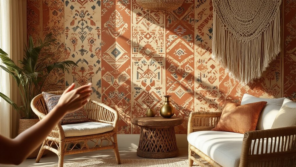
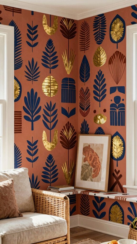
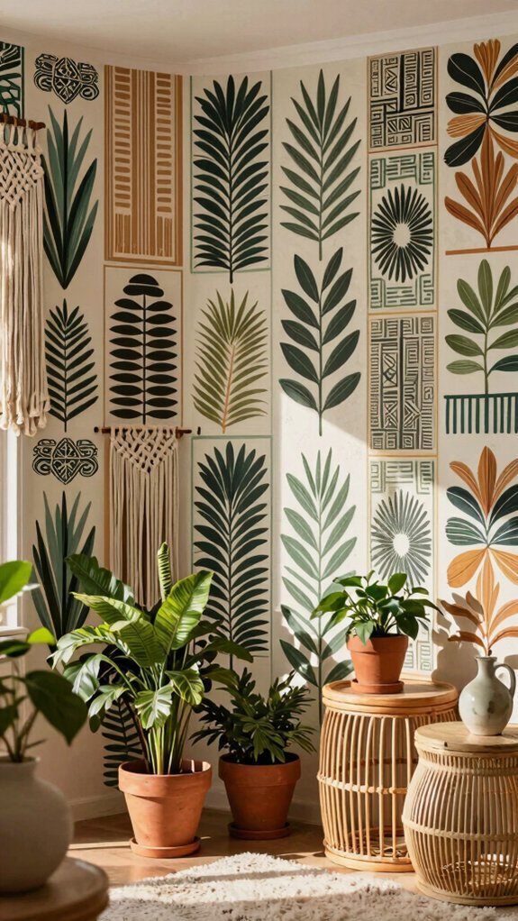
Afro bohemian wallpaper draws from a rich tapestry of cultural influences, blending African artistic traditions with free-spirited, eclectic design sensibilities. I see mud cloth patterns, Adinkra symbols, and kente-inspired geometries dancing alongside flowing botanicals and dreamcatcher motifs. You’re witnessing centuries of diasporic creativity reinterpreted through a bohemian lens—earthy ochres, indigos, and terracottas grounding wild, asymmetrical compositions.
I trace how nomadic Tuareg aesthetics merge with 1970s counterculture, creating visual storytelling that honors ancestry while embracing wanderlust. When you study afro bohemian wallpaper closely, you’ll notice hand-drawn imperfection matters more than precision; each line carries intention, resistance, and celebration across your walls.
Where to Find Authentic Afro Bohemian Wallpaper
Where do you turn when mass retailers peddle watered-down prints that strip away the soul of Afro bohemian design? I hunt for Black-owned studios and African diaspora designers who honor heritage through every brushstroke. I scour independent marketplaces like Etsy for artisans preserving traditional Adinkra symbols, Kente patterns, and botanical motif that pulse with cultural memory. I bookmark brands like Yowie, Home Union, and small Nigerian studios shipping globally. I dig through textile archives and collaborate directly with artists who understand that authenticity isn’t aesthetic—it’s lineage. I pay premium prices gladly, knowing my walls carry stories mass production can’t replicate.
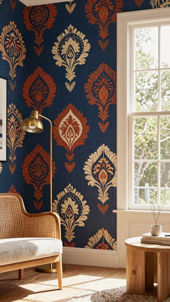
Choosing Patterns by Scale, Color, and Room Function
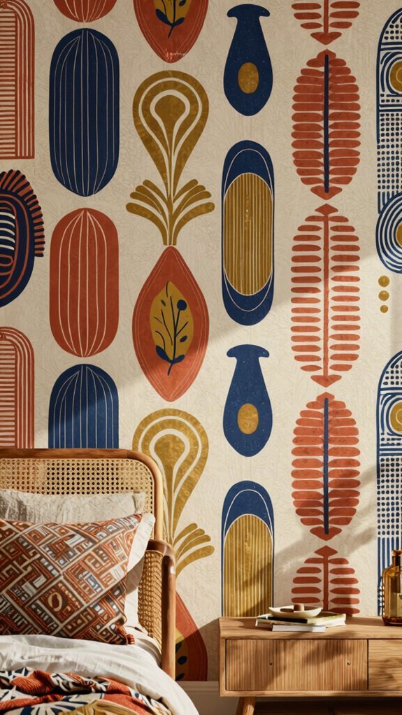
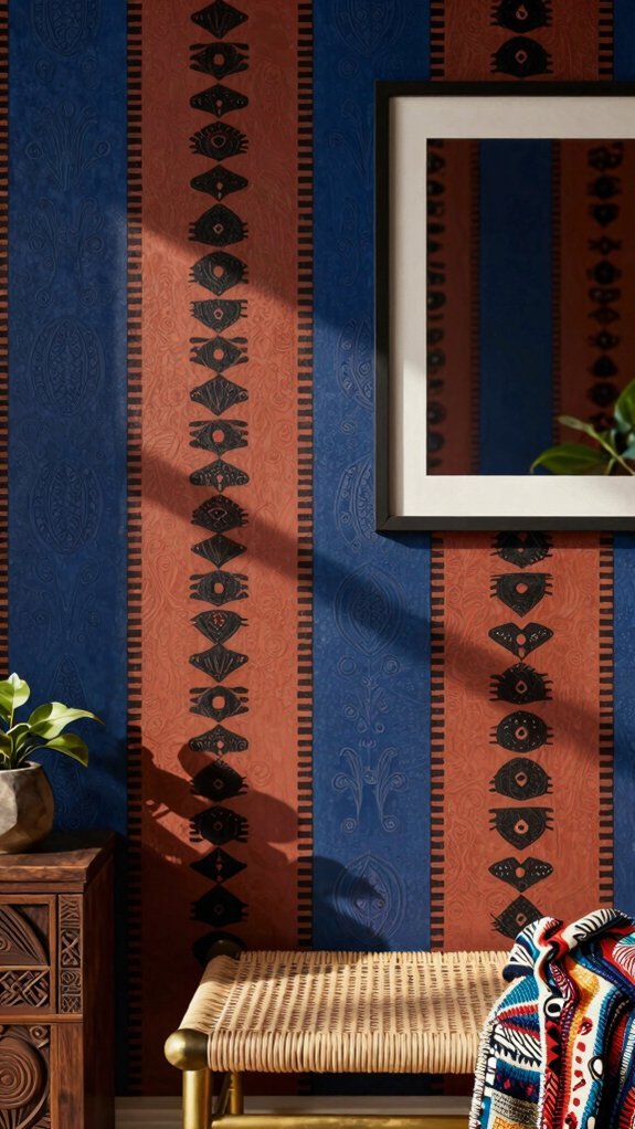
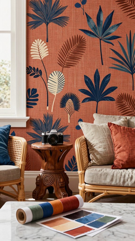
How do I know which pattern won’t overwhelm my space before I’ve even unrolled it? I measure twice and choose once. In small rooms, I stick with delicate prints; oversized patterns demand breathing room. I balance bold geometric wallpaper with solid furniture so nothing competes. For bedrooms, I favor softer, flowing motifs that promote rest. I energize kitchens and entryways with vibrant, busy designs that spark conversation. Color anchors my decisions—deep earth tones ground a space while jewel tones add drama. I always test samples at different times of day, trusting my eye to guide the final choice.
Matching Wallpaper to Your Room’s Natural Light
Why does the same wallpaper look divine in the store and dull in my hallway? I’ve learned it’s all about light. North-facing rooms drain warmth, so I push for rich, grounded tones—charcoal, clay, deep sand—that embrace the shadow rather than fight it.
South-facing spaces blast warmth, and I’ve watched cream-based neutrals glow beautifully there. I always test swatches at different hours because color logic shifts with the sun. Your neutral base isn’t just background; it’s how light lives in your room. Match your ground color to your window’s personality, and suddenly every pattern sings.
Small Spaces, Big Impact: Scaling Patterns Without Overwhelming
What stops most people from going bold in a tiny bathroom or cramped entryway? Fear of closing in the space further. I refuse to let square footage dictate my design choices. I scale patterns strategically: I choose medium-scale prints over oversized ones, and I apply wallpaper to a single accent wall rather than wrapping the entire room. I create dimensional layering by pairing textured grasscloth with flat-printed afro bohemian motifs, adding depth without visual chaos. I extend the wallpaper onto the ceiling for unexpected continuity. Small spaces crave personality, and I’ve learned restraint with placement lets bold patterns breathe and thrive.
Balancing Bold Prints With Calming Neutrals
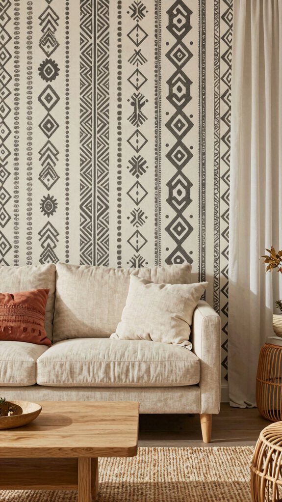
Every room I’ve designed with afro bohemian wallpaper taught me the same lesson: bold prints demand breathing room. I balance vibrant geometric wallpaper with sandy taupes, warm whites, and muted terracottas on neighboring walls. These neutrals don’t compete—they let the pattern sing.
I pick up the wallpaper’s subtle undertones and repeat them in plaster finishes or raw linen curtains. This creates visual rest without stripping away energy. You’ll notice how a geometric wallpaper’s rhythm feels intentional, not chaotic, when anchored by earth-toned serenity. I never mute the spirit; I simply give it space to resonate.
Sofas, Rugs, and Throws That Ground Your Wallpaper
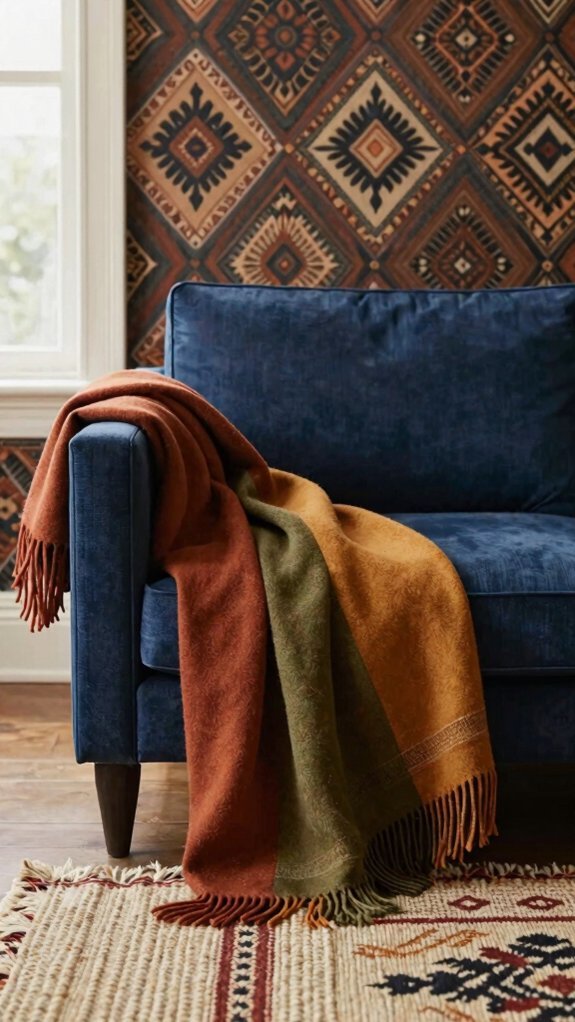
Three anchoring pieces transform a bold afro bohemian print from statement to sanctuary: the sofa that catches your eye, the rug that catches your step, and the throw that catches your mood.
I’ll pair my geometric wallpaper with a low-slung, earth-toned sectional. It absorbs visual energy without competing.
My rug needs weight—handwoven jute or vintage Moroccan pile creates tactile contrast against flat geometric wallpaper. I step onto something grounded.
Throws drape strategically: mud cloth, indigo, or kente cloth add warmth I can adjust. I layer textures that echo the wall’s rhythm without mimicking its pattern. These three pieces stabilize everything.
Art, Plants, and Final Layers for Finished Rooms
Where does the room finally breathe? I’ve placed my last piece.
Against bold geometric wallpaper, I hang woven wall art and vintage African masks. Plants soften every corner—tall fiddle leaf figs, trailing pothos, and snake plants in terracotta and mud cloth pots. I layer brass candleholders, hand-carved bowls, and stacks of textile books on surfaces. A single mud cloth throw drapes over my reading chair. These final touches don’t compete with my wallpaper; they complete it. I step back, and the space exhales. Every layer tells my story. The room feels collected, not decorated—alive, not staged. I’ve built something soulful here.