How to Choose a Scandinavian Color Palette for Every Room in Your Home
The Core of Scandinavian Color Palettes
What makes Scandinavian design so visually compelling?
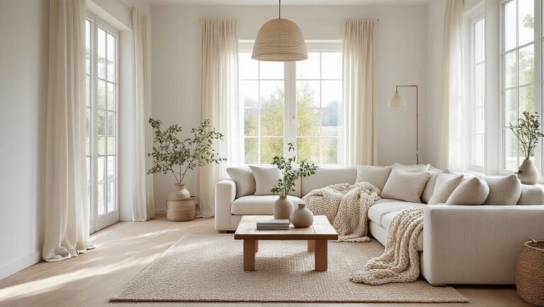
The foundation rests upon a refined palette of whites, grays, blacks, and muted earth tones. These colors embody silent luxury—understated elegance without ostentation. Scandinavian interiors prioritize natural light orientation, employing soft neutrals that amplify sunlight and create luminous spaces. This approach reflects the region’s climate, where maximizing daylight proves essential.
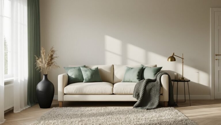
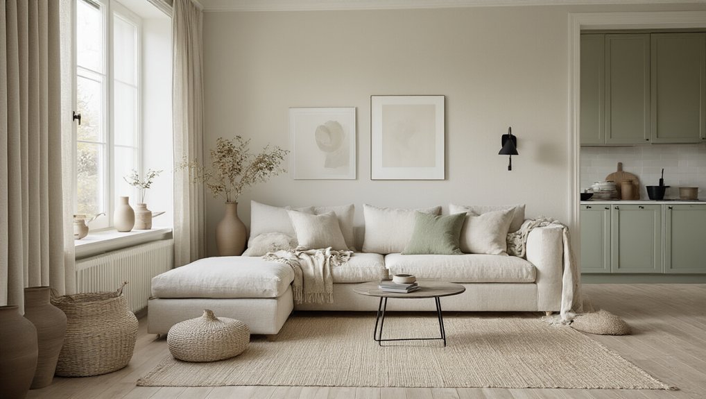
The palette emphasizes balance and harmony, avoiding bold contrasts in favor of subtle gradations. Soft blues, pale greens, and warm beiges complement the neutral base, introducing gentle personality. This restrained chromatic strategy creates serene, sophisticated environments that feel both timeless and contemporary.
Layering Whites and Grays: How to Add Visual Depth
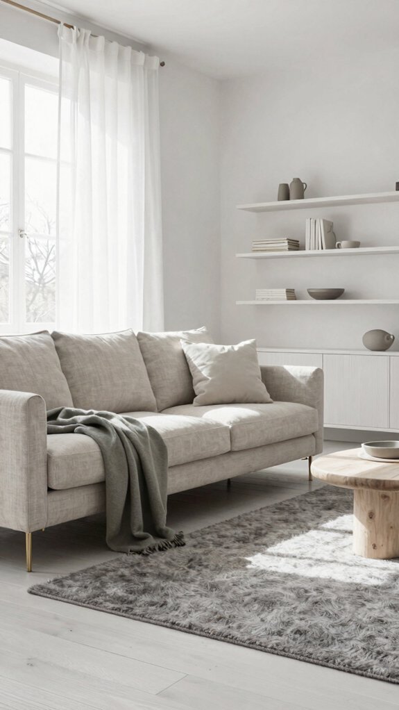
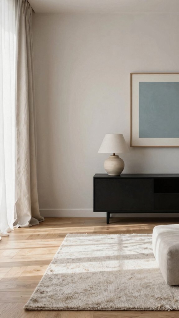
While the neutral foundation of Scandinavian design relies on whites, grays, and blacks, the true artistry emerges in how these shades interact and build upon one another. Layering different tones creates visual dimension without introducing color. Thundercloud gray paired with crisp whites establishes sophisticated contrast, while honed limestone surfaces add textural variety and warmth. Combining matte and glossy finishes amplifies depth further. Strategic placement of lighter shades advances spaces visually, while deeper grays recede, defining zones within open layouts. This nuanced approach prevents monotony, allowing rooms to feel both serene and engaging through carefully orchestrated tonal relationships.
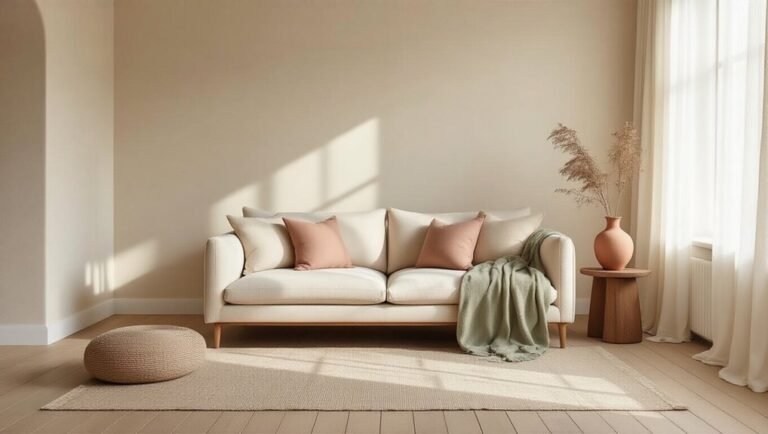
Adding Warmth: Which Earth Tones Actually Work
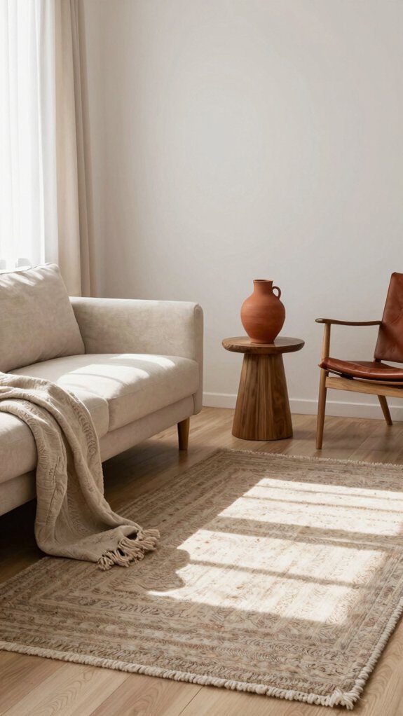
How does one introduce warmth to a Scandinavian palette without abandoning its minimalist restraint? Earth tones bridge this tension effectively. Universal khaki serves as an anchor, grounding spaces while maintaining sophistication. Soft terracottas and warm beiges complement cool grays, creating visual interest through subtle contrast. Honey oak woodwork adds natural warmth without overwhelming neutral backdrops. These tones work best in measured doses—accent walls, furniture pieces, or textiles rather than dominant applications. The key lies in restraint: earth tones should enhance the foundational white-and-gray framework rather than disrupt it. This calibrated approach preserves Scandinavian minimalism while introducing genuine comfort and coziness.
Scandinavian Color Palettes by Room
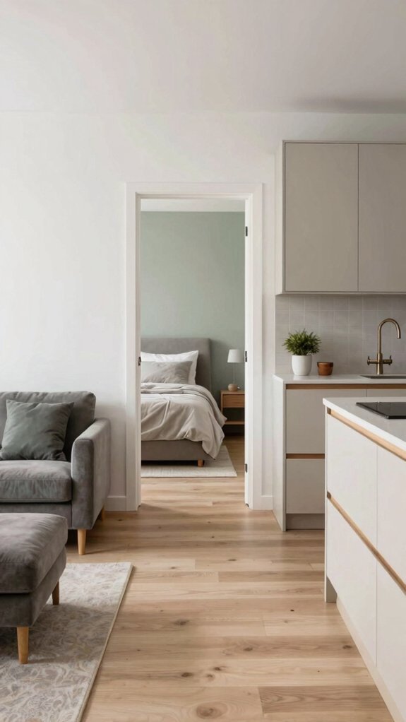
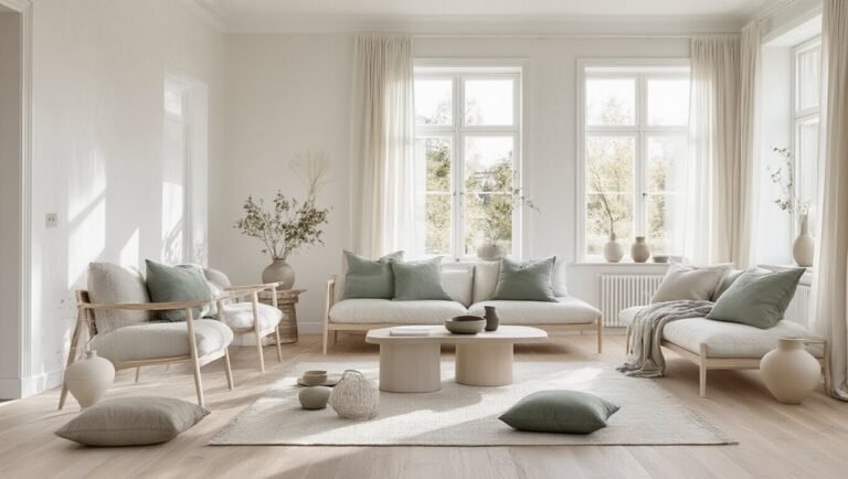
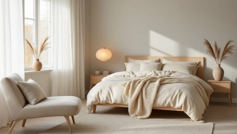
Each room in the home presents distinct functional and atmospheric demands that call for thoughtful palette adjustments. Bedrooms benefit from calming nordic blues and soft whites that promote restful sleep. Living spaces thrive with forest green accents paired with warm neutrals, creating inviting focal points. Kitchens suit crisp whites and light grays that feel clean and expansive. Bathrooms embrace minimalist palettes of pale blues and whites for spa-like serenity. Home offices incorporate deeper tones like forest green to foster concentration while maintaining Scandinavian simplicity. Entryways work well with contrasting combinations of charcoal and cream, establishing purposeful first impressions while maintaining the region’s design philosophy.
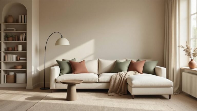
Accent Colors That Break the Rules (Without Breaking the Style)
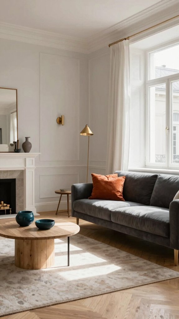
Does Scandinavian design demand unwavering adherence to its signature neutral palette, or can strategic accent colors enhance the aesthetic without compromising its essence? The answer lies in purposeful restraint. Bold jewel tones, deep forest greens, or warm terracotta can punctuate spaces when applied sparingly—through artwork, textiles, or a single accent wall. These touches provide emotional utility, creating visual interest while maintaining design integrity. Sand-colored baseboards complement deeper accents seamlessly. The key: ensure accent colors serve functional beauty rather than decorative excess. When thoughtfully integrated, strategic hues strengthen Scandinavian spaces, adding personality without abandoning minimalist principles.