How to Achieve the Timeless Coastal Grandmother Blue and White Look
Your living room feels tired, but starting over sounds exhausting—and expensive. You flip through magazines and see those breezy, collected spaces that somehow look lived-in and elegant at once. How do people actually *do* that?
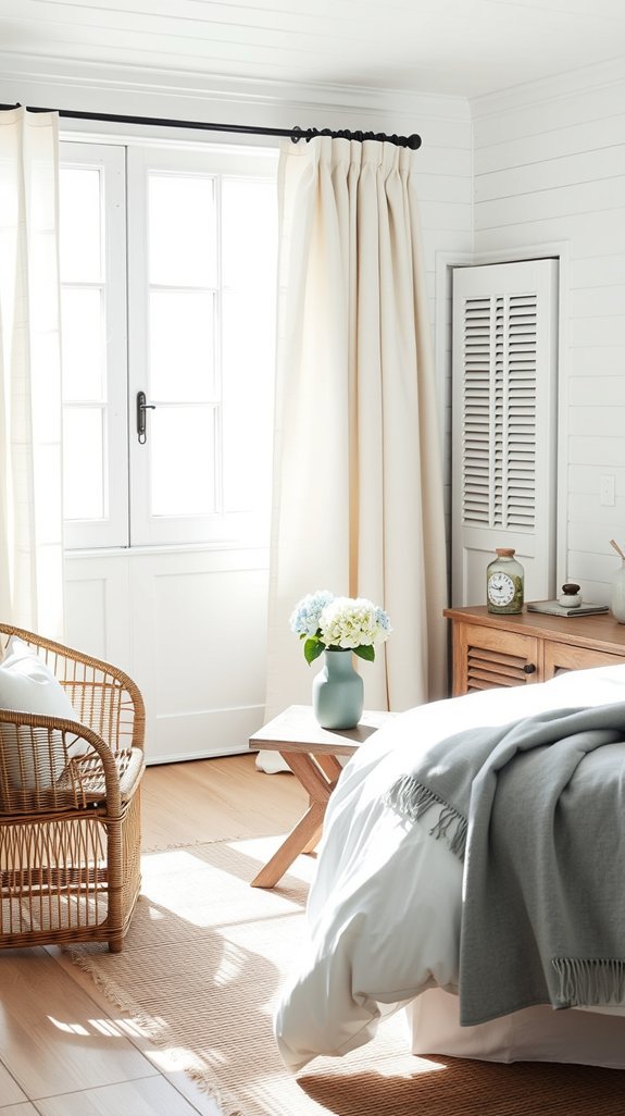
Here’s the secret nobody talks about: coastal grandmother style isn’t about buying a whole new house. It’s about two colors having a quiet conversation. That specific blue—the one that makes your shoulders drop when you see it. And a white that isn’t quite white, the kind with warmth and memory baked in.
The magic happens in the mixing. Linen next to jute. Something worn beside something found. Your grandmother didn’t buy matching sets; she gathered what mattered. The result? A home that feels settled, not staged—beautiful today, still right in ten years.
Ready to see how simple pieces tell your story?
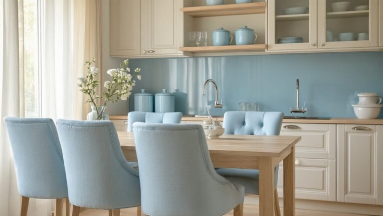
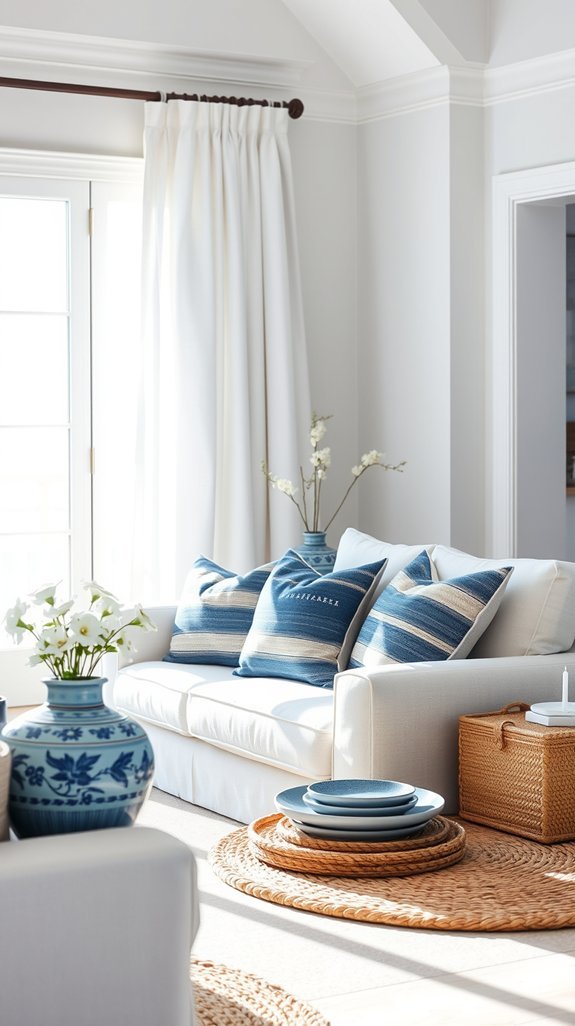
Find Your Signature Coastal Grandmother Blue
Choosing a blue shouldn’t feel harder than picking a Netflix show. Yet here you are: navy (too serious?), sky (too plain?), turquoise (too tropical?). Every shade claims it’ll transform your space, but which one actually feels like *you*?
Here’s a gentler way. Think of blues as personalities, not paint swatches. Navy brings instant sophistication—like borrowing confidence you didn’t know you had. Sky breathes easy, perfect for rooms where stress isn’t invited. Turquoise? Unapologetically coastal, the shade that says “I belong near windows and waves.”
The secret isn’t finding the “perfect” blue. It’s finding *your* blue—the one that makes you exhale when you walk in. Anchor it with crisp white later (texture over matchy-matchy), and you’ve got a look that outlasts trends and still photographs beautifully at golden hour. Ready to meet your match? Grab your iced coffee—this gets fun.
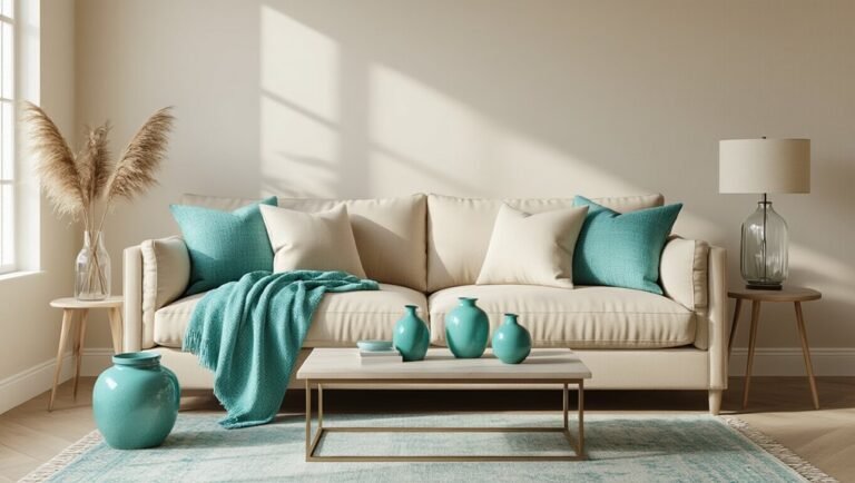
Pick the White That Makes Your Blue Sing
You’ve spent hours hunting for the perfect coastal blue, the one that feels like vacation every time you walk in the room. Then you slap it on the wall with a basic white and… flat. Lifeless. Like the海上 in a snowstorm. (Okay, dramatic, but you felt it.)
Here’s the secret nobody talks about: your white matters just as much as your blue.
Your white is half the story—choose wrong and even the perfect coastal blue goes quiet.
Choose a white with whisper-soft blue undertones and suddenly everything clicks. That dreamy pigment you fell for? Finally sings. Your blues get depth. Your space feels intentional, not accidental.
Linen textures layer in that relaxed, lived-in vibe without trying too hard. Your walls become quiet support—think Fleetwood Mac, where everyone knows Stevie’s the star but Lindsey’s guitar makes the magic.
The best part? This combo ages beautifully. No trendy regrets in five years.
Ready to make your coastal palette actually coastal?
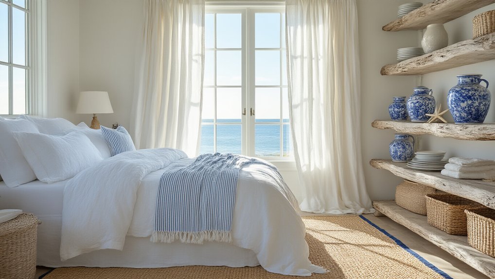
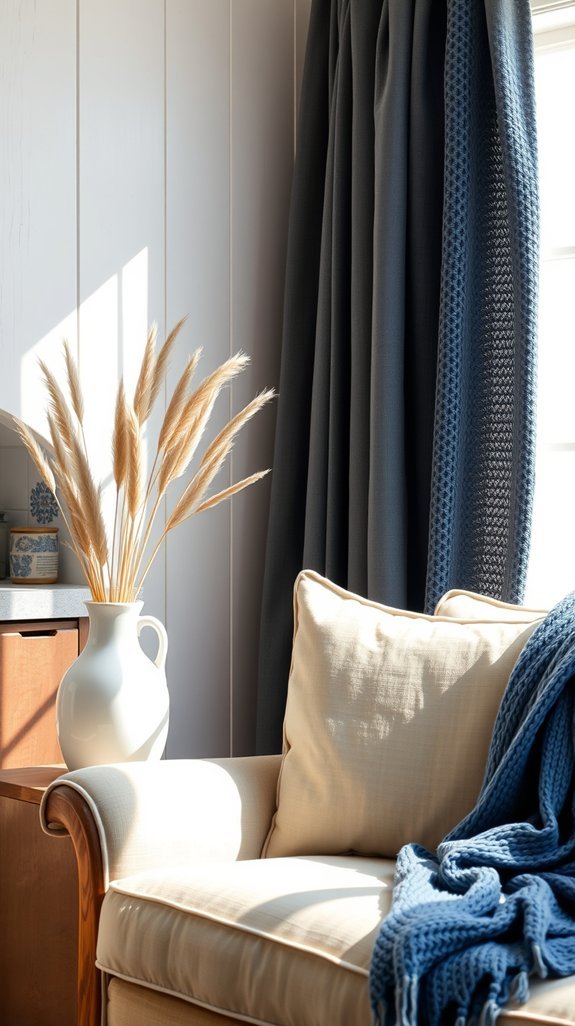
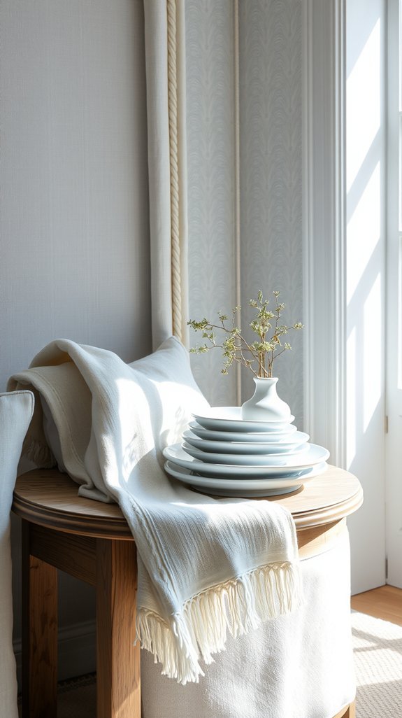
Layer Textures So the Room Never Looks Flat
You finally nailed that perfect blue-and-white palette. But now your room feels… flat. Like a beautiful cake with no frosting. We’ve all been there—staring at walls that technically match but somehow lack soul.
The fix? Texture. Lots of it. Think of it as the secret ingredient that transforms “nice” into “magazine-worthy.”
Layering fabrics isn’t just pretty—it’s practical. That chunky knit throw? Cozy for movie nights. Natural linen curtains? They filter light beautifully and last for years. Mixing materials like cotton, jute, and weathered wood adds depth you can actually feel.
The best part? This approach grows with you. No trendy pieces to toss next season. Just timeless, touchable layers that make your space feel lived-in and loved.
Ready to turn your flat foundation into something with real dimension? Let’s dive in. 🌊
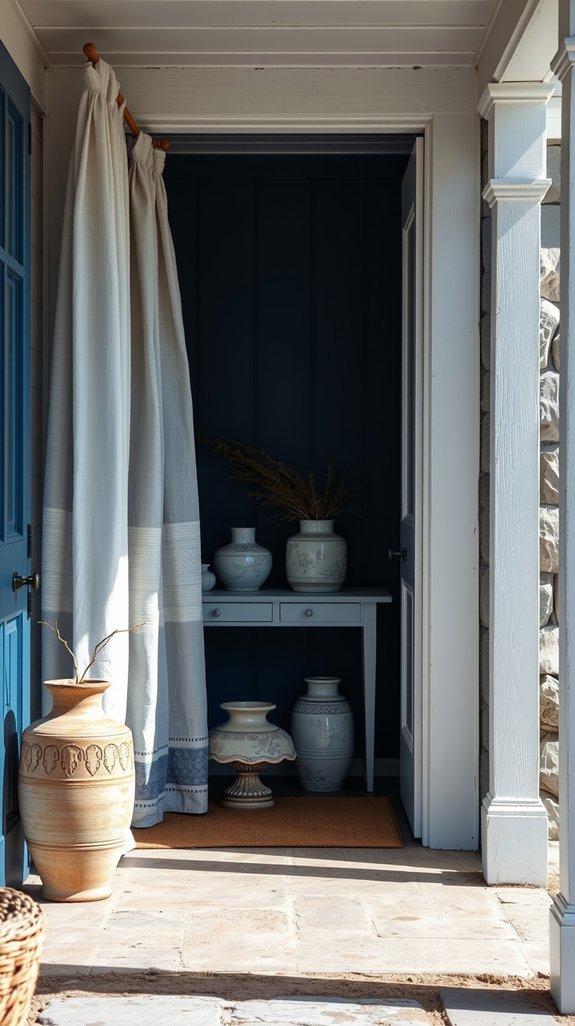
Choose Materials That Weather Like the Coast
You know that sinking feeling when you spot a water ring on your brand-new dining table? Or when guest panic kicks in because someone’s red-wining it up on your white sofa? Coastal living can feel like a constant battle against salt, sun, and sandy feet.
Here’s the secret: stop fighting it.
The most beautiful beach houses aren’t precious museums. They’re filled with materials that actually *thrive* on a little neglect. Driftwood that gets better with every storm. Rattan that softens in the sun. Linen that looks lived-in from day one.
These pieces save you money, stress, and that weird host energy where you’re hovering with coasters. They age gracefully so you don’t have to. Ready to embrace the perfectly imperfect? These coastal materials are about to change everything. 🌊
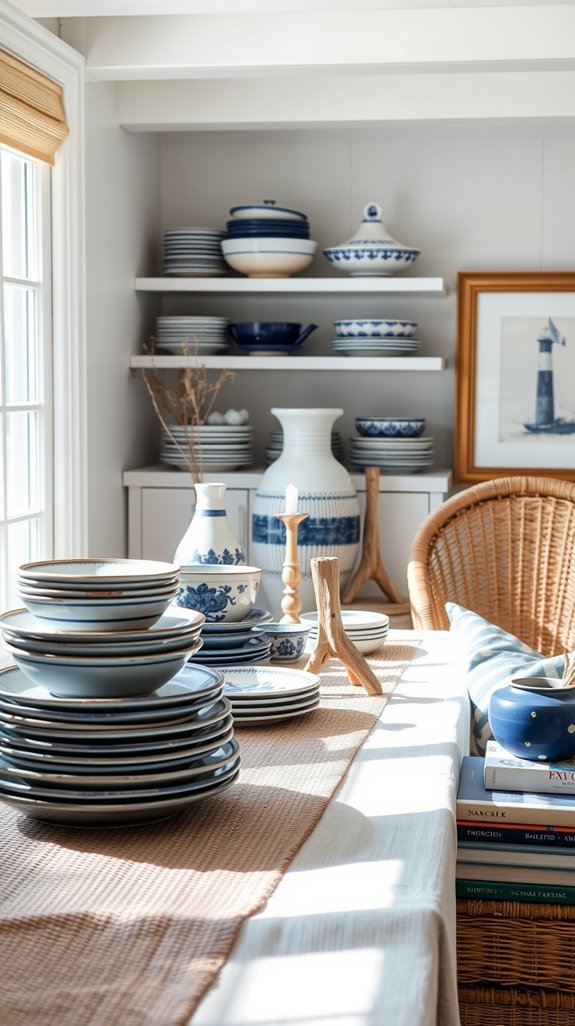
Add Patterns That Read as Quiet Texture
You want that layered, lived-in look—but somehow your space still reads flat, or worse, busy enough to give you a headache. Sound familiar?
Here’s the secret designers whisper about: quiet texture. Instead of loud statement pieces, layer subtle patterns that almost disappear into each other. Faded ticking stripes. Soft block prints. Washed geometrics that feel like they’ve been sun-bleached for years.
The trick? Vary your scales so small dots meet medium stripes without competing. Think of it as visual breathing room—depth without the noise.
Vintage-inspired pieces do the heavy lifting here. That slightly faded quality reads intentional and warm, while freshly-minted patterns can feel like you’re trying too hard (and nobody wants their living room to wear a costume).
Best part? This approach ages beautifully. The more lived-in, the better it gets.
Ready to build a space that feels collected, not decorated? Let’s dive into the pattern combinations that make it effortless.✨
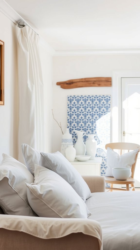
Curate Pieces That Feel Collected, Not Bought
Your living room looks like a furniture store exploded in it—same matching set, zero personality, right? We’ve all been there: buying the “complete look” only to feel like you’re renting someone else’s life.
Here’s the fix. Start with one piece that actually means something. Maybe it’s your grandmother’s weathered side table or that blue ceramic bowl from your beach trip last summer. Build around it slowly. White walls aren’t boring—they’re breathing room for your treasures to shine. Mix rough linen with smooth wood. Let things age; perfection is exhausting.
The best part? This approach costs less, lasts longer, and feels like *you*. No more replacing trends. No more explaining why everything matches. Your space tells your story now, not a catalog’s.
Ready to hunt for pieces with soul?
Layer Warm Lighting for That Sun-Faded Glow
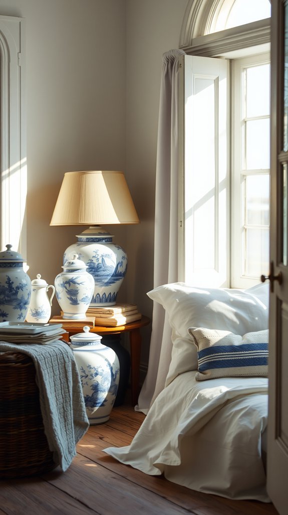
Your living room feels flat, even with the lamps on. That harsh overhead light drains the life out of Netflix nights and cozy corners alike. But here’s the fix: layered warm lighting that mimics the golden hour you chase with your phone camera.
Think of it like outfitting your space in soft sweaters instead of stiff blazers. Floor lamps, table glow, maybe a dimmable sconce or two—each layer adds depth without the electricity bill drama. The sun-faded look isn’t about actual faded furniture; it’s about that nostalgic, lived-in warmth that makes guests linger.
I’ve learned the hard way that one bright bulb kills the vibe every time. Layered lighting? It works harder so you don’t have to, stretching from morning coffee to midnight snacks. Ready to give your space that golden-hour glow on demand?
Edit Ruthlessly to Keep the Breezy Feeling
Your shelves are crying for help. You know the ones—crowded with souvenirs from trips you barely remember, dried flowers that aren’t that dry anymore, and that *one* ceramic seagull from 2003 nobody asked for. We’ve all been there, clinging to clutter while our living rooms slowly suffocate.
Your shelves are crying for help, crowded with souvenirs from trips you barely remember and that ceramic seagull nobody asked for.
Here’s the fix: ruthless editing with a breezy twist. Keep three blue vases, max. Ditch the dust traps. Let your surfaces breathe.
The magic? Less stuff equals less stress. Open windows, moving air, chill vibes—your brain actually notices the difference. Science backs it up, but honestly, you’ll feel it the second you stop stubbing your toe on decorative nonsense.
This isn’t minimalism with a rulebook. It’s your space, finally making sense. Ready to lose the guilt and gain your sanity? We’ve got ideas heading your way 🌊
Conclusion
Does your living room feel more “beachy souvenir shop” than breezy retreat? You’re not alone. That coveted coastal grandmother look—think: crisp linens, faded blues, and furniture with stories to tell—can feel impossible to pull off without looking like you raided a catalog.
Here’s the secret: start with two colors and one rule.
Find that perfect worn-in blue. Pair it with a white that feels like sun-bleached sails. Then layer—linen on cotton, wood on wicker, old with older. The magic lives in the mix of weathered textures, not in buying everything new.
This isn’t just pretty. These pieces age beautifully, hide life with kids and dogs, and never fight for attention. Your home breathes. You breathe.
Ready to create that sun-faded glow without the guesswork? Let’s break it down. ✨