Best Scandinavian Color Palette Ideas for a Warm Minimal Interior
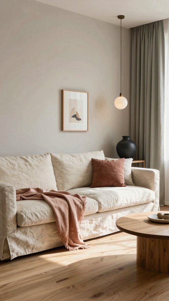
Warm Neutrals: Creams, Beiges, and Soft Grays
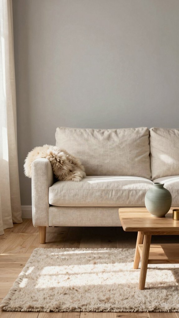
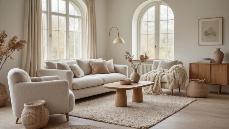
How do warm neutrals create the foundation of Scandinavian design? These foundational hues—creams, beiges, and soft grays—establish visual calm and maximize light reflection in minimalist spaces. Greige, a sophisticated blend of gray and beige, offers versatility while maintaining warmth. Travertine-inspired tones bring earthy authenticity without visual heaviness. These neutrals serve multiple functions: they provide cohesive backgrounds for carefully curated furnishings, amplify natural daylight, and create psychological comfort. By employing warm neutrals as primary palette elements, designers achieve Scandinavian restraint while avoiding sterility. This approach allows architectural features and textures to shine, demonstrating that minimalism need not feel cold or impersonal.
Layering Warm Whites Without Cold Sterility
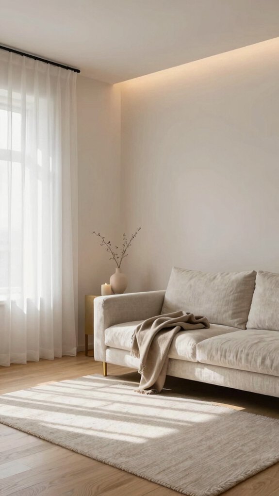
Why do pure whites fail in Scandinavian interiors while layered warm whites succeed? The answer lies in strategic layering. Pure whites create stark, uninviting spaces that contradict minimalist warmth. Instead, combining off-whites, ivory, and cream tones generates depth and softness. Raw linen textiles introduce natural texture while maintaining the palette’s understated elegance. Layering whites through different materials—painted walls, upholstered furniture, and woven accents—establishes visual interest without clutter. This approach achieves the Scandinavian ideal: clean lines paired with genuine coziness. The result transcends cold sterility, creating interiors that feel both refined and genuinely livable.
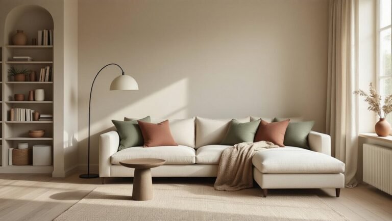
Muted Earth Tones That Ground Your Space
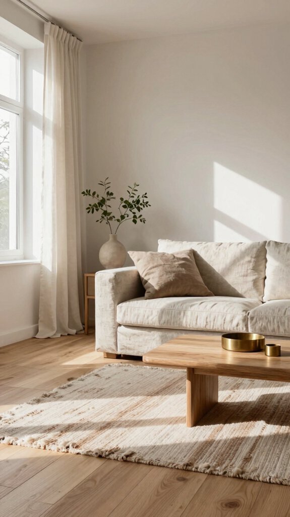
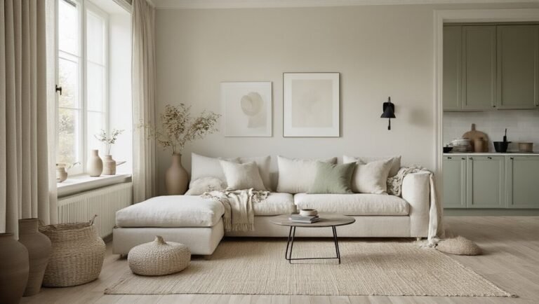
While warm whites establish the foundation of a Scandinavian interior, muted earth tones provide the grounding layer that prevents minimalist spaces from feeling incomplete. Soft mushroom hues on accent walls create subtle depth without overwhelming rooms. Jade-inspired greens bring natural serenity, connecting interiors to the landscape. Walnut-toned wood furniture anchors spaces with warmth and authenticity. These restrained colors work harmoniously together, layering visual interest through texture rather than saturation. When thoughtfully applied to textiles, flooring, and furnishings, muted earth tones establish a cohesive palette that feels both sophisticated and inviting, elevating minimalist design beyond coldness into genuine comfort.
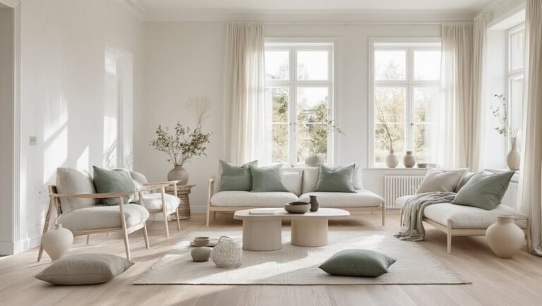
Scandinavian Pastels as Warm Accent Colors
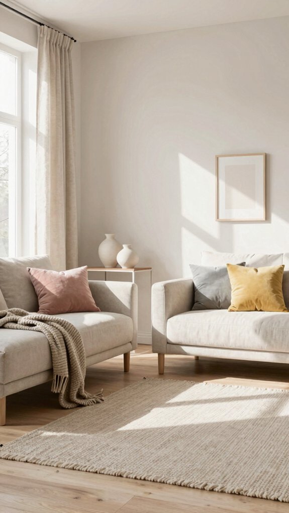
Scandinavian pastels offer a refined departure from earth tones, introducing soft color accents that maintain warmth without sacrificing minimalist principles. These delicate hues—blush pink, soft sage, and divine damson—create visual interest while preserving serene environments. Pastels work exceptionally well as accent colors on walls, textiles, or furniture pieces, adding personality to otherwise neutral spaces. Their subdued nature prevents overwhelming interiors, allowing them to complement muted earth tones gracefully. When paired strategically with white or cream backgrounds, Scandinavian pastels establish focal points that draw the eye without disrupting the calm aesthetic that defines Nordic design philosophy.
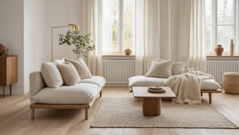
Natural Wood Finishes and Your Color Palette
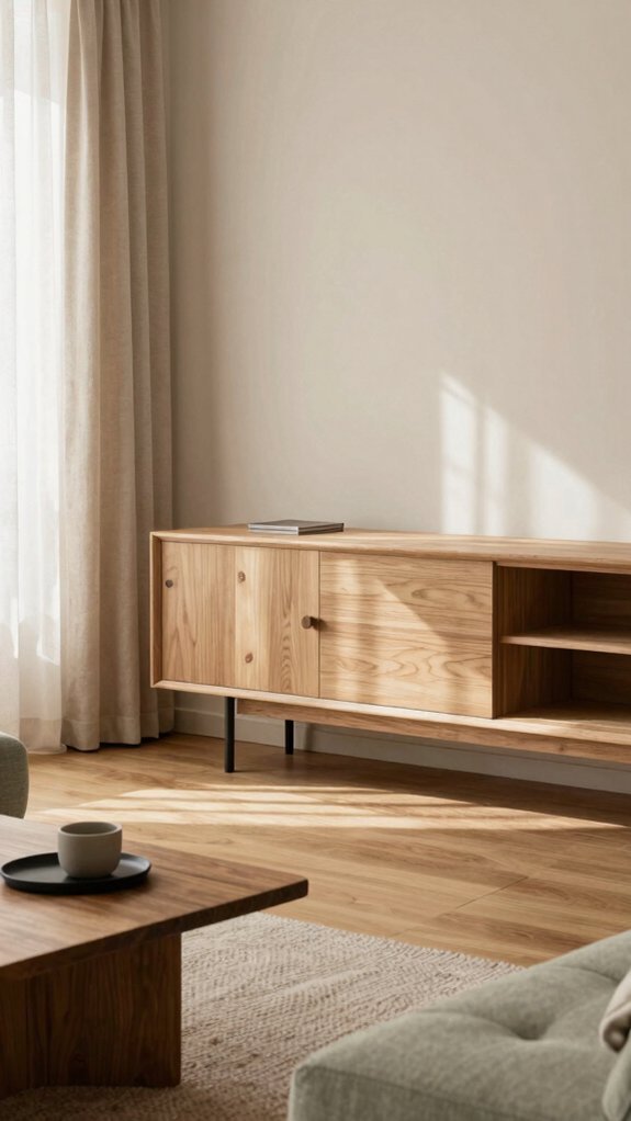
How do natural wood finishes anchor a Scandinavian color palette? Natural wood finishes serve as the foundational element that grounds warm minimal interiors. Light oak, birch, and pine tones complement soft pastels and neutral hues, creating visual harmony throughout spaces. These finishes provide warmth that prevents sterile minimalism, while their organic texture adds depth to monochromatic schemes. Natural wood finishes also bridge bold accent colors and understated backgrounds, facilitating seamless transitions. Their inherent grain patterns introduce subtle visual interest without compromising the clean aesthetic. By incorporating varying wood tones—from pale to honey-colored—designers achieve dimensional interest while maintaining Scandinavian simplicity and cohesion.
Using Texture to Enhance Warm Scandinavian Palettes
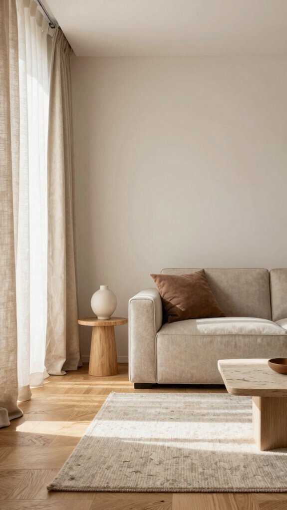
Beyond the visual foundation that natural wood provides, texture becomes the tactile dimension that breathes life into warm Scandinavian interiors. Layering varied textures creates depth without overwhelming minimalist principles. Soft materials like bouclé upholstery, chunky knit throws, and linen fabrics invite comfort while maintaining aesthetic restraint. Rough stone accents, woven rugs, and untreated leather contrast smoothly finished surfaces, establishing visual interest through tactile contrast. Natural fibers—jute, wool, and cotton—introduce organic warmth that complements warm color palettes. This textural interplay prevents spaces from feeling flat or sterile, grounding the design in sensory richness while preserving Scandinavian simplicity and functionality.
Real-World Scandinavian Color Combinations That Work
When does a color palette shift from theoretical concept to lived reality? When homeowners apply proven combinations to their spaces.
Color palettes transform from inspiration to reality when homeowners commit to applying proven combinations throughout their living spaces.
A popular pairing combines warm white walls with soft terracotta accents, grounded by deep charcoal furniture.
Another successful formula features cream bases paired with sage green and natural wood elements.
Matte lacquer finishes on cabinetry enhance these combinations, adding sophistication without gloss.
Warm gray paired with ochre and linen creates understated elegance.
These real-world applications demonstrate how Scandinavian palettes transition from inspiration boards to functional, beautiful interiors that balance minimalism with warmth and character.
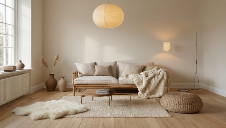
Warm Lighting That Completes Your Palette
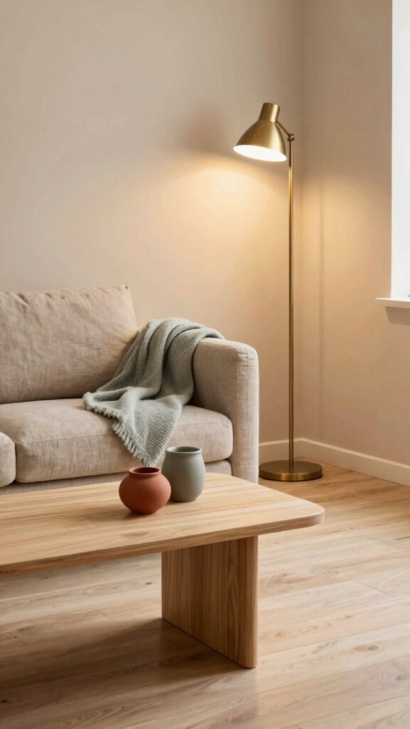
Color palettes alone cannot fully express the warmth of Scandinavian design—lighting plays an equally essential role in bringing these carefully chosen hues to life. Warm white bulbs at 2700K enhance cream, taupe, and soft gray tones, creating inviting spaces. Layered lighting through pendant fixtures, table lamps, and wall sconces allows inhabitants to adjust ambiance throughout the day. In scandi 2.0, designers emphasize natural light during daylight hours, supplemented by warm artificial lighting during evenings. Minimalist fixtures with clean lines maintain aesthetic cohesion while providing functional illumination. This thoughtful approach to lighting ensures color palettes achieve their full potential, transforming minimal interiors into warm, welcoming retreats.