12 Dark Wood + Deep Red Pairings That Work Every Time
You wanted drama. Instead, you got a dining room that feels like a vampire’s basement.
We’ve all been there—swatched the perfect deep red, paired it with that gorgeous dark wood furniture, and suddenly the walls are closing in. The good news? This combo *can* work beautifully. You just need the right balance.
Dark wood and deep red aren’t enemies. They’re actually perfect partners when you know the tricks—like letting natural light in, adding lighter accents, or choosing the right red undertone. Get it right, and you’ve got instant warmth, timeless elegance, and a space that feels collected, not cluttered.
The best part? These pairings grow with you. No trendy regrets in two years.
Ready to turn that dungeon energy into something worth bragging about? These 12 combos will get you there.
What you’ll learn:
- How to balance dark tones so your room feels cozy, not cramped
- Which shade of red plays nicest with walnut, mahogany, and oak
- Simple accent tricks that brighten the whole look
- Budget-friendly finishes that still feel high-end
How to Choose the Right Wood-and-Red Pairing for Your Space
Ever feel like your room is missing that “wow” factor, but you’re terrified of clashing colors? You’re staring at beautiful wood floors or furniture, loving the warmth, yet completely stuck on what wall color won’t fight with them. That anxiety is real—and totally fixable.
The secret weapon? Red. Not the stop-sign kind, but sophisticated, mood-boosting reds that dance beautifully with wood tones. This pairing isn’t just pretty—it’s practical. Wood grounds a space; red adds energy without requiring constant redecorating. Together, they age gracefully and work harder than trendy neutrals that feel flat by year two.
Ready to stop playing it safe and start creating spaces that actually feel like *you*? Let’s find your perfect match.
- Test in your actual light—morning, afternoon, and evening. Colors shapeshift dramatically.
- Match intensity, not just hue. Light oak pairs with soft terracotta; dark walnut loves rich wine tones.
- Start small. Paint one accent wall or add red textiles before committing fully.
- Consider your room’s purpose. Deep reds cozy up bedrooms; brighter versions energize home offices.
Your dream space is closer than you think—let’s explore the possibilities. 🔥
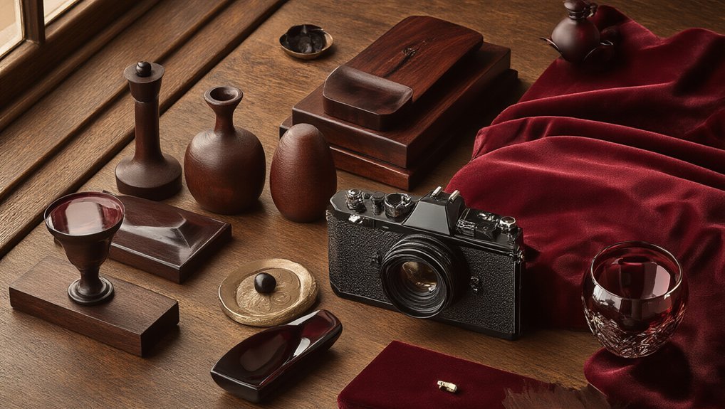
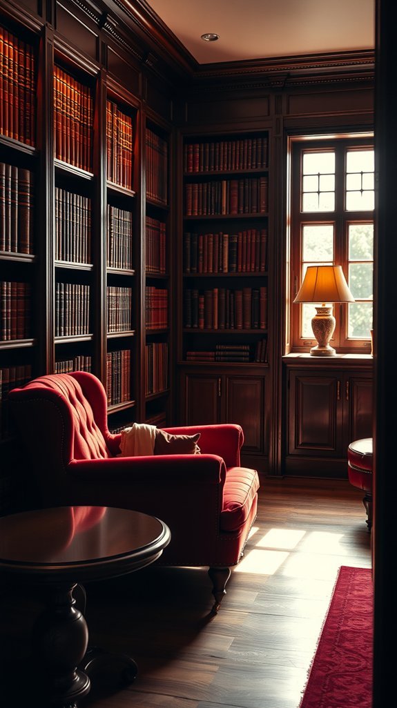
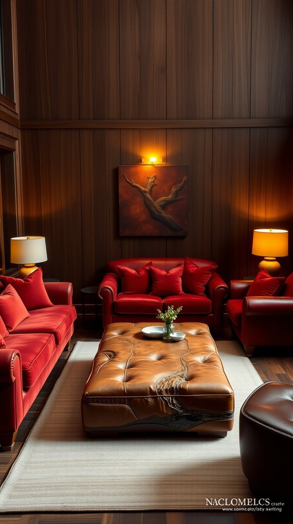
Rich Mahogany and Crimson: Classic Libraries That Never Age
You’ve stared at that blank wall in your living room for weeks. Pinterest overload. Too many trends that feel tired by Tuesday. What actually lasts?
Enter mahogany and crimson—the library combo that’s been stunning since your grandparents’ day and somehow keeps getting better. No fleeting TikTok aesthetic here. Just rich wood tones meeting deep, moody red in a way that whispers “I have opinions about first editions” without trying too hard.
Rich wood and deep red: the library pairing that outlasts every trend cycle.
This pairing works because it *does* the work for you. The colors are already friends. The mood sets itself. You add a lamp, maybe that leather chair from Facebook Marketplace, and suddenly you have a room with gravity.
Clear Takeaways:
- Pair warm wood tones with burgundy, crimson, or oxblood walls for instant depth
- Layer in brass or aged gold accents to elevate without cluttering
- Choose adjustable lighting—overhead kills the vibe, lamps save it
- Mix real books with decorative stacks; function meets personality
- This palette hides dust and wear, making it ideal for high-traffic spaces
Ready to build a room that outlasts your next three lease renewals? Let’s find your perfect shade of timeless.
Cherry Wood and Brick Red: Traditional Dining Rooms That Work
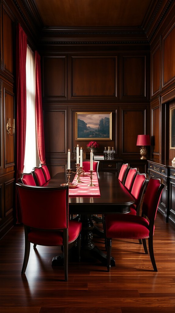
You’ve scrolled through a thousand “modern farmhouse” dining rooms and they all look the same. White shiplap. Edison bulbs. Another distressed wood sign that says “EAT.” Where’s the warmth? Where’s the *personality*?
Here’s your answer: cherry wood and brick red walls. This classic pairing feels like a dinner party at your coolest friend’s house—the one who actually uses their good dishes and doesn’t stress about water rings. Cherry wood tables only get richer and more beautiful as life happens to them. That deep red? It wraps the room in instant coziness without trying too hard.
What to steal for your space:
- Pair a cherry table with brick red or terracotta walls for instant warmth
- Layer in mixed textures—linen, leather, vintage ceramics—to keep it lived-in
- Embrace the patina; scratches and glow add character, not flaws
- Skip matching sets; collected pieces feel more personal
Ready to ditch the farmhouse fatigue? Your dining room is calling. 🪑
Jacobean Oak and Merlot: Farmhouse Kitchens Without the Tired Look
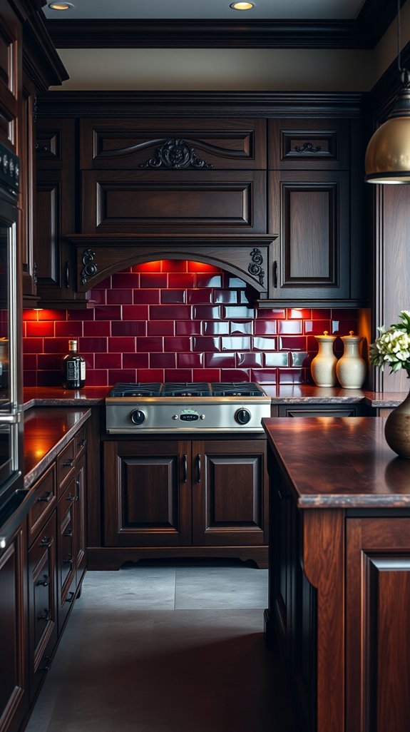
The “Farmhouse Fatigue” Is Real
You’re scrolling again, aren’t you? Another white shiplap kitchen. Another “rustic” sign about gathering. You want that cozy farmhouse feel, but everything looks like it came from the same generic catalog—and frankly, you’re over it.
Here’s the thing nobody tells you: farmhouse doesn’t have to mean faded. There’s a richer, moodier way in that feels timeless instead of tired. Enter Jacobean oak and merlot—an unexpected pairing that trades tired trends for something with actual soul.
- Anchor with deep wood: Jacobean oak brings instant drama without the cluttered farmhouse clichés
- Use red as an accent, not a theme: One merlot runner, a few vintage canisters—done
- Skip the fake distressing: Clean cabinet lines keep it current, not costume-y
- Let the wood do the work: Dark oak ages beautifully; no touch-ups needed
- Balance with breathing room: Sparse styling prevents that “overdecorated” trap
This combo works because it commits fully instead of winking at the trend. The result? A kitchen that feels collected over time, not assembled from a Pinterest board. Ready to see how dark oak + bold red actually plays out? Let’s dig in.
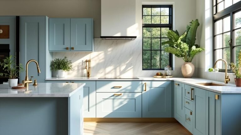
Walnut and Burgundy: Warm Modern Kitchens Done Right
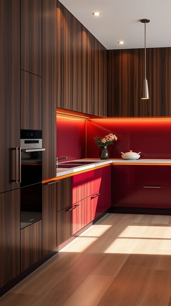
That sinking feeling when your kitchen looks flat on Instagram but sterile in real life? We’ve all been there. The fix might be simpler than gut-renovating everything: let walnut and burgundy do the heavy lifting.
This pairing works because it solves two problems at once. Walnut brings natural warmth that beats trendy white every time. Burgundy adds depth without the commitment-phobe panic of all-black cabinets. Together they feel intentional, not accidental.
Here’s how to nail it:
- Choose smooth walnut cabinets with visible grain—it’s the feature, not the floor
- Pair with matte burgundy walls, not glossy; flat paint reads richer
- Swap cool bulbs for warm ones (2700K–3000K) or watch the magic disappear
- Skip busy hardware; simple pulls keep eyes on the wood
- Add one unexpected element, like a vintage brass fixture, so it doesn’t feel staged
The payoff? A kitchen that photographs beautifully for Sunday brunch and actually feels like home at 6 AM with coffee. Ready to see how others are making this work?
Teak and Pomegranate: Midcentury Living Rooms That Feel New
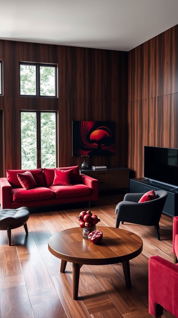
You want the warmth of midcentury style without your living room looking like a museum exhibit. Fair. That teak sideboard your aunt left you? Gorgeous. But paired with oatmeal walls and beige everything, it reads tired instead of timeless. Here’s the fix: pomegranate. That deep, juicy red wakes up all that honey-colored wood without stealing the show. It’s bold but livable, retro but right now. Bonus? Red ages beautifully—no trendy regret in two years. You’ll actually use your space more when it feels this good to walk into. Ready to see how this combo comes together? The inspo ahead might surprise you.
Clear Takeaways:
- Pair warm teak wood with deep pomegranate red textiles for instant edge
- Add brass accents to bridge the vintage and modern vibes
- Skip beige walls—let the wood and red create the warmth instead
- Choose deeper reds over bright ones for longevity beyond trends
Espresso Maple and Rust: Cozy Living Rooms to Settle Into
Staring at blank walls while your old furniture surrenders to coffee rings and claw marks? That sterile showroom look might photograph well, but it sure doesn’t *live* well.
Showroom-perfect rooms photograph well, but they never survive coffee rings, claw marks, or real life.
Enter espresso maple and rust velvet—a pairing that works harder than your guilty-pleasure TV habits. The deep wood tones hide life’s little disasters while that burnt-orange upholstery wraps around you like your favorite autumn sweater. This isn’t about impressing judgmental relatives. It’s about building a room that actually fits your sloppy, beautiful reality.
Here’s how to pull it off without hiring a professional or draining your savings:
- Start with one statement piece — a maple coffee table or rust sofa anchors everything without overwhelming
- Kill the overhead lighting — floor and table lamps at varied heights create instant intimacy
- Mix textures deliberately — smooth wood against plush velvet keeps eyes moving and interest high
- Choose performance fabrics — spills wipe clean, pets shed without shame, you relax knowing it’ll last
Your living room shouldn’t feel like a waiting area. It should feel like *yours*. Ready to see how this color story plays out across real spaces?
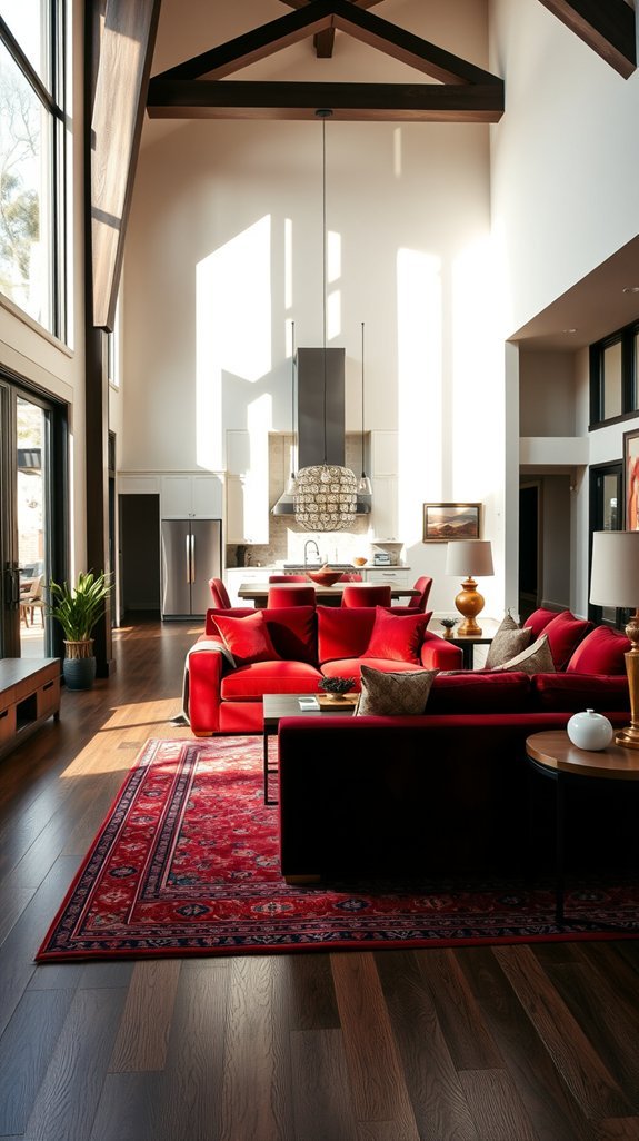
Smoked Hickory and Sangria: Open-Concept Living Rooms That Flow
You fell in love with your open floor plan—until you tried to make the living room and dining area feel like two actual rooms instead of one confusing blob. Suddenly your cozy couch faces off against a lonely table, and neither space knows its job.
Enter smoked hickory and sangria: the grounding wood tone you need, plus a red-wine shade daring enough to carve out “zones” without a single wall.
This combo works because hickory whispers “relax here” while that berry pop shouts “dinner’s ready.” Layer them right, and your open concept finally breathes—no construction required, no regrets later.
Ready to stop floating furniture around and start *living* in your space? These ideas get you there.
Ebony-Stained Oak and Oxblood: Dramatic Bedrooms With Contrast
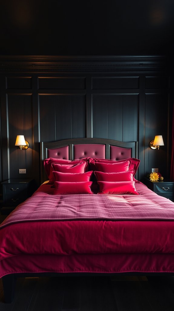
You’ve stared at your bedroom walls for months, wondering why everything feels either too sterile or too chaotic. That hit of deep ebony oak against rich oxblood? It sounds bold—maybe *too* bold. But here’s the thing: high contrast doesn’t have to mean high stress.
The trick is balance. Pair those dramatic tones with matte metals and cream linens to soften the intensity without losing the edge. Too much dark furniture and you’re basically hibernating in a cave. Not exactly restful. Instead, layer in brass accents and varied textures. Suddenly your space feels curated, not cave-like.
This approach works because it grows with you. The neutral elements adapt as your taste shifts; the dramatic foundation stays timeless.
Ready to trade boring beige for something with actual personality? Your moody sanctuary awaits.
—
Quick Wins for Today:
- Swap one black piece for cream bedding or throws
- Add a single brass lamp or hardware pull
- Mix three textures (linen, metal, wood) in one view
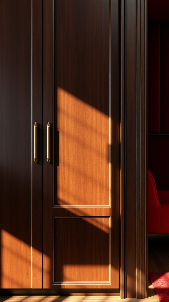
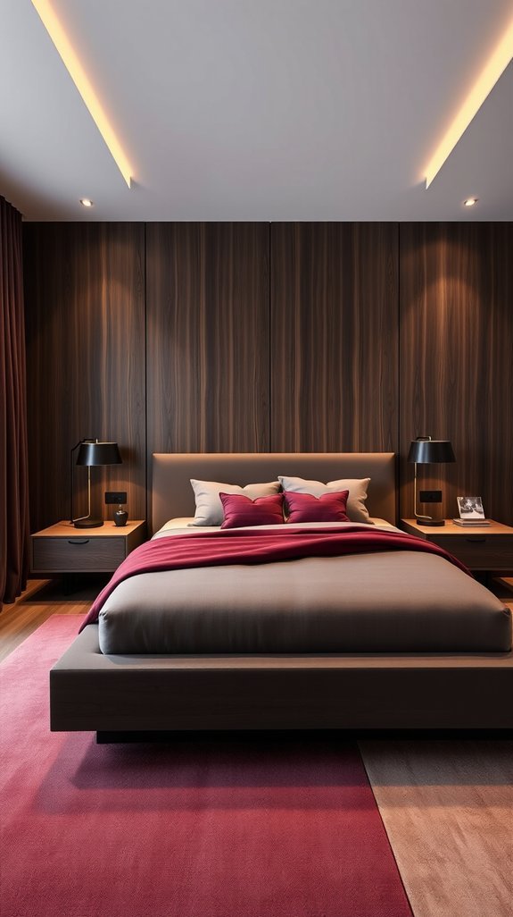
Wenge and Wine: Minimalist Bedrooms With Maximum Impact
Some nights you want to feel like royalty. Most nights you just want to sleep. The problem? Your bedroom tries too hard—or not enough.
Your bedroom tries too hard—or not enough.
Enter wenge and wine. Deep, chocolate-brown wood meets a single wall in rich, muted burgundy. The result looks expensive. Feels like a exhale. And somehow works whether you’re scrolling in bed at midnight or actually getting your eight hours.
No clutter required. No gallery walls, no nightmare decision fatigue. Just two materials doing the heavy lifting while you reap the calm.
- Strip surfaces clean—wenge furniture needs room to breathe
- Pick *one* wall for wine paint; more kills the mood
- Let natural grain be your “pattern”
- Add texture with linen bedding, not more color
- Enjoy a space that ages better than your taste in sleep playlists
Ready to see how dark and moody actually helps you rest?
Black Walnut and Garnet: Moody Bathrooms to Copy
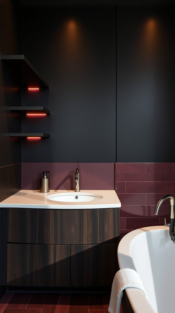
Tired of staring at that builder-grade beige bathroom every morning? You’re not alone—and you don’t need a gut renovation to fix it. There’s a bold combo that’s been hiding in plain sight: deep black walnut paired with rich garnet tile. It sounds dramatic, but here’s the surprise—it actually makes small spaces feel intentional and expensive without the showroom price tag.
Think of it as your bathroom’s cozy sweater season. The warm wood keeps things grounded while those deep red tiles add depth that flat white simply can’t touch. Plus, this pairing ages beautifully. Unlike trendy colors that scream their year, this feels timeless enough to live with for decades.
Ready to ditch the blah? Here’s exactly how to pull it off without second-guessing yourself.
—
What to steal from this look:
- Go for wood with visible grain—variations hide water spots and daily wear better than perfect surfaces
- Choose satin finish for tile if you bathe by candlelight; pick matte if you prefer clean, modern lines with less reflection
- Keep walls quiet—warm gray, soft cream, or moody charcoal so the materials stay the stars
- Add one metallic accent (aged brass or matte black) to keep the palette from feeling too heavy
- Skip the matching set: mix vintage wood pieces with new tile for that “collected over time” feel
Your bathroom should feel like a exhale, not another to-do. This pairing delivers—with zero spa membership required.
Rosewood and Maroon: Home Offices That Command Attention
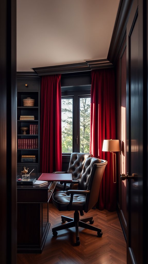
Your home office shouldn’t feel like a storage closet with a laptop in it. Yet here you are, squinting at video calls while stacked boxes form your “background.” That ends now.
Your home office shouldn’t feel like a storage closet with a laptop in it—yet stacked boxes always seem to find their way into frame.
Rosewood and maroon aren’t just colors—they’re a silent rebellion against beige mediocrity. Deep, wine-dark walls wrap the room like a well-tailored jacket. A vintage rosewood desk grounds everything with warmth that whispers “I’ve got this” instead of yelling it. The result? A space that makes you want to close the door and *actually* focus.
No corporate stiffness. No showing off. Just a room that works as hard as you do and photographs beautifully in the process.
What to do right now:
- Source one solid rosewood piece (desk, shelves, or credenza—thrift stores and estate sales are gold mines)
- Paint your main wall maroon; test samples in morning and afternoon light first
- Add a single brass lamp for the glow everyone will ask about
- Keep the rest neutral so the wood and color can breathe
Your best ideas are waiting for a worthy room.
—
Ready for the reveal? Let’s build your commanding space.