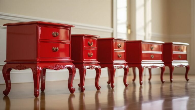
7 Deep Red Paint Colors That Interior Designers Actually Use
Staring at that paint chip like it might bite you? Same. Deep red walls feel like a commitment—one wrong shade and suddenly your bedroom looks like a crime scene, not a cozy retreat. But here’s the thing designers know that Pinterest doesn’t always show: the right burgundy or wine shade works *everywhere*, from tiny powder rooms to sun-drenched living rooms. These aren’t intimidating museum colors. They’re the shades that make guests pause and ask, “What color *is* that?” (in a good way). Bonus? Dark reds hide scuffs, feel instantly sophisticated, and pair with basically every neutral you already own. Below, seven designer-approved hues that actually function in real homes—plus how to use them without regret. 🍷
How to Pick a Deep Red You’ll Actually Live With
Deep red walls look incredible in magazines—and absolutely terrifying in the paint aisle. That tiny chip doesn’t prepare you for how intense this color actually feels once it surrounds you. Suddenly you’re second-guessing everything: Is it too dark? Too dramatic? Will I hate this in six months?
The secret isn’t finding the “perfect” red. It’s knowing how to live with it before you commit. With a few smart moves, you can capture that cozy, moody vibe without turning your living room into a haunted house. Here’s how to make deep red work in real life, not just on Instagram.
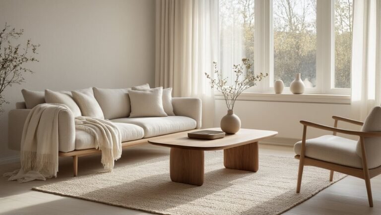
- Test like your sanity depends on it. Paint large swatches and watch them shift from crimson to burgundy to near-black throughout the day. Lighting changes everything.
- Mix your finishes. Pair that saturated wall with matte ceramics, woven textures, or light wood. Contrast keeps the color from swallowing the room whole.
- Try before you buy big. One accent wall lets you test the waters without drowning in regret.
Ready to find a red that actually feels like home? Let’s dive into the shades that work hardest for your space.
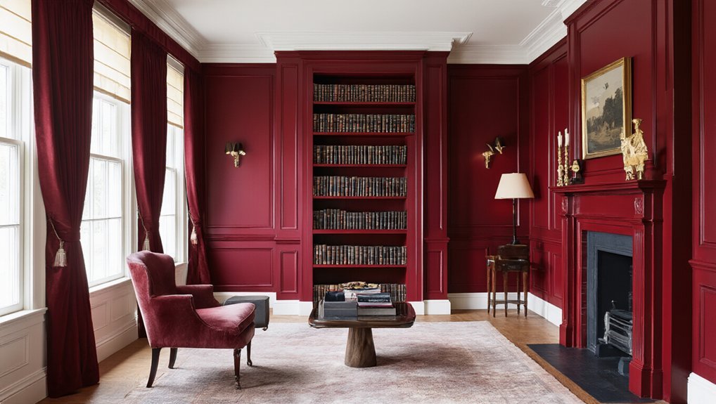
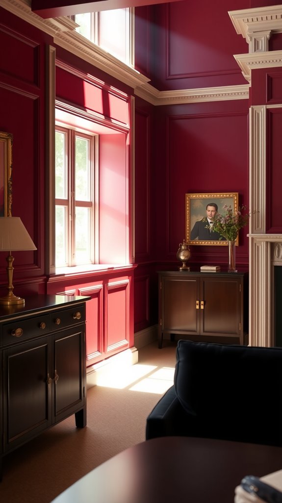
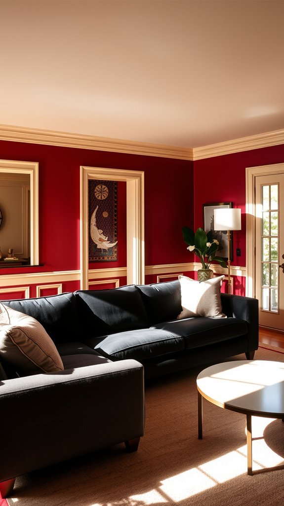
Farrow & Ball Eating Room Red: The Burgundy Designers Love
You want a dining room that feels special. Memorable. But somehow you end up with beige walls and a table nobody lingers at.
Farrow & Ball’s Eating Room Red fixes that fast. This isn’t the heavy burgundy from your aunt’s formal living room—it’s deep, yes, but alive. Wine-stained and warm without the stuffiness. The kind of color that makes candlelight dance and conversations stretch past dessert.
Wine-stained warmth without the stuffiness—deep enough for drama, alive enough to linger.
What surprised me? How practical it actually is. Dark reds hide scuffs, age beautifully, and never read trendy-then-dated. Your room gets instant character that lasts.
- Test it at 3pm in north-facing rooms—it can go nearly black
- Dining rooms and powder rooms are no-brainers; try it in a book nook too
- Pair with warm brass, unbleached linen, and matte black accents
Ready to make your walls do the heavy lifting?
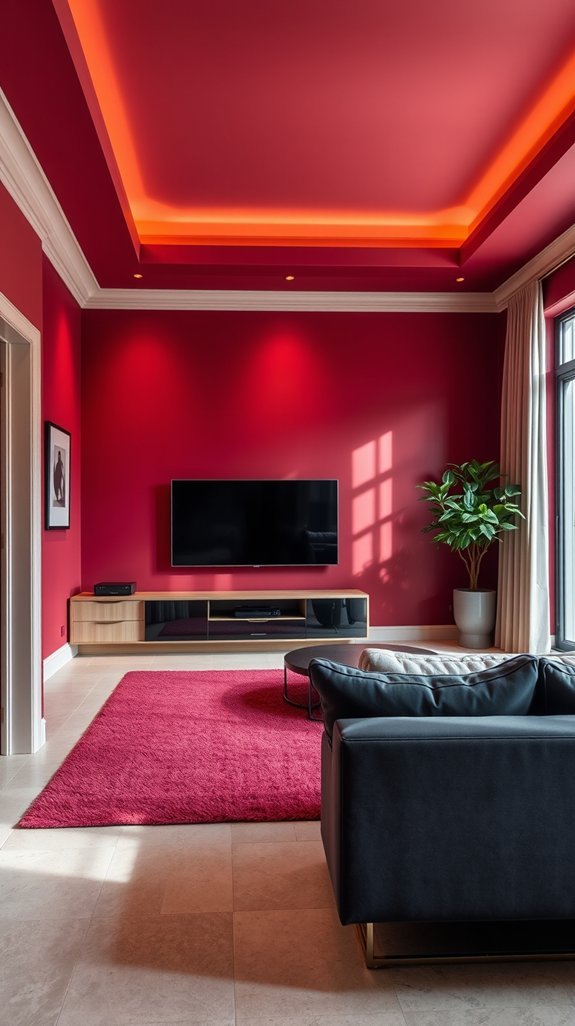
Benjamin Moore Heritage Red: A Warm Crimson for Any Room
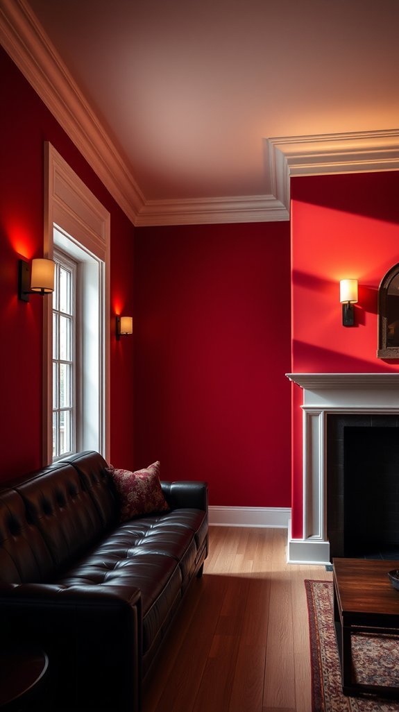
When Your “Moody Wine Bar” Wall Just Feels… Cold?
You’ve studied that Farrow & Ball swatch for weeks. You finally painted your dining room Eating Room Red. Now you’re sitting there eating cereal at noon wondering why it feels like you’re sulking in a gothic novel. Gorgeous? Yes. Cozy? Not exactly.
Sometimes you want drama without the emotional baggage.
That’s where Benjamin Moore Heritage Red steps in. Think crimson met a sunset-orange glow and decided to play nice. The result? Warmth that actually invites you to stay awhile—no brooding required.
What to do with this color right now:
- Use it in your living room for instant “everyone gathers here” energy
- Try bedrooms when you want drama that still helps you unwind
- Go bold in bathrooms—unexpected but deeply satisfying
- Pair with brass fixtures and natural wood for easy sophistication
Heritage Red doesn’t scream for attention. It quietly collects compliments. Ready to find where this shade belongs in your home?
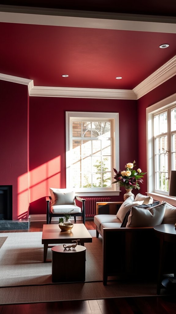
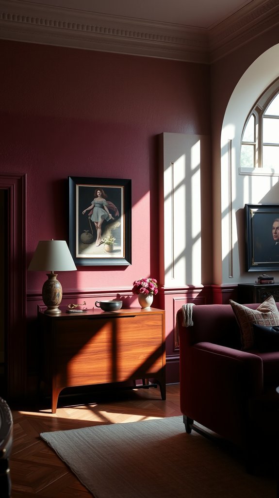
Sherwin-Williams Rookwood Dark Red: Built for Moody, Layered Rooms
You’ve stared at that empty wall for weeks. Too afraid of beige. Too scared of black. You want *presence* without turning your living room into a Halloween shop. Enter Sherwin-Williams Rookwood Dark Red—the color that actually knows how to hold a room together without screaming for attention.
This isn’t your grandma’s burgundy. It’s moody, it’s layered, and it plays surprisingly nice with your existing stuff. Think of it as the design equivalent of that friend who shows up dressed to kill but somehow makes everyone else look good too.
Your quick-start guide:
- Pair it with warm cream trim or brass hardware for instant sophistication
- Skip it in dark, north-facing rooms—it’ll eat your light alive
- Test a sample first, especially in south-facing spaces where it truly sings
- Layer in velvet throws and matte black accents for depth
Your space deserves more than safe. It deserves interesting. Ready to see where this shade can take you?
Farrow & Ball Preference Red: Sophisticated Wine Without the Purple
You’ve finally found the perfect wine-colored paint—until your walls turn grape soda purple at 5 PM. That gut-punch moment when expensive paint betrays you under evening light? Designers know it well.
That moment when your perfect wine paint turns grape soda purple at 5 PM? Designers know that expensive betrayal well.
Enter Farrow & Ball Preference Red: the burgundy that keeps its promise. No purple surprises, no regret. Just that deep, library-rich warmth that makes rooms feel collected rather than decorated.
What makes it work
- Stays true to color in dim light—no more evening color shock
- Pairs effortlessly with brass hardware and aged metals
- Creates instant depth without overwhelming smaller spaces
- Works as an accent wall or full-room statement
- Ages beautifully, developing character over time
The price stings at checkout, but this is the shade you’ll still love when trends have moved on. Some things earn their keep.
Ready to see where burgundy belongs in your home?
Behr Moroccan Ruby: The Budget-Friendly Choice That Reads Luxe
Dreaming of a rich, moody space that looks straight out of a design magazine—until you see the price tag on those hand-plastered walls or imported velvet panels? Yeah, same. Most of us want that luxe, wine-cellar sophistication without the wine-cellar budget. Here’s the secret designers love: a single can of Behr’s Moroccan Ruby. This deep burgundy paint delivers instant old-world elegance for about the cost of a nice dinner out. No contractors, no special skills, just a weekend and a roller. The color reads expensive because it *is* expensive-looking—warm undertones, serious depth, that subtle glow when the light hits right. Plus, paint is the ultimate commitment-phobe’s friend. Hate it in five years? Paint over it. But you won’t.
Your Takeaways:
- Burgundy walls photograph beautifully and hide scuffs better than flat white
- One dramatic accent wall transforms a whole room without overwhelming it
- Pair with brass fixtures and creamy textiles to balance the depth
- Satin or eggshell finish elevates the color even further
Ready to see how this shade works in real (read: imperfect, lived-in) spaces?
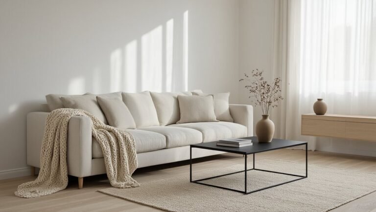
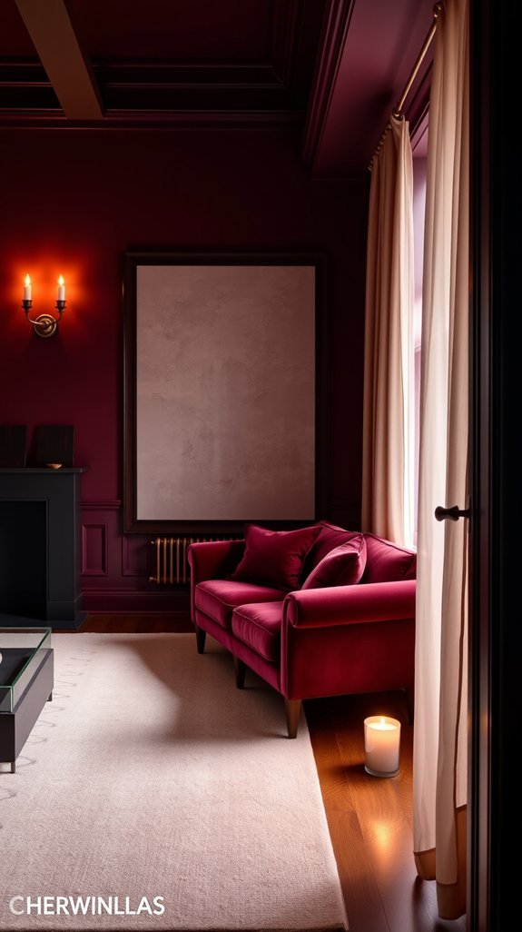
Colors and Materials That Balance Deep Red Walls
You painted that wall crimson. Now your room feels like it’s shouting at you. We’ve all been there—bold choice, big regret, maybe a little panic. But deep red isn’t a mistake waiting to be fixed. It’s a foundation begging for the right partners.
The secret? Cool, grounding colors that turn that energy into something liveable. Think sage that whispers instead of screams, or dusty blue that pulls the temperature down like evening shade. This isn’t about playing it safe. It’s about being smart enough to let your walls have personality without letting them run the show.
Done right, you’ll get a space that feels collected, not chaotic—cozy in winter, fresh in summer. Ready to see what actually works?
Your balance-the-red toolkit:
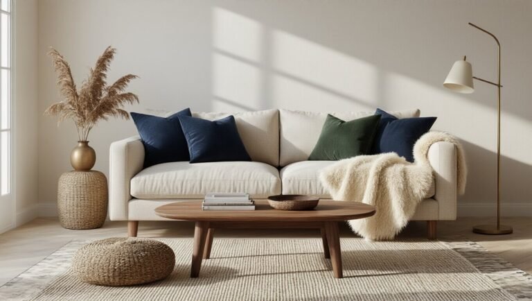
- Sage green – softens the intensity without going boring
- Dusty blue – instant visual air conditioning
- Raw brass – warm metal that plays nice with red
- Woven jute – texture that grounds without competing
- Moss green velvet – luxury layer that absorbs excess heat
Start with swatches, not gallons. Your walls can stay bold. You just need friends who know how to handle them.