Afro Bohemian Interior Design: The Complete Style Guide
Most bohemian interiors are missing something — and you can feel it even if you can’t name it. They have the layers, the plants, the macramé. But they read as culturally thin. Borrowed aesthetics without roots. Afro Bohemian interior design solves this by grounding the free-spirited layering of boho in something older and more specific: the textile traditions, earth pigments, geometric systems, and material honesty of African design heritage.
The result isn’t bohemian with an accessory added. It’s a distinct visual language with its own logic — one that’s warmer, more textured, and more layered than anything the standard boho internet can produce. This guide covers the full system: color, material, pattern, lighting, and room application. By the end, you’ll know exactly what separates an Afro Bohemian room from a vaguely ethnic Pinterest board — and how to build one that actually holds together.
Quick Takeaway:
- Afro Bohemian design is anchored in African textile heritage — mud cloth, kente geometry, and natural fiber weaving — not generic eclectic layering.
- The palette runs on earth pigments: ochre, terracotta, indigo, warm black, and raw linen — cool white and grey dissolve it.
- Layering works when every element has a clear material identity: rough against smooth, matte against sheen, geometric against organic.
What Afro Bohemian Interior Design Actually Is (and What It Isn’t)
Afro Bohemian interior design sits at the intersection of West and Central African material culture and the layered, eclectic sensibility of bohemian decorating. The African half supplies the specific: mud cloth from Mali, kente-derived geometric systems, hand-carved wooden forms, terracotta pottery, and natural fiber weaving traditions developed over centuries.
The bohemian half supplies the compositional freedom — the willingness to layer, mix periods, and let a room accumulate meaning over time. What separates it from standard boho is specificity of cultural reference. Generic bohemian borrows broadly and shallowly from loosely defined “global” sources. Afro Bohemian is anchored — there are recognizable textile traditions, a defined color logic, and a material vocabulary that repeats with intention.
The style isn’t a trend that surfaced on Pinterest in 2019. It’s the visual outcome of a cultural perspective applied to interior space — one that values handcraft over mass production, warmth over cool minimalism, and layered storytelling over single-statement decorating. That’s what gives it staying power while other aesthetic cycles come and go.
The Color Palette: Earth Pigments, Warm Black, and Raw Linen
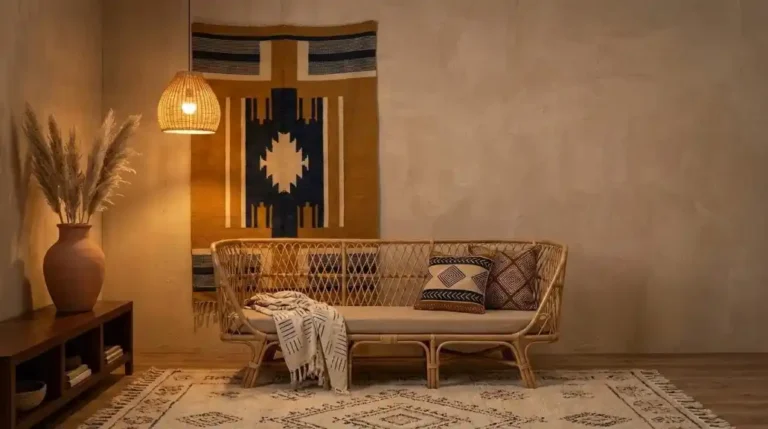
In Afro Bohemian design, textiles do more structural work than furniture. The mud cloth throw on a sofa carries more visual weight than the sofa itself. The woven wall tapestry is the primary architectural element of its wall.
This is a fundamentally different relationship with soft furnishings than Western interior design typically uses — where textiles accent, here they anchor. Understanding this reorients the entire decorating sequence: you choose your textiles first and build the rest of the room around them.
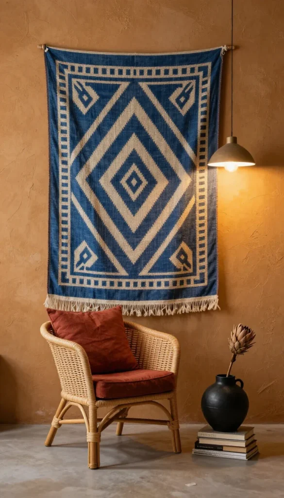
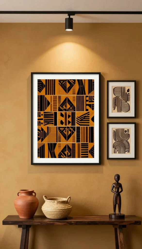
Mud cloth (bogolan) is the most recognizable entry point: hand-woven cotton with geometric patterns applied in fermented mud pigment, historically from Mali. Kente-derived patterns — interlocking geometric forms in high contrast — work alongside it at a different scale.
Natural fiber weaving extends the textile logic into three-dimensional objects: baskets, lamp shades, furniture frames. The principle across all of them is the same — handmade material with visible process.
Layer textiles at three distinct scales to avoid flatness. A large-pattern mud cloth at sofa scale, a mid-scale geometric rug underfoot, and a small-pattern cushion at close range creates the depth composition that makes Afro Bohemian rooms feel deliberately rich rather than accidentally busy.
Textiles: The Load-Bearing Element of the Style
In Afro Bohemian design, textiles do more structural work than furniture. The mud cloth throw on a sofa carries more visual weight than the sofa itself. The woven wall tapestry is the primary architectural element of its wall.
This is a fundamentally different relationship with soft furnishings than Western interior design typically uses — where textiles accent, here they anchor. Understanding this reorients the entire decorating sequence: you choose your textiles first and build the rest of the room around them.
Mud cloth (bogolan) is the most recognizable entry point: hand-woven cotton with geometric patterns applied in fermented mud pigment, historically from Mali.
Kente-derived patterns — interlocking geometric forms in high contrast — work alongside it at a different scale. Natural fiber weaving extends the textile logic into three-dimensional objects: baskets, lamp shades, furniture frames. The principle across all of them is the same — handmade material with visible process.
Layer textiles at three distinct scales to avoid flatness. A large-pattern mud cloth at sofa scale, a mid-scale geometric rug underfoot, and a small-pattern cushion at close range creates the depth composition that makes Afro Bohemian rooms feel deliberately rich rather than accidentally busy.
Furniture and Form: Low, Solid, and Handmade
Afro Bohemian furniture sits low, reads solid, and shows its making. Low platform beds, squat wooden stools, rattan loungers with visible frame construction — the silhouettes are grounded, literally and visually. This isn’t the elevated tapered-leg furniture of mid-century modern, and it isn’t the overstuffed upholstery of maximalist European interiors. The forms are pared down and functional, but the material quality is always present and legible.
Dark-stained or natural hardwoods are the primary material — mango, teak, mahogany, ebony-stained pieces. Rattan and wicker appear in lighter-use items: side chairs, accent tables, storage baskets. Upholstery, where it exists, runs in linen, cotton, or leather in terracotta, warm brown, or natural undyed tones. Avoid synthetic fabrics — polyester upholstery will read as incongruent against natural fiber textiles regardless of color match.
The handmade quality matters because it creates material variation across a room. Machine-made furniture has a surface uniformity that flattens texture contrast. Hand-carved, hand-woven, and hand-thrown objects each carry slight irregularities that catch light differently — and that differential light response is exactly what gives an Afro Bohemian room its depth.
Pattern Logic: Mixing African Geometric Motifs Without Visual Noise
Pattern mixing in Afro Bohemian design follows a scale hierarchy, not a color-matching logic. The mistake most rooms make is trying to match patterns by color before resolving their scale relationships. Two patterns at the same visual scale placed in proximity create competition — the eye can’t resolve which one to read first and registers both as noise. The fix is to resolve scale before anything else.
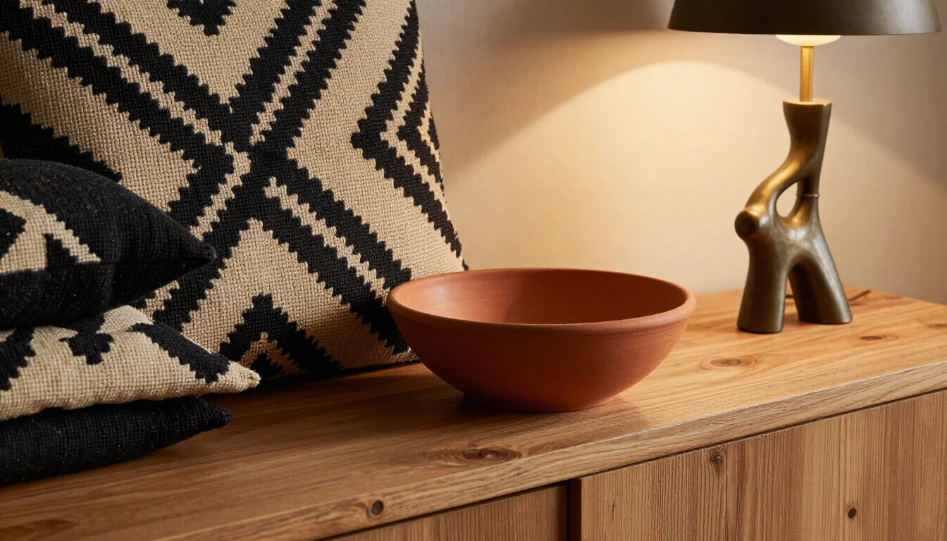
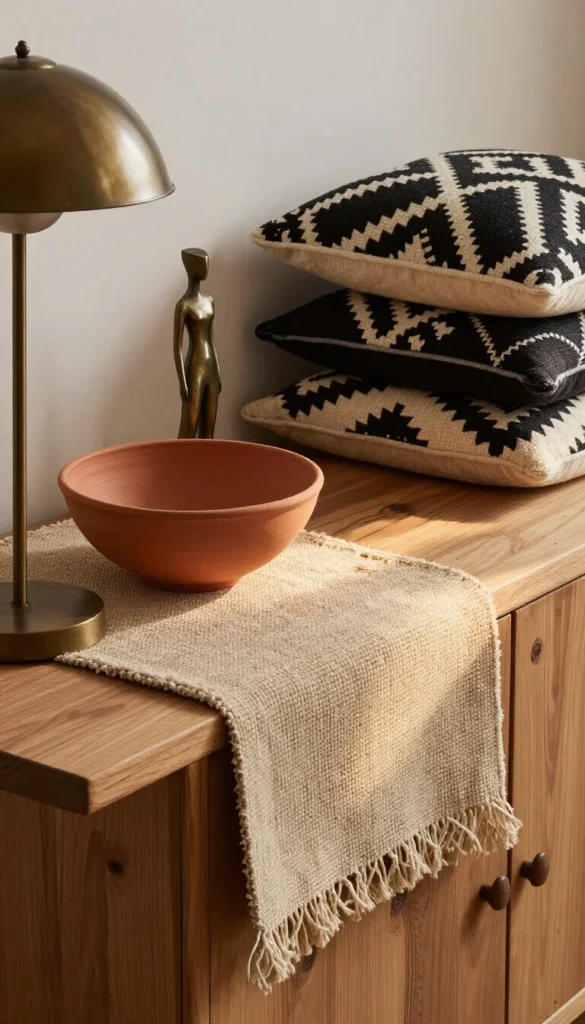
A working pattern composition runs: one large-scale anchor pattern (a mud cloth throw or woven wall piece), one mid-scale extending pattern (a rug with geometric repeat), and one small-scale detail pattern (a cushion or ceramic motif). This three-tier hierarchy can hold four or five different patterns simultaneously without the room reading as chaotic — because each pattern occupies a distinct perceptual distance from the viewer.
Color contrast within patterns should stay within the warm earth range. High-contrast geometric patterns in ochre and black are cohesive in this palette because both colors share the same pigment origin. The same composition in teal and orange would fragment it. The pattern vocabulary can vary widely — chevrons, diamonds, interlocking squares, linear repeat — but the colorway range needs to stay earth-anchored throughout.
Lighting: The One Thing You Can’t Decorate Around
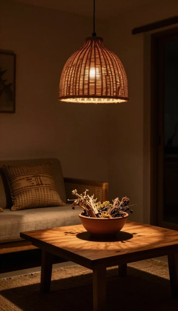
Warm lighting isn’t a mood choice in Afro Bohemian design — it’s a structural requirement. Earth pigments are calibrated under warm light conditions. Ochre, terracotta, and warm brown perform at their most accurate under 2700K incandescent or equivalent warm LED.
Under cool white light (4000K and above), the same colors shift: ochre reads greenish, terracotta grays out, warm black loses its depth. The entire palette can go visually inert without any single identifiable cause — just a persistent sense that something is off.
Rattan and woven fiber pendant lights are the natural fixture choice because they function as textural elements simultaneously — the weave casts geometric shadow patterns onto surrounding surfaces at night, adding a layer of visual interest that solid shades can’t produce. Position lighting at low and mid-height rather than relying on ceiling fixtures alone.
A floor lamp at one end, a table lamp at the other, and a pendant overhead creates three light zones that eliminate the flat overhead-only look common in rooms that haven’t resolved their lighting architecture.
Recessed cool-white downlights are spatially efficient and atmospherically destructive in this context. They’re the single fastest way to neutralize a room that’s otherwise correctly assembled.
Room-by-Room: Where the Style Lands Differently
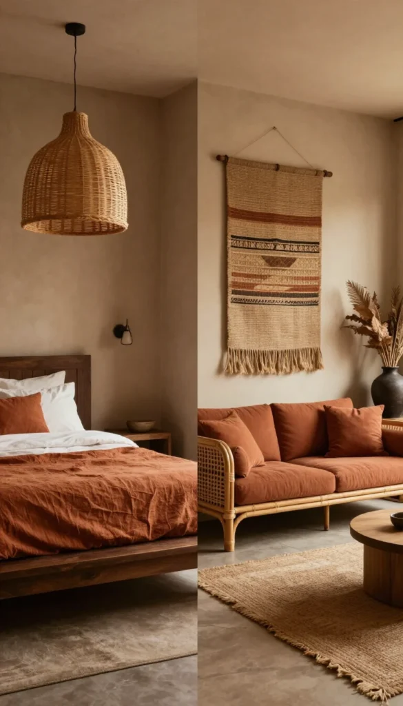
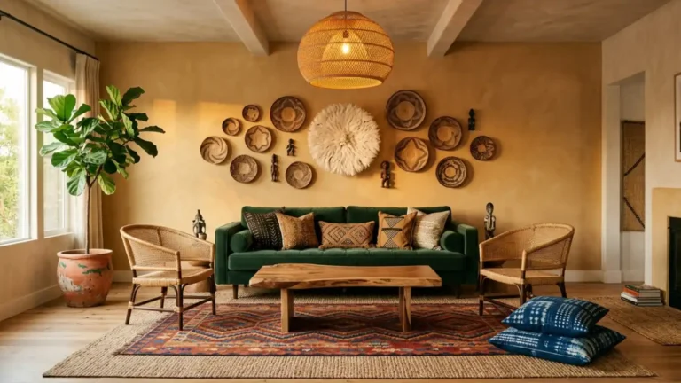
The Afro Bohemian system applies differently by room because each space has functional constraints that determine which elements lead. The bedroom is textile-first — the bed is the canvas and layering is the primary design act.
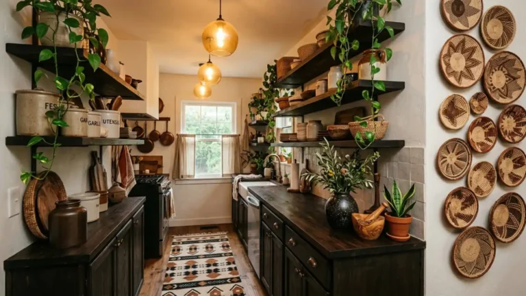
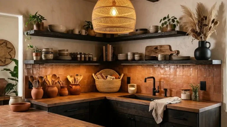
The living room gives more weight to furniture form and wall treatment because the space is architecturally more visible and less defined by a single central element. The kitchen applies the palette through material surfaces — terracotta tile, dark wood cabinetry, woven pendant — since fabric doesn’t belong at the cooking zone. The bathroom works at a smaller scale; terracotta, woven baskets, and a single wall-hung textile can complete the aesthetic in a space that can’t support full layering. The office requires the aesthetic to work within productive functionality — pattern and texture add the visual richness without disrupting the cognitive clarity a work space needs.
Each room has a dedicated guide that covers the specific application in detail:
- Afro Bohemian Bedroom — textile layering, bed composition, and low furniture selection
- Afro Bohemian Living Room — sofa arrangement, wall treatment, and pattern mixing at scale
- Afro Bohemian Kitchen — palette in a functional space without textile dependence
- Afro Bohemian Bathroom — small-scale application with maximum material contrast
- Afro Bohemian Office — productivity space with full aesthetic coherence
Why the Room Looks Right in Photos and Flat in Person
The disconnect between a reference photo and your actual space is almost always a light source problem. Editorial Afro Bohemian photography is shot under 2700K warm fill light, often with a golden hour window contribution added. If your space runs on cool overhead downlights, the earth pigments in your textiles are being rendered under a completely different color temperature than the one they were calibrated for.
The palette is correctly assembled — it’s just being evaluated under the wrong conditions. Switching to 2700K bulbs in existing fixtures is the fastest single intervention available.
Why One Pattern in the Room Always Looks Wrong
Pattern dissonance in a mixed-textile room is almost always a scale collision, not a color clash. When two patterns occupy the same visual scale in the same frame — a rug and a throw, both with mid-size geometric repeats — the eye can’t resolve which one to prioritize and reads both as noise. The fix isn’t removing one. It’s changing its scale. Replace the throw with a solid linen in the same colorway, or swap the rug for a larger-scale weave that recedes into background. Scale hierarchy solves what color coordination can’t reach.
Why Afro Bohemian Rooms Read as “Too Much” — and One Fix
The over-layered Afro Bohemian room has one consistent structural problem: no visual rest zone. Every surface is activated — walls, floor, furniture, shelves. The eye needs somewhere to stop before moving to the next element, and that pause is created by negative space or a plain matte surface. A section of raw plaster wall, a solid linen cushion, or an undecorated floor area functions as the visual breath that makes the layered elements readable around it. The solution isn’t less layering — it’s the deliberate placement of rest within the layer.
What Your Saved Afro Bohemian Rooms Are Actually Telling You
Before you buy a single item, spend ten minutes with your Pinterest saves or your phone’s screenshot folder. The pattern in what you’ve been collecting is more useful than any shopping list. Look at your saved images and answer these specific questions:
- Are most of your saved rooms dark and moody or open and window-lit? This reveals your instinctive preference for light level — and determines your lamp placement strategy before you’ve bought anything.
- Which room type appears most frequently — living rooms, bedrooms, or styled vignettes? That’s where you actually want to land the aesthetic first, regardless of what you think you should prioritize.
- Is there one textile that appears in almost every saved image — mud cloth, woven wall tapestry, patterned rug? That’s your anchor piece. Start there and build the rest of the room outward from it.
- Are your saved images full-room shots or close-up detail shots? If you’re consistently saving details, you’re drawn to material quality over spatial composition — invest in texture first, furniture scale second.
- Do the saved rooms feature dark wood furniture or lighter rattan and natural fiber pieces? This is your furniture tone baseline — don’t fight your own visual preference.
- How many saved rooms use a deliberate undecorated wall section as a design choice? If most of them do, your version of the style needs significantly more breathing room than the maximalist references suggest.
Your saves are a frequency analysis of your own taste. The pattern they form together is more honest than any single image you fell in love with.
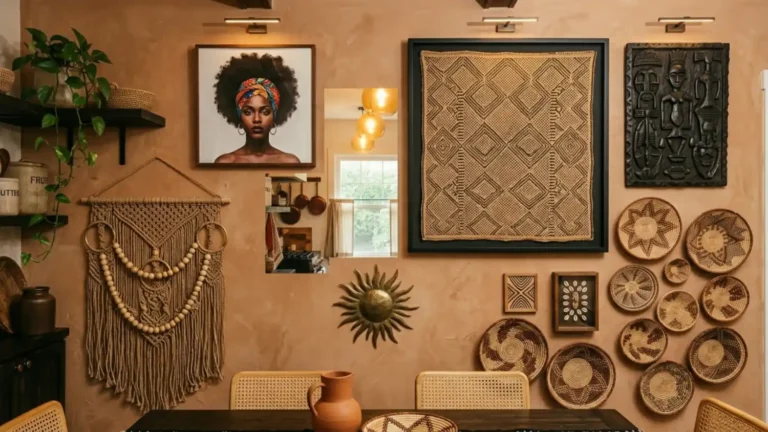
Afro Bohemian design is the only interior aesthetic where the materials themselves carry historical argument. A mud cloth throw isn’t decorative — it’s a textile tradition developed over centuries in West Africa, where the geometric patterns held social and ceremonial meaning. When you build this aesthetic with that understanding, the room becomes something different from a styled space.
The objects you choose, layered with knowledge of where they come from, make a claim about what you value: craft over convenience, warmth over trend, material honesty over surface polish. That’s not decoration. That’s a worldview given physical form — and it’s why rooms built this way tend to outlast everything else on the mood board.
Read More
- 15 Afro Bohemian Interior Design Ideas for a Warm and Layered Home — See how mud cloth, terracotta, and natural fiber weaving come together across real room applications.
- 11 Afro Bohemian Color Palettes That Actually Work — Explore the full range of earth pigment combinations built around ochre, indigo, warm black, and raw linen.
- 9 Common Afro Bohemian Decorating Mistakes to Avoid — Learn why cool-white lighting, scale collisions between patterns, and synthetic upholstery dissolve the aesthetic from the inside.
- How to Create an Afro Bohemian Interior Design Style at Home — A step-by-step walkthrough for building the full system — color, textile, furniture, and lighting — in your own space.
- How to Mix Soulful Earth Tones in Afro Bohemian Decor — Master the three-tier pattern scale hierarchy that lets you layer five patterns simultaneously without visual noise.
- How to Decorate in Afro Bohemian Style Without Making It Look Busy — Discover why deliberate rest zones and negative space are the difference between richly layered and overwhelmingly cluttered.
- Afro Bohemian Decor Must-Haves for Beginners — Start with your anchor textile — mud cloth, woven wall tapestry, or patterned rug — and build your room outward from there.