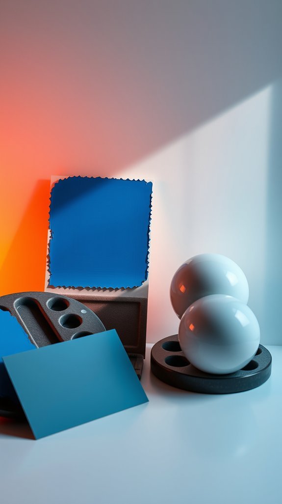
How to Choose Between Warm vs. Cool Blues Based on Your Lighting
You fell in love with that dreamy navy in the store, but by dinnertime your kitchen walls look like a stubborn bruise. What happened? Blues are notorious shape-shifters—cozy yellow light coaxes out hidden greens, while crisp afternoon sun amps up the steel-gray undertones. Your bulbs and windows are secretly casting votes on your color, and you don’t get to see the final result until the paint’s already dry.
The good news: you can stop guessing and start choosing with confidence. By matching your blue’s temperature to your room’s natural and artificial light, you’ll land a shade that feels intentional morning, noon, and night. No more unwelcome purple surprises, no more repaint regret. Just a color that actually behaves the way you imagined. Ready to find your perfect blue?
Key Takeaways
You finally found the perfect blue paint—then watched it turn muddy gray at 6 p.m. Sound familiar? Choosing blue isn’t just about the shade on the swatch; it’s a partnership between color and light that can make or break your room.
Here’s the insider trick: warm bulbs and cool blues are basically enemies, while the right pairing feels like your walls finally took a deep breath. North-facing rooms crave those cozy, green-leaning blues that feel like a hug, while sun-drenched southern spaces can handle something crisper and more awake.
Test your color on big boards and live with it from sunrise to that sad evening lamp moment—because nobody wants “flat and depressing” as their design aesthetic. Get the match right, and your blue stays gorgeous all day long, no repainting required. Ready to stop second-guessing your walls?
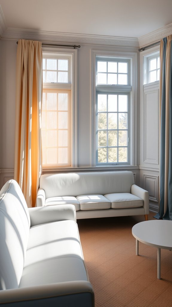
Why Your Blue Looks Different at Home
You finally painted that accent wall the perfect navy blue. Then night fell. Suddenly your Pinterest-worthy living room feels more like a cozy cave—or worse, a sterile office. Sound familiar? We’ve all been the person squinting at our walls, wondering where our beautiful color went.
The culprit isn’t your paint choice. It’s your light bulbs.
Here’s the secret designers know: warm, dimmable bulbs flatter deeper colors and hide evening clutter, while cooler, brighter ones energize your morning coffee routine. The same room can feel like a calming retreat or a productive workspace just by flipping a switch. Even better? Strategic lighting saves your eyes, your energy bill, and your sanity when entertaining.
Ready to stop blaming your paint and start loving your lighting?
How to Spot Warm vs. Cool Blue Undertones in Daylight
You finally found the perfect blue paint—then watched it turn completely different by dinnertime. That moody navy looked sophisticated in the store but suddenly reads baby-blue on your living room wall. Sound familiar? The real culprit isn’t your taste; it’s your light bulbs playing tricks on you.
Here’s the designer secret most people miss: daylight is the only honest critic. Before you commit to a color, let your blue samples bask in natural light from sunrise to sunset. You’ll discover something fascinating—blues are shape-shifters. Morning light pulls out crisp, icy notes, while golden hour coaxes out softer greens and purples you never noticed.
This simple habit saves you from expensive do-overs and reveals the true personality hiding in your paint chip. Grab a coffee, tape up those samples, and watch the magic happen. Your walls have stories to tell—you just need to listen at the right time of day.
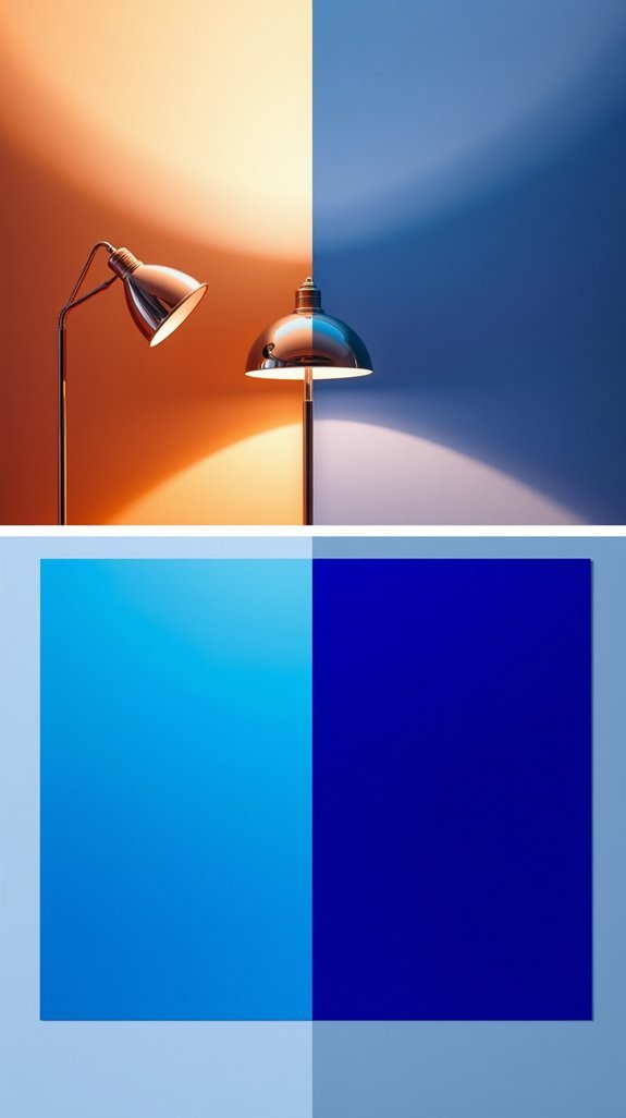
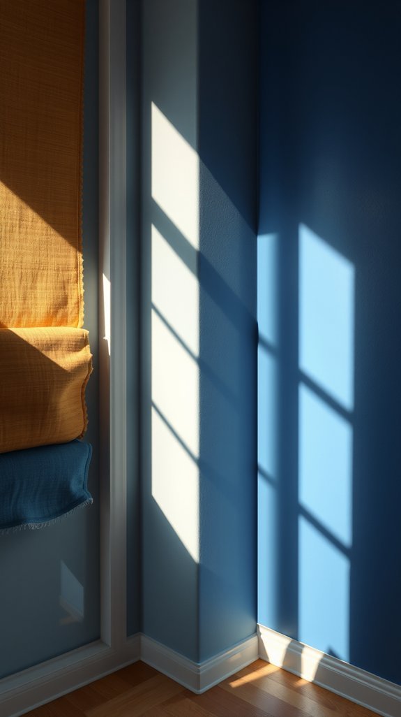
What Warm Bulbs Do to Cool Blues (And Vice Versa)
You finally found the perfect dusty blue for your bedroom walls. Then evening hits, and suddenly your sanctuary looks like a sad hospital corridor—or worse, a dim cave where color goes to die. The culprit? Your light bulbs are staging a silent war against your paint.
Here is the fix nobody talks about: pairing your bulb temperature to your color palette. Warm bulbs cozy up creams and terracottas beautifully, but they swallow cool blues whole, turning them muddy and flat. Flip the switch to cooler light, and those same blues sing—crisp, airy, alive.
The best part? This one swap costs less than a throw pillow but transforms how your space feels from breakfast through midnight. No repainting required, no regrets, just rooms that finally look like you imagined.
Ready to stop fighting your fixtures? Let’s show you how to make every hour golden.
How LEDs Trick Your Eye: Blue Shifts You Didn’t Expect
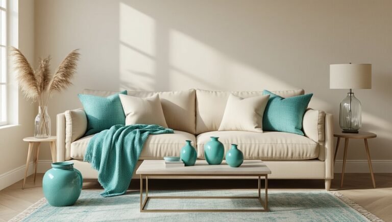
You finally found the perfect couch. The throw pillows *chefkiss.* Yet somehow your living room still feels like you’re waiting for a teeth cleaning. The secret culprit? Those “warm” LED bulbs glowing above you like tiny interrogation lights.
Here’s the twist: your bulbs are lying to you. Manufacturers sneak in harsh blue spikes to chase efficiency ratings, and your eyes notice the faint institutional vibe even when you can’t name it. The good news? You don’t need an engineering degree to fix this.
Smart bulb choices and simple swaps can turn that clinical chill into golden-hour coziness—lower energy bills included. Your space should feel like *you* designed it, not like a corporate upgrade gone wrong.
Ready to stop fighting with your lighting and start loving your rooms again?
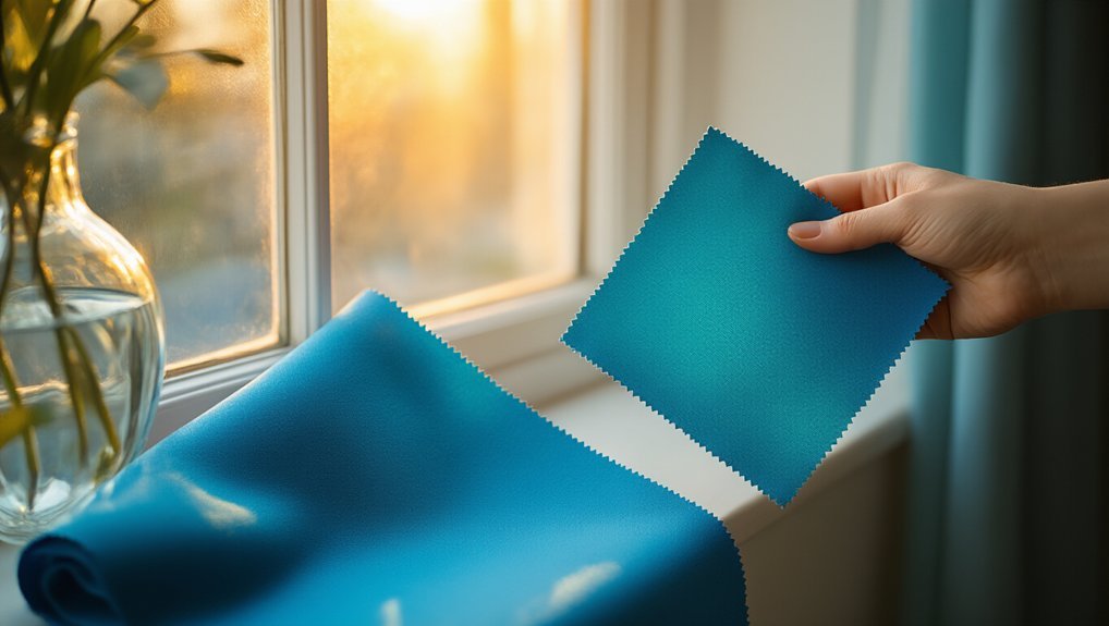
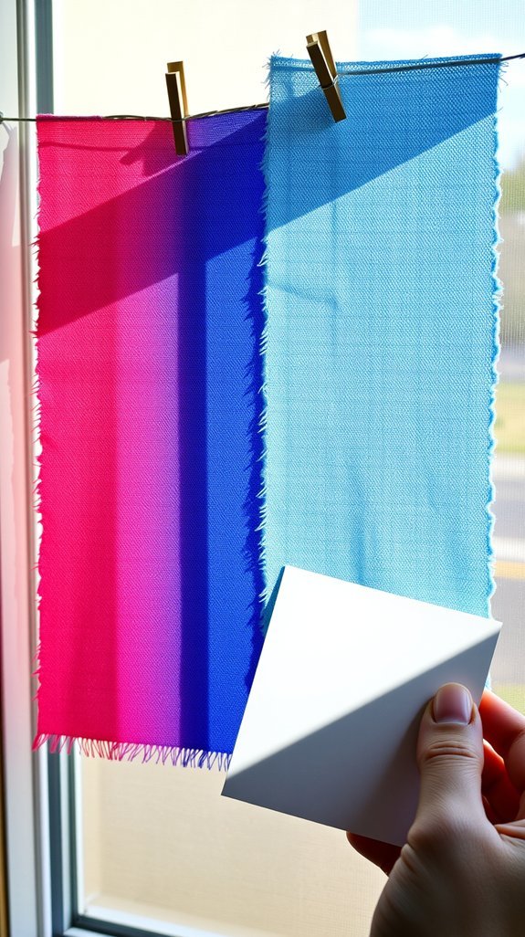
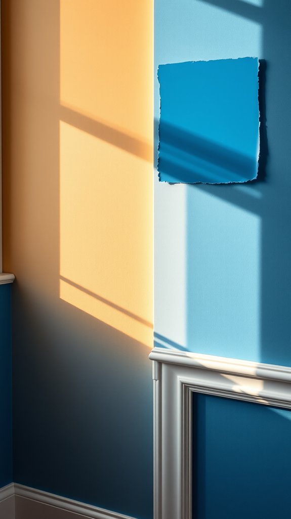
The Paint-Swapping Method: Test Blues Under Every Light
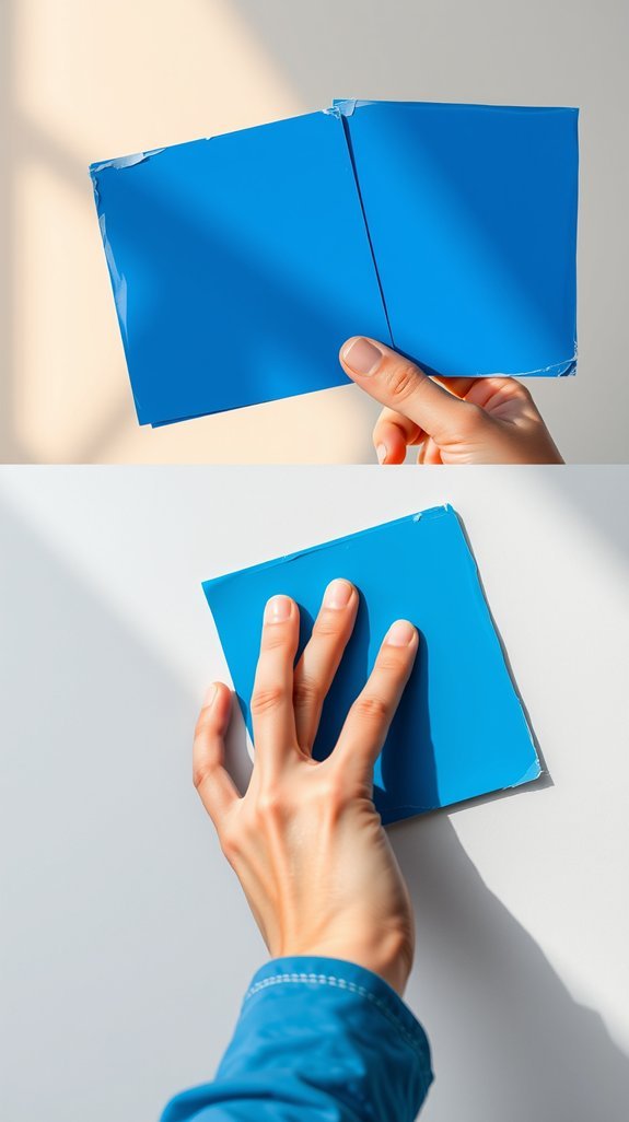
You fell in love with a blue in the store. Then you got it home, and suddenly your bedroom walls looked like a dentist’s office. What happened? That periwinkle didn’t disappear—it just met your terrible lighting.
Here’s the fix nobody tells you: quit trusting tiny swatches. Paint large boards instead and carry them around your space like a weird art project. Watch what morning sun does to those undertones. See how your evening lamps flatten everything into sadness. Move your samples from window to shadow, room to room. The blue that survives this torture test? That’s your winner.
This little extra effort saves you from repainting an entire room because “ocean breeze” turned into “hospital corridor” at 6 p.m. Plus, you get to pretend you’re conducting Very Important Design Science in your pajamas. Ready to find a blue that actually behaves?
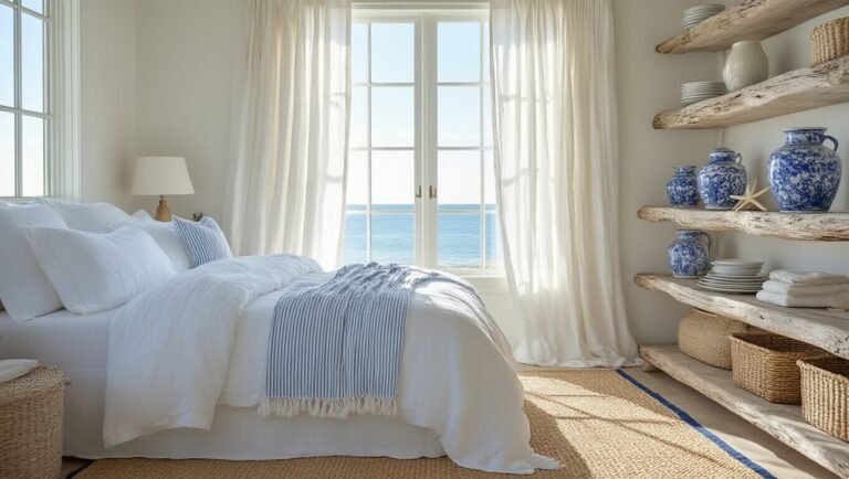
North-Facing Rooms: Skip the Cool Blue Entirely
You finally found the perfect blue paint—soft, serene, exactly what you saw in that magazine spread. Then you slap it on your north-facing living room wall and… yikes. Suddenly your cozy space feels like a dentist’s office waiting room. That cool gray light streaming through the window? It turns your dreamy blue into something cold and lifeless, no matter how many lamps you buy.
Here’s the fix nobody tells you about: swap those icy blues for warm, green-leaning ones instead. Think sage, think teal with a whisper of moss. Your room stays colorful without fighting its natural light, and you stop throwing money at “cozy” bulbs that never quite work.
The best part? You get a space that actually feels like home from morning coffee to evening wind-down. Ready to find your room’s perfect temperature?
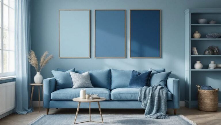
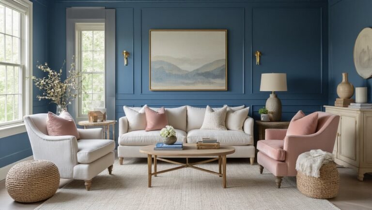
South-Facing Light: When You Can Use Any Blue
You know that sinking feeling when you paint a wall blue, only to watch it turn muddy gray by afternoon? North-facing rooms love to play that trick, leaving you second-guessing every swatch. But south-facing windows? They’re the generous friend who actually wants you to succeed.
Here’s the secret: that steady, warm light pouring in from sunrise to sunset acts like nature’s color stabilizer. Suddenly, every blue on the wheel becomes fair game—warm slate, crisp cobalt, even that daring navy you’ve been eyeing. No more testing paint at six different times of day just to hedge your bets. You pick a sample, you look at it, you trust what you see.
Beyond the immediate relief, this consistency saves you from costly do-overs and years of living with “almost right” walls. Ready to find your perfect blue? Let’s explore which shades sing brightest in that golden glow.
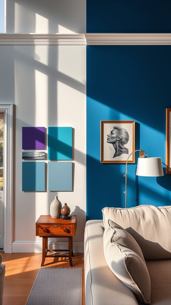
Which White Trim Works With Your Blue’s Undertone
You finally found *the* blue—the one that made your heart skip when you swatched it on the wall. But now? You’re standing in the white paint aisle, surrounded by what feels like fifty shades of “almost right,” and suddenly your confidence is crumbling. Pick the wrong white, and that gorgeous blue turns muddy, or your trim starts screaming for attention instead of quietly framing the room. The secret most people miss? White isn’t blank—it’s packed with hidden color that either hugs your blue or fights it. Warm blues crave creamy whites with soft yellow or peach undertones (think vintage linen, not stark paper). Cool blues need crisp whites with blue or gray whispering underneath. Get this pairing right, and your whole room breathes together, looking intentional for years. Ready to find your perfect match? Here’s how to crack the code.
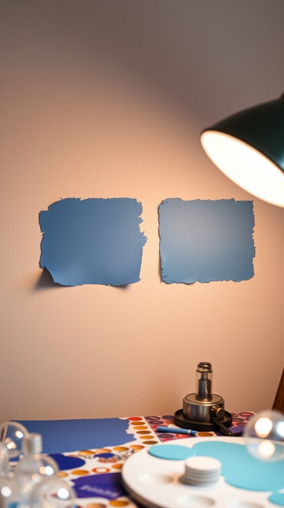
Why Blue Paint Fails in Rooms With Sun Plus Lamp Light
You finally painted your bedroom that perfect dusty blue—then the sun went down and your lamps clicked on. Suddenly your calm retreat looks like a sad hospital corridor, all gray and washed out. Sound familiar?
The fix isn’t buying twenty paint samples. It’s understanding how your lighting works as a team (or doesn’t). Daylight and lamplight pull your blue in opposite directions—one minute it’s crisp and coastal, the next it’s swimming-pool green in the corners. Most people blame the paint. It’s actually the pairing.
Once you learn to balance color temperature across your light sources, that dreamy blue stays dreamy around the clock. No more morning-only magic. No more cringing at your walls after sunset.
Ready to stop fighting with your fixtures and start loving your color full-time?
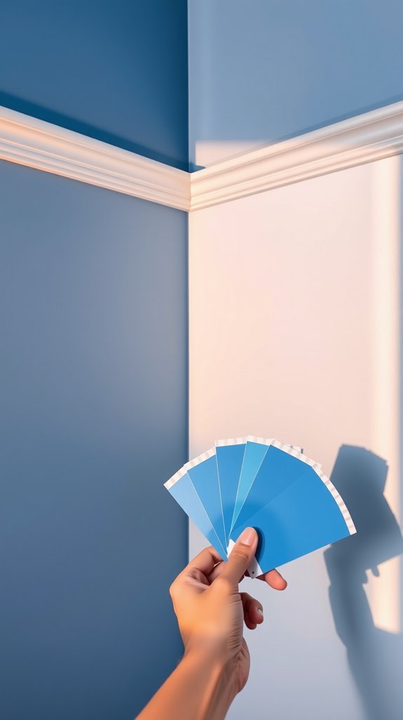
Blue Paint Cheat Sheet: Match Your Light to the Right Tone
You finally found the perfect blue paint swatch in the store—confident, calm, exactly right. Then evening hits, and your walls look like a smudgy aquarium. Sound familiar?
Here’s the thing: blue doesn’t play fair. It shape-shifts with your light, turning cozy one minute and cold the next. But you can outsmart it. The trick is marrying your paint to your windows. North-facing rooms crave warm blues with hints of gray or green—think misty lake, not frozen pond. South-facing spaces can handle the crisp, clean stuff. Always test samples morning, noon, and evening. Forget vague labels like “just blue” and get precise about undertones.
Get this right, and you stop repaint-ing every two years. Your walls finally behave. Below, your cheat sheet for picking a blue that stays true all day long.
Conclusion
You finally found the perfect blue paint swatch—until you get it home. Suddenly it looks like a muddy pond at noon and ice-cold hospital walls by dinner. Sound familiar? The secret isn’t buying more samples; it’s matching your blues to *your* light, not the store’s fluorescents.
Here’s the fix nobody tells you: warm blues for golden morning sun, cool blues for crisp north-facing windows. Test boards at breakfast, lunch, and evening. That trendy navy? It might turn bruise-purple under your vintage bulbs. But get this right once, and you stop repainting every two years.
The best part? Your space finally feels intentional—not like you’re chasing some Pinterest fantasy that doesn’t exist. Ready to find a blue that actually loves your living room back? Let’s dig into the tricks that save your walls (and your sanity).