9 Scandinavian Color Combinations for a Warm Minimal Home
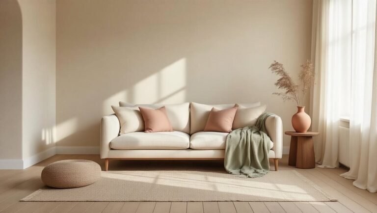
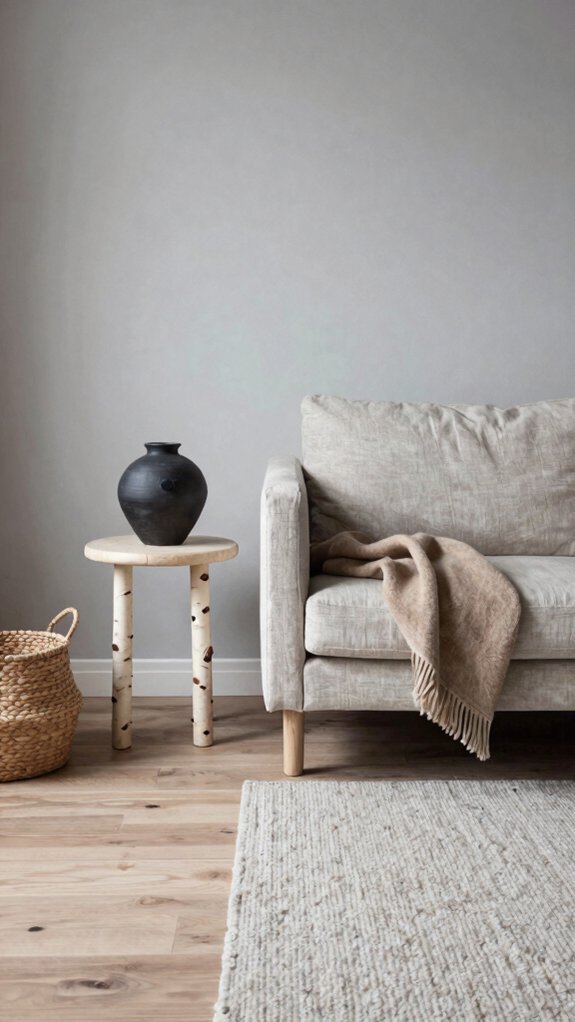
Warm White & Soft Taupe: The Scandinavian Starting Point
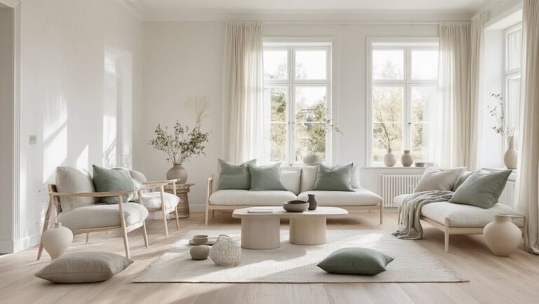
Why do Scandinavian interiors feel simultaneously warm and restful? The combination of warm white and soft taupe provides the foundational answer.
Warm white walls create an airy, luminous backdrop that reflects natural light throughout spaces, while soft taupe introduces subtle earthiness without overwhelming minimalist aesthetics.
This pairing echoes warm slate tones found in Nordic landscapes, grounding interiors with organic sophistication.
The interplay between these neutrals establishes visual tranquility, allowing architectural elements and carefully curated furnishings to become focal points.
Together, warm white and soft taupe create a serene canvas that embodies Scandinavian design principles: simplicity, functionality, and understated elegance that endures beyond fleeting trends.
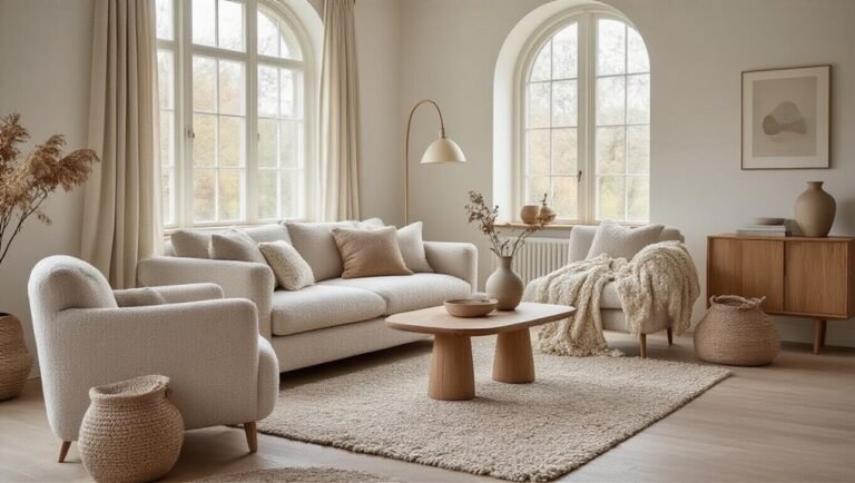
Creamy Ivory & Warm Gray: Adding Depth to Neutral Spaces
While warm white and soft taupe establish a foundational palette, introducing creamy ivory and warm gray creates dimensional depth within minimalist Scandinavian spaces.
Creamy ivory serves as a softer alternative to stark whites, offering visual warmth without compromising the aesthetic’s clean lines.
Creamy ivory softens stark whites while preserving clean lines, bringing warmth to minimalist Scandinavian interiors.
New greys—those with brown or beige undertones rather than cool blue—complement ivory beautifully, adding subtle contrast and sophistication.
This pairing prevents spaces from feeling flat or monotonous.
Layering these neutrals across walls, textiles, and furnishings generates visual interest while maintaining the restrained elegance central to Scandinavian design principles.
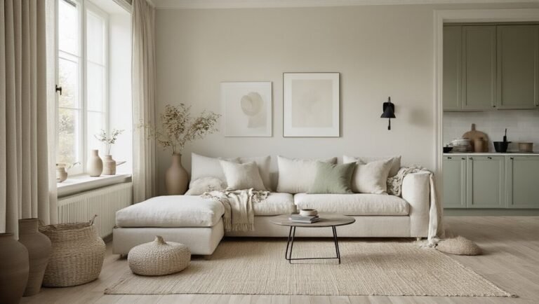
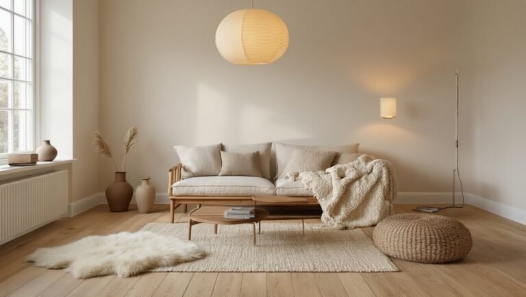
Soft Sage & Natural Wood: Bringing the Outdoors In
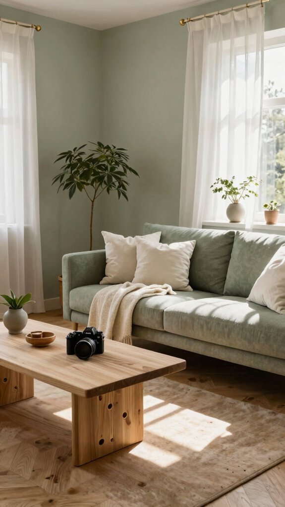
How can a single color transform a minimalist interior into a sanctuary? Soft sage paired with natural wood achieves this transformation effortlessly. The herbaceous greens of sage create a calming backdrop that evokes botanical spaces, while exposed wooden elements—beams, furniture, or flooring—ground the aesthetic in organic authenticity. This combination establishes visual continuity between interior and exterior environments, seamlessly blending nature indoors. The muted sage tone prevents the wood from overwhelming the minimal framework, maintaining balance and restraint characteristic of Scandinavian design. Together, these elements foster an environment that prioritizes tranquility without sacrificing warmth, creating rooms that feel both open and inviting.
Pale Linen & Muted Terracotta: Earthy Warmth Without Drama
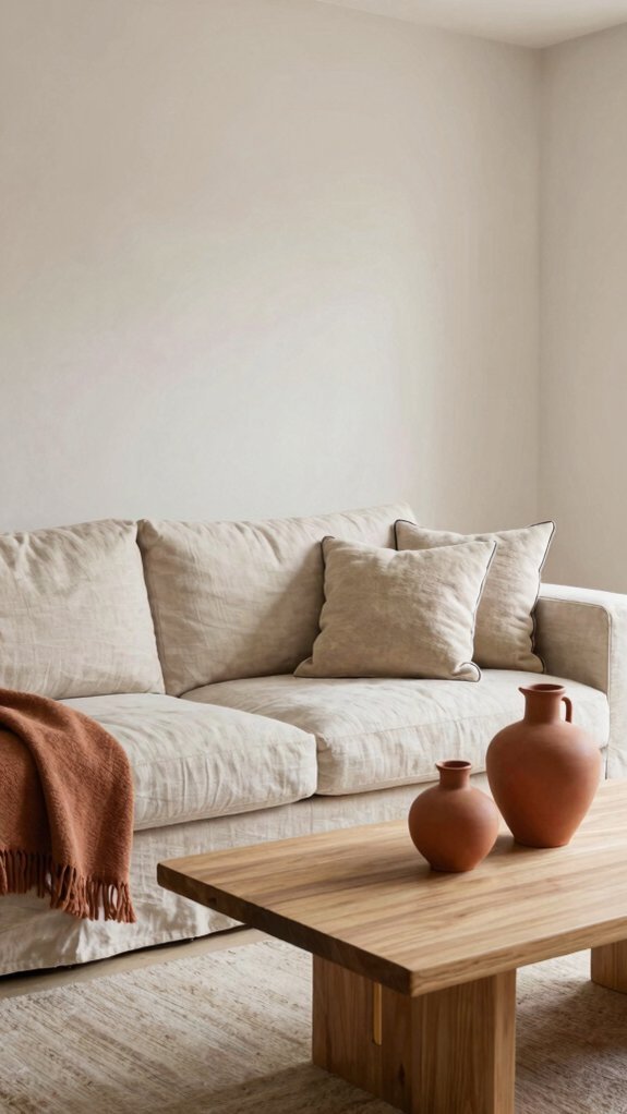
Pale linen and muted terracotta form a sophisticated pairing that introduces warmth to minimalist interiors without visual excess. This combination balances neutral greige tones with subtle earthiness, creating understated sophistication. Pale linen serves as a calming base for walls and textiles, while muted terracotta accents—appearing in pottery, artwork, or upholstered pieces—add gentle warmth and organic character. The restrained palette maintains minimalist principles while avoiding cold austerity. This approach suits Scandinavian design philosophy, emphasizing coziness through color restraint rather than saturation, resulting in spaces that feel both serene and inviting without overwhelming the senses.
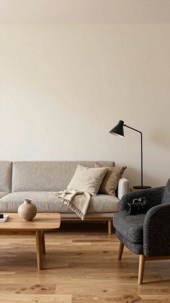
Warm Beige & Charcoal: Strategic Contrast in Minimal Rooms
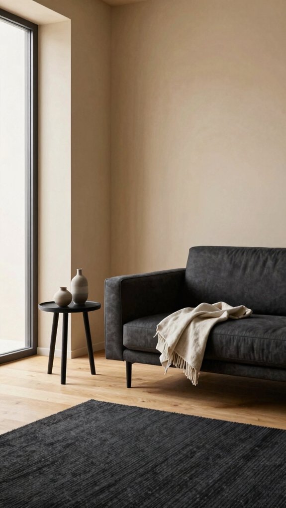
When does minimalism require visual anchoring? The pairing of warm beige with charcoal provides precisely that foundation. Beige serves as a serene base, allowing negative space to breathe throughout minimal interiors.
Charcoal accents—whether in furniture, textiles, or architectural elements—establish purposeful contrast without overwhelming the aesthetic. This combination respects Scandinavian design principles by maintaining restraint while introducing definition.
The darker tones ground spaces, preventing beige-dominated rooms from feeling flat or uninspired. Strategic placement of charcoal pieces creates visual interest and focal points, essential in minimalist environments where every element carries weight.
The result balances warmth with sophistication.
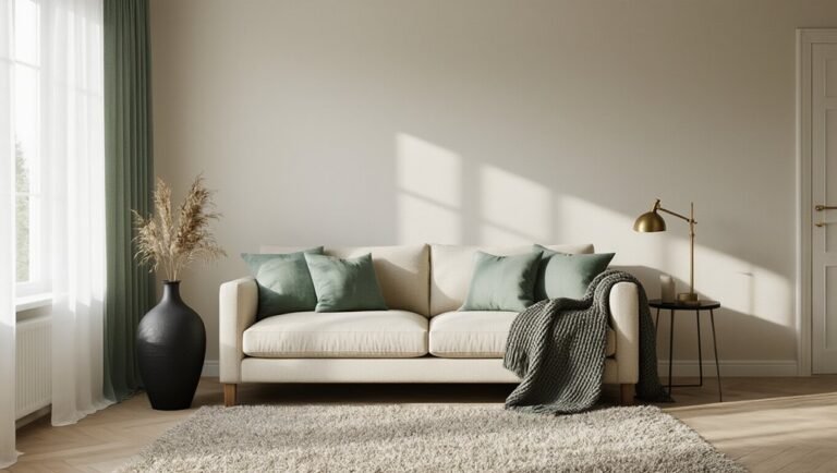
Cream & Soft Ochre: Subtle Golden Tones for Living Areas
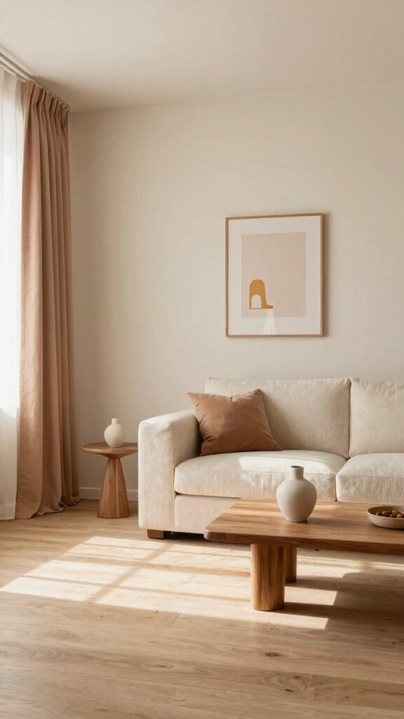
While warm beige and charcoal create definition through contrast, cream and soft ochre achieve warmth through harmonious subtlety. This palette introduces gentle golden undertones that soften living areas without overwhelming minimalist principles. Cream serves as a neutral foundation, while soft ochre adds depth and visual interest through warm earth-inspired hues.
Introducing accents like warm eucalyptus in botanical elements or textiles bridges the color scheme with natural sophistication. This combination suits spaces requiring comfort alongside restraint, allowing inhabitants to experience coziness without sacrificing clean, uncluttered aesthetics. The result is an inviting atmosphere that feels both grounded and contemporary.
Light Gray & Warm Greige: The Cozy-Cool Balance
Light gray and warm greige represent a sophisticated evolution of cool minimalism, marrying the crispness of modern aesthetics with the comfort of warmer undertones. This scandi 2.0 approach balances neutrality with approachability, creating spaces that feel neither sterile nor heavy.
Light gray provides architectural clarity on walls and larger surfaces, while warm greige grounds the environment through upholstery, textiles, and accent pieces. Together, they establish a cozy-cool equilibrium—sophisticated yet inviting.
This combination suits contemporary Scandinavian interiors seeking warmth without abandoning restraint, allowing residents to inhabit minimalist spaces that feel genuinely livable and psychologically balanced.
Soft White & Dusty Rose: Warmth Through Gentle Accent Color
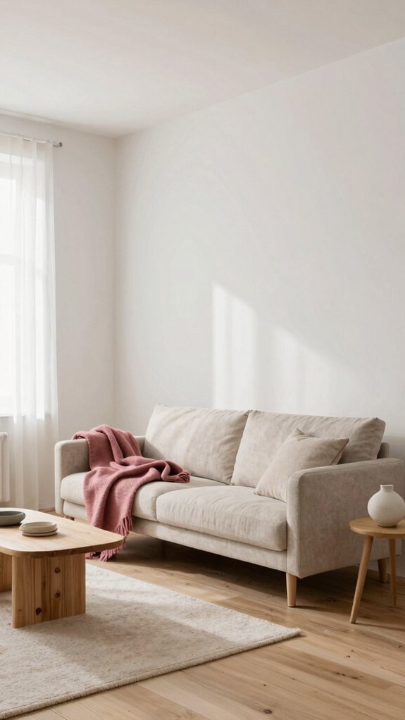
Soft white and dusty rose take the minimalist palette in a distinctly different direction, introducing color through restraint rather than neutrality alone. This pairing softens clinical minimalism by incorporating warmth through a whisper of rose that floats like mist across predominantly white surfaces.
The dusty rose appears in accents—throw pillows, artwork, or a single accent wall—while soft white remains the dominant backdrop. This combination maintains Scandinavian simplicity while evoking comfort and approachability. The muted rose tone avoids boldness, instead suggesting femininity and calm sophistication. Together, these colors create spaces that feel both serene and inviting, balancing austerity with gentle emotional resonance.
Oatmeal & Warm Brass: Luxury Through Texture and Metallics
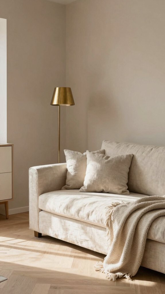
How does minimalism achieve sophistication without relying on bold color? The oatmeal and warm brass combination demonstrates this through tactile richness and subtle luminosity. Oatmeal walls provide a neutral canvas that emphasizes texture—linen, wool, and natural fibers become focal points. Warm brass fixtures introduce understated luxury, catching light without demanding attention. Accents in jade offer cool contrast, grounding the palette while maintaining restraint. This approach prioritizes quality materials over quantity, where every element serves a purpose. The result is a serene environment that feels intentional and refined, proving that sophisticated interiors emerge from thoughtful material selection rather than chromatic boldness.