10 Scandinavian Color Palettes That Make Any Room Feel Calm and Bright
Crisp White and Soft Gray With Muted Blue Accents
Why do Scandinavian interiors feel so restful? This palette combines warm whites and off-whites as foundational elements, creating an airy backdrop that reflects light throughout the space. Soft gray tones add subtle depth and sophistication without introducing heaviness. Muted blue accents—whether through textiles, artwork, or decorative objects—provide visual interest while maintaining the serene atmosphere characteristic of Nordic design. The blue hues, deliberately desaturated, echo natural elements like sky and water without overwhelming the senses.
Together, these three components establish a harmonious environment that promotes relaxation and mental clarity, making this palette ideal for bedrooms, living areas, and workspaces seeking calm sophistication.
Warm Beige, Charcoal, and Natural Wood Tones for Grounded Spaces
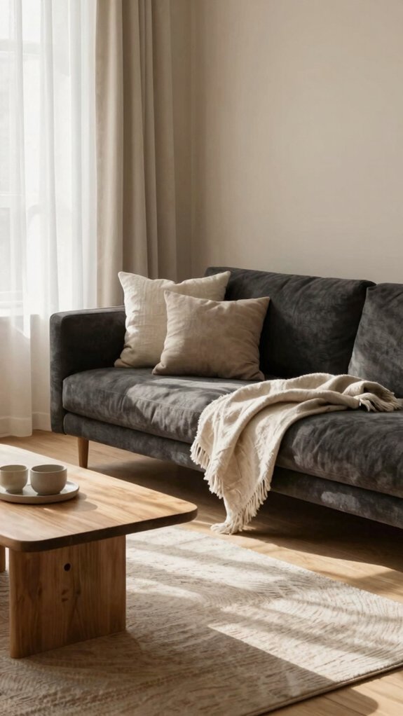
While cool neutrals and soft blues create serenity through lightness, this palette grounds interiors through warmth and earthiness. Warm beige walls paired with charcoal accents establish sophisticated contrast without visual harshness. Natural wood tones—whether flooring, furniture, or architectural elements—introduce organic texture and authenticity. This combination embodies warm minimalism by balancing restraint with inviting coziness.
The earthy foundation creates psychological comfort, making spaces feel simultaneously modern and timeless. Charcoal provides visual weight and definition, preventing the palette from feeling too soft or insubstantial. Together, these elements produce rooms that feel anchored and peaceful, offering refuge through understated elegance and natural materials.
Pale Gray, Sage Green, and Cream: The Calm Bedroom Combination
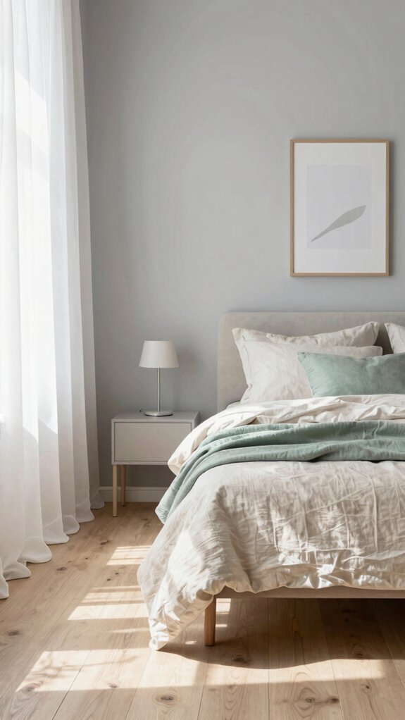
How does one create a bedroom sanctuary that feels both restful and naturally sophisticated? Pale gray walls provide a serene foundation, while sage green accents introduce subtle botanical freshness without overwhelming the senses. Cream-colored textiles—bedding, curtains, and rugs—soften the palette with warm neutrals that enhance comfort. This combination works because each color balances the others: gray prevents warmth from becoming cloying, sage green adds depth and calm, and cream unifies the scheme. Natural wood furniture complements these tones, reinforcing Scandinavian minimalism. The result is a cohesive bedroom environment that promotes relaxation while maintaining visual interest and understated elegance.
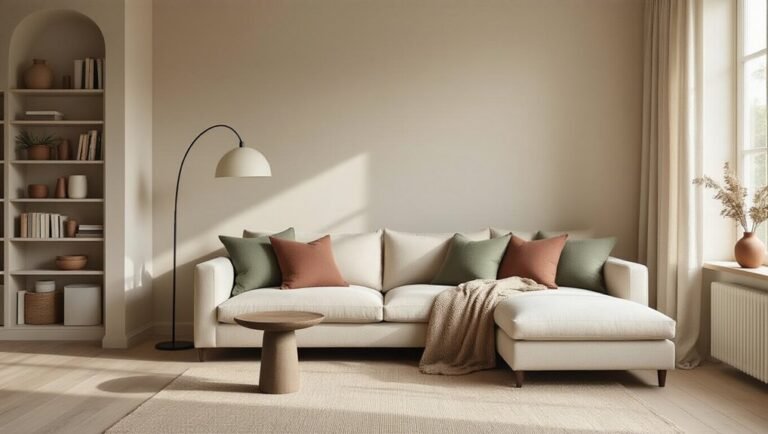
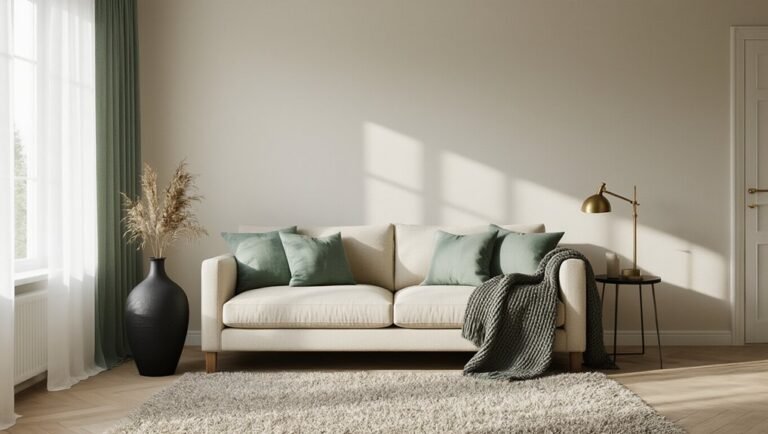
Navy Blue, White, and Warm Amber for Cozy Living Rooms
When seeking to balance warmth and sophistication in a living room, the combination of navy blue, white, and warm amber proves exceptionally effective. Navy serves as an anchoring accent wall, while white maintains the bright, airy aesthetic characteristic of Scandinavian design. Warm amber lighting—through floor lamps or pendant fixtures—introduces coziness without compromising the palette’s clarity.
Tone-on-tone layering with various shades of navy in textiles and furniture creates visual depth while preserving coherence. This palette establishes an inviting atmosphere where residents feel simultaneously energized and relaxed, making it ideal for spaces designed for both socializing and unwinding.
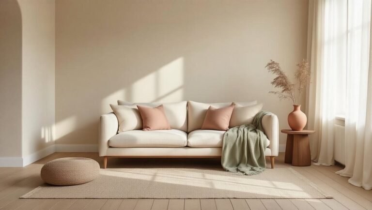
Soft Taupe and Dusty Blush for Intimate, Welcoming Spaces
For those seeking to cultivate spaces that feel both refined and deeply personal, soft taupe and dusty blush offer a compelling alternative to brighter Scandinavian palettes. These muted, earthy tones create an atmosphere of understated elegance while maintaining the minimalist principles central to Nordic design. Taupe walls provide a neutral foundation that grounds a room, while dusty blush accents—introduced through textiles, artwork, or accessories—add warmth and subtle personality.
Together, they establish intimate environments that encourage relaxation and connection. This palette particularly suits bedrooms and reading nooks, where tranquility and comfort are paramount priorities.
Cool Gray and Black: Minimalist Monochrome at Its Best
Restraint defines the cool gray and black palette, stripping Scandinavian design to its philosophical essence. This monochromatic approach eliminates visual noise, creating serene environments through disciplined color choice.
Scandinavian minimalism strips design to its essence: restrained gray and black palettes eliminating visual noise, creating serene, disciplined spaces.
Deep charcoal walls contrast with alabaster trim and furniture, establishing sophisticated spatial depth. The interplay between dark and light anchors the room psychologically, preventing monotony while maintaining tranquility.
Black accents—door frames, shelving, fixtures—punctuate the composition, drawing the eye deliberately.
Gray gradations provide subtle variation without distraction. This palette suits minimalist interiors perfectly, emphasizing form, texture, and function over decorative color. The result is understated elegance that feels both modern and timelessly calm.
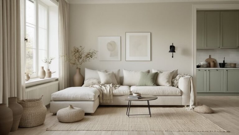
Ivory, Stone Gray, and Eucalyptus Green for Airy Kitchens
While cool gray and black palettes embrace minimalist restraint, kitchens benefit from a warmer approach that maintains Scandinavian serenity without sacrificing livability. Ivory and bone tones create a welcoming foundation, preventing sterile aesthetics while maximizing light reflection. Stone gray introduces subtle depth and sophistication, anchoring the palette without visual heaviness. Eucalyptus green softens the composition through cabinetry, textiles, or accent walls, adding organic warmth reminiscent of Nordic forests. This combination promotes both functionality and tranquility, allowing kitchens to feel simultaneously bright and grounded. The neutral-to-muted transition creates visual harmony that encourages relaxation while maintaining practical, efficient workspace aesthetics essential for modern culinary environments.
Warm Gray, Terracotta Accents, and Off-White for Textured Warmth
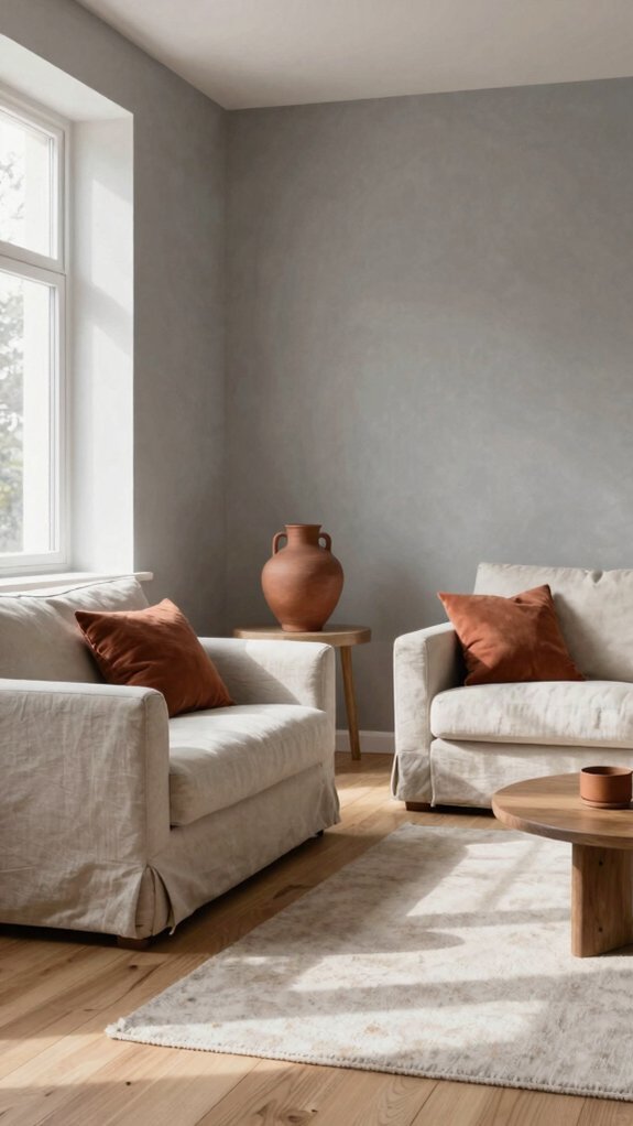
How can a space embrace warmth without abandoning Scandinavian minimalism? This palette combines warm gray walls with terracotta accents and off-white trim, creating textured depth while maintaining clean lines. Terracotta’s earthy undertones add personality through pottery, textiles, or artwork without cluttering the aesthetic. Off-white ceilings amplify light and preserve airiness. Warm gray provides sophisticated grounding that feels inviting rather than cold. Incorporating circadian lighting—warm-toned fixtures that shift throughout the day—enhances this palette’s natural rhythm. Layered textures through linen, wool, and ceramic pieces complete the composition. This combination proves that Scandinavian design thrives when warmth and restraint coexist intentionally.
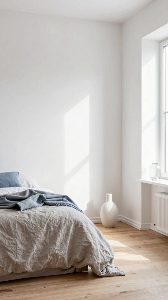
White, Pale Blue-Gray, and Natural Fibers for Serene Bathrooms
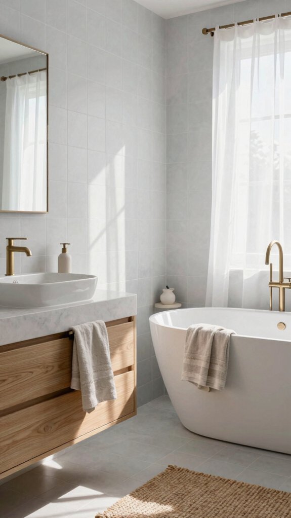
Bathrooms transform into tranquil retreats when anchored by white walls, pale blue-gray accents, and natural fiber elements. This palette creates a spa-like atmosphere that promotes relaxation and mental clarity. White provides a clean foundation, while soft blue-gray tones introduce subtle depth without overwhelming the space. Natural materials—linen towels, jute rugs, wooden shelving—add warmth and texture, grounding the minimalist aesthetic. Mushroom-toned accessories or storage baskets introduce earthy sophistication. These components work harmoniously to establish a serene environment where morning routines feel less rushed and evening wind-downs prove genuinely restorative.
Charcoal, Warm Cream, and Muted Ochre for Sophisticated Home Offices
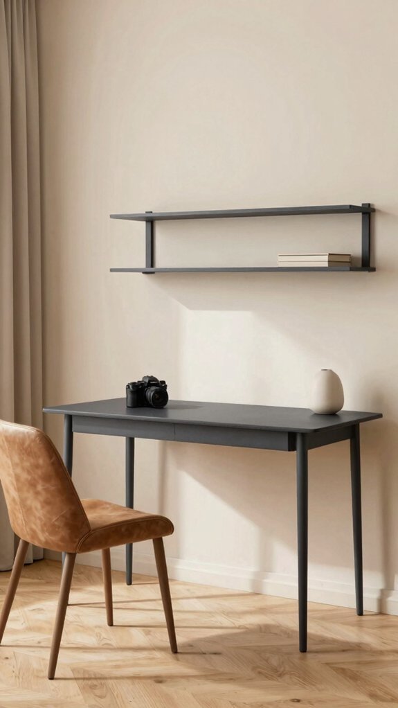
Why do home offices often feel sterile or uninviting? The answer lies in thoughtful color selection. Charcoal walls create a grounding backdrop that reduces visual fatigue during long work hours. Warm cream accents, reminiscent of cloud dancer tones, soften the darkness while maintaining sophistication. Muted ochre introduces subtle warmth without overwhelming the senses, encouraging focus and creativity. This palette combines professional aesthetics with psychological comfort. Natural wood desks and linen accessories complement these hues, reinforcing Scandinavian principles. The result is a workspace that feels both authoritative and welcoming—an environment where productivity flourishes naturally, free from the coldness typically associated with contemporary office design.